Getting Rid of Unwanted Space
littlespank made me do it.
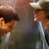
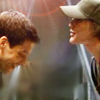
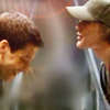
From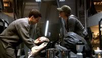
to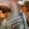
Done with Photoshop CS4 but I'm assuming it should work in most other programs.
The main idea of this tutorial is to show you how to remove space between two subjects you want in an icon. This is actually pretty simple but I just figured out how to do it so I thought somebody else could use the info. This may have a lot of steps but most of them are REALLY easy. Have fun!
Step 1:
I started with this screencap (obviously a larger version). As you can see there's too much space between Kara and Lee to make a good icon unless the subjects are very small. Also, there's that annoying light in between them.

Step 2:
Using the Rectangular Marquee Tool select the area that you don't want in the icon. For this particular screencap, I selected about a one inch strip between Kara and Lee that included the light.
Step 3:
Hit the delete button. This should remove the area and leave you with a blank strip down the center of the picture.
Step 4:
Using the Rectangular Marquee Tool again, select the area that is left on the right side of the blank strip. Make sure you don't have any of the black strip included in your selection. You may want to exclude just a little bit of the picture to make sure.
Step 5:
There are two ways to do the next step:
option A
Right click on the mouse and choose "Layer via cut" option.
option B
Select Layer -> New -> Layer via cut (Shift+Ctrl+J)
Either option works the same and you are left with two separate layers.
Step 6:
Move the layer with the right side of the picture over to match up as close as you can to the left side.
Step 7:
Merge layers. Move this picture to your 100X100 canvas and resize to desired crop. Blur, smudge or whatever to blend the two sides together. (for this icon I wanted most of the background to be blurry so I blurred and smudged)
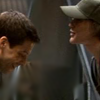
(That's how I cut out the middle and got the crop I wanted. The rest is just what I did with the icon itself. You may or may not care about what I did. It wasn't really anything fancy, but I'll ramble on about it anyway.)
Step 8:
Duplicate your layer twice. Set the first one to Screen at 100% and the second one to Soft Light at 50%. (When I was finished with everything else I went back and added a lens flare to the Screen layer. That's why it's in the example picture here.)
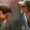
Step 9:
Add a Hue/Saturation layer and set the saturation to +15.
Step 10:
Add a Brightness/Contrast layer and set contrast to +15.
Step 11:
Add a Curves layer. I don't really know what I was doing here so I'll just tell you what settings I used.
Point 1: output=84/input=64
Point 2: output=207/input=168
Step 12:
I learned this little trick from skydawnjade.
Add a new layer. Using a size 5 brush and white color, paint a few lines between and around the subjects. Then blur the lines either with the blur tool or using Gaussian blur. The layer is set to Normal at 48%.
Step 13:
Add this texture:
Move it about half way down your icon. Set it to Screen at 100%. I erased most of the layer at varying opacities so I was just left with the light effects below Lee.
Step 14:
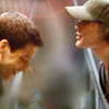
This is when I added the lens flair that I mentioned in Step 8. It's a 50-300mm flare at 100%.
Step 15:
Add text and you're done!
From

to

Done with Photoshop CS4 but I'm assuming it should work in most other programs.
The main idea of this tutorial is to show you how to remove space between two subjects you want in an icon. This is actually pretty simple but I just figured out how to do it so I thought somebody else could use the info. This may have a lot of steps but most of them are REALLY easy. Have fun!
Step 1:
I started with this screencap (obviously a larger version). As you can see there's too much space between Kara and Lee to make a good icon unless the subjects are very small. Also, there's that annoying light in between them.

Step 2:
Using the Rectangular Marquee Tool select the area that you don't want in the icon. For this particular screencap, I selected about a one inch strip between Kara and Lee that included the light.
Step 3:
Hit the delete button. This should remove the area and leave you with a blank strip down the center of the picture.
Step 4:
Using the Rectangular Marquee Tool again, select the area that is left on the right side of the blank strip. Make sure you don't have any of the black strip included in your selection. You may want to exclude just a little bit of the picture to make sure.
Step 5:
There are two ways to do the next step:
option A
Right click on the mouse and choose "Layer via cut" option.
option B
Select Layer -> New -> Layer via cut (Shift+Ctrl+J)
Either option works the same and you are left with two separate layers.
Step 6:
Move the layer with the right side of the picture over to match up as close as you can to the left side.
Step 7:
Merge layers. Move this picture to your 100X100 canvas and resize to desired crop. Blur, smudge or whatever to blend the two sides together. (for this icon I wanted most of the background to be blurry so I blurred and smudged)

(That's how I cut out the middle and got the crop I wanted. The rest is just what I did with the icon itself. You may or may not care about what I did. It wasn't really anything fancy, but I'll ramble on about it anyway.)
Step 8:
Duplicate your layer twice. Set the first one to Screen at 100% and the second one to Soft Light at 50%. (When I was finished with everything else I went back and added a lens flare to the Screen layer. That's why it's in the example picture here.)

Step 9:
Add a Hue/Saturation layer and set the saturation to +15.
Step 10:
Add a Brightness/Contrast layer and set contrast to +15.

Step 11:
Add a Curves layer. I don't really know what I was doing here so I'll just tell you what settings I used.
Point 1: output=84/input=64
Point 2: output=207/input=168

Step 12:
I learned this little trick from skydawnjade.
Add a new layer. Using a size 5 brush and white color, paint a few lines between and around the subjects. Then blur the lines either with the blur tool or using Gaussian blur. The layer is set to Normal at 48%.

Step 13:
Add this texture:

Move it about half way down your icon. Set it to Screen at 100%. I erased most of the layer at varying opacities so I was just left with the light effects below Lee.

Step 14:
This is when I added the lens flair that I mentioned in Step 8. It's a 50-300mm flare at 100%.
Step 15:
Add text and you're done!