yogurt
in
iconsanity
Tutorial for the savvy PSCS user
I feel like making icon tutorials more than actually making icons. What's wrong with me? I neglect this journal far too much. THOUGH. I do plan on updating soon with some KHII icons that have been posted in my personal journal and a set of The Producers icons when I finish them.
Anyway. This is really image heavy. And if you don't know your way around Photoshop or have never really attempted at making icons before, this tutorial isn't for you. It deals with layers, layer settings, brushes, textures, gradients and all of the above. I kind of went way too far with this icon it isn't even funny! ..yet I'm laughing anyway.
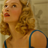
to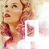
STEP 01; MAKING THE BASE
First, I found the image I wanted. Which happened to be from the movie, The Producers. The original image can be found here.
Then I took the image into PSCS and made a base out of it.
Basically, to make a base you just crop the image, resize it, auto layer + auto contrast + auto color it, and then sharpen it a few times. Zooming in you should take the blur tool and smooth out the skin to make it softer, leaving the eyes lips and everything else sharpened. You do this until you're satisfied with how your image looks. (I did tell you that you have to be Photoshop savvy, didn't I?)
But my end result for the base was this:
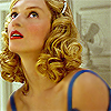
(I auto leveled and auto contrasted it (because auto coloring washed out the warmth and I didn't like it), then sharpened it twice, took the blur tool, made the strength 20% and went over her skin.)
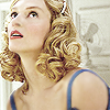
STEP 02; THE B&W LAYER
Duplicate the base layer and desaturate it.
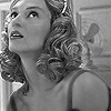
Set the desaturated layer to Screen at 100%.
STEP 03; THE GRADIENT
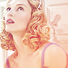
Time to add a gradient. I found one that I wanted made by crumblingwalls.

Paste it above the desaturated layer and set it to screen at 100% as well.
STEP 04; DUPLICATE THE BASE
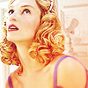
Go back to the base layer and duplicate it. Drag the duplicated layer to the top of all of your other layers.

Set the duplicated base layer to Soft Light at 100%.
STEP 05; THE SMALL IMAGE
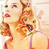
Now, what I did was I took the original image and found one part I really wanted to focus on. I cropped out her lips from the original image and resized it to a 14x37 image. I did the same thing I did to the base by autoing the layers, contrast and colors of the image and sharpening it twice (without using the blur tool). I then messed around with making the image face another direction just for fun.

Pasting it above the icon I started, I moved it someplace where it wouldn't be in the way.
STEP 06; DUPLICATE THE GRADIENT
I took the same gradient as before and pasted it over the icon again.

Going back to the small image layer underneath the gradient, I take the Magic Wand Tool and select the area around the small image.
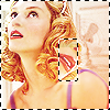
Going back up to the gradient I delete the area that I previously selected, leaving me with a tiny square of the gradient to go over the tiny image.

I then set this layer to screen at 100%.
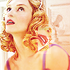
STEP 07; FIRST LIGHT TEXTURE
I so do love my light textures. 8D Unfortunately I have no idea who made this one. I think I found it in a tutorial somewhere.
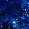
Pasting it above all the other layers, I set it to Lighten at 100%.
STEP 08; OBLIGITORY TAN LAYER
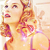
Yesss, the tan layer is almost as abused as much as the exclusion dark blue layer. I used #E9CFA2 and floodfilled a new layer above all my other layers.

I then, of course, set this layer to multiply at 70% opacity.
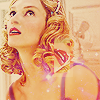
STEP 09; LIGHT BLUE LAYER
Making a new layer I floodfilled this one with the color #C1F1FF.

Then set this one to Color Burn at 70% opacity.
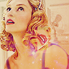
STEP 10; ANOTHER LIGHT TEXTURE
Whoo! More light textures! This one's a bit tricky, but I do know it was made by myrasis.
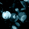
After pasting that ontop of all of my previous layers, I went to Edit > Transform > Flip Horizontal.
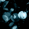
I dragged it down to the bottom corner of the icon.

Then set it to Screen at 100%.
STEP 11; LAST LIGHT TEXTURE
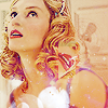
I promise, it's the last one! This one is another random texture I yoinked from an icon tutorial. But anyway, pasting it above all my layers...

Seeing the light texture would have obscured the icon if I left it how it was, I went back to Edit > Transform > Flip Horizontal for this one, too.

I set this one, you guessed it, to screen at 100% as well.
STEP 12; AN ACTUAL TEXTURE
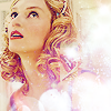
This one was made by tinamishi. I pasted it above all my other layers.
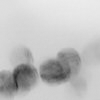
This one was set to Soft Light at 100%.
STEP 13; FIRST BRUSH
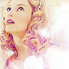
I needed something to outline the small image I did to make it stand out. After looking through all the brushes I had I found one that somewhat fit the resolutions. I altered the original brush a bit, but I don't know who made the original since the brush set I own was given to me by a friend. Sorry guys.
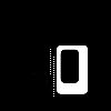
I brushed it on a new layer with white (#FFFFFF).
STEP 14; SMALL TEXT BRUSH
I don't know who made this brush either, but any small text brushes can work and you can find them anywhere.
I brushed it over the icon on a new layer in white (#FFFFF).

STEP 15; FINISHING TOUCH
Seeing as the overall icon looked too washed out, I decided to darken it by making a new layer and floodfilling it with black (#000000).

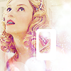
I took the black layer and set it to Soft Light at 100% and vuala;

So. Yeah. Any questions, comments, icons you made, or ideas for any other tutorials.. you know what to do~. :D *dead*
Anyway. This is really image heavy. And if you don't know your way around Photoshop or have never really attempted at making icons before, this tutorial isn't for you. It deals with layers, layer settings, brushes, textures, gradients and all of the above. I kind of went way too far with this icon it isn't even funny! ..yet I'm laughing anyway.
to
STEP 01; MAKING THE BASE
First, I found the image I wanted. Which happened to be from the movie, The Producers. The original image can be found here.
Then I took the image into PSCS and made a base out of it.
Basically, to make a base you just crop the image, resize it, auto layer + auto contrast + auto color it, and then sharpen it a few times. Zooming in you should take the blur tool and smooth out the skin to make it softer, leaving the eyes lips and everything else sharpened. You do this until you're satisfied with how your image looks. (I did tell you that you have to be Photoshop savvy, didn't I?)
But my end result for the base was this:
(I auto leveled and auto contrasted it (because auto coloring washed out the warmth and I didn't like it), then sharpened it twice, took the blur tool, made the strength 20% and went over her skin.)
STEP 02; THE B&W LAYER
Duplicate the base layer and desaturate it.
Set the desaturated layer to Screen at 100%.
STEP 03; THE GRADIENT
Time to add a gradient. I found one that I wanted made by crumblingwalls.
Paste it above the desaturated layer and set it to screen at 100% as well.
STEP 04; DUPLICATE THE BASE
Go back to the base layer and duplicate it. Drag the duplicated layer to the top of all of your other layers.
Set the duplicated base layer to Soft Light at 100%.
STEP 05; THE SMALL IMAGE
Now, what I did was I took the original image and found one part I really wanted to focus on. I cropped out her lips from the original image and resized it to a 14x37 image. I did the same thing I did to the base by autoing the layers, contrast and colors of the image and sharpening it twice (without using the blur tool). I then messed around with making the image face another direction just for fun.
Pasting it above the icon I started, I moved it someplace where it wouldn't be in the way.
STEP 06; DUPLICATE THE GRADIENT
I took the same gradient as before and pasted it over the icon again.
Going back to the small image layer underneath the gradient, I take the Magic Wand Tool and select the area around the small image.
Going back up to the gradient I delete the area that I previously selected, leaving me with a tiny square of the gradient to go over the tiny image.
I then set this layer to screen at 100%.
STEP 07; FIRST LIGHT TEXTURE
I so do love my light textures. 8D Unfortunately I have no idea who made this one. I think I found it in a tutorial somewhere.
Pasting it above all the other layers, I set it to Lighten at 100%.
STEP 08; OBLIGITORY TAN LAYER
Yesss, the tan layer is almost as abused as much as the exclusion dark blue layer. I used #E9CFA2 and floodfilled a new layer above all my other layers.
I then, of course, set this layer to multiply at 70% opacity.
STEP 09; LIGHT BLUE LAYER
Making a new layer I floodfilled this one with the color #C1F1FF.
Then set this one to Color Burn at 70% opacity.
STEP 10; ANOTHER LIGHT TEXTURE
Whoo! More light textures! This one's a bit tricky, but I do know it was made by myrasis.
After pasting that ontop of all of my previous layers, I went to Edit > Transform > Flip Horizontal.
I dragged it down to the bottom corner of the icon.
Then set it to Screen at 100%.
STEP 11; LAST LIGHT TEXTURE
I promise, it's the last one! This one is another random texture I yoinked from an icon tutorial. But anyway, pasting it above all my layers...
Seeing the light texture would have obscured the icon if I left it how it was, I went back to Edit > Transform > Flip Horizontal for this one, too.
I set this one, you guessed it, to screen at 100% as well.
STEP 12; AN ACTUAL TEXTURE
This one was made by tinamishi. I pasted it above all my other layers.
This one was set to Soft Light at 100%.
STEP 13; FIRST BRUSH
I needed something to outline the small image I did to make it stand out. After looking through all the brushes I had I found one that somewhat fit the resolutions. I altered the original brush a bit, but I don't know who made the original since the brush set I own was given to me by a friend. Sorry guys.
I brushed it on a new layer with white (#FFFFFF).
STEP 14; SMALL TEXT BRUSH
I don't know who made this brush either, but any small text brushes can work and you can find them anywhere.
I brushed it over the icon on a new layer in white (#FFFFF).
STEP 15; FINISHING TOUCH
Seeing as the overall icon looked too washed out, I decided to darken it by making a new layer and floodfilling it with black (#000000).
I took the black layer and set it to Soft Light at 100% and vuala;
So. Yeah. Any questions, comments, icons you made, or ideas for any other tutorials.. you know what to do~. :D *dead*