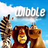
Madagascar wibble tutorial (PS 7.0)
Get from this to 
!
Crop this base image (capped by dj43) to a 100x100 base.
Here was my result:
Copy the layer and set the copied layer to "multiply." Set the opacity to 61%. The layers all-together should look like this:
Now copy the first layer again and paste it over layer 2. Set the layer to "screen." The layers all-together should look like this: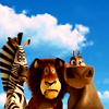
Merge the second layer down. Merge the third layer down.
It's still not as bright/vivid as I'd like. So I repeated the process. I copied
and pasted it.
I set that layer to multiply, opacity 30%, this is what all the layers look like together:
Now, of course I don't want it so dark. I pasted
over the multiply layer and set it to screen, opacity 59%. The layers all-together look like this:
Merge the layer set to multiply down. Merge the layer set to screen down.
I like the brightness of the colors, but it's just too blurry. I copied
and went to filter >> sharpen >> sharpen. You get this:
.
I personally thought that it was too sharp, so I set the sharpened layer to opacity 38%. Here's the result: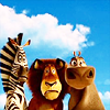
Slap on some text and send it to the press!
I chose the font "bubbleboy" since it's currently my favorite icon font. Using the color white, I set it to 17pt, anti-aliasing at "smooth." You can get the font at dafont.com. :)
You get: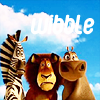
Almost done! Now, since the font is white, and so are the clouds, you want the text to stand out. You can set the font to black, but I didn't like it. So I went to the layer style of the text layer and I selected "drop shadow" at blend mode: multiply, opacity: 75%, distance: 5px, spread: 0% and distance: 5px.
Ta da! A few simple steps to change
to

!
Crop this base image (capped by dj43) to a 100x100 base.
Here was my result:

Copy the layer and set the copied layer to "multiply." Set the opacity to 61%. The layers all-together should look like this:

Now copy the first layer again and paste it over layer 2. Set the layer to "screen." The layers all-together should look like this:

Merge the second layer down. Merge the third layer down.
It's still not as bright/vivid as I'd like. So I repeated the process. I copied

and pasted it.
I set that layer to multiply, opacity 30%, this is what all the layers look like together:

Now, of course I don't want it so dark. I pasted

over the multiply layer and set it to screen, opacity 59%. The layers all-together look like this:

Merge the layer set to multiply down. Merge the layer set to screen down.
I like the brightness of the colors, but it's just too blurry. I copied

and went to filter >> sharpen >> sharpen. You get this:

.
I personally thought that it was too sharp, so I set the sharpened layer to opacity 38%. Here's the result:

Slap on some text and send it to the press!
I chose the font "bubbleboy" since it's currently my favorite icon font. Using the color white, I set it to 17pt, anti-aliasing at "smooth." You can get the font at dafont.com. :)
You get:

Almost done! Now, since the font is white, and so are the clouds, you want the text to stand out. You can set the font to black, but I didn't like it. So I went to the layer style of the text layer and I selected "drop shadow" at blend mode: multiply, opacity: 75%, distance: 5px, spread: 0% and distance: 5px.
Ta da! A few simple steps to change

to
