Mmm, chocolate.
Starting here 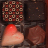
and finishing here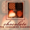
This icon was made in Photoshop CS3 (on a Mac). There is one minor Selective Color layer, but the effect is probably achievable by other means (eg desaturating) if you have a different program. Uses: Curves, Selective Color, Gaussian Blur.
Cross-posted to severalplums.
The basic problem with this source picture was to get the chocolate to look yummy. Surprisingly difficult, and I probably cheated a bit because it's so reduced in size.
To begin with, I rotated the source picture (if you want to see it, go here: http://i11.photobucket.com/albums/a160/pensnest/severalplums/chocolate_byjhritz.jpg) and selected several groupings of four chocolates. Eventually decided which group to use, trimmed it nicely, and got it down to icon size.
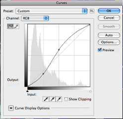
The first thing I did was to add a Curves adjustment layer. (Since I discovered the little menu at the bottom of the Layers Palette, I never use anything but Adjustment Layers, except for Desaturate. It's accessed via the little icon that looks like a circle, half black, half white.) I picked a spot on the line (RGB) at the intersection of the lowest, leftmost grid lines, and moved it down a bit, and then a spot at the central intersection and moved that up a bit. The lower spot ends up as Output 50/Input 59, the upper at 150/124. Blending Mode Normal 100%.
The Curves curve looked like this:
I amalgamated the chocolate base layer with the Curves into a new layer, added a Gaussian Blur (Filter>Blur>Gaussian Blur) at 6.0 and set it to Screen, then duplicated this layer and set to Soft Light.
The whole thing was a bit red, so I fiddled rather nervously with a Selective Color layer, just reducing the Magenta in the Reds to -14%. Then an amalgamation layer of all these.
I copied the amalgamated chocolates layer and reduced it in size (Move tool, with Shift held down to keep everything in proportion) to something that I liked the look of. Then made a new layer and used the Select tool to Stroke a square around it in a colour picked up from the chocolates (652422).
I added in a Color Fill layer of f4e6cf and moved this to the bottom, and hid the several layers that had gone into the making of the little square of chocolates.
Text was easy, as I have a lovely little book called "Chocolate: The Consuming Passion" by Sandra Boynton-it is illustrated with rabbits (who are indifferent to chocolate) and hippos (who are extremely keen on chocolate, like me). So. 'Chocolate' is in Bickham Script Pro, 30pt, tracking at 50, colour 652422. 'The consuming passion' is Arial, 8pt, in small caps. I believe I then stretched it a little bit with the Move tool so that it would fit exactly into the square. Duplicated both text layers and set the upper ones to Soft Light-I find this just sharpens up the definition of the text, which spindly fonts and small fonts both benefit from.
Now. This did not actually happen in this order! What really happened was, I started out using a different set of four chocolates, and messed around a lot with colouring and trying to get them to look nice.
Anyway, when I'd got to something that looked very much like this:
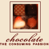
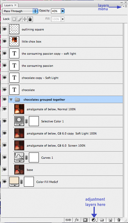
I wanted to add some texture to the cream background. I experimented with brushes and textures and blurs and what not, and eventually came up with the idea of an overlay of chocolates. But to spare you all that, what effectively happens in the icon is as follows: I selected the original layers of chocolates and made a New Group from Layers (it's the menu from the little down-turned triangle at the top right of the Layers Palette). I turned down the opacity of the Group to 40%, made sure it was positioned just above the Cream background, and there was something I liked. Of course, it would be equally possible to create one amalgamated layer of this group, and set it to Normal with reduced opacity in the usual way.
So, save, and Save for Web and Devices as .png 24.
Thus:

My Layers palette looked like this:
If you have any questions, please ask.

and finishing here

This icon was made in Photoshop CS3 (on a Mac). There is one minor Selective Color layer, but the effect is probably achievable by other means (eg desaturating) if you have a different program. Uses: Curves, Selective Color, Gaussian Blur.
Cross-posted to severalplums.
The basic problem with this source picture was to get the chocolate to look yummy. Surprisingly difficult, and I probably cheated a bit because it's so reduced in size.
To begin with, I rotated the source picture (if you want to see it, go here: http://i11.photobucket.com/albums/a160/pensnest/severalplums/chocolate_byjhritz.jpg) and selected several groupings of four chocolates. Eventually decided which group to use, trimmed it nicely, and got it down to icon size.
The first thing I did was to add a Curves adjustment layer. (Since I discovered the little menu at the bottom of the Layers Palette, I never use anything but Adjustment Layers, except for Desaturate. It's accessed via the little icon that looks like a circle, half black, half white.) I picked a spot on the line (RGB) at the intersection of the lowest, leftmost grid lines, and moved it down a bit, and then a spot at the central intersection and moved that up a bit. The lower spot ends up as Output 50/Input 59, the upper at 150/124. Blending Mode Normal 100%.
The Curves curve looked like this:

I amalgamated the chocolate base layer with the Curves into a new layer, added a Gaussian Blur (Filter>Blur>Gaussian Blur) at 6.0 and set it to Screen, then duplicated this layer and set to Soft Light.
The whole thing was a bit red, so I fiddled rather nervously with a Selective Color layer, just reducing the Magenta in the Reds to -14%. Then an amalgamation layer of all these.
I copied the amalgamated chocolates layer and reduced it in size (Move tool, with Shift held down to keep everything in proportion) to something that I liked the look of. Then made a new layer and used the Select tool to Stroke a square around it in a colour picked up from the chocolates (652422).
I added in a Color Fill layer of f4e6cf and moved this to the bottom, and hid the several layers that had gone into the making of the little square of chocolates.
Text was easy, as I have a lovely little book called "Chocolate: The Consuming Passion" by Sandra Boynton-it is illustrated with rabbits (who are indifferent to chocolate) and hippos (who are extremely keen on chocolate, like me). So. 'Chocolate' is in Bickham Script Pro, 30pt, tracking at 50, colour 652422. 'The consuming passion' is Arial, 8pt, in small caps. I believe I then stretched it a little bit with the Move tool so that it would fit exactly into the square. Duplicated both text layers and set the upper ones to Soft Light-I find this just sharpens up the definition of the text, which spindly fonts and small fonts both benefit from.
Now. This did not actually happen in this order! What really happened was, I started out using a different set of four chocolates, and messed around a lot with colouring and trying to get them to look nice.
Anyway, when I'd got to something that looked very much like this:

I wanted to add some texture to the cream background. I experimented with brushes and textures and blurs and what not, and eventually came up with the idea of an overlay of chocolates. But to spare you all that, what effectively happens in the icon is as follows: I selected the original layers of chocolates and made a New Group from Layers (it's the menu from the little down-turned triangle at the top right of the Layers Palette). I turned down the opacity of the Group to 40%, made sure it was positioned just above the Cream background, and there was something I liked. Of course, it would be equally possible to create one amalgamated layer of this group, and set it to Normal with reduced opacity in the usual way.
So, save, and Save for Web and Devices as .png 24.
Thus:

My Layers palette looked like this:

If you have any questions, please ask.