Tutorial for PS CS but translateable to other programs!
Okay, this is my very first tutorial! I thought I'd post this since this is such a popular style. It's really very easy and includes a few basic techniques that can be applied to other icons. Enjoy!
We're going to make this icon: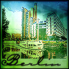
I started out with this image from Corbis Stock: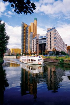
I usually go for shots taken at night for these cityscapes because the colors are usually more vibrant but these day images come out really nice especially when you have a lot of reflection going on. Look for ones with water that reflect the lights of the city. Those always come out gorgeous. :)
I cropped out the parts I wanted, sharpened a couple of times and resized to 100x100 and then sharpened it two more times, fading the last sharpening to 60%. It will look a bit oversharpened at this point so stay with me: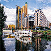
Now duplicate the image once and set the new layer to Overlay:
Create a new layer at the very top and using your color picker tool, select two colors from the image. I usually pick two similar or complimentary colors depending on what I want to emphasize in my picture. For this one I chose #B5E1FB and #526AA2 from the sky and the water respectively. Make sure that one is in your foreground and the other is your background color. Select your gradient tool and using the vertical gradient setting, apply a gradient to your new layer on a diagonal: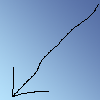
Select an square area of your gradient, leaving a small border and a slightly larger space along the bottom. Delete your selection: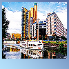
Make a new layer and set it to Hard Light. Fill with a texture or gradient of your choice. I used this one by lookslikerain_. The texture or gradient you choose should highlight your image and make it look dreamy but not obscure it: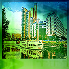
Make a new layer and select your text tool. Make sure your foreground color is black. For the text on these icons, I generally choose a plain font (Georgia, Tahoma, Arial, Times Roman, etc...) that is still readable in the smaller sizes. This time, I chose Carpenter IPG, size 30 for the heck of it: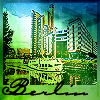
Make a new layer and add a 1px border in black. I usually apply it twice: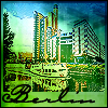
Flatten the image and then duplicate it once again. Apply a Gaussian Blur set at 2.0 to the top layer: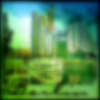
Again working with the top layer, adjust the contrast to +44 and the brightness to +25 or whatever looks right to you. Desaturate the layer to -75. Finally lower the opacity of the top layer to 30% or adjust it to where you want it. Flatten the image and you're done!
That wasn't too hard, was it? Let me know what you thought or if you have any questions. I'd be happy to help if you're confused. I use Photoshop CS but I'm sure its translateable to other programs.
The icon is certainly up for grabs but please follow the usual rules. Please don't just make the exact icon. Play around with your ideas and have fun with it. I'd love to see what you come up with! :)
And now back to writing my paper...I've done enough procrastination for one day. ;)
x-posted to organicdesigns.
We're going to make this icon:

I started out with this image from Corbis Stock:

I usually go for shots taken at night for these cityscapes because the colors are usually more vibrant but these day images come out really nice especially when you have a lot of reflection going on. Look for ones with water that reflect the lights of the city. Those always come out gorgeous. :)
I cropped out the parts I wanted, sharpened a couple of times and resized to 100x100 and then sharpened it two more times, fading the last sharpening to 60%. It will look a bit oversharpened at this point so stay with me:

Now duplicate the image once and set the new layer to Overlay:

Create a new layer at the very top and using your color picker tool, select two colors from the image. I usually pick two similar or complimentary colors depending on what I want to emphasize in my picture. For this one I chose #B5E1FB and #526AA2 from the sky and the water respectively. Make sure that one is in your foreground and the other is your background color. Select your gradient tool and using the vertical gradient setting, apply a gradient to your new layer on a diagonal:

Select an square area of your gradient, leaving a small border and a slightly larger space along the bottom. Delete your selection:

Make a new layer and set it to Hard Light. Fill with a texture or gradient of your choice. I used this one by lookslikerain_. The texture or gradient you choose should highlight your image and make it look dreamy but not obscure it:

Make a new layer and select your text tool. Make sure your foreground color is black. For the text on these icons, I generally choose a plain font (Georgia, Tahoma, Arial, Times Roman, etc...) that is still readable in the smaller sizes. This time, I chose Carpenter IPG, size 30 for the heck of it:

Make a new layer and add a 1px border in black. I usually apply it twice:

Flatten the image and then duplicate it once again. Apply a Gaussian Blur set at 2.0 to the top layer:

Again working with the top layer, adjust the contrast to +44 and the brightness to +25 or whatever looks right to you. Desaturate the layer to -75. Finally lower the opacity of the top layer to 30% or adjust it to where you want it. Flatten the image and you're done!

That wasn't too hard, was it? Let me know what you thought or if you have any questions. I'd be happy to help if you're confused. I use Photoshop CS but I'm sure its translateable to other programs.
The icon is certainly up for grabs but please follow the usual rules. Please don't just make the exact icon. Play around with your ideas and have fun with it. I'd love to see what you come up with! :)
And now back to writing my paper...I've done enough procrastination for one day. ;)
x-posted to organicdesigns.