Full Icon Tutorial - John Lennon "simplicity" icon
Okay, so the lurvely aylaranzz requested a tutorial for this icon:
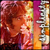
So, I've tried to duplicate what I did. And I've done pretty well, if I do say so myself. It certainly resembles the original.
We're going from this: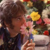
to this: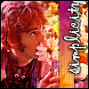
using PSP8, almost definitely translatable!
Okay, so we start with this pretty picture of John Lennon bein' all cute and stuff.
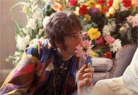
We crop it to a square and resize it to 100x100 to make a base.

Easy enough, I do believe.
Then we sharpen it. Actually, we sharpen it more. By going to Adjust>Sharpness>Sharpen More.

Next, we take our old friend the soften tool thingie and go over Johnny's cheek a bit to smooth him out. Use a small size, probably around 4 or 5.

Now we're gonna work on the lighting of the icon. This is a thingy I do a lot with icons, and you all probably do, but if you don't, try it out, cuz it's nifty. Duplicate the base layer twice, so you have three layers altogether. Set the middle layer to screen, and the top layer to soft light.
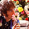
I'm liking the colors of the icon a lot more now.
Now it's time for fun! Yippee! First, we're adding this texture, made by colorfilter:

Paste it on a new layer and set it to Hard Light at 80%.
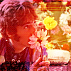
It's still a little...er...much. But I don't want to lower the opacity of that layer anymore, because I want to keep that little border at the bottom. So instead, I drag the duplicated base layer that we set to soft light up above that one. It's a very subtle difference, but now we've got Johnny standing out a little bit more. From top to bottom, your layers are now: a copy of the base set to soft light, that texture, a copy of the base set to screen, and the base itself. Okay?
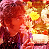
The texture is still a little WHOA; it's kind of making Johnny look like the human cheez-it. So I take my eraser and grab a spongy sort of brush - I believe just one that came with PSP - and set it to a very low opacity and erase over John's face a bit.
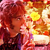
Now, I've kind of got it in my head that I want vertical text on the right, since John is looking that way and drawing the viewer's eyes over there. I want something else, too, not just text. I start thinking a rectangle in some color, and then I have this idea. I grab a pretty texture - this one is by graphicjunkie.

I crop a skinny little rectangle out of this texture. It's 16 pixels wide and the whole 100 tall. It's the first 16 pixels, if that makes sense. It looked like a good little bit.

I paste this as a new layer on to my icon and move it over where I want it.
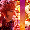
Now, it's getting awfully busy, and that little rectangle is getting lost in the background and making my eyeballs go URGH! So I add a drop shadow to that layer to get it to stand out more. I do this sort of thing a lot. When I'm using a shadow to make something stand out like this, I always have the offset at 0, 0. This makes the shadow bit even on all sides of it. In this case, I used an opacity of 100 and a blur of 5.
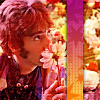
Better! Now for text. I add "simplicity" in 16 point Gigi - a font I use WAY too much. I ALWAYS ALWAYS add my text as vectors so I can change it 'round later. ALWAYS. So I spin it around so it goes vertically.
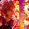
I don't want it going all the way from bottom to top. I want it towards the top of the icon, because that's where John's eyes are making the viewer look. Because I used vector text (DO IT!), this is easy to fix. I just grab the little handle and squish it up a little.
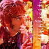
Now, that's impossible to see, never mind read. And I kinda wanted to read it, I dunno about you. So I do something I do a lot. I add a drop shadow again - same settings as before except that this time the blur is 3. I always add my shadows on a new layer so I can play with them. I set the text layer to screen to make it stand out more. And then I duplicate. Something I frequently do. Duplicate both the text layer and the shadow layer until you like the look. I end up duplicating the text layer once, and duplicating the shadow layer about 10 times, because I'm insane like that. By the time I'm done with it it's more an outline than a shadow, but, um, that's good too!
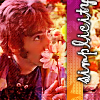
And then I just add a 1-pixel border in black on a new layer.

So there's our finished icon! Woohoo!
Here it is compared to the original one.
ours----->

<-----my original.
Pretty close, eh?
And now for the boring bits. If I lost you along the way, PLEASE ask me about it! I didn't get too detailed here, so if I confused you, I'm sorry. Leave a comment and I'll try to help you.
If you like the icon, feel free to use it, just comment and credit. I don't really care which version you use, so if you happen to like this one better than the original, that's cool too.
And a shameless plug! If you liked that icon, it was part of a liddle icon post I just did over at beatlepics, so check out the post HERE! Okay, sorry about that liddle plug there. Couldn't help meself, y'see!
Anyway. ENJOY!!!!!!!

So, I've tried to duplicate what I did. And I've done pretty well, if I do say so myself. It certainly resembles the original.
We're going from this:

to this:

using PSP8, almost definitely translatable!
Okay, so we start with this pretty picture of John Lennon bein' all cute and stuff.

We crop it to a square and resize it to 100x100 to make a base.

Easy enough, I do believe.
Then we sharpen it. Actually, we sharpen it more. By going to Adjust>Sharpness>Sharpen More.

Next, we take our old friend the soften tool thingie and go over Johnny's cheek a bit to smooth him out. Use a small size, probably around 4 or 5.

Now we're gonna work on the lighting of the icon. This is a thingy I do a lot with icons, and you all probably do, but if you don't, try it out, cuz it's nifty. Duplicate the base layer twice, so you have three layers altogether. Set the middle layer to screen, and the top layer to soft light.

I'm liking the colors of the icon a lot more now.
Now it's time for fun! Yippee! First, we're adding this texture, made by colorfilter:

Paste it on a new layer and set it to Hard Light at 80%.

It's still a little...er...much. But I don't want to lower the opacity of that layer anymore, because I want to keep that little border at the bottom. So instead, I drag the duplicated base layer that we set to soft light up above that one. It's a very subtle difference, but now we've got Johnny standing out a little bit more. From top to bottom, your layers are now: a copy of the base set to soft light, that texture, a copy of the base set to screen, and the base itself. Okay?

The texture is still a little WHOA; it's kind of making Johnny look like the human cheez-it. So I take my eraser and grab a spongy sort of brush - I believe just one that came with PSP - and set it to a very low opacity and erase over John's face a bit.

Now, I've kind of got it in my head that I want vertical text on the right, since John is looking that way and drawing the viewer's eyes over there. I want something else, too, not just text. I start thinking a rectangle in some color, and then I have this idea. I grab a pretty texture - this one is by graphicjunkie.

I crop a skinny little rectangle out of this texture. It's 16 pixels wide and the whole 100 tall. It's the first 16 pixels, if that makes sense. It looked like a good little bit.

I paste this as a new layer on to my icon and move it over where I want it.

Now, it's getting awfully busy, and that little rectangle is getting lost in the background and making my eyeballs go URGH! So I add a drop shadow to that layer to get it to stand out more. I do this sort of thing a lot. When I'm using a shadow to make something stand out like this, I always have the offset at 0, 0. This makes the shadow bit even on all sides of it. In this case, I used an opacity of 100 and a blur of 5.

Better! Now for text. I add "simplicity" in 16 point Gigi - a font I use WAY too much. I ALWAYS ALWAYS add my text as vectors so I can change it 'round later. ALWAYS. So I spin it around so it goes vertically.

I don't want it going all the way from bottom to top. I want it towards the top of the icon, because that's where John's eyes are making the viewer look. Because I used vector text (DO IT!), this is easy to fix. I just grab the little handle and squish it up a little.

Now, that's impossible to see, never mind read. And I kinda wanted to read it, I dunno about you. So I do something I do a lot. I add a drop shadow again - same settings as before except that this time the blur is 3. I always add my shadows on a new layer so I can play with them. I set the text layer to screen to make it stand out more. And then I duplicate. Something I frequently do. Duplicate both the text layer and the shadow layer until you like the look. I end up duplicating the text layer once, and duplicating the shadow layer about 10 times, because I'm insane like that. By the time I'm done with it it's more an outline than a shadow, but, um, that's good too!

And then I just add a 1-pixel border in black on a new layer.

So there's our finished icon! Woohoo!
Here it is compared to the original one.
ours----->


<-----my original.
Pretty close, eh?
And now for the boring bits. If I lost you along the way, PLEASE ask me about it! I didn't get too detailed here, so if I confused you, I'm sorry. Leave a comment and I'll try to help you.
If you like the icon, feel free to use it, just comment and credit. I don't really care which version you use, so if you happen to like this one better than the original, that's cool too.
And a shameless plug! If you liked that icon, it was part of a liddle icon post I just did over at beatlepics, so check out the post HERE! Okay, sorry about that liddle plug there. Couldn't help meself, y'see!
Anyway. ENJOY!!!!!!!