Harry Potter Icon Tutorial
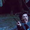
From this: 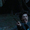
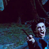
to this: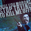
As requested by homeflight.
Program: GIMP 2
Difficulty: Intermediate
1. First off, brighten your base. Duplicate base image twice, then set one duplicate to Screen: Opacity 100, and the other to Screen: Opacity 75.
Now comes a bunch of fussy, time-consuming little fill layers used to slowly tweak the coloring to a blue/green tint with traces of purple shadows. In PSP, the original program I used, it's much faster to achieve a similar coloring with Channel Mixer, but since GIMP doesn't have Channel Mixer, so far as I know, adaptions are needed.
2. Create two new layers, and fill both of them with #7f0948. Set the lower fill layer to Lighten only: Opacity 45 and the upper fill layer to Burn: Opacity 7.

3. Create two new layers, and fill the lower layer with #cdd6f5 and the upper with #b0f4c6. Set both of them to Burn: Opacity 20.

4. Create two new layers, and fill the lower layer with #5dadd7 and the upper with #5dd7b0. Set both to Soft Light: Opacity 30.

5. Create three new layers, and fill the lower layer with #7f0948, and the middle layer with #d7a25d, and the upper with #5dbfd7. Set all three layers to Soft Light: Opacity 38.
6. Create two new layers, and fill the lower layer with #d35dd7 set to Burn: Opacity 18 and the upper with #d7935d set to Soft Light: Opacity 11.
Now for a few contrast adjustments, as well as more color-tweaking fill layers.
7. Click Edit>Copy Visisble and then paste two new layers (Edit>Paste As>New Layer). Set the lower copied layer to Screen: Opacity 20 and the upper copied layer to Soft Light: Opacity 30.
8. Create a new layer, fill with #1d725b, and set it to Burn 13.

9. Copy Visible and paste as a new layer again, then click Colors>Hue-Saturation-Lightness. Set the fields to
Overlap: 0
Hue: 0
Lightness: 0
Saturation: 30.
Leave this layer at Normal: Opacity 100.

10. Create two new layers, fill each with #e0ddb1, and set the lower fill layer to Burn: Opacity 13, and the upper fill layer to Soft Light: Opacity 40.
11. Last fill layer! Fill this one with #96f8cd, and set to Burn: Opacity 10.

12. Using the Text Tool and the color #91a7b3, create three different text layers, adjusting size as necessary, and then use the Rotate Tool to rotate the text's angle as necessary, and finally use the Move Tool to position the text just so. Keep switching back and forth between these tools until you get the desired result.
13. Create a new layer, scribble around with a soft brush with white (#ffffff) and then go to Filters>Blur>Glaussian Blur and set the fields to
Horizontal: 50
Vertical: 50
Set this layer to Normal: Opacity 60.
This, I'm assuming, is what gives the icon the "laminated" look. I use it for practically every icon I make. If I were to make a texture of this layer, it would look like this:

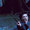
After creating this layer, the icon looks like this:

14. Finally, sharpen at will! Copy Visible, paste as new layer, then select the Blur / Sharpen Tool and set it to Scale: 3 and Rate: 60 and run it over the icon. Then set the layer to Normal: Opacity 25.
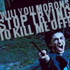
And, you're done!

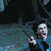
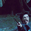
to this:

As requested by homeflight.
Program: GIMP 2
Difficulty: Intermediate
1. First off, brighten your base. Duplicate base image twice, then set one duplicate to Screen: Opacity 100, and the other to Screen: Opacity 75.

Now comes a bunch of fussy, time-consuming little fill layers used to slowly tweak the coloring to a blue/green tint with traces of purple shadows. In PSP, the original program I used, it's much faster to achieve a similar coloring with Channel Mixer, but since GIMP doesn't have Channel Mixer, so far as I know, adaptions are needed.
2. Create two new layers, and fill both of them with #7f0948. Set the lower fill layer to Lighten only: Opacity 45 and the upper fill layer to Burn: Opacity 7.

3. Create two new layers, and fill the lower layer with #cdd6f5 and the upper with #b0f4c6. Set both of them to Burn: Opacity 20.

4. Create two new layers, and fill the lower layer with #5dadd7 and the upper with #5dd7b0. Set both to Soft Light: Opacity 30.

5. Create three new layers, and fill the lower layer with #7f0948, and the middle layer with #d7a25d, and the upper with #5dbfd7. Set all three layers to Soft Light: Opacity 38.

6. Create two new layers, and fill the lower layer with #d35dd7 set to Burn: Opacity 18 and the upper with #d7935d set to Soft Light: Opacity 11.

Now for a few contrast adjustments, as well as more color-tweaking fill layers.
7. Click Edit>Copy Visisble and then paste two new layers (Edit>Paste As>New Layer). Set the lower copied layer to Screen: Opacity 20 and the upper copied layer to Soft Light: Opacity 30.

8. Create a new layer, fill with #1d725b, and set it to Burn 13.

9. Copy Visible and paste as a new layer again, then click Colors>Hue-Saturation-Lightness. Set the fields to
Overlap: 0
Hue: 0
Lightness: 0
Saturation: 30.
Leave this layer at Normal: Opacity 100.

10. Create two new layers, fill each with #e0ddb1, and set the lower fill layer to Burn: Opacity 13, and the upper fill layer to Soft Light: Opacity 40.

11. Last fill layer! Fill this one with #96f8cd, and set to Burn: Opacity 10.

12. Using the Text Tool and the color #91a7b3, create three different text layers, adjusting size as necessary, and then use the Rotate Tool to rotate the text's angle as necessary, and finally use the Move Tool to position the text just so. Keep switching back and forth between these tools until you get the desired result.

13. Create a new layer, scribble around with a soft brush with white (#ffffff) and then go to Filters>Blur>Glaussian Blur and set the fields to
Horizontal: 50
Vertical: 50
Set this layer to Normal: Opacity 60.
This, I'm assuming, is what gives the icon the "laminated" look. I use it for practically every icon I make. If I were to make a texture of this layer, it would look like this:

After creating this layer, the icon looks like this:

14. Finally, sharpen at will! Copy Visible, paste as new layer, then select the Blur / Sharpen Tool and set it to Scale: 3 and Rate: 60 and run it over the icon. Then set the layer to Normal: Opacity 25.
And, you're done!