Blue-ish/Red-ish Tutorial (Gimp and PS)
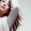
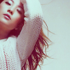
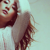
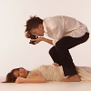
Going from this 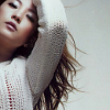
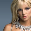
to this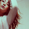
Others:
Program: Gimp
Translatable: Yes!
Steps: 11
Difficulty: Easy
This tutorial is best used for icons with light or blue-ish backgrounds. This tutorial adds reddish hues to icons featuring redheads and brunetts. And with blondes, it makes more of a dark gold look. Of course it all depnds on the opacities you use. : )
1. Get your base and resize it to 100x100. I sharpened mine with the Sharpen Tool at 45%.
2. Instead of using a plain screen layer, we will create a new layer and fill it with #bbb7b7 and set it to Soft Light 100%. Usually I'd use screen layers, but with this type of icon it added too much white, whereas the grey color added lightness, but kept the color of her hair and her skin tone.

>>>>>
3. Before I start with the coloring, I added a created a new layer using: Layer > New From Visible. Then, on this new layer, I wanted to add the color that was lost by doing Step 2. So, I went to Colors>Hue/Saturation and set the Saturation to 30. Now for your icon, the saturation number will depend on the type of icon you have and how highlighted you want your colors to be. You don't want them to be too dark, but enough to see the hints of color that were lost from doing the Step 2 layer. Again, it is up to you. : )
>>>>>>
4. This next section, we are actually adding an Exclusion layer; however I am using Gimp, so there is a work-around to making an exclusion layer. First, we are going to make three fill layers with the color: #820b1f.

5. The trick is to set two layers to Screen and the last one to Subtract. So the one at top will be the Subtract layer, while the bottom two are Screen layers. Howerver, when all of them are set to 100% opacity, the icon will be too blue. So I changed the opacity of the three layers. Like before, you will have to adjust the opacities until you get the right coloring you want for your icon. You can make it really blue or really red depending on your preference. : )
Subtract Layer (top Layer) at 40.2%
>>>
Screen Layer (middle layer) at 50%
>>>
Screen Layer (bottom layer) at 60%
>>>
6. Ok, now create another layer, again using: Layer >> New from Visible.
7. On this new visible layer, we will be creating a Color Balance layer to lighten the image up and add a little bit of yellow.
Shadows: 11, 5, 10
Midtones: 4, -6, -11
Highlights: 7, 7, -1
>>>
8. Next, duplicate your base and bring it to the top. Set this layer to Multiply at 30.8. Multiply will darken the image, so adjust the opacity to however dark or light you want it to be.
>>>
9. Create a new visible layer. Layer >> New from Visible.
10. Now I want to add some more pink/red into the icon to highlight her face and hair. So I created a new layer, and filled it with the color #f7d9dd and set it to Burn 55%.

>>>
11. You can flatten the image, sharpen, and be done. Or if you want to adjust the coloring or add textures/text, go for it!
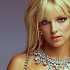
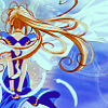
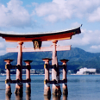
Other Examples
to
to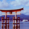
to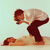

to
PS: I would love to see how your icon turns out!
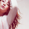
to this
Others:
Program: Gimp
Translatable: Yes!
Steps: 11
Difficulty: Easy
This tutorial is best used for icons with light or blue-ish backgrounds. This tutorial adds reddish hues to icons featuring redheads and brunetts. And with blondes, it makes more of a dark gold look. Of course it all depnds on the opacities you use. : )
1. Get your base and resize it to 100x100. I sharpened mine with the Sharpen Tool at 45%.
2. Instead of using a plain screen layer, we will create a new layer and fill it with #bbb7b7 and set it to Soft Light 100%. Usually I'd use screen layers, but with this type of icon it added too much white, whereas the grey color added lightness, but kept the color of her hair and her skin tone.
>>>>>
3. Before I start with the coloring, I added a created a new layer using: Layer > New From Visible. Then, on this new layer, I wanted to add the color that was lost by doing Step 2. So, I went to Colors>Hue/Saturation and set the Saturation to 30. Now for your icon, the saturation number will depend on the type of icon you have and how highlighted you want your colors to be. You don't want them to be too dark, but enough to see the hints of color that were lost from doing the Step 2 layer. Again, it is up to you. : )
>>>>>>
4. This next section, we are actually adding an Exclusion layer; however I am using Gimp, so there is a work-around to making an exclusion layer. First, we are going to make three fill layers with the color: #820b1f.
5. The trick is to set two layers to Screen and the last one to Subtract. So the one at top will be the Subtract layer, while the bottom two are Screen layers. Howerver, when all of them are set to 100% opacity, the icon will be too blue. So I changed the opacity of the three layers. Like before, you will have to adjust the opacities until you get the right coloring you want for your icon. You can make it really blue or really red depending on your preference. : )
Subtract Layer (top Layer) at 40.2%
>>>
Screen Layer (middle layer) at 50%
>>>
Screen Layer (bottom layer) at 60%
>>>
6. Ok, now create another layer, again using: Layer >> New from Visible.
7. On this new visible layer, we will be creating a Color Balance layer to lighten the image up and add a little bit of yellow.
Shadows: 11, 5, 10
Midtones: 4, -6, -11
Highlights: 7, 7, -1
>>>
8. Next, duplicate your base and bring it to the top. Set this layer to Multiply at 30.8. Multiply will darken the image, so adjust the opacity to however dark or light you want it to be.
>>>
9. Create a new visible layer. Layer >> New from Visible.
10. Now I want to add some more pink/red into the icon to highlight her face and hair. So I created a new layer, and filled it with the color #f7d9dd and set it to Burn 55%.
>>>
11. You can flatten the image, sharpen, and be done. Or if you want to adjust the coloring or add textures/text, go for it!
Other Examples
to
to
to
to
PS: I would love to see how your icon turns out!