Icon Tutorial #17 → Kaanivaru

Credits: xloliconsx
Made in: Adobe Photoshop CS4
Creator: kaanivaru
READ ME!
► Thank you for looking~!
► Credit isn't necessary, but it would be nice. :D
► I would love to see your results!
► Do not HOTLINK.
► Do not redistribute/steal.
► Enjoy!
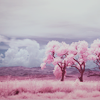
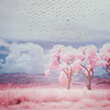
Ø1. Layer → New Adjustment Layer → Curves
INPUT 189
OUTPUT: 137
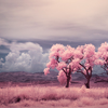
『note: it's a little dark, don't you think? lightening it up before you start working on a photo is easier to work with.』
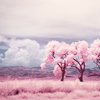
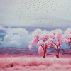
Ø2. Layer → New Adjustment Layer → Chanel Mixer
RED:
red: 100
green: -15
blue: 0
GREEN:
red: 0
green: 100
blue: -5
『note: the image was too pink. by adding this blue tint, it calms the pinkness down and you can work with the color of the trees because the sky in the back has achieved its blueness. you don't want to abuse the blueness though. so be careful...』
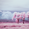
Ø3. Layer → New Adjustment Layer → Color Balance
MIDTONES:
15 | -10 | -5
SHADOWS:
5 | 4 | -5
HIGHLIGHTS:
10 | 5 | 5
『note: here, i'm trying to get the colors of the trees to come out more. get that awesome pinkness only from the tree/grass. not the sky.』
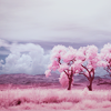
Ø4. Layer → New Adjustment Layer → Solid Color
Mode: Exclusion Opacity: 30%
Color: #332f47
『note: i wanted the image to look "vintage" by adding a little tint of sepia tone-like color. lol.』
Ø5. Layer → New Adjustment Layer → Hue/Saturation
Master:
saturation: +15
『note: making the colors more bright! i love colors...』
Ø6. Layer → New Adjustment Layer → Selective Coloring
REDS:
cyan: -100
magenta: 0
yellow: 45
black: 0
NEUTRALS:
cyan: 25
magenta: 0
yellow: 0
black: 0

『note: i was thinking of only bringing out the main colors of this photo. i wanted the blue sky to be more blue. i wanted the trees to be more new and fresh looking. remember to make any adjustments if needed.』
Ø7. Add Texture:
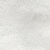
Set to: DARKEN
Opacity: 100%
Fill: 100%
Made by: poxomix
『note: adding a grunge texture would make it look more vintage, right?』
Ø8. Add Texture:
Set to: SCREEN
Opacity: 60%
Fill: 100%
Made by: --- (i forgot who made this. forgive me. if anyone knows, pls do tell me.)
『note: i have enlarged this texture to make it a little bigger and moved it down a little. with this light texture, it should draw your attention to the trees instead.』
Ø9. Add Texture:
Set to: SCREEN
Opacity: 100%
Fill: 100%
Made by: mizubunshin (i believe that was their username...)
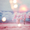
『note: light textures are almost as risky as text. you don't want to overdo it. you can't just slap on any light texture that you think looks pretty. it needs to fit in with the image. i figured since i wanted the icon to look vintage, a light that looks like it's burning through would look cool.』
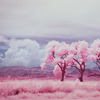
1Ø.
『note: and you're finished. plz make sure to do some additional adjustments to make this coloring or style fit your icon image. ^^』
+1 can be found @ xloliconsx~