(no subject)
>>

Steps:9-10
Translatable: Yes
Difficulty: Easy/Medium
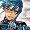
Step 1~ Take your base and duplicate it once. Flip that duplicate horizontally (edit>>transform>>flip horizontally) and place it so that only the top is showing on the bottom of your icon. You may have to crop the top and move your main base a little.
Step 2~ Add a new fill colour (Layer>>new fill layer>>solid colour...) . #89d7f6 set to colour burn/burn 100%. This will darken the image and add some blues to prep it up for the next colour fills.
Step 3~ Add a new fill colour. #f385b6 set to softlight 100%. This'll give the icon a more cooler tone of blue.
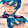
Step 4~ Add a new fill colour. #fdc793 set to multiply. This is mostly focousing on toning the skin.
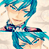
Step 5~ Add a new fill colour. #fff9cb set to softlight. This will give the icon less shadows to look at, and give it a nice colour.
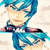
Step 6~ Open up a curves layer (layer>>new adjustment layer>>curves...) . Input the following settings
RGB: (first point) input: 75, output: 50
(second point) input: 201, output: 182
This'll give the icon some contrast to get rid of the little dullness it has.
Step 7~ Add a white 6 px thick line, or however thick you want it to be, in the middle of where the two images meet. This line will be for the text later on, and noticably seperates the two images better.
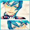
Step 8~ Make a new layer and make a merged copy (press shift+ctrl+alt+E on your keyboard) and add a 3 px white border(edit>stroke) I selected a colour from his hair using the eyedropper tool, and used that to make a 1 px border.

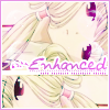
Step 9~ Add any text you want using the same sampled colour of your choice. I typed "Enhanced" in Avant que and added a white 2 px stroke (right click on text layer on layers palette and select blending options)
Add any brushes you want if you'd like. The briush beside the text also had a 2 px white stroke.
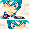
Step 10~ This is optional but I decided to add a light texture by sixtysixheavens to brighten things up a bit. I pasted the texture on the icon and set it to screen 80%. I duplicated that texture and flipped it horizontally so that the lightn't only be on the right side.
And you're done ! I appreciate comments, results, and/or feedbacks =)
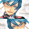
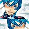
Another result with a bit tweaking to the colouring of the text and texture:
>>
Please direct and comments at the original post @ jdsanctuary =)