(no subject)
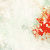
Learn to go from:
to
Program: Photoshop CS5
Difficulty: Easy to medium
Translatable: To older PS definitely & probably to Gimp + PSP
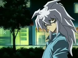
First, I started with this cap of Bakura from Kokoro no Naka.
I cropped it down & slid it to the left, since I wanted a hunk a empty space. I then sharpened my base using Unsharp Mask, because that tends to look better & less choppy. I filled in some of that space with a light blue, blurred slightly. It looks weird now, but I'm going to cover that space in textures, so it'll provide some subtle color differences later.

Next, some color layers! A layer of #f6989d and one of #fff899, both with the blend mode set at Soft Light. Finally, one of #7da7d9, with the blend mode set to Color Burn. These tend to look good with screen caps from anime & fan art, but I mess around with them slightly for each icon until I find what I want.

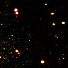
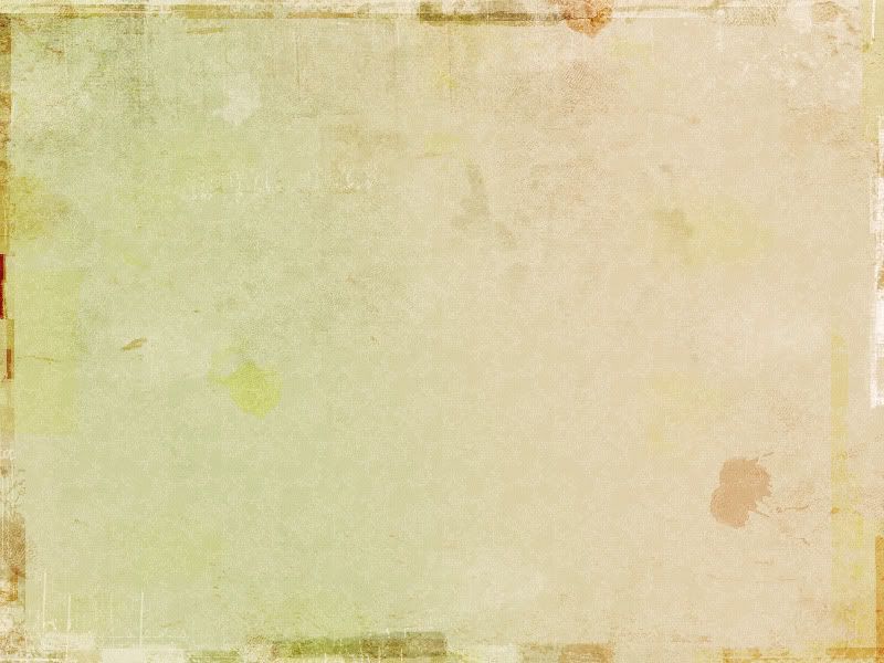
Now for all the texture work! WHEE. Lots of fun happens here~ First, This texture by sanami276 on dA, moved around and set to screen. I try not to have TOO many white grungy bits; just enough for them to show up without taking over the whole thing.

Then, another texture by sanami276, set to Soft Light. I also partially erased a bit of the left side of it to show Bakura's face better & not have the random Chinese characters in the way. This gives the icon some color variation.
→
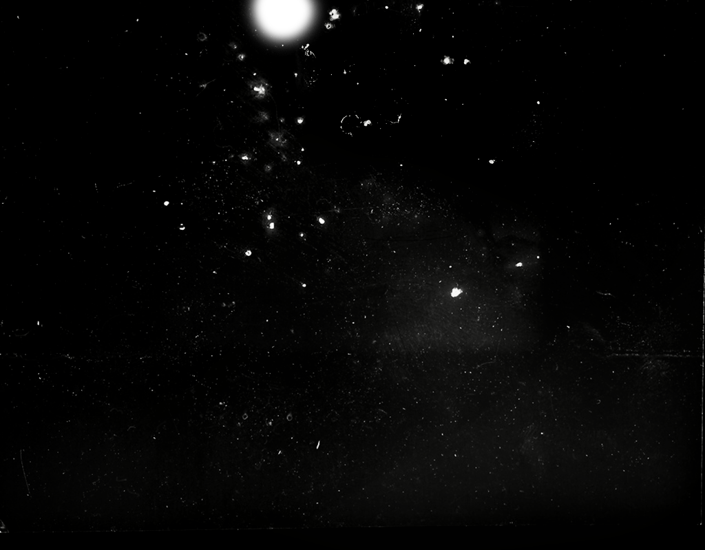
Next, the first in a large amount of light textures. I unfortunately have lost where this one originally came from, though. It's set to Screen at 70% opacity. I use tons of light textures because I like shiny things. Really XD
→
More light textures! This is one of my favorites by ianthinae. I rotated it and moved it, then set it to Screen. Again...shiny things. I only wanted a little bit of it though, because too much would take over too much of the icon.

→
Next comes another one of my favorite light textures, which is from sanami276 (again. lovely resources there, really). It's rotated & set to Screen at 80% opacity. I'm starting to build up the textures on the far right hunk of empty space.
→
Another from ianthinae. Again, rotated & I erased a bunch of the middle of it. I do that for a lot of textures, especially the light ones. Never be afraid to modify textures!! I sometimes change the colors in mind or twist them around with the Free Transform tool.

→
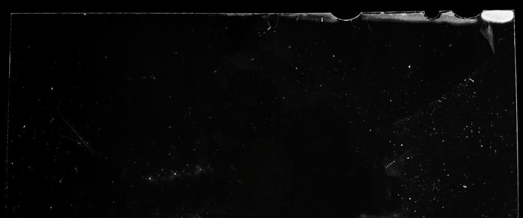
Now for more scratchy textures & another one where I lost source. Oops. I took this texture, inverted it, moved it around a bit, and set it to Multiply. Inverting grungy textures can give some different spiffy effects.

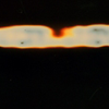
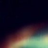
Almost done, actually :O Next up is a texture from blooming_art, set to Multiply. This darkens the icon up some & gives that big red splotchy bit in my empty space.
→
Another light texture by sanami276, rotated & moved so there's just a bit of it on the far right & set to Screen. It's hard to see it, but it gives a subtle bit of blue green light to the right.
→
And finally, this texture by urbanstrokes, moved around and set to Multiply. I absolutely love this texture and it's how I darken most of my icons without just using plain colors.
That's all! If you have any questions, feel free to ask! I'll answer to the best of my ability :D Also, if you want to know how I made any of my other icons, ask away!! I'm definitely up for writing more of these~
to
Program: Photoshop CS5
Difficulty: Easy to medium
Translatable: To older PS definitely & probably to Gimp + PSP
First, I started with this cap of Bakura from Kokoro no Naka.
I cropped it down & slid it to the left, since I wanted a hunk a empty space. I then sharpened my base using Unsharp Mask, because that tends to look better & less choppy. I filled in some of that space with a light blue, blurred slightly. It looks weird now, but I'm going to cover that space in textures, so it'll provide some subtle color differences later.
Next, some color layers! A layer of #f6989d and one of #fff899, both with the blend mode set at Soft Light. Finally, one of #7da7d9, with the blend mode set to Color Burn. These tend to look good with screen caps from anime & fan art, but I mess around with them slightly for each icon until I find what I want.
Now for all the texture work! WHEE. Lots of fun happens here~ First, This texture by sanami276 on dA, moved around and set to screen. I try not to have TOO many white grungy bits; just enough for them to show up without taking over the whole thing.
Then, another texture by sanami276, set to Soft Light. I also partially erased a bit of the left side of it to show Bakura's face better & not have the random Chinese characters in the way. This gives the icon some color variation.
→
Next, the first in a large amount of light textures. I unfortunately have lost where this one originally came from, though. It's set to Screen at 70% opacity. I use tons of light textures because I like shiny things. Really XD
→
More light textures! This is one of my favorites by ianthinae. I rotated it and moved it, then set it to Screen. Again...shiny things. I only wanted a little bit of it though, because too much would take over too much of the icon.
→
Next comes another one of my favorite light textures, which is from sanami276 (again. lovely resources there, really). It's rotated & set to Screen at 80% opacity. I'm starting to build up the textures on the far right hunk of empty space.
→
Another from ianthinae. Again, rotated & I erased a bunch of the middle of it. I do that for a lot of textures, especially the light ones. Never be afraid to modify textures!! I sometimes change the colors in mind or twist them around with the Free Transform tool.
→
Now for more scratchy textures & another one where I lost source. Oops. I took this texture, inverted it, moved it around a bit, and set it to Multiply. Inverting grungy textures can give some different spiffy effects.
Almost done, actually :O Next up is a texture from blooming_art, set to Multiply. This darkens the icon up some & gives that big red splotchy bit in my empty space.
→
Another light texture by sanami276, rotated & moved so there's just a bit of it on the far right & set to Screen. It's hard to see it, but it gives a subtle bit of blue green light to the right.
→
And finally, this texture by urbanstrokes, moved around and set to Multiply. I absolutely love this texture and it's how I darken most of my icons without just using plain colors.
That's all! If you have any questions, feel free to ask! I'll answer to the best of my ability :D Also, if you want to know how I made any of my other icons, ask away!! I'm definitely up for writing more of these~