SPN CS3 tutorial using gradient maps
This was created in CS3 and uses gradient maps. Difficulty from 1-10: probably a 4-5?
See this tutorial posted in its original entry for more comments or to request a tutorial.
Please do not ask for a .psd. If I can take the time to write out all the steps in detail, you can take the time to read them over and try them.
Go from
to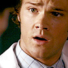
Alrighty. I tried to find the original cap I made this out of, I know it's somewhere in my files, but I'll be damned if I can find out which episode it came from right now. Cap was found, thanks to bubl and is here.
01) Resized and arranged the cap in my 100x100 image. As you can see there's a nice contrast of light and dark in the original base.

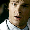
02) Like always I duplicated my base. This time the first duplicate was set to multiply and the second to screen, which was then sharpened. Reduce the sharpen as needed.

-->
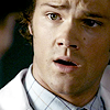
03) I added this gradient as a gradient map (see this post in which I extensively went over gradient maps. Feel free to ask questions for clarification on anything) set to soft light. I chose that particular gradient because it lightened the icon over all to a point that wasn't blotchy and also changed the tint from kinda green/yellow to more pink/skin toned.

-->
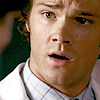
04) Then I added this rose/beige gradient, again as a gradient map, set to soft light. It gave Sam's skin more saturation and brought it out of the pastel-y kind of colour it had.

-->
05) I added a Hue/Saturation layer next. I only touched the saturation and bumped it up a bit, so little that on some monitors it might not even look like anything happened. I do this as an alternate to selective colouring which I have drastically cut out of my icon making for various reasons. Instead of playing with the red level in selective colour I just enhanced the colour that was already in the icon overall.

06) Finally I added a Brightness/Contrast layer. I didn't touch the brightness but I added a bit of contrast to make the dark side of Jared/Sam's face a little darker. It also made the cleft in his chin just a bit more defined. ;) But, like the saturation, the difference might be too little for many people to notice. I definitely do but it's a preference as to how vibrant you want your colours to be or how much contrast you like.

And that's that, short and sweet!
See this tutorial posted in its original entry for more comments or to request a tutorial.
Please do not ask for a .psd. If I can take the time to write out all the steps in detail, you can take the time to read them over and try them.
Go from

to

Alrighty. I tried to find the original cap I made this out of, I know it's somewhere in my files, but I'll be damned if I can find out which episode it came from right now. Cap was found, thanks to bubl and is here.
01) Resized and arranged the cap in my 100x100 image. As you can see there's a nice contrast of light and dark in the original base.

02) Like always I duplicated my base. This time the first duplicate was set to multiply and the second to screen, which was then sharpened. Reduce the sharpen as needed.

-->

03) I added this gradient as a gradient map (see this post in which I extensively went over gradient maps. Feel free to ask questions for clarification on anything) set to soft light. I chose that particular gradient because it lightened the icon over all to a point that wasn't blotchy and also changed the tint from kinda green/yellow to more pink/skin toned.

-->

04) Then I added this rose/beige gradient, again as a gradient map, set to soft light. It gave Sam's skin more saturation and brought it out of the pastel-y kind of colour it had.

-->

05) I added a Hue/Saturation layer next. I only touched the saturation and bumped it up a bit, so little that on some monitors it might not even look like anything happened. I do this as an alternate to selective colouring which I have drastically cut out of my icon making for various reasons. Instead of playing with the red level in selective colour I just enhanced the colour that was already in the icon overall.

06) Finally I added a Brightness/Contrast layer. I didn't touch the brightness but I added a bit of contrast to make the dark side of Jared/Sam's face a little darker. It also made the cleft in his chin just a bit more defined. ;) But, like the saturation, the difference might be too little for many people to notice. I definitely do but it's a preference as to how vibrant you want your colours to be or how much contrast you like.

And that's that, short and sweet!