Font Tutorial

I am seeing this font all over LJ, which is awesome b/c it's a good font, but it appears that no one has bothered to READ ABOUT IT.
So I'm here to tell you how to use it correctly, so your words look complete.
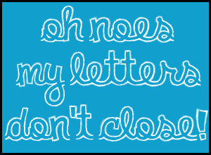
INCORRECT
CORRECT
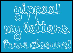
see the difference? It's amazingly simple to do, there are 2 rules:
- Always start a word with a CAPITAL letter
- End a word with ^ (SHIFT + 6)
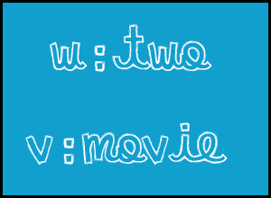
W gets a ^ before:
if the word has a W in the middle, a ^ is needed before the W.
V gets a ^ before and a capital after: if the word has a V in the middle, a ^ is needed before the V and the following letter will need to be capitalized.
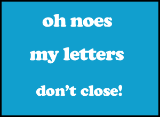
So this is what you would actually type:
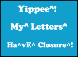
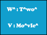
Want more examples? Any questions? Just ask!