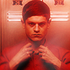
Breaking the ice!

Here's my first icon disaster of the year. And I'm positive it's only the first one of a long row, because one of my 2012 icon resolution is to make an icon per day, no matter how crappy it turns out to be.
So, what was I aiming for? I don't know. I've seen this cap being iconned so many times that I just wanted to make something different. Yep, I succeeded, I think. It does look different. But it's not pretty at all, is it? :D
What went wrong? Well, I'd say almost everything. The coloring is blinding and boring at the same time, the crop is nothing special and the contrast is messed up. And I even tried to fix it with textures, to add some other colours and some interesting lighting, but I failed.
The sharpening is nice, though, and I think the combo of Gaussian Blur + Paint Daubs was a good choice here, to soften the graininess of the cap while keeping the edges crisp.
Damn cap, don't you think you defeated me for good! I'll keep trying. Later.