TUTORIAL 04-- "always be there"
okee dokeee... sinistrata asked me to make a tutorial for this icon...
...and so i'm doing one ^_^ just so you know, i work with PS7, but i'm sure this can be easily translated to other programs. you should probably have some knowledge of how these things work, though, because terms like "cropping", changing layer blending modes and stuff like that will pop up, and i won't get too deep into them.
please, PLEASE, don't make exact copies of this icon. just get the techniques and adjust them to your own style. the idea is that you learn what i'm THINKING when i make my icons so you can learn to reason with yours.
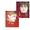
so i started out with this image of the trio, which i'm sure everyone has seen by now. i cropped harry and hermione's faces, pasted them in a new 100x100 canvas, with a white background. i positioned them as i wanted, added a white background, and then merged the layers. then i sharpened, and ran the auto-contrast and auto-color tools until i liked the results. this became my base, or "background" layer.
after that, i duplicated that layer (the second one became "duplicate 1") and started playing with the saturation (going to image>adjustments>hue/saturation). if i'm not mistaken, i lowered the saturation by about 50-60%. left the layer in the "normal" blending mode. it's important to work on a duplicate layer, because if you mess up with the desaturation you can always just delete that layer and you still have your background intact.
anyway. after that, i decided to play a little with the coloring. i wanted to try a lighten effect... red/orange/yellow-ish gradients always work nicely with desaturated images. so i grabbed this gradient...

...which i'm pretty sure is by crumblingwalls (i might be wrong, though #_#)... set it on top of everything (layer's name is "gradient") and changed the blending mode to lighten at 80% opacity. this is what i got:
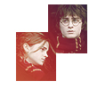
that's what the lighten blending mode does-- it gives color to the dark parts, and the light parts, like their faces and the white background, are pretty much left alone. it makes for some pretty neat effects.
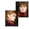
but i still felt it was a little dark, so i went down to the "duplicate 1" layer and duplicated that (thus was born "duplicate 2"), setting that layer to screen at 50% opacity. and here's the result:
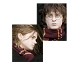
but as the images get lighter, some of the pretty color dissappears ;_; and we don't want that, so we want to bring back the dark parts without darkening the light parts, right? that's what a soft light layer does. so i went down to the "background" layer and duplicated it again (this became "duplicate 3"), and then by going to image>adjustments>desaturate i... desaturated it completely (du-uh!)

i dragged that layer up between "duplicate 2" and "gradient", and set it to soft light.

see how their hair got darker but their faces remained light? that's what i was looking for.
ok, now it's time to add textures because it's looking pretty empty. now, this icon is somewhat old and so i don't really remember where i got these textures from #_# i'm sure they're all credited in my resources post, but if you've seen the size of that thing, you'll know that it's pretty much suicide going through it for a single texture. so if these textures are yours, please tell me so i can credit you properly!
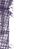
anyway, as i was saying. i took this grid-like texture and put it on a new layer on top of everything ("texture 1") with a purple color (#3F2E50 or something along those lines). originally the texture covered the whole of the icon, but i just wanted it to be to one side so it wouldn't take our attention away from the w00blets. so i grabbed a round brush, any round brush that comes with PS, and deleted some of it until it came to look the way it does on the icon. took me a while, cuz i suck at anything that has to be done manually #_# i also made sure it didn't cover hermione's face.
, and on the icon:
now, that separation between hermione's face and the texture looks... sudden ~_~ not to mention you really can't see where hermione's rectangle ends and harry's begins. so i used the rectangular selection tool thingie to select around hermione's rectangle, and in a new layer on top of everything ("border") i went to edit>stroke, and added a border (2px, if i remember well). ended up with this:
but with a transparent background, of course. the black is only there so you can see it ^.^ and on the icon, it looks like this:
then on another layer ("texture 2"), i added another random grid texture in a reddish color. i used the rectangular selection to erase all the parts that covered the first texture. i also used another default brush and erased some parts of it to the right, and over their faces. i didn't want the icon to look all covered up in textures, i like to see some white spaces.
here's the texture:
and how it looks on the icon: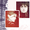
next, i used the polygonal lasso tool with a 1 or 2px feathering, and drew an "x" on a new layer (unoriginally named "x", lol). i filled the selection with a color i picked from the gradient, #C83436.

didn't like it much. so i set that layer to multiply...
...which looks much better. then in new layers i added text, and a pretty flower brush by crumblingwalls, all in the same purple color as the first texture.

and then, because as i said, i don't want the icon to look over-textured, i decided to add a light stock image ("light"... i know, i'm the queen of the obvious...). these light texture thingies are really fun to play with, they can give life to an icon so easily. i used this one, by colorfilter:

when using light textures, i usually prefer to set them in a lighten or screen blending mode. it's not a rule, though, sometimes i go with hard light or even difference. this time, though, all of the latter would mess up my coloring, because i have a white background, and i didn't want that, so i went with the classic "screen" blending mode.
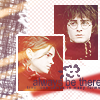
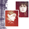
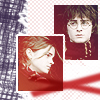
and TA-DAH! here you have it, the final product:
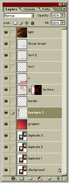
it was pretty easy, wasn't it? ^.^ here you have the layers palette, in case you got lost somewhere down the line...
and happy iconing!
note-- if you'd like me to make a tutorial about a specific icon of mine, or if you have any suggestions you'd like to give me, please come by this post and drop me a line. i'd be more than happy to help, when i have the time.
...and so i'm doing one ^_^ just so you know, i work with PS7, but i'm sure this can be easily translated to other programs. you should probably have some knowledge of how these things work, though, because terms like "cropping", changing layer blending modes and stuff like that will pop up, and i won't get too deep into them.
please, PLEASE, don't make exact copies of this icon. just get the techniques and adjust them to your own style. the idea is that you learn what i'm THINKING when i make my icons so you can learn to reason with yours.
so i started out with this image of the trio, which i'm sure everyone has seen by now. i cropped harry and hermione's faces, pasted them in a new 100x100 canvas, with a white background. i positioned them as i wanted, added a white background, and then merged the layers. then i sharpened, and ran the auto-contrast and auto-color tools until i liked the results. this became my base, or "background" layer.
after that, i duplicated that layer (the second one became "duplicate 1") and started playing with the saturation (going to image>adjustments>hue/saturation). if i'm not mistaken, i lowered the saturation by about 50-60%. left the layer in the "normal" blending mode. it's important to work on a duplicate layer, because if you mess up with the desaturation you can always just delete that layer and you still have your background intact.
anyway. after that, i decided to play a little with the coloring. i wanted to try a lighten effect... red/orange/yellow-ish gradients always work nicely with desaturated images. so i grabbed this gradient...
...which i'm pretty sure is by crumblingwalls (i might be wrong, though #_#)... set it on top of everything (layer's name is "gradient") and changed the blending mode to lighten at 80% opacity. this is what i got:
that's what the lighten blending mode does-- it gives color to the dark parts, and the light parts, like their faces and the white background, are pretty much left alone. it makes for some pretty neat effects.
but i still felt it was a little dark, so i went down to the "duplicate 1" layer and duplicated that (thus was born "duplicate 2"), setting that layer to screen at 50% opacity. and here's the result:
but as the images get lighter, some of the pretty color dissappears ;_; and we don't want that, so we want to bring back the dark parts without darkening the light parts, right? that's what a soft light layer does. so i went down to the "background" layer and duplicated it again (this became "duplicate 3"), and then by going to image>adjustments>desaturate i... desaturated it completely (du-uh!)
i dragged that layer up between "duplicate 2" and "gradient", and set it to soft light.
see how their hair got darker but their faces remained light? that's what i was looking for.
ok, now it's time to add textures because it's looking pretty empty. now, this icon is somewhat old and so i don't really remember where i got these textures from #_# i'm sure they're all credited in my resources post, but if you've seen the size of that thing, you'll know that it's pretty much suicide going through it for a single texture. so if these textures are yours, please tell me so i can credit you properly!
anyway, as i was saying. i took this grid-like texture and put it on a new layer on top of everything ("texture 1") with a purple color (#3F2E50 or something along those lines). originally the texture covered the whole of the icon, but i just wanted it to be to one side so it wouldn't take our attention away from the w00blets. so i grabbed a round brush, any round brush that comes with PS, and deleted some of it until it came to look the way it does on the icon. took me a while, cuz i suck at anything that has to be done manually #_# i also made sure it didn't cover hermione's face.
, and on the icon:
now, that separation between hermione's face and the texture looks... sudden ~_~ not to mention you really can't see where hermione's rectangle ends and harry's begins. so i used the rectangular selection tool thingie to select around hermione's rectangle, and in a new layer on top of everything ("border") i went to edit>stroke, and added a border (2px, if i remember well). ended up with this:
but with a transparent background, of course. the black is only there so you can see it ^.^ and on the icon, it looks like this:
then on another layer ("texture 2"), i added another random grid texture in a reddish color. i used the rectangular selection to erase all the parts that covered the first texture. i also used another default brush and erased some parts of it to the right, and over their faces. i didn't want the icon to look all covered up in textures, i like to see some white spaces.
here's the texture:
and how it looks on the icon:
next, i used the polygonal lasso tool with a 1 or 2px feathering, and drew an "x" on a new layer (unoriginally named "x", lol). i filled the selection with a color i picked from the gradient, #C83436.
didn't like it much. so i set that layer to multiply...
...which looks much better. then in new layers i added text, and a pretty flower brush by crumblingwalls, all in the same purple color as the first texture.
and then, because as i said, i don't want the icon to look over-textured, i decided to add a light stock image ("light"... i know, i'm the queen of the obvious...). these light texture thingies are really fun to play with, they can give life to an icon so easily. i used this one, by colorfilter:
when using light textures, i usually prefer to set them in a lighten or screen blending mode. it's not a rule, though, sometimes i go with hard light or even difference. this time, though, all of the latter would mess up my coloring, because i have a white background, and i didn't want that, so i went with the classic "screen" blending mode.
and TA-DAH! here you have it, the final product:
it was pretty easy, wasn't it? ^.^ here you have the layers palette, in case you got lost somewhere down the line...
and happy iconing!
note-- if you'd like me to make a tutorial about a specific icon of mine, or if you have any suggestions you'd like to give me, please come by this post and drop me a line. i'd be more than happy to help, when i have the time.