Welcome to the next big-ass project. I swear, I'm not a masochist. Really.
Please forgive me in advance for the extreme length of this entry, but as this is, among other things, the initial offering in (yet another) big project, it's somewhat necessary. Since I've finally finished up the "Totally Plastered" project, welcome to the project that's replacing it: The Great EAxis Wooden Furniture What Matches Project. :) (And no, that "What" is not a typo. Ask any redneck. ;) )
My mission: To beat into submission a wide selection of EAxis's wood furniture, so that each piece is available in a uniform and realistic color palette with compatible grain patterning. Sounds simple...BUT IT ISN'T!
The end result: In theory, every piece of furniture that I recolor will be mix-and-matchable at least in terms of color and grain pattern. (Style is a whole 'nother story, of course. ;) )
Mind you, I have NO intention of recoloring every single piece of EAxis's furniture...but I do intend to recolor a LOT of it, cherry-picking my way in no particular order through the base game and all EPs/SPs.
For furniture, I've selected 11 of the not-"weathered" colors from my wood palette to use, mostly because those are the ones that have a real-world wood stain color equivalent and so make realistic sense for furniture. Plus, I've added a "white," which is really a very light true gray that generally looks a bit distressed and that I call "Cottage White." (For those keeping score, its hex code is EAEAEA. *snicker*) It's meant to replace all three of the grays that I left out of this selection of colors, in that it will still go rather nicely with the gray wood floors and other Build Mode stuff I've made and am still working on uploading. Plus, "white" is just generally useful to have when all else fails. So, that's a total of 12 colors to spread across a very big board.
In addition to changing colors, in pretty much all cases I'm editing the original grain patterns of the pieces, if not completely re-graining them. EAxis has a tendency to use textures that are rather obviously drawn from photographs of finished wood. That can look really nice on any given piece, but it tends to make one's life difficult when trying to use the same pattern on pieces of many different shapes and sizes...which I suspect is probably why a lot of EAxis's wood furniture doesn't match. I, on the other hand, tend to create grain patterns from scratch, and they are usually very simple. Simple is better because, ultimately, the simpler a grain pattern is, the more things you can slap it on without a lot of blood, sweat, and tears going into making it look right. So, my furniture textures might not be as photo-realistic as some of EAxis's...but they are more universal, so I can (relatively) painlessly make furniture that mixes and matches. However, if true photo-realism is your thing...look elsewhere. :)
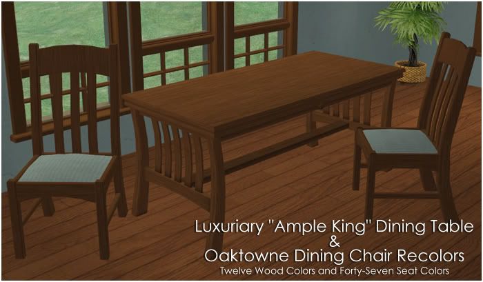
So, all that "boilerplate" said... I started with dining sets because those are the pieces whose not-matchiness ticks me off the most. First up, I offer the base-game Luxuriary "Ample King" Dining Table. It's one of my favorites, but it's a case of "Love the table, hate all but one of EAxis's textures." Its mate is the Oaktowne Dining Chair...although you'd never know it by looking at EAxis's textures. *rolls eyes* So:
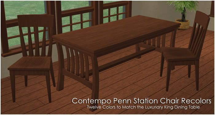
Oh, and there are also recolors of the Penn Station chair available from this entry, like so:
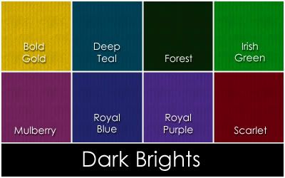
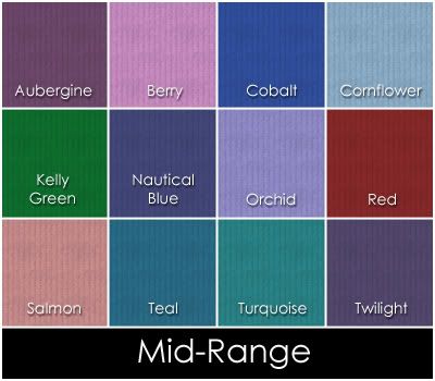
First of all: The Oaktowne chair has seat cushion things. The EAxis textures for it are supposed to be a smooth leather, but I don't like them. Besides, since one of my goals with this project is mix-and-matchableness, I want the upholstery of all the chairs which have it to be in the same colors and in similar materials/fabrics. So, that means developing a color palette. Which I did. Granted, it's a very selfish palette because the colors coordinate with color schemes that I like to use in my own Sim-decorating. Your tastes in that regard may greatly differ from mine, so you may find the upholstery recolors completely useless. (They will always be offered separately, for this very reason.) But if our tastes do intersect in places, then you might find some color(s) you like. There are 47 of them, and I've grouped them into four color subsets, like so:
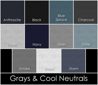
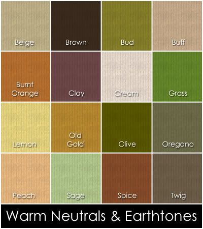
Heh. You can tell what kinds of colors I like best, eh? ;) Also, the swatches above show the fabric pattern that I'll be using across the board, which has a very subtle tone-on-tone stripe...although I might do a few different patterns for fancier chairs, too...or perhaps instead of this pattern. I haven't decided how crazy I want to drive myself yet. I suppose I'll find out when I get to those fancy Victorian-style pieces. *rolls eyes* But for the moment...Well, I like that pattern because it's simple, and therefore good for mixing-and-matching and blending with just about any style of decor, but it's still a step above just plain solid color. And like I said, these colors, at least, will be applied to all chairs/sofas/whatever that I'm going to recolor and that have upholstery. Hell, I might even figure out bedding while I'm at it, since beds are on my to-do list...
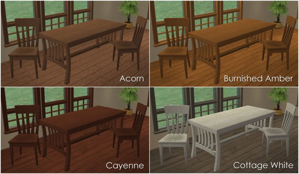
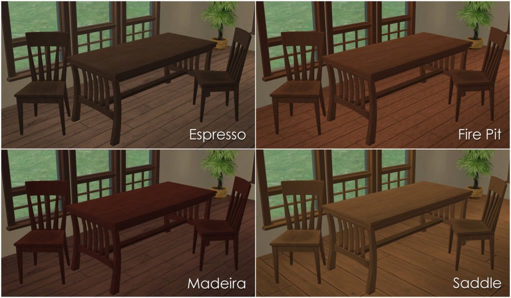
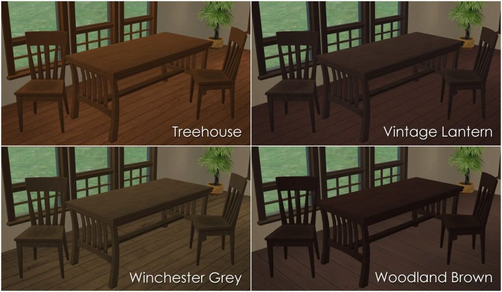
Anyway, here are pics of all 12 wood colors for this set, each paired with a random seat color, so that you can see how twelve of the seat colors look in use in-game. From there, I give you credit for being able to deduce how the others might look because this damned entry is long enough as it is. :) So:
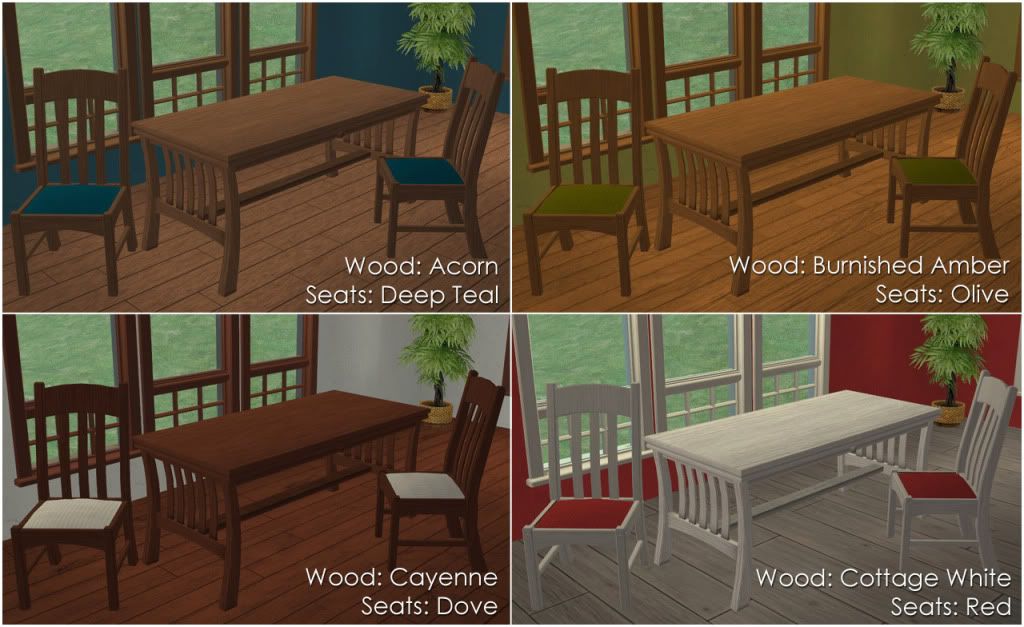
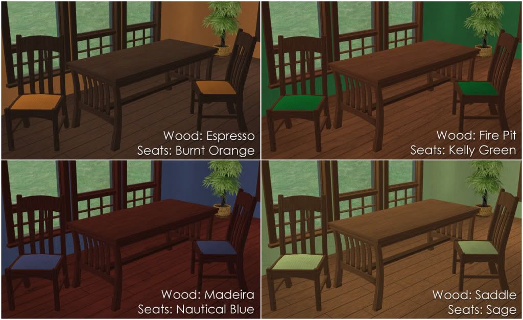

And yes, all but two of the walls in the pics above are "Totally Plastered" walls. (The red one and the bright green one are Lava and Golf Course, respectively, from my "Plasters of Paradise" set here...but there are probably very similar "Totally Plastered" walls. I just ran across the Paradise ones first.) Don't ask me which colors the others are because I didn't keep track, but suffice it to say that if you've downloaded a cross-section (Or, God help you, all) of those walls, you'll have walls that will coordinate with all these upholstery colors, if that's your bag.
Now, here's the deal about that flaw: The textures for the seats of this chair are exactly the same as the textures for the frames. Both are a 256x256-pixel square of wood with a 98x98-pixel square of fabric embedded in it. For frame files, the square of fabric is not used. For fabric files, only the little square of fabric is used...mostly. For some bizarre-o reason, there's a tiny strip of the chair frame that takes its texture from the wood part of whatever fabric texture image you select, not from the frame texture you select. As shown on this "lovely" EAxis combo:
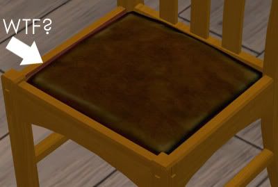
So, even if you only use EAXis colors, each seat color of this chair will really only completely match one of its frame colors, specifically the combination where the frame texture image is identical to the fabric texture image. Fortunately, the flaw is only on the left-hand side of that part of the chair, as shown. Everything else on the chair frame is perfectly fine. Believe me, I looked at it practically microscopically and from all angles, even underneath. I do not know why it does this, and I can't fix it. I mean, I imagine it might be an easy fix for someone who understands and can do meshing and mapping and all that...but I am emphatically NOT one of those people. I just enjoy screwing around in Photoshop as a hobby.
To "fix" this issue, I first tried making the wood part of the texture image transparent and then using the DXT format that preserves transparency to make the recolor, hoping that the weird bit was just overlaying the proper frame color underneath. No such luck. When I did that, that strip became white, which I'm guessing is "bare mesh," and while that looked just fine on my white, it looked horrible on all the other colors.
So, what I ended up doing was making the wood part of the fabric textures an "average" color that blends with the majority of my wood colors. But it doesn't blend well with all of them, namely the lightest and darkest colors on the spectrum, with the "white" being the most egregious offender. To show the general range of blendiness, here's three of my colors close up.
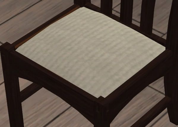
Here's Cottage White, which as I said is the worst. The flaw is very noticeable even from pretty far away, such that you can see it in the collage pics above if you know to look for it:
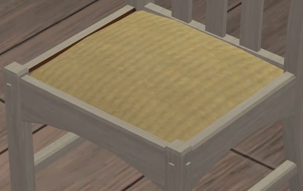
Then here's Fire Pit, where the "fix" blends Yay!Seamlessly:
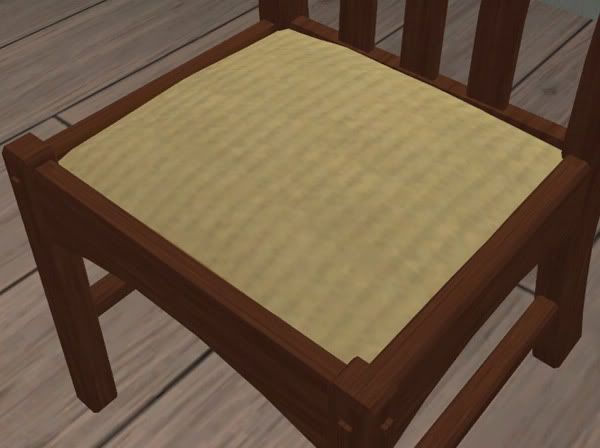
And here's Woodland Brown, which is also quite noticeable but not as badly as it is on the white:
The other colors work more or less well. Generally, unless you zoom in really close to the seat of the chair, something that I doubt generally happens in normal gameplay, the "fix" looks like a shadow, and the color isn't glaringly off from the chair frame's color. However, I make no guarantees about how these seats will look on EAxis's frame colors, should you want to use them. And as for EAxis's seats on my frames...I don't know. I didn't even look. I don't like EAxis's seats that much. *laughs*
Now, the real way to fix this, aside from mesh/mapping stuff that I haven't the faintest clue how to do, would be to make each seat color in a version where that little strip would match each frame color. But that would mean 47x12 seat recolors, and I hope to God that no one out there is that anal. *laughs* And even if someone is, I sure as hell am not going to make 500-and-some seat recolors. Making 47 of them is bad enough. So, this was the compromise that I came up with. If the flaw really bugs you but you still want the chair in general, then you probably shouldn't keep the Cottage White and the Woodland Brown colors, and depending on your level of tolerance maybe not Madeira, Winchester Grey, Saddle, or Vintage Lantern as well, as those are the colors where the flaw is, IMO, most noticeable. The others look good or at least good enough to me.
OR, just screw it and don't use the Oaktowne chair at all. Use the Penn Station chair instead, like so:
This is the chair that I'm pairing this table with on MTS because I think it matches well enough and because I consider the Oaktowne chair to be flawed, and I endeavor not to upload flawed things to MTS, even when the flaw isn't my fault. But after all that work (and livid cursing) associated with figuring out WTF was wrong with the Oaktowne chair, I figured I'd offer them up here, for those who can tolerate imperfect. :)
Now, finally, here are the download links:
Download the Luxuriary Ample King Dining Table Recolors
Download the Oaktowne Dining Chair FRAME Recolors
Download the Oaktowne Dining Chair SEAT Recolors
Download the Contempo Penn Station Chair Recolors
With the seat recolors, the RAR file contains folders for each of the four color subsets plus a folder containing copies of the swatches, to aid in weeding out colors you don't want to keep. So, if you find yourself only liking, for instance, the mid-range colors, just extract only that folder and ignore the other three. If you like only certain colors from each set...Well, I'm afraid you'll have to cherry-pick. :)
As always with my crap, the files are pre-Compressorized to help avoid a nervous breakdown in your Downloads folder, and the files are all clearly named so that you can easily get rid of those colors you don't like/want/need.
And with that, I'm done. Really. I promise. And I promise that future related posts will be MUCH shorter! :)
...Assuming, of course, that other furniture isn't messed up such that I am compelled to rant out the wazoo about it...
My mission: To beat into submission a wide selection of EAxis's wood furniture, so that each piece is available in a uniform and realistic color palette with compatible grain patterning. Sounds simple...BUT IT ISN'T!
The end result: In theory, every piece of furniture that I recolor will be mix-and-matchable at least in terms of color and grain pattern. (Style is a whole 'nother story, of course. ;) )
Mind you, I have NO intention of recoloring every single piece of EAxis's furniture...but I do intend to recolor a LOT of it, cherry-picking my way in no particular order through the base game and all EPs/SPs.
For furniture, I've selected 11 of the not-"weathered" colors from my wood palette to use, mostly because those are the ones that have a real-world wood stain color equivalent and so make realistic sense for furniture. Plus, I've added a "white," which is really a very light true gray that generally looks a bit distressed and that I call "Cottage White." (For those keeping score, its hex code is EAEAEA. *snicker*) It's meant to replace all three of the grays that I left out of this selection of colors, in that it will still go rather nicely with the gray wood floors and other Build Mode stuff I've made and am still working on uploading. Plus, "white" is just generally useful to have when all else fails. So, that's a total of 12 colors to spread across a very big board.
In addition to changing colors, in pretty much all cases I'm editing the original grain patterns of the pieces, if not completely re-graining them. EAxis has a tendency to use textures that are rather obviously drawn from photographs of finished wood. That can look really nice on any given piece, but it tends to make one's life difficult when trying to use the same pattern on pieces of many different shapes and sizes...which I suspect is probably why a lot of EAxis's wood furniture doesn't match. I, on the other hand, tend to create grain patterns from scratch, and they are usually very simple. Simple is better because, ultimately, the simpler a grain pattern is, the more things you can slap it on without a lot of blood, sweat, and tears going into making it look right. So, my furniture textures might not be as photo-realistic as some of EAxis's...but they are more universal, so I can (relatively) painlessly make furniture that mixes and matches. However, if true photo-realism is your thing...look elsewhere. :)
So, all that "boilerplate" said... I started with dining sets because those are the pieces whose not-matchiness ticks me off the most. First up, I offer the base-game Luxuriary "Ample King" Dining Table. It's one of my favorites, but it's a case of "Love the table, hate all but one of EAxis's textures." Its mate is the Oaktowne Dining Chair...although you'd never know it by looking at EAxis's textures. *rolls eyes* So:
Oh, and there are also recolors of the Penn Station chair available from this entry, like so:
First of all: The Oaktowne chair has seat cushion things. The EAxis textures for it are supposed to be a smooth leather, but I don't like them. Besides, since one of my goals with this project is mix-and-matchableness, I want the upholstery of all the chairs which have it to be in the same colors and in similar materials/fabrics. So, that means developing a color palette. Which I did. Granted, it's a very selfish palette because the colors coordinate with color schemes that I like to use in my own Sim-decorating. Your tastes in that regard may greatly differ from mine, so you may find the upholstery recolors completely useless. (They will always be offered separately, for this very reason.) But if our tastes do intersect in places, then you might find some color(s) you like. There are 47 of them, and I've grouped them into four color subsets, like so:
Heh. You can tell what kinds of colors I like best, eh? ;) Also, the swatches above show the fabric pattern that I'll be using across the board, which has a very subtle tone-on-tone stripe...although I might do a few different patterns for fancier chairs, too...or perhaps instead of this pattern. I haven't decided how crazy I want to drive myself yet. I suppose I'll find out when I get to those fancy Victorian-style pieces. *rolls eyes* But for the moment...Well, I like that pattern because it's simple, and therefore good for mixing-and-matching and blending with just about any style of decor, but it's still a step above just plain solid color. And like I said, these colors, at least, will be applied to all chairs/sofas/whatever that I'm going to recolor and that have upholstery. Hell, I might even figure out bedding while I'm at it, since beds are on my to-do list...
Anyway, here are pics of all 12 wood colors for this set, each paired with a random seat color, so that you can see how twelve of the seat colors look in use in-game. From there, I give you credit for being able to deduce how the others might look because this damned entry is long enough as it is. :) So:
And yes, all but two of the walls in the pics above are "Totally Plastered" walls. (The red one and the bright green one are Lava and Golf Course, respectively, from my "Plasters of Paradise" set here...but there are probably very similar "Totally Plastered" walls. I just ran across the Paradise ones first.) Don't ask me which colors the others are because I didn't keep track, but suffice it to say that if you've downloaded a cross-section (Or, God help you, all) of those walls, you'll have walls that will coordinate with all these upholstery colors, if that's your bag.
Now, here's the deal about that flaw: The textures for the seats of this chair are exactly the same as the textures for the frames. Both are a 256x256-pixel square of wood with a 98x98-pixel square of fabric embedded in it. For frame files, the square of fabric is not used. For fabric files, only the little square of fabric is used...mostly. For some bizarre-o reason, there's a tiny strip of the chair frame that takes its texture from the wood part of whatever fabric texture image you select, not from the frame texture you select. As shown on this "lovely" EAxis combo:
So, even if you only use EAXis colors, each seat color of this chair will really only completely match one of its frame colors, specifically the combination where the frame texture image is identical to the fabric texture image. Fortunately, the flaw is only on the left-hand side of that part of the chair, as shown. Everything else on the chair frame is perfectly fine. Believe me, I looked at it practically microscopically and from all angles, even underneath. I do not know why it does this, and I can't fix it. I mean, I imagine it might be an easy fix for someone who understands and can do meshing and mapping and all that...but I am emphatically NOT one of those people. I just enjoy screwing around in Photoshop as a hobby.
To "fix" this issue, I first tried making the wood part of the texture image transparent and then using the DXT format that preserves transparency to make the recolor, hoping that the weird bit was just overlaying the proper frame color underneath. No such luck. When I did that, that strip became white, which I'm guessing is "bare mesh," and while that looked just fine on my white, it looked horrible on all the other colors.
So, what I ended up doing was making the wood part of the fabric textures an "average" color that blends with the majority of my wood colors. But it doesn't blend well with all of them, namely the lightest and darkest colors on the spectrum, with the "white" being the most egregious offender. To show the general range of blendiness, here's three of my colors close up.
Here's Cottage White, which as I said is the worst. The flaw is very noticeable even from pretty far away, such that you can see it in the collage pics above if you know to look for it:
Then here's Fire Pit, where the "fix" blends Yay!Seamlessly:
And here's Woodland Brown, which is also quite noticeable but not as badly as it is on the white:
The other colors work more or less well. Generally, unless you zoom in really close to the seat of the chair, something that I doubt generally happens in normal gameplay, the "fix" looks like a shadow, and the color isn't glaringly off from the chair frame's color. However, I make no guarantees about how these seats will look on EAxis's frame colors, should you want to use them. And as for EAxis's seats on my frames...I don't know. I didn't even look. I don't like EAxis's seats that much. *laughs*
Now, the real way to fix this, aside from mesh/mapping stuff that I haven't the faintest clue how to do, would be to make each seat color in a version where that little strip would match each frame color. But that would mean 47x12 seat recolors, and I hope to God that no one out there is that anal. *laughs* And even if someone is, I sure as hell am not going to make 500-and-some seat recolors. Making 47 of them is bad enough. So, this was the compromise that I came up with. If the flaw really bugs you but you still want the chair in general, then you probably shouldn't keep the Cottage White and the Woodland Brown colors, and depending on your level of tolerance maybe not Madeira, Winchester Grey, Saddle, or Vintage Lantern as well, as those are the colors where the flaw is, IMO, most noticeable. The others look good or at least good enough to me.
OR, just screw it and don't use the Oaktowne chair at all. Use the Penn Station chair instead, like so:
This is the chair that I'm pairing this table with on MTS because I think it matches well enough and because I consider the Oaktowne chair to be flawed, and I endeavor not to upload flawed things to MTS, even when the flaw isn't my fault. But after all that work (and livid cursing) associated with figuring out WTF was wrong with the Oaktowne chair, I figured I'd offer them up here, for those who can tolerate imperfect. :)
Now, finally, here are the download links:
Download the Luxuriary Ample King Dining Table Recolors
Download the Oaktowne Dining Chair FRAME Recolors
Download the Oaktowne Dining Chair SEAT Recolors
Download the Contempo Penn Station Chair Recolors
With the seat recolors, the RAR file contains folders for each of the four color subsets plus a folder containing copies of the swatches, to aid in weeding out colors you don't want to keep. So, if you find yourself only liking, for instance, the mid-range colors, just extract only that folder and ignore the other three. If you like only certain colors from each set...Well, I'm afraid you'll have to cherry-pick. :)
As always with my crap, the files are pre-Compressorized to help avoid a nervous breakdown in your Downloads folder, and the files are all clearly named so that you can easily get rid of those colors you don't like/want/need.
And with that, I'm done. Really. I promise. And I promise that future related posts will be MUCH shorter! :)
...Assuming, of course, that other furniture isn't messed up such that I am compelled to rant out the wazoo about it...