1st ever coloring tutorial!!!!
Go from this:

to either one of these:


So I was asked to create a tutorial for my coloring, so here we go! This is my first time doing a tutorial, so hopefully I won't confuse the hell out of everyone who is reading this.
REMEMBER, THIS IS JUST A TEMPLATE.
If you really want quality icons, you have to judge things for yourself and learn what works for what kind of icon. So basically, don't follow this to a T...try experimenting.
Okay, firstly pick a screencap, for the purposes of this tutorial I'm going to pick this one from the wonderful housecaps.sosugary.com/index.php
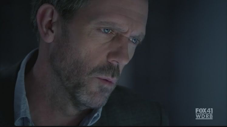
1) The first step is to crop the picture to the 100x100 icon base. Crop the picture with the emotion you want portrayed, if it's a close up it's dramatic....etc...For this picture I'm going to crop it like this:

2) Now I like my images nice and sharp so go to Layer, duplicate layer. Then go to Filter, sharpen, then just sharpen. Now the advantage of creating a duplicate layer with a sharpen filter on top is that you can change the opacity of the layer, letting you have control over how sharp you want the image to be. If it's a close up on the face, I tend to leave the opacity at 100%. If it's a little further away, I tend to make it around 75% because then the background also gets sharpened and it can look wierd.
3) Now we need to lighten the image up so go to Layer, New adjustment layer, curves. I normally have the values as: output: 230 and input: 140. But remember adjust according to the image, if you want the image lighter or darker mess with the point until you get something you like. For this image I decided upon, output: 226 and input: 160
The image should now look like this:
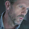
4) Time to bring out some of the brown in the icon. Go to Layer, new fill layer, solid color. I tend to use a dark brown color, something like 1a0e01 and set that layer to exclusion, opacity changes depending on if you want the icon to really bring out the browns (leaving it at a high percent) or if you would rather focus on the reds and yellows (low percent). I tend to leave the opacity at about 75%. But again, look at your icon and determine what you want.
5) Go to layer, new fill layer, solid color. Put in this code, e6e6e6 and set it to color burn, opacity 100%. I love using this because it sharpens up the image and makes it look great. This is what your icon should look like:
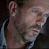
6) Okay this is where you start making some decisions of your own.
Do you want to go with the blue color and end up with an icon like this?

Or would you rather go for a browner/redder look to the icon?
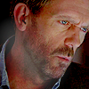
Both say different things about the icon and evoke different emotions, so it's very important to have an idea about which path you would rather take. So I'm splitting the tutorial into two, those that like the bluer approach, that will be tutorial A. For those of you that prefer the browner/redder look, that will be tutorial B. So go to whichever coloring you prefer.
Tutorial A.
1) Color needs to be brought out in this icon now. Go to layer, new adjustment layer, selective color. Since you wanted to go down the blue path these are the values I used to bring out the blues and the reds in this icon.
Reds,
cyan: -100
Yellows
yellow: 100
Blues
cyan: 100
yellow: -100
2) Duplicate the selective color layer and set it to an opacity of 25%
3) Now to get, what I like to call, the shiny effect. Or the contrast in lighting that gives a nice gleam to the icon.
I use combinations of different texture icons but generally I've liked using these two. The first one is made by the wonderful darlaslilgirl and the last one is made by myself.


4) Take the first, lighter texture, and drag it on top of your icon. Set it to soft light, opacity 72%
5) Take the second texture, the circle of white, and drag it on top of the icon. Set it to lighten, opacity 64%. I sometimes blend the second texture, using the smudge tool, so really get the nice contrast. Your icon should look something like this:
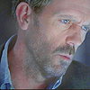
6) Now this image is far too light for House's broody moods, so we've got to darken the image. Go to layer, fill layer, solid color and put in the e6e6e6 color from before. Set it to color burn, opacity 100%. Duplicate the layer.
Now your icon should be finished and look something like this:
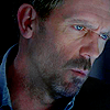
Voila finished!
Tutorial B
1) You've gone down the browner/redder route! So the first step is to get rid of the bluish tinge on the picture. I do this with a combination of fill layers.
First go to layer, fill layer, solid color. Pick a light pink color, very light something like fecbcb. Set it to soft light, opacity 63%
Second go to layer, fill layer, solid color. Pick a very light orangey yellow like fbefb8. Set it to soft light, opacity 50%.
Your icon should look something like this:
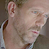
2) Looks like crap right? Don't worry trust me. Now remember that lovely solid fill layer e6e6e6 from before. We're going to be using that a lot right now.
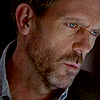
Go to layer, fill layer, solid color. Put in e6e6e6 and set it to color burn, opacity 100%. Duplicate this layer 3 times. Now your icon should look something like this:
3) Now we need to add some color to this rather lifeless icon. So go to layer, new adjustment layer, selective color. Here are the values I used for the icon, tweak as necessary.
Reds
cyan: -62
Yellows
yellow: 86
Blues
cyan: 100
yellow: -100
Your icon should be more colorful now and look like this:
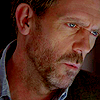
4) Now to get the shiny effect. Or in other words, the nice contrast in lighting that adds a gleam to the icon. I use combinations of different light textures to get this effect, but recently I've liked using the two below. The first one is by darlaslilgirl and the second one is by me


5) Take the first lighter texture, drag it onto the icon and set it to softlight, opacity 73%
6) Take the second texture, the circle, and drag it onto the icon. Set it to lighten, opacity 72%. I tend to smudge, with the smudge tool, the circle texture around to get a more blended feel to the contrast.
Your icon should look something like this:
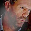
7) The contrast is too strong here. So add a solid color fill layer of e6e6e6, color burn, opacity 100%.
Your finished icon should look something like this:

So that's the end of the tutorial. Remember this is just a template, experiment with the techniques used here, find your own style.
Best of luck to you all!!!!
Been fixed, the images are viewable now...my bad!