Reno Tutorial
In this tutorial, we will be going from this 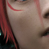
to this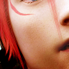
Difficulty: Beginner. Everything will be explained as best I can, with plenty of images to show what's going on.
Program: Photoshop CS5
STEP 1
The first thing we need to do is prepare the base. Duplicate your image with Ctrl+J. Once you have done that, go to this panel:

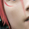
See that bit that says "Normal"? We need to change that to "Screen". Once you do that your icon should be lighter, like this:
STEP 2
It looks better now that it's lighter, but there's still more we need to do to prepare our base.
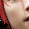
Duplicate the bottom layer again and pull it to the top of your stack of layers. Take this one and, instead of normal, change it to a "Soft Light" layer. It looks a bit hard though, doesn't it? To soften it up, go to Filter>Blur>Gaussian Blur... and change the number in the radius box to 4.0 to clear it up.
It should look something like this:
STEP 3
Now we want to change up the lighting a bit. This can be useful in icons because you want to have the lighting look uniform or face in a certain direction to get the effect you are looking for. Make a new layer.
In this icon, I used a black and white gradient layer. You can make your own by right clicking the Paint Bucket tool and selecting the Gradient tool. This is the one I ended up with:

You set this layer to "Soft Light" and in the box next to it that says "Opacity", you change 100% to 50%. That way it's not overpowering. You should end up with something like this:
STEP 4
Here's where we start laying down the colour that we'll want in our icon. I find that, with any icon I'm making, it's good to put down a nice little base layer to help lighten things up and build colour upon. In this icon, I filled a new layer above all of the others with f599b2. Set this to "Soft Light" and change the Opacity to about 30%.
After you've done that, it should take on a pinkier tone, like this:
STEP 5
While this icon's looking a lot better already, the colouring still leaves much to be desired. Here's where adjustment layers come in! They're pretty crucial in colouring and one of the pretty basic steps you need to get down. They look daunting at first, but once you're used to them they're second nature!
We're going to start off with a "Colour Balance" layer. You can find this by going to your Toolbar and clicking Layer>New Adjustment Layer>Colour Balance... like so:
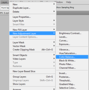
When a dialog box comes up just click "OK" without doing anything to it. You should now have something like this on your sidebar above your layers:
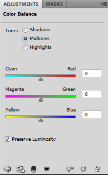
We're going to work with the Midtones first, so keep that one checked. These are the values that you need to put into the three boxes to get this colouring. On other icons feel free to play about with them a bit to get the right reddish hue, but for now keep it simple.
Cyan/Red: +17
Magenta/Green: -5
Yellow/Blue: -12
Now that you've done that part, click "Shadows" instead. In these boxes, you put:
Cyan/Red: +10
Magenta/Green: +3
Yellow/Blue: -8
And, last but not least, click "Highlights". Be careful with this part of Colour Balancing, since the effects are much more noticeable and you want to keep your colouring subtle.
Cyan/Red: -5
Magenta/Green: -5
Yellow/Blue: -9
And there you have it! Your icon should now look something like this:
STEP 6
Now we want to get a bit more contrast in our icon, as well as make the colours that bit more bold and striking. Go back to the Layer toolbar and click New Adjustment Layer, but this time go to "Curves..."
You should have this graph come up. To make points in the graph, you want to click somewhere along the line, at which point the "Output" and "Input" boxes will appear at the bottom. Rather than shifting your line manually, when you are following this tutorial I suggest you type the values into those boxes.
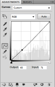
In this icon, you want to have two separate points. The first point shall be (O=64, I=71) and (O=76, I=79) Your graph will look like this:
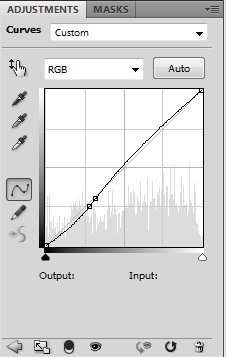
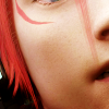
And your icon will look something like this:
STEP 7
Next you need to go to the same menu that the previous two adjustment layers were found in and click "Levels..." and you should see a graph like this:
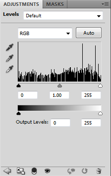
For this icon we are only going to be dealing with the three boxes underneath the graph, as opposed to the Output Levels. From left to right, the numbers you want in the boxes are 9, 1.03 and 252. It's a small difference, but making an icon is about lots of subtle changes. You should now have something like this:
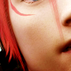
STEP 08
We now need a Vibrance Layer. By now you should be well acquainted with visiting the New Adjustment Layer menu, so find that on the list and select it. This one's nice and easy, there are only two boxes you need adjust with simple sliders.
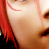
Input the value +25 for Vibrance, and +2 for Saturation. You will then have something like this:
STEP 09
This is the final adjustment layer we will be using this time. It is a Photo Filter layer, and is also quite simple.
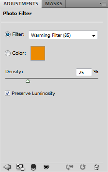
All you need to do is change the Density to 7% (I don't usually put it far above 10% in any icon) and the Filter needs to be called "Cooling Filter(80)". This adds a cool tinge to your icon to keep it from becoming overly red.

STEP 10
Almost there! Now we need to sharpen the icon. It will be looking very slightly blurry, so we want to clear that up. Press ctrl+alt+shift+e to merge your icon on a new layer. All of your other layers will still be there and intact, which is just what you want.
With this new layer that is on top of all of the others, you want to go to Filters>Other>High Pass... and, once the box comes up, change the number in the Radius area to 0.5. This will make the outlines in your icon stand out on the gray background.
What you want to do with this layer is change it to a "Soft Light" layer. Now your icon should be looking a little bit sharper, but not over-sharpened.

STEP 11
Time to put on the finishing touches! I like my icons to have a slightly misty effect, so make a new layer above all of the other ones. Keep this layer Normal, but change the Opacity to about 20%.
Once you've done that, take a fuzzy brush at about 50 pixels and change the colour to eae6e3. Place your dots carefully on your icon. If you have a darker space where it just shows up as a big, splodgy circle, I suggest taking that away. You want these dots to be quite subtle.
After that, you should have your finished product!

This colouring should work for most icons, although if your base is still quite dark at the beginning it's always best to add in an extra screen layer or two. Hope this is helpful!

to this

Difficulty: Beginner. Everything will be explained as best I can, with plenty of images to show what's going on.
Program: Photoshop CS5
STEP 1
The first thing we need to do is prepare the base. Duplicate your image with Ctrl+J. Once you have done that, go to this panel:

See that bit that says "Normal"? We need to change that to "Screen". Once you do that your icon should be lighter, like this:

STEP 2
It looks better now that it's lighter, but there's still more we need to do to prepare our base.
Duplicate the bottom layer again and pull it to the top of your stack of layers. Take this one and, instead of normal, change it to a "Soft Light" layer. It looks a bit hard though, doesn't it? To soften it up, go to Filter>Blur>Gaussian Blur... and change the number in the radius box to 4.0 to clear it up.
It should look something like this:

STEP 3
Now we want to change up the lighting a bit. This can be useful in icons because you want to have the lighting look uniform or face in a certain direction to get the effect you are looking for. Make a new layer.
In this icon, I used a black and white gradient layer. You can make your own by right clicking the Paint Bucket tool and selecting the Gradient tool. This is the one I ended up with:

You set this layer to "Soft Light" and in the box next to it that says "Opacity", you change 100% to 50%. That way it's not overpowering. You should end up with something like this:

STEP 4
Here's where we start laying down the colour that we'll want in our icon. I find that, with any icon I'm making, it's good to put down a nice little base layer to help lighten things up and build colour upon. In this icon, I filled a new layer above all of the others with f599b2. Set this to "Soft Light" and change the Opacity to about 30%.
After you've done that, it should take on a pinkier tone, like this:

STEP 5
While this icon's looking a lot better already, the colouring still leaves much to be desired. Here's where adjustment layers come in! They're pretty crucial in colouring and one of the pretty basic steps you need to get down. They look daunting at first, but once you're used to them they're second nature!
We're going to start off with a "Colour Balance" layer. You can find this by going to your Toolbar and clicking Layer>New Adjustment Layer>Colour Balance... like so:

When a dialog box comes up just click "OK" without doing anything to it. You should now have something like this on your sidebar above your layers:

We're going to work with the Midtones first, so keep that one checked. These are the values that you need to put into the three boxes to get this colouring. On other icons feel free to play about with them a bit to get the right reddish hue, but for now keep it simple.
Cyan/Red: +17
Magenta/Green: -5
Yellow/Blue: -12
Now that you've done that part, click "Shadows" instead. In these boxes, you put:
Cyan/Red: +10
Magenta/Green: +3
Yellow/Blue: -8
And, last but not least, click "Highlights". Be careful with this part of Colour Balancing, since the effects are much more noticeable and you want to keep your colouring subtle.
Cyan/Red: -5
Magenta/Green: -5
Yellow/Blue: -9
And there you have it! Your icon should now look something like this:

STEP 6
Now we want to get a bit more contrast in our icon, as well as make the colours that bit more bold and striking. Go back to the Layer toolbar and click New Adjustment Layer, but this time go to "Curves..."
You should have this graph come up. To make points in the graph, you want to click somewhere along the line, at which point the "Output" and "Input" boxes will appear at the bottom. Rather than shifting your line manually, when you are following this tutorial I suggest you type the values into those boxes.

In this icon, you want to have two separate points. The first point shall be (O=64, I=71) and (O=76, I=79) Your graph will look like this:

And your icon will look something like this:

STEP 7
Next you need to go to the same menu that the previous two adjustment layers were found in and click "Levels..." and you should see a graph like this:

For this icon we are only going to be dealing with the three boxes underneath the graph, as opposed to the Output Levels. From left to right, the numbers you want in the boxes are 9, 1.03 and 252. It's a small difference, but making an icon is about lots of subtle changes. You should now have something like this:

STEP 08
We now need a Vibrance Layer. By now you should be well acquainted with visiting the New Adjustment Layer menu, so find that on the list and select it. This one's nice and easy, there are only two boxes you need adjust with simple sliders.
Input the value +25 for Vibrance, and +2 for Saturation. You will then have something like this:

STEP 09
This is the final adjustment layer we will be using this time. It is a Photo Filter layer, and is also quite simple.

All you need to do is change the Density to 7% (I don't usually put it far above 10% in any icon) and the Filter needs to be called "Cooling Filter(80)". This adds a cool tinge to your icon to keep it from becoming overly red.

STEP 10
Almost there! Now we need to sharpen the icon. It will be looking very slightly blurry, so we want to clear that up. Press ctrl+alt+shift+e to merge your icon on a new layer. All of your other layers will still be there and intact, which is just what you want.
With this new layer that is on top of all of the others, you want to go to Filters>Other>High Pass... and, once the box comes up, change the number in the Radius area to 0.5. This will make the outlines in your icon stand out on the gray background.
What you want to do with this layer is change it to a "Soft Light" layer. Now your icon should be looking a little bit sharper, but not over-sharpened.

STEP 11
Time to put on the finishing touches! I like my icons to have a slightly misty effect, so make a new layer above all of the other ones. Keep this layer Normal, but change the Opacity to about 20%.
Once you've done that, take a fuzzy brush at about 50 pixels and change the colour to eae6e3. Place your dots carefully on your icon. If you have a darker space where it just shows up as a big, splodgy circle, I suggest taking that away. You want these dots to be quite subtle.
After that, you should have your finished product!

This colouring should work for most icons, although if your base is still quite dark at the beginning it's always best to add in an extra screen layer or two. Hope this is helpful!