Ar Ru: Tutorial
Since one of the challenges at landofart is to make a tutorial, I thought I'd make this tutorial for one of my soon to be released icons! Sorry about the wonky cropping for the step-by-step images in advance.
We will be taking this image and we'll turn it into this: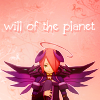
Difficulty: Intermediate, requires basic knowledge of adjustment layers
Translateable?: Should be? There's no Selective Colouring.
1.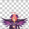
Well, before you do anything else you need to cut your image out with the lasso, eraser or whatever other method you prefer and, once that is done, crop it. Make sure the edges are as clean as possible.
2.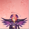
Now that it's cut out, add a texture that you would like to use for the background to your image and place it behind your newly cut out layer. I used this texture, which was made by twinstrikeish
3.
Next I pressed ctrl+alt+shift+e to take both layers and merge them on a new layer above the ones that already existed. After that I set the layer to soft light 100% opacity and then went to Filters>Blur>Gaussian Blur and blurred it with a radius of 4.0. Now the colours have been improved and the icon has a bit more contrast.
4.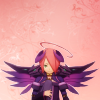
I wanted the lighting to be more uniform so I made a gradient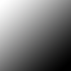
and set it to soft light 50% opacity over my other layers.
5.
I then made a colour fill layer with the colour f599be and set it to soft light 30% opacity. For now we don't want the colour to be too noticeable, but adding this layer improves the next steps.
6.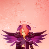
Now to the adjustment layers! Here you need to make a Colour Balance layer and the values should look something like this:
Midtones:
Cyan/Red: +16
Magenta/Green: +3
Yellow/Blue: -13
Shadows:
Cyan/Red: +13
Magenta/Green: -3
Yellow/Blue: -12
Highlights:
Cyan/Red: +3
Magenta/Green: +2
Yellow/Blue: +6
Play around with the numbers if you find they don't work for your icon.
7.
For this step you need to make a Levels layer. The values I used were 19,1.07,249. Leave the Output Levels as is. Now the icon has a bit more contrast and looks more bold.
8.
Now make a Vibrance layer. Set the Vibrance to about +30 and the Saturation to no more than +5. The difference is subtle, but still adds to the colour of the icon.
9.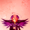
Next make a Photo Filter layer. For this icon I used Warming FIlter (85) and set the Density to 10. While it didn't make much of a difference in this icon it does in others, so if it adds nothing then don't add it. Alternatively, use a Cooling Filter at a similar density to add some blue to your icon.
10.
Take the gradient used earlier, duplicate it and drag it to the top of your icon. Make sure it is now soft light 19% opacity. Change this accordingly if it has little effect on your icon at that opacity.
11.
At this point, press ctrl+alt+shift+e to take everything you've done so far and copy it to a new layer. Then, go to Filters>Other>High Pass... and set it to a 0.5 radius. You should have a grey layer with the details of your icon on it. Set this to soft light 100% opacity to sharpen your icon. I find this looks less harsh than sharpening it using other methods. If any parts of your icon become oversharpened, erase the parts of this layer that are over them.
12.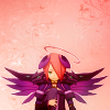
Make a new layer, keep it normal but set it to 20% opacity. If your icon uses darker colours then you can set it higher, but don't let it pass 40%. On this layer use a soft brush and paint on some faded light dots in ebe8e9.
By this point you can just finish there, but if you want you can add text as well.
13.
If you do want to add text, here is what I did. Type out the text you want and make it white. To make sure that it shows up well, duplicate this layer and change the colour to a darker colour that you eyedropped from your icon. I chose to take a sample of the darker parts of the pink background. Take this layer and make sure it is underneath your white layer, then shift it a pixel or two down and to the right. That way you get a thick, hard shadow rather than something fuzzy.
If anybody has a request for a tutorial, feel free to say so. I can probably whittle another up pretty easily.
If this tutorial wasn't clear, let me know in the comments.
We will be taking this image and we'll turn it into this:

Difficulty: Intermediate, requires basic knowledge of adjustment layers
Translateable?: Should be? There's no Selective Colouring.
1.

Well, before you do anything else you need to cut your image out with the lasso, eraser or whatever other method you prefer and, once that is done, crop it. Make sure the edges are as clean as possible.
2.

Now that it's cut out, add a texture that you would like to use for the background to your image and place it behind your newly cut out layer. I used this texture, which was made by twinstrikeish
3.

Next I pressed ctrl+alt+shift+e to take both layers and merge them on a new layer above the ones that already existed. After that I set the layer to soft light 100% opacity and then went to Filters>Blur>Gaussian Blur and blurred it with a radius of 4.0. Now the colours have been improved and the icon has a bit more contrast.
4.

I wanted the lighting to be more uniform so I made a gradient

and set it to soft light 50% opacity over my other layers.
5.

I then made a colour fill layer with the colour f599be and set it to soft light 30% opacity. For now we don't want the colour to be too noticeable, but adding this layer improves the next steps.
6.

Now to the adjustment layers! Here you need to make a Colour Balance layer and the values should look something like this:
Midtones:
Cyan/Red: +16
Magenta/Green: +3
Yellow/Blue: -13
Shadows:
Cyan/Red: +13
Magenta/Green: -3
Yellow/Blue: -12
Highlights:
Cyan/Red: +3
Magenta/Green: +2
Yellow/Blue: +6
Play around with the numbers if you find they don't work for your icon.
7.

For this step you need to make a Levels layer. The values I used were 19,1.07,249. Leave the Output Levels as is. Now the icon has a bit more contrast and looks more bold.
8.

Now make a Vibrance layer. Set the Vibrance to about +30 and the Saturation to no more than +5. The difference is subtle, but still adds to the colour of the icon.
9.

Next make a Photo Filter layer. For this icon I used Warming FIlter (85) and set the Density to 10. While it didn't make much of a difference in this icon it does in others, so if it adds nothing then don't add it. Alternatively, use a Cooling Filter at a similar density to add some blue to your icon.
10.

Take the gradient used earlier, duplicate it and drag it to the top of your icon. Make sure it is now soft light 19% opacity. Change this accordingly if it has little effect on your icon at that opacity.
11.

At this point, press ctrl+alt+shift+e to take everything you've done so far and copy it to a new layer. Then, go to Filters>Other>High Pass... and set it to a 0.5 radius. You should have a grey layer with the details of your icon on it. Set this to soft light 100% opacity to sharpen your icon. I find this looks less harsh than sharpening it using other methods. If any parts of your icon become oversharpened, erase the parts of this layer that are over them.
12.

Make a new layer, keep it normal but set it to 20% opacity. If your icon uses darker colours then you can set it higher, but don't let it pass 40%. On this layer use a soft brush and paint on some faded light dots in ebe8e9.
By this point you can just finish there, but if you want you can add text as well.
13.

If you do want to add text, here is what I did. Type out the text you want and make it white. To make sure that it shows up well, duplicate this layer and change the colour to a darker colour that you eyedropped from your icon. I chose to take a sample of the darker parts of the pink background. Take this layer and make sure it is underneath your white layer, then shift it a pixel or two down and to the right. That way you get a thick, hard shadow rather than something fuzzy.
If anybody has a request for a tutorial, feel free to say so. I can probably whittle another up pretty easily.
If this tutorial wasn't clear, let me know in the comments.