Results - Round 01 Challenge 03
Thanks for voting everyone, last minute or otherwise! Unfortunately we couldn't break the ties in the end I cannot count, the tie got broken after all. Here are the results for the 3rd challenge of round one.
Eliminations
Unfortunately we have to say goodbye to the following participants:
lizpin
#12 [+00 -10] = -10
dark_flight
#01 [+01 -06] = -05
Thank you guys so much for participating! I hope you will stick around for voting!
People's Choice
nastylies
#07 [+06 -00] = +06
Mods' Choice
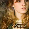
sweetnessarose
#05 Beautifully contrasted b/w icon, and I really like the little details to Hermione's left.
zestyzorra
#09 Interesting crop, very natural colouring, and text placement and execution are perfect.
Points
+ are positive/favorite votes
- are negative/least favorite votes
Voting post for reference
01. [+01 -06] = -05
02. [+00 -04] = -04
03. [+01 -00] = +01
04. [+01 -00] = +01
05. [+05 -00] = +05
06. [+03 -02] = +01
07. [+06 -00] = +06
08. [+02 -03] = -01
09. [+05 -00] = +05
10. [+04 -04] = 00
11. [+00 -00] = 00
12. [+00 -10] = -10
13. [+05 -03] = +02
14. [+00 -01] = -01
15. [+00 -02] = -02
16. [+03 -01] = +02
Least favourite comments
01 - The icon seemed oversharpened and slightly grainy.
01 - The crop is alright for this icon, although I don't usually like chopping off heads unless I'm going for a half-face look, but the crop is alright. However, it seems some skewing/distorting happened when the maker cropped; Hermione's face looks scrunched up or something. The image is also a little too dark, but I do like the coloring the maker was going for; however, the image is oversharpened. Her hair and outline of her face especially are really pixelated due to oversharpening.
01 - This icon is oversaturated, and I'm not sure what happened to the quality... it appears to have been spot-sharpened in one spot, and blurred everywhere else.
01 - The crop is nice, but the sharpness is too high and detracts from the icon.
01 - It seems to be too sharp in some places and a bit blurry in others. Might be better to find a better balance between the two or mess around with the opacity in the layers with the effects.
01 - The coloring isn't terrible though it's darker than it probably needs to be, but the aspect ratio has been lost so that Hermione's face looks a bit chubby, and it spoils the icon.
02 - I feel like the font and the photo are off balance from one another. The faces are completely lost. If I didn't know the original photo, I mightn't have known who they were.
02 - Oversharp and the text is a little odd. It might be better to work with different fonts and different text placement.
02 - The text is just sort of sitting there, and it's very distracting. I don't feel like you did a lot with the cap, coloring wise. I like the lighting behind the text, though.
02 - I feel like the 'trio' text was a little much like an after thought, just something to fill up dead space. Because of this, I don't feel it meshes well with the image, as there's nothing to cohesively draw them together. Perhaps it would work better if the text was a little smaller in size, and a little closer to the characters? I do like the colouring, however!
06 - I'm not crazy about the crop. Also, it's not sharp enough, so Hermione comes out a bit blurry. I'd also like to see it a tad brighter.
06 - I love the tilting of Hermione, but the coloring just seems so blah:(
08 - It's a bit too dull, so it doesn't stand out much. THe crop's pretty good, but the text just doesn't really work. I think the phrase is a bit too long, and it looks a bit cluttered on that side.
08 - I feel like the font is lost in the icon and yet a bit distracting at the same time. I have trouble reading it, even those it's quite plain as far as fonts go, and yet it pulls away from Ron.
08 - The text is a bit difficult to read, which makes me feel like I'm missing a cool or important piece of the icon. Maybe make it darker?
10 - Nice concept, but subject is too blurry next to the much clearer moon.
10 - the moon becomes the central focus of this icon and it probably shouldn't be. the image of hermione is too faded, in shadows.
10 - While the icon is pretty, the moon texture does not go at all. The location of the texture itself is odd; very large and below Hermione. You can still slightly see some of the brick behind her shoulders and head, so basically there's a giant moon in doors - Remus Lupin aside, it does not make sense.
10 - The moon looks to be in the foreground, on top of Hermione's shoulder instead of further back like you'd expect. Also, it's brightness, position in relation to Hermione, and it's position at just off of centre make it pop more than any other part and Hermione, whom I'd suspect to be the focus of the icon, disappears from notice.
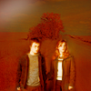
12 - Pixelated, unclear faces, bodies and background is indistinguishable.
12 - Nice pose, but the icon looks oversaturated.
12 - I presume there's a texture of a tree in the background, but the odd color contrasts between the background and the characters really distracts from Harry and Hermione. The icon as a whole also seems very blurry.
12 - Not quite sure what is going on here... background is difficult to make out, subject is difficult to make out. Coloring on H/H is nice but doesn't go too well with background.
12 - the intensity of the colors turns me off. I'm not sure what the background is supposed to be, and trying to figure it out is distracting. the image of harry & hermione is too small. there is too much negative space otherwise.
12 - I think the texture colors swallow up the image and distract, rather than enhance, the subject of the icon.
12 - It is somewhat unclear as to what the background is, and it doesn't contrast enough with the colors of Harry and Hermione.
12 - The dark red of the background rather overwhelms the icon. Maybe add a second color to balance it?
12 - Coloring obscures the image, and the figures don't blend well with the background.
12 - The colouring of Harry and Hermione make them blend into the background too much that they're hard to distinguish from the rest of the image. Also, though the red is lovely and vivid, it's mix with the brown-green makes it very heavy and not too attractive.
13 - It's a bold crop, but it doesn't work well with the text - perhaps more subtle text, or at least something less fuzzy.
13 - I love the crop of this icon, and I love the soft, bright coloring. I just wish the font weren't blurry! This would be a nice icon if it weren't. The text placement is great, and the style of the font works really nicely too. It's just that it's so blurry, and it detracts from the image because of that. Instead of looking at Hermione, my eyes just drift to that text, every time.
13 - Although the crop is interesting, I don't feel like the text and the icon go well together, the coloring is pretty but the text is distracting.
14 - The colouring is a little too strong and overwhelms the subjcects, especially Harry and Ron. I think it would have worked better if the opacity was a little lower. I love the use of text, though :)
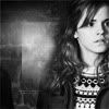
15 - The image seems a little washed out & overcontrasted; Hermione's face seems almost grimy because of the multiple (?) textures used over it.
15 - The composition of this icon is really great actually, but something to do with the colouring has left the image looking very pixellated, and it detracts a lot from the overall quality.
16 - Hermione is too red, it's unflattering.
Favourite comments
01 - The colours are rich and warm, really brightens up the picture.
03 - THE COLORINGGGGG! It's so lovely, she positively glows:)
04 - The coloring is absolutely phenomenal, especially the red around the text!
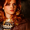
05 - The black and white is simple, and the texture is a nice touch that adds, but isn't too distracting.
05 - The black and white effects on this icon are splendidly done - it perfectly highlights Hermione's face.
05 - I think the off balanced cropping here works well with the look on her face. It doesn't take away from the focus being on her, and it's a visually appealing icon.
05 - The way the focus has been pulled just off Hermione to the wall adds some drama to this icon. The effect that has been accomplished with the wall looks details and not easy.
05 - The black and white coloring combined with a lot of negative space from the crop makes for a really amazing icon! Bravo!
06 - The coloring is stunning!
06 - This icon has a really interesting crop, and I love that the maker rotated the image. There is a lot of interesting negative space too, and I love the coloring. This is a case where darker coloring actually works, because the contrast, crop, and negative space are all interesting. It maybe could be a *tiny* bit more subtle/less dark, but I really like this icon.
06 - Really like the coloration and crop of this icon
07 - Nice framing crop, nice focus and coloring.
07 - The creative placement of the images, plus the lovely coloring, is extremely interesting and well executed.
07 - Interesting icon, subject has nice color and is sharp.
07 - Creative, unique and well balanced. I like the bordering her with different filters on the top and bottom. I like that she's the obvious focus and it's all colored well.
07 - Lovely use of duplication in the icon without being distracting.
07 - The colouring is beautiful. I love the misty, romantic feel and the vividness of her hair. I also like the repition of the darker toned version on the top and bottom of the icon to really emphasize the vivacity and brilliance of the middle image. It's very striking and attractive to the eyes.
08 - Lovely soft coloring and use of text.
08 - Awesome integration of text--even though the text is rather 'stock' in nature, the way its integrated into the icon is awesome and subtle enough that it doesn't overpower the crop.
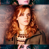
09 - I like this icon a lot; the color is very nice and realistic, and though I can't read the text, I like the placement of it as well as the fading effect.
09 - this icon has a great crop. and the coloring is warm and fitting. the text placement is interesting and draws my eye there. it gives the icon a feeling of mystery.
09 - I love the placement of the text and how it is not very visible, and how it fades. It's really awesome. I'd suggest a bit more color or texture, maybe?
09 - The placement of the text and the way it's barely there adds a lot of depth to this icon. The crop is also fantastic.
09 - I love the colouring of it and especially the words against her hair and the backround. It's a very naturally pretty looking image. Also, I adore the cropping and positioning of Hermione within the icon. It takes up the space beautifully to not be too overpowering but not random or off. It's a pleasing choice of balance and use of space.
10 - I love the black and white coloring and the moon brush used.
10 - Ok, I really don't get the moon, it's a bit too random for me, but I love the icon. Another example of b&w done right. The maker gave us bright whites and dark blacks/greys, but not overly so, and there's a lot of contrast. I also really like the negative space the maker created; the crop is a really interesting one. So, I kinda wish the moon weren't there, because it draws my eyes instead of Hermione since it's so bright, and it's also just very random, because you can tell she's indoors and then O HAI MOON! It's a still a gorgeous icon though.
10 - Good black and white icon, which is sometimes hard to pull off. Also, good use of texture and placement/composition.
10 - I love the crop, and the usage of the texture. It's interesting and appeals to my aesthetics. However, I do feel it somewhat overpowers the subject.
13 - I love the crop! It's interesting and unique. However, the text is a little blurry.
13 - the crop is fantastic and the image of hermione crisp and sharp. the text placement and font is very well executed as well. though I would say, personally, I'm not too much a fan of the blurry text. for this icon, however, it works well.
13 - Interesting crop and use of text. Also lovely coloring.
13 - Although I could do without the blurred text (I don't understand the trend, but can recognize that it is popular), I love the coloration and the overall quality of the image--very nice & great crop!
13 - Love the cropping you've chosen, and the text is perfectly chosen and placed!
16 - I like the crop as well as the bright coloring. I usually don't like coloring that's only warm, but I really like the effect here, especially as the hue changes just slightly in her hair.
16 - Great coloring and crop
16 - The crop is perfect, and the color overlays are subtle but beautiful and not overbearing.
HiH points (sweetnessarose and zestyzorra only get 10 additional points for Mod's Choice, not 20)
Challenge 04 will be up tomorrow morning, after I got some sleep :)
Eliminations
Unfortunately we have to say goodbye to the following participants:
lizpin
#12 [+00 -10] = -10
dark_flight
#01 [+01 -06] = -05
Thank you guys so much for participating! I hope you will stick around for voting!
People's Choice
nastylies
#07 [+06 -00] = +06
Mods' Choice
sweetnessarose
#05 Beautifully contrasted b/w icon, and I really like the little details to Hermione's left.
zestyzorra
#09 Interesting crop, very natural colouring, and text placement and execution are perfect.
Points
+ are positive/favorite votes
- are negative/least favorite votes
Voting post for reference
01. [+01 -06] = -05
02. [+00 -04] = -04
03. [+01 -00] = +01
04. [+01 -00] = +01
05. [+05 -00] = +05
06. [+03 -02] = +01
07. [+06 -00] = +06
08. [+02 -03] = -01
09. [+05 -00] = +05
10. [+04 -04] = 00
11. [+00 -00] = 00
12. [+00 -10] = -10
13. [+05 -03] = +02
14. [+00 -01] = -01
15. [+00 -02] = -02
16. [+03 -01] = +02
Least favourite comments
01 - The icon seemed oversharpened and slightly grainy.
01 - The crop is alright for this icon, although I don't usually like chopping off heads unless I'm going for a half-face look, but the crop is alright. However, it seems some skewing/distorting happened when the maker cropped; Hermione's face looks scrunched up or something. The image is also a little too dark, but I do like the coloring the maker was going for; however, the image is oversharpened. Her hair and outline of her face especially are really pixelated due to oversharpening.
01 - This icon is oversaturated, and I'm not sure what happened to the quality... it appears to have been spot-sharpened in one spot, and blurred everywhere else.
01 - The crop is nice, but the sharpness is too high and detracts from the icon.
01 - It seems to be too sharp in some places and a bit blurry in others. Might be better to find a better balance between the two or mess around with the opacity in the layers with the effects.
01 - The coloring isn't terrible though it's darker than it probably needs to be, but the aspect ratio has been lost so that Hermione's face looks a bit chubby, and it spoils the icon.
02 - I feel like the font and the photo are off balance from one another. The faces are completely lost. If I didn't know the original photo, I mightn't have known who they were.
02 - Oversharp and the text is a little odd. It might be better to work with different fonts and different text placement.
02 - The text is just sort of sitting there, and it's very distracting. I don't feel like you did a lot with the cap, coloring wise. I like the lighting behind the text, though.
02 - I feel like the 'trio' text was a little much like an after thought, just something to fill up dead space. Because of this, I don't feel it meshes well with the image, as there's nothing to cohesively draw them together. Perhaps it would work better if the text was a little smaller in size, and a little closer to the characters? I do like the colouring, however!
06 - I'm not crazy about the crop. Also, it's not sharp enough, so Hermione comes out a bit blurry. I'd also like to see it a tad brighter.
06 - I love the tilting of Hermione, but the coloring just seems so blah:(
08 - It's a bit too dull, so it doesn't stand out much. THe crop's pretty good, but the text just doesn't really work. I think the phrase is a bit too long, and it looks a bit cluttered on that side.
08 - I feel like the font is lost in the icon and yet a bit distracting at the same time. I have trouble reading it, even those it's quite plain as far as fonts go, and yet it pulls away from Ron.
08 - The text is a bit difficult to read, which makes me feel like I'm missing a cool or important piece of the icon. Maybe make it darker?
10 - Nice concept, but subject is too blurry next to the much clearer moon.
10 - the moon becomes the central focus of this icon and it probably shouldn't be. the image of hermione is too faded, in shadows.
10 - While the icon is pretty, the moon texture does not go at all. The location of the texture itself is odd; very large and below Hermione. You can still slightly see some of the brick behind her shoulders and head, so basically there's a giant moon in doors - Remus Lupin aside, it does not make sense.
10 - The moon looks to be in the foreground, on top of Hermione's shoulder instead of further back like you'd expect. Also, it's brightness, position in relation to Hermione, and it's position at just off of centre make it pop more than any other part and Hermione, whom I'd suspect to be the focus of the icon, disappears from notice.
12 - Pixelated, unclear faces, bodies and background is indistinguishable.
12 - Nice pose, but the icon looks oversaturated.
12 - I presume there's a texture of a tree in the background, but the odd color contrasts between the background and the characters really distracts from Harry and Hermione. The icon as a whole also seems very blurry.
12 - Not quite sure what is going on here... background is difficult to make out, subject is difficult to make out. Coloring on H/H is nice but doesn't go too well with background.
12 - the intensity of the colors turns me off. I'm not sure what the background is supposed to be, and trying to figure it out is distracting. the image of harry & hermione is too small. there is too much negative space otherwise.
12 - I think the texture colors swallow up the image and distract, rather than enhance, the subject of the icon.
12 - It is somewhat unclear as to what the background is, and it doesn't contrast enough with the colors of Harry and Hermione.
12 - The dark red of the background rather overwhelms the icon. Maybe add a second color to balance it?
12 - Coloring obscures the image, and the figures don't blend well with the background.
12 - The colouring of Harry and Hermione make them blend into the background too much that they're hard to distinguish from the rest of the image. Also, though the red is lovely and vivid, it's mix with the brown-green makes it very heavy and not too attractive.
13 - It's a bold crop, but it doesn't work well with the text - perhaps more subtle text, or at least something less fuzzy.
13 - I love the crop of this icon, and I love the soft, bright coloring. I just wish the font weren't blurry! This would be a nice icon if it weren't. The text placement is great, and the style of the font works really nicely too. It's just that it's so blurry, and it detracts from the image because of that. Instead of looking at Hermione, my eyes just drift to that text, every time.
13 - Although the crop is interesting, I don't feel like the text and the icon go well together, the coloring is pretty but the text is distracting.
14 - The colouring is a little too strong and overwhelms the subjcects, especially Harry and Ron. I think it would have worked better if the opacity was a little lower. I love the use of text, though :)
15 - The image seems a little washed out & overcontrasted; Hermione's face seems almost grimy because of the multiple (?) textures used over it.
15 - The composition of this icon is really great actually, but something to do with the colouring has left the image looking very pixellated, and it detracts a lot from the overall quality.
16 - Hermione is too red, it's unflattering.
Favourite comments
01 - The colours are rich and warm, really brightens up the picture.
03 - THE COLORINGGGGG! It's so lovely, she positively glows:)
04 - The coloring is absolutely phenomenal, especially the red around the text!
05 - The black and white is simple, and the texture is a nice touch that adds, but isn't too distracting.
05 - The black and white effects on this icon are splendidly done - it perfectly highlights Hermione's face.
05 - I think the off balanced cropping here works well with the look on her face. It doesn't take away from the focus being on her, and it's a visually appealing icon.
05 - The way the focus has been pulled just off Hermione to the wall adds some drama to this icon. The effect that has been accomplished with the wall looks details and not easy.
05 - The black and white coloring combined with a lot of negative space from the crop makes for a really amazing icon! Bravo!
06 - The coloring is stunning!
06 - This icon has a really interesting crop, and I love that the maker rotated the image. There is a lot of interesting negative space too, and I love the coloring. This is a case where darker coloring actually works, because the contrast, crop, and negative space are all interesting. It maybe could be a *tiny* bit more subtle/less dark, but I really like this icon.
06 - Really like the coloration and crop of this icon
07 - Nice framing crop, nice focus and coloring.
07 - The creative placement of the images, plus the lovely coloring, is extremely interesting and well executed.
07 - Interesting icon, subject has nice color and is sharp.
07 - Creative, unique and well balanced. I like the bordering her with different filters on the top and bottom. I like that she's the obvious focus and it's all colored well.
07 - Lovely use of duplication in the icon without being distracting.
07 - The colouring is beautiful. I love the misty, romantic feel and the vividness of her hair. I also like the repition of the darker toned version on the top and bottom of the icon to really emphasize the vivacity and brilliance of the middle image. It's very striking and attractive to the eyes.
08 - Lovely soft coloring and use of text.
08 - Awesome integration of text--even though the text is rather 'stock' in nature, the way its integrated into the icon is awesome and subtle enough that it doesn't overpower the crop.
09 - I like this icon a lot; the color is very nice and realistic, and though I can't read the text, I like the placement of it as well as the fading effect.
09 - this icon has a great crop. and the coloring is warm and fitting. the text placement is interesting and draws my eye there. it gives the icon a feeling of mystery.
09 - I love the placement of the text and how it is not very visible, and how it fades. It's really awesome. I'd suggest a bit more color or texture, maybe?
09 - The placement of the text and the way it's barely there adds a lot of depth to this icon. The crop is also fantastic.
09 - I love the colouring of it and especially the words against her hair and the backround. It's a very naturally pretty looking image. Also, I adore the cropping and positioning of Hermione within the icon. It takes up the space beautifully to not be too overpowering but not random or off. It's a pleasing choice of balance and use of space.
10 - I love the black and white coloring and the moon brush used.
10 - Ok, I really don't get the moon, it's a bit too random for me, but I love the icon. Another example of b&w done right. The maker gave us bright whites and dark blacks/greys, but not overly so, and there's a lot of contrast. I also really like the negative space the maker created; the crop is a really interesting one. So, I kinda wish the moon weren't there, because it draws my eyes instead of Hermione since it's so bright, and it's also just very random, because you can tell she's indoors and then O HAI MOON! It's a still a gorgeous icon though.
10 - Good black and white icon, which is sometimes hard to pull off. Also, good use of texture and placement/composition.
10 - I love the crop, and the usage of the texture. It's interesting and appeals to my aesthetics. However, I do feel it somewhat overpowers the subject.
13 - I love the crop! It's interesting and unique. However, the text is a little blurry.
13 - the crop is fantastic and the image of hermione crisp and sharp. the text placement and font is very well executed as well. though I would say, personally, I'm not too much a fan of the blurry text. for this icon, however, it works well.
13 - Interesting crop and use of text. Also lovely coloring.
13 - Although I could do without the blurred text (I don't understand the trend, but can recognize that it is popular), I love the coloration and the overall quality of the image--very nice & great crop!
13 - Love the cropping you've chosen, and the text is perfectly chosen and placed!
16 - I like the crop as well as the bright coloring. I usually don't like coloring that's only warm, but I really like the effect here, especially as the hue changes just slightly in her hair.
16 - Great coloring and crop
16 - The crop is perfect, and the color overlays are subtle but beautiful and not overbearing.
HiH points (sweetnessarose and zestyzorra only get 10 additional points for Mod's Choice, not 20)
Challenge 04 will be up tomorrow morning, after I got some sleep :)