Results - Round 02 Challenge 12
Thanks for voting everyone! Here are the results for the 12th challenge of round two.
Elimination
Unfortunately we have to say goodbye to the following participant:
blackestbird
#03 [+00 -05] = -05
Alicia won people's choice in rounds 5, 10, 11, was the overall winner of round one, and is one of our most dedicated voters.
Thank you so much for participating and congratulations for making it this far! I'd have loved to see you in the final challenge again, I hope you'll come back for round three!
People's Choice
scatteredintime
#04 [+10 -02] = +08
Congrats! Please note that we are down to so few participants in this round that immunity is no longer granted.
Mods' Choice
Not enough entries for a Mod's Choice. :)
Points
+ are positive/favourite votes
- are negative/least favourite votes
Voting post for reference
01. [+05 -05] = 00
02. [+02 -05] = -03
03. [+00 -05] = -05
04. [+10 -02] = +08
Least favourite comments
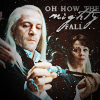
01 reason: While the composition is interesting for a larger picture, for an icon it is uninteresting and just seems to be highly lacking in anything substantial. I find it bland.
01 reason: The biggest 'irk' I have with this icon is the masking to take away Voldemort's hand. I know it looked nicer to get his hand out of the image, but it needs to be executed perfectly or close to to make it work. I can instantly tell where his hand was; Lucius's hair is oddly cut of where Voldemort's hand was, and it should be flowing, draping over his shoulder, etc. I definitely get why the maker did it, but it just is too obvious. I'd guess that's part of the reason the maker made Lucius & Narcissa smaller, to make that less obvious. That all being said, I do love the effect of making the subject smaller, I really like that in icons, and I think it's well-executed; the negative space created is wonderful. I also like the b&w; it's a good b&w icon, with strong contrast and a good array of shades from white to black. I can't stop looking at Lucius's cut-off hair though, it's distracting. Also, I don't think the added light/texture up in the right corner adds anything to the icon. It would have been better either without it, or if those added effects were closer to the subject. It almost looks as if it doesn't belong where the maker has placed it.
01 reason: In all actuality, this is not a bad icon in the slightest- I enjoy the black and white coloring, and the contrast makes the figures pop out quite nicely! However, I think the figures are perhaps a bit too small: Narcissa doesn't really look like a person, but more of a pillar, haha. In addition, I find the smudge from the texture in the upper right corner to be incredibly distracting, when the focus of the icon should be on the subject. In summary, it's a pretty graphic, I had to choose one!
01 reason: This icon is too simple, I think. The maker didn't do very much to the graphic. It doesn't show the maker's skill very well. I think it would've been more interesting if they'd added some color to the large plain black area. They could use a color orb, for example.
01 reason: While the use of negative space is well-utilized, the principle characters are not very clear. I think Lucius's hair and forehead are indistinguishable and it's over-brightened.
02 reason: The coloring on #2 lacks contrast. The purple coloring appears to be taking over the icon, there doesn't seem to be much variety (as opposed to say #4, which has a predominately red coloring but the turquoise still pops - in #2 the turquoise in blending in with the purples).
The text, also, doesn't seem to be very fitting with the screenshot. The scene is a sad one, from the Malfoys' POV. If you look at #3 and #4, the text reflects that. The characters are feeling upset and powerless in their situation and the text reflects that emotion wonderfully. Having 'true love' written alongside a scene that - at least in the movie - does not reflect a loving relationship makes little sense. The fonts used, also, are not ones generally made for being in small print and seem blurry.
02 reason: The coloring is very flat and muted, which I don't think fits the attempted theme of love/devotion between Narcissa and Lucius. The font is also slightly out of focus, making the "true" part seem not to match the "love".
02 reason: the color balance washes out all the characters and they lose their facial features.
02 reason: The icon looks a little flat & the font they choose looks a little odd. If they bold the icon up a little more & choose a more simpler font, then it would be perfect!
02 reason: The icon feels out of focus, so does the text and heart. The text blends way too much in with the icon and doesn't really seem to fit the image at all. Especially not the emotions that we know we're witnessing in the scene
03 reason: The texture used, which is more likely to be the "scratchy type" makes the image too messy. Besides, when you apply a very light texture like that in contrast with the black of the background image it's likely that the icon gets that reddish coloring which is not very fitting in the overall contest ^^ so perhaps instead of putting the layer to "screen" for example they should try "lighten", the reddish won't appear :)
03 reason: Hmm. While I adore the text and its' placement, the grainy texture is far too much for this scene - it almost overpowers the icon. It certainly pushes Lucius to the forefront, but then Narcissa is just.. there. Might've been better if you'd just blackened her out - it would've given more room for the text. Also, while the coloring is nice, it's too dark at some points, while too light at others. The only really even spot would be Lucius' right hand, holding the hilt of his cane-wand.
03 reason: The cropping on this icon I think is pretty standard, nothing outstanding as far as that goes. It looks like this creator used a texture which, instead of enhancing the overall effect, only serves to make the image look grainy. Finally, there is too much text for the space available on this icon, so it looks cramped and is hard to read.
03 reason: The texture adds a graininess that I feel is out of place, especially since it obscures Narcissa's face so much. Narcissa is kind of pushed into the background--both by the fact that her face is covered by texture and by the fact that the lighting is on Lucius--and I think this may be the point, but at the same time, all these little white specks are popping out of the background and distracting me, so Lucius isn't really the focus. Nice sharpness, though.
03 reason: The text on the icon is hard to read and I think that is because of the fonts chosen and the fact that it's a fairly up close crop.
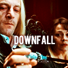
04 reason: The coluring is beautiful but the crop looks weird for me. None of the faces are centered and the text is just too big and distracting from the whole icon.
04 reason: The text is way to big for the icon and it centers all my attention. I cant really focus on the icon because of that. The coluring is beautiful.
Favourite comments
01 reason: I love how they've used negative space in this icon, it was a very good decision on the maker's part. It was something the other makes did not do, choosing instead for closer crops, and it makes #1 stand out the most. The sharpening needs a little work, however. Narcissa appears blurry, while Lucius appears almost too sharp (especially where his hairline meets the background.
Their texture use seems like it was placed with thought, the lighting towards the top right seems to balance out the icon and make the 'empty' part seem less empty - which tends to bother a lot of people with negative space icons. Another thing I need to give the maker props for is the absolutely SEAMLESS removal of Voldemort's hand to the left of Lucius. I honestly didn't even realize that it had been there until I looked closer at #3 to wonder what that thing was in his hair. XD
01 reason: Love the use of B/W and contrast.
01 reason: This one is a beautiful icon. I like the placement of Lucius and Narcissa in black & white combined with the black space of the rest of the icon.
01 reason: I really love the simplicity of this icon just using the black & white and it also shows a lot of emotion! Very beautiful! I also love the placement of the picture!
01 reason: The crop is nice and the negative space doesn't draw away from the icon but puts your attention at Lucius and Narcissa. The icon is nicely contrasted as well.
02 reason: I like the cropping and the colouring. The placement of the text as well as the text itself is nice.
02 reason: While I am not one for 'Cissa/Lucious as a true love pairing, the lighting and text seem to work wonderfully.
04 reason: omg the coloring is so bright and vibrant without being overly harsh or unnatural looking. I love that you can see the scruff he has so clearly, it makes the text of "Downfall" even more powerful. The cropping is expertly done, drawing the eye to Lucius but still not leaving out Narcissa.
04 reason: The crop is interesting, and the text is placed beautifully in relation to the rest of the image. The color and contrast is fantastic.
04 reason: Wow! Not only is the text placement spectacularly done, but I love the crop and coloring. It really highlights Lucius' ragged appearance and Narcissa's concerned look, mirroring the text nicely. Additionally, the spot of red in the upper half makes the icon more vibrant and makes the eye look at the entire icon, rather than just focusing on one point and stopping.
04 reason: I choose this icon for my favourite because it's very unique from the rest. I love the warm, sepia-toned coloring used. Icon 1 is b&w, 2 & 3 are blue-toned [2 does have some warmth to it], so this icon really stands out among the rest. It isn't cropped as well as it could be, but this screencap was pretty hard to get a good crop [not to say I don't like the base image, because I do; I like that it's a challenge]. The text is very fitting for the image and what is going on in this scene, the coloring is unique, and not only that, but it's just good coloring. The colors are bright, there's a lot of great contrast, and it's nice and smooth. The gorgeous coloring used in this icon makes it really strong and stand out from the rest.
04 reason: Although the text nearly obscures Narcissa's face, I actually love the placing and shading that you gave it- it really pops on the screen and draws attention to what Lucius is actually doing! The brownish coloring you've chosen is quite nice as well, draws out shadows and features of the photo and makes the icon warmer than the events of the scene, hee :)
04 reason: With this one, I do very much like the cropping. It shows only exactly what needs to be seen: the Malfoys' facial expressions and the wand. I like the coloring very much as well; it's much more saturated on this icon and it makes the icon pop. Finally, I love the text placement on this icon. It's simple, with just one effective/appropriate word and it's placed right in the center of the icon, in between the three elements I mentioned were the most important in the picture (Lucius' face, Narcissa's face, and the wand). I'm very impressed with this one.
04 reason: This icon has very nice coloring. It is vibrant, but not in a way of making it look fake. The text is very nice, the glow behind it really bringing out the text and making it the main eye-catcher. I also really love the crop.
04 reason: the colouring is wonderful, and not just in comparison to the rest, it's really made the image come to life. The text is VERY fitting, and the way you read it and end on Narcissa's face is just fantastic because it goes with the test so well. Plus, the way Lucius is looking down on it. Very nicely done.
04 reason: The text placement manages to be very clear and visible without obscuring important detail. Good sharpness, nice coloring.
04 reason: I think the text is well-placed as it is beside Narcissa's face, giving both characters equal notice within the icon. I think the word count was good as well and the coloring brought out a nice red in the background and in Narcissa's face which further brought her to light.
HiH points
Elimination
Unfortunately we have to say goodbye to the following participant:
blackestbird
#03 [+00 -05] = -05
Alicia won people's choice in rounds 5, 10, 11, was the overall winner of round one, and is one of our most dedicated voters.
Thank you so much for participating and congratulations for making it this far! I'd have loved to see you in the final challenge again, I hope you'll come back for round three!
People's Choice
scatteredintime
#04 [+10 -02] = +08
Congrats! Please note that we are down to so few participants in this round that immunity is no longer granted.
Mods' Choice
Not enough entries for a Mod's Choice. :)
Points
+ are positive/favourite votes
- are negative/least favourite votes
Voting post for reference
01. [+05 -05] = 00
02. [+02 -05] = -03
03. [+00 -05] = -05
04. [+10 -02] = +08
Least favourite comments
01 reason: While the composition is interesting for a larger picture, for an icon it is uninteresting and just seems to be highly lacking in anything substantial. I find it bland.
01 reason: The biggest 'irk' I have with this icon is the masking to take away Voldemort's hand. I know it looked nicer to get his hand out of the image, but it needs to be executed perfectly or close to to make it work. I can instantly tell where his hand was; Lucius's hair is oddly cut of where Voldemort's hand was, and it should be flowing, draping over his shoulder, etc. I definitely get why the maker did it, but it just is too obvious. I'd guess that's part of the reason the maker made Lucius & Narcissa smaller, to make that less obvious. That all being said, I do love the effect of making the subject smaller, I really like that in icons, and I think it's well-executed; the negative space created is wonderful. I also like the b&w; it's a good b&w icon, with strong contrast and a good array of shades from white to black. I can't stop looking at Lucius's cut-off hair though, it's distracting. Also, I don't think the added light/texture up in the right corner adds anything to the icon. It would have been better either without it, or if those added effects were closer to the subject. It almost looks as if it doesn't belong where the maker has placed it.
01 reason: In all actuality, this is not a bad icon in the slightest- I enjoy the black and white coloring, and the contrast makes the figures pop out quite nicely! However, I think the figures are perhaps a bit too small: Narcissa doesn't really look like a person, but more of a pillar, haha. In addition, I find the smudge from the texture in the upper right corner to be incredibly distracting, when the focus of the icon should be on the subject. In summary, it's a pretty graphic, I had to choose one!
01 reason: This icon is too simple, I think. The maker didn't do very much to the graphic. It doesn't show the maker's skill very well. I think it would've been more interesting if they'd added some color to the large plain black area. They could use a color orb, for example.
01 reason: While the use of negative space is well-utilized, the principle characters are not very clear. I think Lucius's hair and forehead are indistinguishable and it's over-brightened.
02 reason: The coloring on #2 lacks contrast. The purple coloring appears to be taking over the icon, there doesn't seem to be much variety (as opposed to say #4, which has a predominately red coloring but the turquoise still pops - in #2 the turquoise in blending in with the purples).
The text, also, doesn't seem to be very fitting with the screenshot. The scene is a sad one, from the Malfoys' POV. If you look at #3 and #4, the text reflects that. The characters are feeling upset and powerless in their situation and the text reflects that emotion wonderfully. Having 'true love' written alongside a scene that - at least in the movie - does not reflect a loving relationship makes little sense. The fonts used, also, are not ones generally made for being in small print and seem blurry.
02 reason: The coloring is very flat and muted, which I don't think fits the attempted theme of love/devotion between Narcissa and Lucius. The font is also slightly out of focus, making the "true" part seem not to match the "love".
02 reason: the color balance washes out all the characters and they lose their facial features.
02 reason: The icon looks a little flat & the font they choose looks a little odd. If they bold the icon up a little more & choose a more simpler font, then it would be perfect!
02 reason: The icon feels out of focus, so does the text and heart. The text blends way too much in with the icon and doesn't really seem to fit the image at all. Especially not the emotions that we know we're witnessing in the scene
03 reason: The texture used, which is more likely to be the "scratchy type" makes the image too messy. Besides, when you apply a very light texture like that in contrast with the black of the background image it's likely that the icon gets that reddish coloring which is not very fitting in the overall contest ^^ so perhaps instead of putting the layer to "screen" for example they should try "lighten", the reddish won't appear :)
03 reason: Hmm. While I adore the text and its' placement, the grainy texture is far too much for this scene - it almost overpowers the icon. It certainly pushes Lucius to the forefront, but then Narcissa is just.. there. Might've been better if you'd just blackened her out - it would've given more room for the text. Also, while the coloring is nice, it's too dark at some points, while too light at others. The only really even spot would be Lucius' right hand, holding the hilt of his cane-wand.
03 reason: The cropping on this icon I think is pretty standard, nothing outstanding as far as that goes. It looks like this creator used a texture which, instead of enhancing the overall effect, only serves to make the image look grainy. Finally, there is too much text for the space available on this icon, so it looks cramped and is hard to read.
03 reason: The texture adds a graininess that I feel is out of place, especially since it obscures Narcissa's face so much. Narcissa is kind of pushed into the background--both by the fact that her face is covered by texture and by the fact that the lighting is on Lucius--and I think this may be the point, but at the same time, all these little white specks are popping out of the background and distracting me, so Lucius isn't really the focus. Nice sharpness, though.
03 reason: The text on the icon is hard to read and I think that is because of the fonts chosen and the fact that it's a fairly up close crop.
04 reason: The coluring is beautiful but the crop looks weird for me. None of the faces are centered and the text is just too big and distracting from the whole icon.
04 reason: The text is way to big for the icon and it centers all my attention. I cant really focus on the icon because of that. The coluring is beautiful.
Favourite comments
01 reason: I love how they've used negative space in this icon, it was a very good decision on the maker's part. It was something the other makes did not do, choosing instead for closer crops, and it makes #1 stand out the most. The sharpening needs a little work, however. Narcissa appears blurry, while Lucius appears almost too sharp (especially where his hairline meets the background.
Their texture use seems like it was placed with thought, the lighting towards the top right seems to balance out the icon and make the 'empty' part seem less empty - which tends to bother a lot of people with negative space icons. Another thing I need to give the maker props for is the absolutely SEAMLESS removal of Voldemort's hand to the left of Lucius. I honestly didn't even realize that it had been there until I looked closer at #3 to wonder what that thing was in his hair. XD
01 reason: Love the use of B/W and contrast.
01 reason: This one is a beautiful icon. I like the placement of Lucius and Narcissa in black & white combined with the black space of the rest of the icon.
01 reason: I really love the simplicity of this icon just using the black & white and it also shows a lot of emotion! Very beautiful! I also love the placement of the picture!
01 reason: The crop is nice and the negative space doesn't draw away from the icon but puts your attention at Lucius and Narcissa. The icon is nicely contrasted as well.
02 reason: I like the cropping and the colouring. The placement of the text as well as the text itself is nice.
02 reason: While I am not one for 'Cissa/Lucious as a true love pairing, the lighting and text seem to work wonderfully.
04 reason: omg the coloring is so bright and vibrant without being overly harsh or unnatural looking. I love that you can see the scruff he has so clearly, it makes the text of "Downfall" even more powerful. The cropping is expertly done, drawing the eye to Lucius but still not leaving out Narcissa.
04 reason: The crop is interesting, and the text is placed beautifully in relation to the rest of the image. The color and contrast is fantastic.
04 reason: Wow! Not only is the text placement spectacularly done, but I love the crop and coloring. It really highlights Lucius' ragged appearance and Narcissa's concerned look, mirroring the text nicely. Additionally, the spot of red in the upper half makes the icon more vibrant and makes the eye look at the entire icon, rather than just focusing on one point and stopping.
04 reason: I choose this icon for my favourite because it's very unique from the rest. I love the warm, sepia-toned coloring used. Icon 1 is b&w, 2 & 3 are blue-toned [2 does have some warmth to it], so this icon really stands out among the rest. It isn't cropped as well as it could be, but this screencap was pretty hard to get a good crop [not to say I don't like the base image, because I do; I like that it's a challenge]. The text is very fitting for the image and what is going on in this scene, the coloring is unique, and not only that, but it's just good coloring. The colors are bright, there's a lot of great contrast, and it's nice and smooth. The gorgeous coloring used in this icon makes it really strong and stand out from the rest.
04 reason: Although the text nearly obscures Narcissa's face, I actually love the placing and shading that you gave it- it really pops on the screen and draws attention to what Lucius is actually doing! The brownish coloring you've chosen is quite nice as well, draws out shadows and features of the photo and makes the icon warmer than the events of the scene, hee :)
04 reason: With this one, I do very much like the cropping. It shows only exactly what needs to be seen: the Malfoys' facial expressions and the wand. I like the coloring very much as well; it's much more saturated on this icon and it makes the icon pop. Finally, I love the text placement on this icon. It's simple, with just one effective/appropriate word and it's placed right in the center of the icon, in between the three elements I mentioned were the most important in the picture (Lucius' face, Narcissa's face, and the wand). I'm very impressed with this one.
04 reason: This icon has very nice coloring. It is vibrant, but not in a way of making it look fake. The text is very nice, the glow behind it really bringing out the text and making it the main eye-catcher. I also really love the crop.
04 reason: the colouring is wonderful, and not just in comparison to the rest, it's really made the image come to life. The text is VERY fitting, and the way you read it and end on Narcissa's face is just fantastic because it goes with the test so well. Plus, the way Lucius is looking down on it. Very nicely done.
04 reason: The text placement manages to be very clear and visible without obscuring important detail. Good sharpness, nice coloring.
04 reason: I think the text is well-placed as it is beside Narcissa's face, giving both characters equal notice within the icon. I think the word count was good as well and the coloring brought out a nice red in the background and in Narcissa's face which further brought her to light.
HiH points