Results - Round 02 Challenge 11
Thanks for voting everyone! Here are the results for the 11th challenge of round two.
Eliminations
Unfortunately we have to say goodbye to the following participant:

sallyna_smile
#04 [+00 -05] = -05
Thank you so much for participating and congratulations for making it this far! I hope you will stick around for voting.
People's Choice

blackestbird
#03 [+03 -00] = +03
Congrats! Please note that we are down to so few participants in this round that immunity is no longer granted.
Mods' Choice
Not enough entries for a Mod's Choice. :)
Points
+ are positive/favorite votes
- are negative/least favorite votes
Voting post for reference
01. [+01 -00] = +01
02. [+03 -02] = +01
03. [+03 -00] = +03
04. [+00 -05] = -05
Least favourite comments
02 reason: I do like the coloring on this one, however the tiny text and box texture doesn't fit at all and seems to out-date the icon. The icon doesn't seem to have any dimension to it - something that the other three have created using soft light and textures.
02 reason: It's not that this is a bad icon, not at all! I just find the coloring to be a little bit drab, and that Ron's illumination is especially distracting with the texture you've chosen. I find the little graphic element at the bottom to be quite nice, however. I'm sorry I had to pick a least favorite, for this is still a high quality graphic!
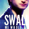
04 reason: While I love the vibrance of your colouring, it's a bit too much towards the purples in Harry's face and it makes him look really unnatural. Additionally, the text could've been done much better. The fact that only half of "swallow" is to see really disctracts from the icon and it actually makes it a bit hard to enjoy the icon because you first have to figure out what the text says. Also, white is usually very good for text but in this case it's very overpowering and something should've been done about a glow set to multiply or burn because I can't even make out the second L of the "swallow" piece unless I try really hard.
04 reason: The cropping is a very close crop and it's not focussed in anything! The ext is very big and bright and I can't really get what it says. I don't know if that is because the last letter is missin in the white background...
04 reason: The text is very big and distracts the attention from the whole icon. The crop is very close and I can't really focuss on anything there. The colouring is beautiful, though.
04 reason: WHile I adore the composition/text placement as a whole, the cropping of the word "swallow" (?) really could've been executed better. As it is, I have to guess which word the largest one is, though swallow seems like a good choice. Additionally, the link between the image and text is missing - how does it relate to this single image of Harry?
(Unless you're trying to go for a complicated presentation of how the Boy Who Lived/Hero of the Wizarding World is swallowing up the young man called Harry James Potter. But I think I'm going too detailed for a 100x100 icon. XD Have I mentioned that I am working on an in-depth literary analysis paper for English right now? ;)
04 reason: The icon looks kind of blurry. Maybe if they sharpen it up more it would look better. And the font is very hard to understand it if you don't concentrate what it is. If they make it smaller maybe it would be more easier to understand it more.
Favourite comments
01 reason: I really like the coloring in this icon! I gives a lot of emotion in it. I also like the font they choose and where they placed it! Very creative!
02 reason: I love the colouring. It's very fitting to the mood of the icon but it doesn't leave the trio looking ill. The icon is nicely sharpened and the boxes and tiny text enhance it without making me lose focus of the trio. Great job!
02 reason: The cropping and the colouring are both beautiful, as well as the placement of the tiny text and the little squares!
02 reason: I love the simplicity of this icon! While the faded squares above the tiny text seem like a bit much, this is otherwise a very well executed icon! I love the clean and simple look, and the faded/muted colors of the image really nicely reflect the predominantly dark themes of Deathly Hallows.
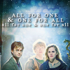
03 reason: I'm not quite sure what specific element captivates me concerning this icon; perhaps it's the blend of coloring, light texture, positioning, and effective use of text that makes it overall brilliant! Usually I am frustrated by barely legible text, but the fact that the "all for one & one for all" is so cleverly placed and shaded makes the rest of the text irrelevant- and wonderfully so :) Well done, o mystery icon maker!
03 reason: The colouring of this one is beautiful although there is a bit too much light in the centre of the icon! I also like the placement of the text and the font used.
The crop is also beautiful!
03 reason: No question, this is my favorite icon of the four. The text is very fitting, and I love the way they've framed it and especially their texture use. I wish they had brought Ron out more (possibly with a soft light layer just over him), but I can't fault them for something that's really due to the screenshot itself.
Two additional comments were left by one voter, so have those too:
01 - #1 is also beautiful as far as coloring goes, they're very vivid and lovely, however I don't really care for that text. The "INTO THE" is nice, however the "UNKNOWN" is very cartoony and takes away from the seriousness of the scene.
04 - I have a feeling #4 may be eliminated due to the text (which really, doesn't seem like a very good choice as 1. the words don't fit the image and 2. it really looks like it just says "SWAL ME WHOLE"), which is a shame because the coloring is GORGEOUS. I'd love to use this icon if only it weren't for the text.
HiH points
Eliminations
Unfortunately we have to say goodbye to the following participant:

sallyna_smile
#04 [+00 -05] = -05
Thank you so much for participating and congratulations for making it this far! I hope you will stick around for voting.
People's Choice

blackestbird
#03 [+03 -00] = +03
Congrats! Please note that we are down to so few participants in this round that immunity is no longer granted.
Mods' Choice
Not enough entries for a Mod's Choice. :)
Points
+ are positive/favorite votes
- are negative/least favorite votes
Voting post for reference
01. [+01 -00] = +01
02. [+03 -02] = +01
03. [+03 -00] = +03
04. [+00 -05] = -05
Least favourite comments
02 reason: I do like the coloring on this one, however the tiny text and box texture doesn't fit at all and seems to out-date the icon. The icon doesn't seem to have any dimension to it - something that the other three have created using soft light and textures.
02 reason: It's not that this is a bad icon, not at all! I just find the coloring to be a little bit drab, and that Ron's illumination is especially distracting with the texture you've chosen. I find the little graphic element at the bottom to be quite nice, however. I'm sorry I had to pick a least favorite, for this is still a high quality graphic!
04 reason: While I love the vibrance of your colouring, it's a bit too much towards the purples in Harry's face and it makes him look really unnatural. Additionally, the text could've been done much better. The fact that only half of "swallow" is to see really disctracts from the icon and it actually makes it a bit hard to enjoy the icon because you first have to figure out what the text says. Also, white is usually very good for text but in this case it's very overpowering and something should've been done about a glow set to multiply or burn because I can't even make out the second L of the "swallow" piece unless I try really hard.
04 reason: The cropping is a very close crop and it's not focussed in anything! The ext is very big and bright and I can't really get what it says. I don't know if that is because the last letter is missin in the white background...
04 reason: The text is very big and distracts the attention from the whole icon. The crop is very close and I can't really focuss on anything there. The colouring is beautiful, though.
04 reason: WHile I adore the composition/text placement as a whole, the cropping of the word "swallow" (?) really could've been executed better. As it is, I have to guess which word the largest one is, though swallow seems like a good choice. Additionally, the link between the image and text is missing - how does it relate to this single image of Harry?
(Unless you're trying to go for a complicated presentation of how the Boy Who Lived/Hero of the Wizarding World is swallowing up the young man called Harry James Potter. But I think I'm going too detailed for a 100x100 icon. XD Have I mentioned that I am working on an in-depth literary analysis paper for English right now? ;)
04 reason: The icon looks kind of blurry. Maybe if they sharpen it up more it would look better. And the font is very hard to understand it if you don't concentrate what it is. If they make it smaller maybe it would be more easier to understand it more.
Favourite comments
01 reason: I really like the coloring in this icon! I gives a lot of emotion in it. I also like the font they choose and where they placed it! Very creative!
02 reason: I love the colouring. It's very fitting to the mood of the icon but it doesn't leave the trio looking ill. The icon is nicely sharpened and the boxes and tiny text enhance it without making me lose focus of the trio. Great job!
02 reason: The cropping and the colouring are both beautiful, as well as the placement of the tiny text and the little squares!
02 reason: I love the simplicity of this icon! While the faded squares above the tiny text seem like a bit much, this is otherwise a very well executed icon! I love the clean and simple look, and the faded/muted colors of the image really nicely reflect the predominantly dark themes of Deathly Hallows.
03 reason: I'm not quite sure what specific element captivates me concerning this icon; perhaps it's the blend of coloring, light texture, positioning, and effective use of text that makes it overall brilliant! Usually I am frustrated by barely legible text, but the fact that the "all for one & one for all" is so cleverly placed and shaded makes the rest of the text irrelevant- and wonderfully so :) Well done, o mystery icon maker!
03 reason: The colouring of this one is beautiful although there is a bit too much light in the centre of the icon! I also like the placement of the text and the font used.
The crop is also beautiful!
03 reason: No question, this is my favorite icon of the four. The text is very fitting, and I love the way they've framed it and especially their texture use. I wish they had brought Ron out more (possibly with a soft light layer just over him), but I can't fault them for something that's really due to the screenshot itself.
Two additional comments were left by one voter, so have those too:
01 - #1 is also beautiful as far as coloring goes, they're very vivid and lovely, however I don't really care for that text. The "INTO THE" is nice, however the "UNKNOWN" is very cartoony and takes away from the seriousness of the scene.
04 - I have a feeling #4 may be eliminated due to the text (which really, doesn't seem like a very good choice as 1. the words don't fit the image and 2. it really looks like it just says "SWAL ME WHOLE"), which is a shame because the coloring is GORGEOUS. I'd love to use this icon if only it weren't for the text.
HiH points