Results - Round 02 Challenge 10
Thanks for voting everyone! Here are the results for the 10th challenge of round two.
Eliminations
Unfortunately we have to say goodbye to the following participants:
easels
#03 [+01 -04] + #15 [+01 -01] = -03
shadowshamrock
#09 [+02 -02] + #13 [+01 -03] = -02
Thank you so much for participating! I hope you will stick around for voting.
People's Choice
blackestbird
#07 [+04 -01] + #16 [+04 -00] = +07
Congrats! You have immunity for the next challenge. You will still need to submit an icon (or use a skip), but you cannot be eliminated.
Mods' Choice
easels
#03 & #15
For what it's worth, I really love your second icon and I don't think your first one is a bad icon at all. Both your entries look like a considerable amount of thought and effort went into them, and I'm really sorry you got voted out with those entries!
Points
+ are positive/favorite votes
- are negative/least favorite votes
Voting post for reference
01. [+02 -00] + 12. [+01 -01] = +02
02. [+02 -01] + 10. [+01 -00] = +02
03. [+01 -04] + 15. [+01 -01] = -03
04. [+01 -05] + 05. [+02 -06] = -08 (saved by immunity from challenge 09)
06. [+02 -00] + 11. [+01 -01] = +02
07. [+04 -01] + 16. [+04 -00] = +07
08. [+01 -00] + 14. [+01 -02] = 00
09. [+02 -02] + 13. [+01 -03] = +01
Least favourite comments
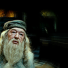
02 reason: The colouring is nice but a little flat. However, the darkness of Dumbledore's beard really gives the icon a sort of unaltered look, like nothing was actually done about it except for cropping and text. Something brighter might have been better suited, even if a dark look was intended. I am assuming that a texture was used because of the diagonal lines and I applaud everyone who uses textures because lots of people can't work with them, but here the texture makes the icon look like a really bad quality picture was used. I like the text, because it usually fits what people feel towards Dumbledore, but in this scene it's kind of inappropriate because we can't see the other person who might feel like that and Dumbledore doesn't look like he's adoring someone or something either. Here again, the text colour could've been brighter to achieve a less grey effect but I quite like that the colour was taken from the icon - an inside source.
03 reason: It just looks over-saturated and bright. Its hard to make out who is on the icon and the division makes it kind of confusing. I think its lacking a focus. The edges of this one are very creative though!
03 reason: The image isn't very well defined. I can't even really see what is going on in this icon.
03 reason: The composition is very intriguing however the coloring is oversaturated which washes out the subject completely. It feels like I'm looking at a giant blob of yellow first glance I had to go back and look.
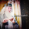
03 reason: While the idea of this icon is brilliant, I think that the usage of four images is a bit too overpowering - it's hard to focus on just one image of Dumbledore as a center point, let alone make out details. (Perhaps if you'd taken out the smallest one on the right side, and made the whole right half larger, leaving the two smaller ones to the left, it would be a more effective composition.) Additionally, the coloring is OK, but might be better were it lighter and more vibrant.
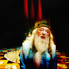
04 reason: Another icon that could have been interesting composition icon ruined by coloring. The yellow is too bright drawing away from Dumbledore along with text that's not legible and overpowered by texture.
04 reason: The texture looks kind of odd with the picture and font. It's kind of hard to see everything in the icon. Font kind of blends into the icon too. Maybe darkening it I think will make it better.
04 reason: The colors seem to clash into one another. The text is barely readable... Perhaps a different color scheme?
04 reason: The coloring and text placement do not compliment the image. The glare takes away from the text.
04 reason: While the cropping is special, the colours of the icon are extremely bright. I like the green/yellow hues but they make Dumbledore look like he's suffering from an illness. I like the text choice (both words and font) and its placement, but it's hard to decipher the letters because they're either too thin or on the white of the cloudy background and on the whole the icon is just too graish looking, although I like the concept.
05 reason: The text distracts from the image rather than compliments it.
05 reason: The text looks good, however, the image could have been sharpened a little more.
05 reason: Though the cropping is creative Dumbledore looks weird with the second eye only half in the icon. The bright yellow is in contrast with the text which is rather sad. Maybe a blue would be better?
05 reason: The way the text overlaps Dumbledore doesn't really work very well and the text actually looks a little blurry, which might be due to it covering the image.
05 reason: The cropping of the picture looks a little odd combined with the font over-layering it. Maybe if they even it out a little more and then it will be perfect!
05 reason: While the cropping is wonderful, the text is distracting and takes away from it.
07 reason: The image looks washed out. The text is grainy.
09 reason: Both images of Albus here appear flat, that is to say they are lacking in some nice contrast. The text on the side adds nothing, and does not appear to make sense with the subject or images used.
09 reason: Though this concept is gorgeous and well-executed with the double-images of Dumbledore, the textures layered on top wash this icon out. The most prominent thing which I think should be removed is the white text - if it's removed, then the background flows a bit more smoothly and all attention is on the images. Additionally, you could have lightened those images/made the colors of the icon as a whole more vibrant, to help make it pop.
11 reason: The texture they used kind of made the icon flat. Maybe make it a little more bold and then it'll be good!
12 reason: The image looks rather blurry. Perhaps it could be sharpened more?
13 reason: Even though i like the cropping and the resulting negative space there is not much happening on this icon. The focus is on Dumbledore but with no text or texture it just looks like a cropped image. Maybe you could play around with color settings to make it look more interessting?
13 reason: While the crop is nicely done, the image seems really blank and plain. Not only are there no effects on top of the image, but there's a huge chunk of negative space to the right. It doesn't really help to focus one's attention on Dumbledore; instead, it almost distracts from him. (A brighter, more colorful image would help to counter that; then the contrasts would balance out.)
13 reason: The cropping is nice, but the icon doesn't really stick out. The background is very dark, Dumbles looks like he could use some colour - either through some contrast or by raising the saturation and some extra layers to bring in some colour. All in all it looks very flat, there's no depth to it, which is unfortunate because I really do like the initial cropping. Additionally, there's such a large dark part, something brighter - like text or a simply large blot of white set to soft light - could really liven it up.
14 reason: I love the idea and the fact that his first name was used instead of his last but that's the only good thing about this icon. The photo itself wasn't colored nicely and it looks like a oversharpened mess. Its sharpened it parts that should be softened and softened in parts that should have been sharpened. The coloring also washes it out making it look like a hot mess.
14 reason: I love the coloring and the crispness here, but the name and red at the bottom are very distracting. I think this would have been nice with a heavy amount of negative space, or perhaps the red changed to a more earthy tone pulled from Dumbledore.
15 reason: The coloring is gorgeous, but Dumbledore is a little too blurry in this icon.
Favourite comments
01 reason: Great use of black and white.
01 reason: I really like that texture that they used! It makes the mood really cool!
02 reason: Crisp and clean but good font choice along with text and a subtle texture to give some oomph but not too overpowering.
02 reason: The cropping is gorgeous and I really love the text. I think the font really compliments the image.
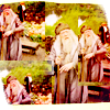
03 reason: Gorgeous colouring. It makes the icon look very vibrant. The cropping is amazing. I love the uneven edges and how the picture was re-used several times. It makes the icon special and really makes the viewer look at it to see the real Dumbledore.
04 reason: I adore the bright coloring in this one! The text placement is wonderful as well.
05 reason: Exquisite cropping. The text was done brilliantly, it really brings out what Dumbledore looks like in that moment and the half-cropped face gives him a lot of focus while not being generic and common. In contrast to that the dark part of the icon adds to that moment because it's so static and doesn't distract from the actual subject of the icon.
05 reason: A daring crop and the text join nicely together. I would have lightened the yellow a tad but its not overpowering and making me cringe as others with the same coloring in this batch.
06 reason: I adore the composition - it's got just the right amount of negative and positive space. The text doesn't overpower the image. The coloring is a bit too red for my tastes, but it works well to accent the image and text. Well done!
06 reason: I like the use of color here. The red-ish color gives the icon a certain positive touch and the text emphasizes this.
07 reason: I like the contrast in this one. The bright Dumbledore seems to shine in the darkness on the right. The text goes really well with the icon for he looks like he is just about to make some plans.
07 reason: Wow, such a wonderful icon! Not only does the small text balance out the tiny text, but the black sidebar with light textures/grainy white dots really helps to pull everything together. My only concern is that the image seems a bit too faded, but I think that's probably an effect you were going for.
07 reason: The cropping with the black on the side is great and give interest, and the text is fitting. I love their use of texture.
07 reason: I love the use of textures in this.
08 reason: I love how sharp the image is. The coloring really compliments the original image.
09 reason: I love love love love love this icon. The two images are blended perfectly. The text placement is complimentary. The texture is awesome.
09 reason: I love the blending and coloring! This icon is nothing but brilliant also in the use of texture!
10 reason: I love the coloring and the way this is cropped.
11 reason: Not sure if this will be ~popular opinion~ at all, but I think this coloring is genius. It's very different from the other colorings made from that screencap and it's still very clear and the background looks natural.
12 reason: I really like the splitting of the image! It shows two different emotions in one icon.
13 reason: I love the crop. The coloring is also nice. The image has been sharpened the perfect amount.
14 reason: While I'm not a big fan of how you've colored the image, (too orange and brown for my tastes) I do adore the unique composition. Not only does the white negative space make this icon pop out, but the red bar at the bottom with the word "Albus" is quite ingenious!
15 reason: Oh brilliant use of coloring levels and a fine way to use textures to draw a viewer's attention toward Dumbledore. Bravo!
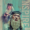
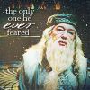
16 reason: Great icon. The light colouring and foggy texture give Dumbledore an aura of light, exactly what you would expect from the leader of the Light side. The colouring also really brings out the blue in his robes, which may remind of his blue eyes. Same for the white dots that most likely belong to the texture used; they kind of remind of his twinkling eyes. Text is well chosen, but it's a bit difficult to read. However, the font change for 'ever' makes up for that. It works really well and the icon has this sort of flowing feel to it, because everything fits.
16 reason: I love the colors and the text that went with it!
16 reason: I also liked the texture they used on this one too! And I really like where they placed the font. Very cool!
16 reason: The text is a little hard to read, but I love the overall coloring and texture on this icon so much.
HiH points
Eliminations
Unfortunately we have to say goodbye to the following participants:
easels
#03 [+01 -04] + #15 [+01 -01] = -03
shadowshamrock
#09 [+02 -02] + #13 [+01 -03] = -02
Thank you so much for participating! I hope you will stick around for voting.
People's Choice
blackestbird
#07 [+04 -01] + #16 [+04 -00] = +07
Congrats! You have immunity for the next challenge. You will still need to submit an icon (or use a skip), but you cannot be eliminated.
Mods' Choice
easels
#03 & #15
For what it's worth, I really love your second icon and I don't think your first one is a bad icon at all. Both your entries look like a considerable amount of thought and effort went into them, and I'm really sorry you got voted out with those entries!
Points
+ are positive/favorite votes
- are negative/least favorite votes
Voting post for reference
01. [+02 -00] + 12. [+01 -01] = +02
02. [+02 -01] + 10. [+01 -00] = +02
03. [+01 -04] + 15. [+01 -01] = -03
04. [+01 -05] + 05. [+02 -06] = -08 (saved by immunity from challenge 09)
06. [+02 -00] + 11. [+01 -01] = +02
07. [+04 -01] + 16. [+04 -00] = +07
08. [+01 -00] + 14. [+01 -02] = 00
09. [+02 -02] + 13. [+01 -03] = +01
Least favourite comments
02 reason: The colouring is nice but a little flat. However, the darkness of Dumbledore's beard really gives the icon a sort of unaltered look, like nothing was actually done about it except for cropping and text. Something brighter might have been better suited, even if a dark look was intended. I am assuming that a texture was used because of the diagonal lines and I applaud everyone who uses textures because lots of people can't work with them, but here the texture makes the icon look like a really bad quality picture was used. I like the text, because it usually fits what people feel towards Dumbledore, but in this scene it's kind of inappropriate because we can't see the other person who might feel like that and Dumbledore doesn't look like he's adoring someone or something either. Here again, the text colour could've been brighter to achieve a less grey effect but I quite like that the colour was taken from the icon - an inside source.
03 reason: It just looks over-saturated and bright. Its hard to make out who is on the icon and the division makes it kind of confusing. I think its lacking a focus. The edges of this one are very creative though!
03 reason: The image isn't very well defined. I can't even really see what is going on in this icon.
03 reason: The composition is very intriguing however the coloring is oversaturated which washes out the subject completely. It feels like I'm looking at a giant blob of yellow first glance I had to go back and look.
03 reason: While the idea of this icon is brilliant, I think that the usage of four images is a bit too overpowering - it's hard to focus on just one image of Dumbledore as a center point, let alone make out details. (Perhaps if you'd taken out the smallest one on the right side, and made the whole right half larger, leaving the two smaller ones to the left, it would be a more effective composition.) Additionally, the coloring is OK, but might be better were it lighter and more vibrant.
04 reason: Another icon that could have been interesting composition icon ruined by coloring. The yellow is too bright drawing away from Dumbledore along with text that's not legible and overpowered by texture.
04 reason: The texture looks kind of odd with the picture and font. It's kind of hard to see everything in the icon. Font kind of blends into the icon too. Maybe darkening it I think will make it better.
04 reason: The colors seem to clash into one another. The text is barely readable... Perhaps a different color scheme?
04 reason: The coloring and text placement do not compliment the image. The glare takes away from the text.
04 reason: While the cropping is special, the colours of the icon are extremely bright. I like the green/yellow hues but they make Dumbledore look like he's suffering from an illness. I like the text choice (both words and font) and its placement, but it's hard to decipher the letters because they're either too thin or on the white of the cloudy background and on the whole the icon is just too graish looking, although I like the concept.
05 reason: The text distracts from the image rather than compliments it.
05 reason: The text looks good, however, the image could have been sharpened a little more.
05 reason: Though the cropping is creative Dumbledore looks weird with the second eye only half in the icon. The bright yellow is in contrast with the text which is rather sad. Maybe a blue would be better?
05 reason: The way the text overlaps Dumbledore doesn't really work very well and the text actually looks a little blurry, which might be due to it covering the image.
05 reason: The cropping of the picture looks a little odd combined with the font over-layering it. Maybe if they even it out a little more and then it will be perfect!
05 reason: While the cropping is wonderful, the text is distracting and takes away from it.
07 reason: The image looks washed out. The text is grainy.
09 reason: Both images of Albus here appear flat, that is to say they are lacking in some nice contrast. The text on the side adds nothing, and does not appear to make sense with the subject or images used.
09 reason: Though this concept is gorgeous and well-executed with the double-images of Dumbledore, the textures layered on top wash this icon out. The most prominent thing which I think should be removed is the white text - if it's removed, then the background flows a bit more smoothly and all attention is on the images. Additionally, you could have lightened those images/made the colors of the icon as a whole more vibrant, to help make it pop.
11 reason: The texture they used kind of made the icon flat. Maybe make it a little more bold and then it'll be good!
12 reason: The image looks rather blurry. Perhaps it could be sharpened more?
13 reason: Even though i like the cropping and the resulting negative space there is not much happening on this icon. The focus is on Dumbledore but with no text or texture it just looks like a cropped image. Maybe you could play around with color settings to make it look more interessting?
13 reason: While the crop is nicely done, the image seems really blank and plain. Not only are there no effects on top of the image, but there's a huge chunk of negative space to the right. It doesn't really help to focus one's attention on Dumbledore; instead, it almost distracts from him. (A brighter, more colorful image would help to counter that; then the contrasts would balance out.)
13 reason: The cropping is nice, but the icon doesn't really stick out. The background is very dark, Dumbles looks like he could use some colour - either through some contrast or by raising the saturation and some extra layers to bring in some colour. All in all it looks very flat, there's no depth to it, which is unfortunate because I really do like the initial cropping. Additionally, there's such a large dark part, something brighter - like text or a simply large blot of white set to soft light - could really liven it up.
14 reason: I love the idea and the fact that his first name was used instead of his last but that's the only good thing about this icon. The photo itself wasn't colored nicely and it looks like a oversharpened mess. Its sharpened it parts that should be softened and softened in parts that should have been sharpened. The coloring also washes it out making it look like a hot mess.
14 reason: I love the coloring and the crispness here, but the name and red at the bottom are very distracting. I think this would have been nice with a heavy amount of negative space, or perhaps the red changed to a more earthy tone pulled from Dumbledore.
15 reason: The coloring is gorgeous, but Dumbledore is a little too blurry in this icon.
Favourite comments
01 reason: Great use of black and white.
01 reason: I really like that texture that they used! It makes the mood really cool!
02 reason: Crisp and clean but good font choice along with text and a subtle texture to give some oomph but not too overpowering.
02 reason: The cropping is gorgeous and I really love the text. I think the font really compliments the image.
03 reason: Gorgeous colouring. It makes the icon look very vibrant. The cropping is amazing. I love the uneven edges and how the picture was re-used several times. It makes the icon special and really makes the viewer look at it to see the real Dumbledore.
04 reason: I adore the bright coloring in this one! The text placement is wonderful as well.
05 reason: Exquisite cropping. The text was done brilliantly, it really brings out what Dumbledore looks like in that moment and the half-cropped face gives him a lot of focus while not being generic and common. In contrast to that the dark part of the icon adds to that moment because it's so static and doesn't distract from the actual subject of the icon.
05 reason: A daring crop and the text join nicely together. I would have lightened the yellow a tad but its not overpowering and making me cringe as others with the same coloring in this batch.
06 reason: I adore the composition - it's got just the right amount of negative and positive space. The text doesn't overpower the image. The coloring is a bit too red for my tastes, but it works well to accent the image and text. Well done!
06 reason: I like the use of color here. The red-ish color gives the icon a certain positive touch and the text emphasizes this.
07 reason: I like the contrast in this one. The bright Dumbledore seems to shine in the darkness on the right. The text goes really well with the icon for he looks like he is just about to make some plans.
07 reason: Wow, such a wonderful icon! Not only does the small text balance out the tiny text, but the black sidebar with light textures/grainy white dots really helps to pull everything together. My only concern is that the image seems a bit too faded, but I think that's probably an effect you were going for.
07 reason: The cropping with the black on the side is great and give interest, and the text is fitting. I love their use of texture.
07 reason: I love the use of textures in this.
08 reason: I love how sharp the image is. The coloring really compliments the original image.
09 reason: I love love love love love this icon. The two images are blended perfectly. The text placement is complimentary. The texture is awesome.
09 reason: I love the blending and coloring! This icon is nothing but brilliant also in the use of texture!
10 reason: I love the coloring and the way this is cropped.
11 reason: Not sure if this will be ~popular opinion~ at all, but I think this coloring is genius. It's very different from the other colorings made from that screencap and it's still very clear and the background looks natural.
12 reason: I really like the splitting of the image! It shows two different emotions in one icon.
13 reason: I love the crop. The coloring is also nice. The image has been sharpened the perfect amount.
14 reason: While I'm not a big fan of how you've colored the image, (too orange and brown for my tastes) I do adore the unique composition. Not only does the white negative space make this icon pop out, but the red bar at the bottom with the word "Albus" is quite ingenious!
15 reason: Oh brilliant use of coloring levels and a fine way to use textures to draw a viewer's attention toward Dumbledore. Bravo!
16 reason: Great icon. The light colouring and foggy texture give Dumbledore an aura of light, exactly what you would expect from the leader of the Light side. The colouring also really brings out the blue in his robes, which may remind of his blue eyes. Same for the white dots that most likely belong to the texture used; they kind of remind of his twinkling eyes. Text is well chosen, but it's a bit difficult to read. However, the font change for 'ever' makes up for that. It works really well and the icon has this sort of flowing feel to it, because everything fits.
16 reason: I love the colors and the text that went with it!
16 reason: I also liked the texture they used on this one too! And I really like where they placed the font. Very cool!
16 reason: The text is a little hard to read, but I love the overall coloring and texture on this icon so much.
HiH points