Results - Round 02 Challenge 06
Thanks for voting everyone! Here are the results for the 6th challenge of round two.
Eliminations
Unfortunately we have to say goodbye to the following participants:
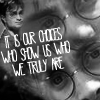
katshakespeare
#06 [+02 -08] = -06
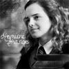
laurenpuppetpal
#07 [+00 -05] = -05
Thank you guys so much for participating! I hope you will stick around for voting and the comeback challenge!
People's Choice
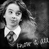
wingsofcaffeine
#05 [+04 -00] = +04
Congrats! You have immunity for the next challenge. You will still need to submit an icon (or use a skip), but you cannot be eliminated.
Mods' Choice
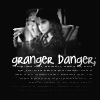
crusading_soul
#11 For a b/w icon, the contrast is very important, and in this icon there are dark black areas and clear white ones, without the contrast being too high. The font is well chosen, and the tiny text works well with the text placement and overall composition of the icon.
Points
+ are positive/favorite votes
- are negative/least favorite votes
Voting post for reference
01. [+03 -02] = +01
02. [+03 -03] = 00
03. [+02 -00] = +02
04. [+02 -01] = +01
05. [+04 -00] = +04
06. [+02 -08] = -06
07. [+00 -05] = -05
08. [+04 -01] = +03
09. [+02 -03] = -01
10. [+02 -00] = +02
11. [+04 -02] = +02
12. [+00 -04] = -04
13. [+01 -04] = -03
14. [+03 -02] = +01
15. [+04 -01] = +03
Least favourite comments
01 reason: love the coloring, but the image itself is a little pixelated making their faces
unrecognizable.
01 reason: It's an interesting idea, for sure. However, the trio is much too pixelated. Also the text is condensed too much - it appears to say 'legscy'.
02 reason: When compared with the others, this is not a strong icon. There is far too much empty space. Some sort of texture could have helped the image quite a lot.
02 reason: First off, I notice that Harry seems very small to be the focus of the icon and the way the image is cropped doesn't give the image much context as to what is going on. I can't tell if that is Harry's cloak flipping off to the left of if that is his arm and it somehow got chopped off. I also don't know what the 4 has to do with the image.
02 reason: Harry looks smugged and the big negative space makes it difficult to concentrate on the main picture. The number above is a bit too high in the icon and makes it look "empty"
04 reason: the crop is just kind of boring and the image is just to dull and grey. I'd like to see maybe a slightly more off center crop to spice things up and some brighter whites and darker blacks to really make it pop.
06 reason: where as I understand what they were trying to create, the font looks very pixelated. if it was plainer (the text), it could be a great composition.
06 reason: There's far too much going on in this icon. My eyes can't find something to settle on, it seems very 'all over the place'. The triple crop of the image PLUS text is just a little too much.
06 reason: The text is overpowering while being difficult to read. It distracts from the icon.
06 reason: Compared to the other icons, this one seems flat. There is not enough contrast to provide interest. The text is squeezed together too much, and is hard to read because of it.
06 reason: It looks really crowded in this icon. Too much going on.
06 reason: this is a really busy icon and it is kind of hard to look at. i don't think you need the repeated image and the little harry and the text on top of it all. it's too much for one 100x100 square. simplify and it could look great.
06 reason: The composition is clever, but the icon overall comes out very busy. There is a lot of text as well as three images, and that may be too much for one icon. The letters of the font are also very close together, which makes the font more difficult to read. The overall placement of the different elements is excellent, though. More contrast would also help bring our the images.
06 reason: The font looks a little squished, making it hard to read
07 reason: Hermione is pixelated, especially around her eyes and nose. The contrast is a bit dull in these areas, as well as her hair. The text is very small and the font is hard to read. In general I think it would have been improved had the text not been there - after all, we don't really need~ the text there to tell us who the character is.
07 reason: Hermione's face is a little too blurred and the text is very hard to read.
07 reason: I generally really like this icon but the text is really small and unreadable (even though it is comprehensible because we know who the character is and can decipher enough of the letters). I also wonder if there wasn't a better way to crop it that would either get rid of the stapler-looking thing in the bottom right corner or at least give more context so that we can know what it is.
07 reason: Though the image of Hermione has a very nicely done contrast, the background and the text do not interact well. The faded and small scripty text is barely readable against the light grey.
07 reason: The text is impossible to read, and the icon seems to have some blurry portions. The text might look better down and to the right of its present location as well.
08 reason: This isn't a bad icon, really, but it was hard to pick 3 to eliminate! The effect of the texture around the main image just doesn't seem to fit.
09 reason: i just think this icon is too dark. the contrast is lacking a little and i think brightening it a little would really help make it stand out. the text might also look better in white rather than the grey that just blends in.
09 reason: The icon is very dark, making it difficult to see the picture. Some more light would be great!
09 reason: While the composition of this icon is rather nice, the text almost blends into the image too well. Both pieces are shades of grey - while that matches the image well, it does not easily stand out.
11 reason: I loved the concept of this icon, but it wasn't executed as well as it could be. The image is too dark to really be seen.
11 reason: While I really like the idea of this icon, I feel like it has a lot of issues that weaken its effectiveness. First of all, I feel like everything in it is just a little too small - you can't really see her face very well. I feel like if you utilized all of the space you have - even by just making it a few pixels bigger, it would be a lot better. I really like the way that the image and text almost create a circle, but that circle isn't centered and is closer to the right side than to the left. The picture isn't the same size as the text, and so that leaves too much empty space on the right side of the icon. There also appears to be a semicolon at the end of "danger" that doesn't seem to have any reason to be there.
12 reason: i really like the crop, but the text placement could've been done differently to make it pop. plus, the texture used really washes Harry out.
12 reason: The font really doesn't work in favour of the mood of the icon. The placement of it seems a little off too.
12 reason: I'm not sure if the font just isn't anti-aliased well or if it's the overall shading, but there's a sharp edge to the font that really distracts from the image and along with the faded aspect to the image of Harry, it just doesn't look right.
12 reason: The icon looks a little washed out, perhaps a little more contrast.
13 reason: The colouring is a little off. I think it could be the white balance. There needs to be a little more shadowing.
13 reason: The coloring looks really odd in this icon and it's kind of blurry too.
13 reason: This is an interesting crop, but the image itself is far too overconstrasted. Either the dark areas are too dark, or the lights are too light - and when you do have grey shadows, they overpower the area. (ie: Harry's cheek.)
13 reason: This image has too high contrast. The crop is not very original. If Harry's have had been cropped more to the edge of the icon the focus might have been more on his eyes. A cloudy texture over the icon might have reduced the brightness and added depth.
14 reason: I really can't see the picture and the font really well. They both kind of fade into the background.
14 reason: There's a little too much empty space. Although there's different shades of gray going on, Bellatrix looks rather tiny and unimportant in the icon overall.
15 reason: The image looks a bit pixelated and the texture doesn't suit the picture. It looks as Ginny has her face covered with stains. The font is a bit too big for the icon.
Favourite comments
01 reason: Very creative and great manip!
01 reason: The way the actual setting was removed so that the actors appear to be sitting on top of a letter is not only exceptionally clever but was executed with amazing skill.
01 reason: I really what they did with the font and made it into a bench! Very creative!
02 reason: The use of negative space in this icon is fantastic! While that faded 4 at the top of the icon is a bit distracting, the composition as a whole is gorgeous. The lighting is perfect, and even the image of quidditch!Harry looks to be fighting off the grey space. GORGEOUS. <3
02 reason: the composition is so great in this! i love the space above harry and the subtle detail up there. also blurring that makes his look like he's really falling is so great.
02 reason: I love the use of negative space in this one. While I generally prefer my characters to be crisp in similarly styled icons, the blur looks great here.
03 reason: I love the text placing and crop.
03 reason: I love the shot of Daniel used and the crop works really well with the text placement.
04 reason: Love the way the font is palced.
04 reason: really like the word placement. very good composition. the black & white of this icons just pops so nicely
05 reason: the texture used on this one really makes Hermione stand out and brings the focus on her face
05 reason: I really like the way that "the" and "one" are oriented differently than "chosen" because it allows for you put the image off-center and not cover any of it or leave weird empty space. I really like how Harry's right eye is the center of the icon.
05 reason: I admit, I'm mostly choosing this one because they managed to use a texture that is WAY hard for me to manage. It looks great, and the screencap + text is wonderful.
05 reason: The contrast between black and white is perfect. I'm not completely in love with the text placement, but the texture is PERFECT.
06 reason: OMG. Such an amazing composition!! The triple-image of Harry is so complicated, but it looks effortless and classic. The text is place perfectly to not only accent that third Harry to the left, but doesn't interfere with the rest of the icon. Again, wow. <3
06 reason: I love the blending and the text placement on this. Gorgeous!
08 reason: The negative space around the main image is very well done and placing Voldemort in the middle just gives some strength to the icon and the expression of the character.
08 reason: the use of texture is perfect. i love how it looks like voldie is really emerging from that hole. it's bright and really stands out.
08 reason: The contrast between black and white is perfect. The texture and tiny, faded text compliments the image.
08 reason: The colour of Voldy's skin compliments the grey of the background perfectly and the fading in the corners works brilliantly.
09 reason: I love the text and the overall layout on this one. My only suggestion would be to lighten the main image, because the subject is a little dark. An extra screen layer would have made this icon even better.
09 reason: The icon could be a little lighter, but the text placement and texture are perfect.
10 reason: The cropping and combination of both images is very well done as well as the text, that fits the images.
10 reason: I really like the pictures they choose. Very cool! I also liked what they did with the cropping and where they placed the font.
11 reason: I really like what they did with the tiny text! It fits very well with the picture.
11 reason: The framing around Hermione using the dark negative space is great. The text is clever and the font fits it while still being easy to read.
11 reason: Lovely use of font and tiny text, as well as the blackening effect. My only complaint is that the screencap itself doesn't seem to go with the text, and perhaps would have been better with a screencap of Hermione from the Yule Ball.
11 reason: I love the blending between the black background and the actual image. I also really like the font and how bold it is against the background, the tiny text works really well too.
13 reason: The B/W is perfect in this icon and the granulated texture makes it look perfect. The cropping is very suiting for the picture too!
14 reason: The textures add a lot of depth to this icon without overwhelming it. The text fits in well with the textures and blends into the background so that Bellatrix's face is the center of focus.
14 reason: I love how the chaos on top of the picture of her mirrors perfectly her personality. The "Lestrange" is also in a font that makes me think of official doctor's papers - like one would find in an insane assylum.
14 reason: i love the use of texture on the black background. there is a lot of contrast to the image so that even thought the blacks are not so deep, it still pops.
15 reason: I like the lighter lines on the right side of the image because they give the impression of sunlight shining on her, which to me is associated with the positive, angels, etc., and corresponds quite nicely with the "magnifique."
15 reason: The lighting and contrast is this icon is so wonderfully executed! The image does not look too dark, but has just the right balance. Additionally, the text does not seem too intrusive at the bottom of the icon; it's quite well-placed.
15 reason: I really love the lighting and the texture on this. I would maybe have sharpened the main image a little, but I think it's likely that a softer look is what the maker was aiming for.
15 reason: love the contrast used on this one
HiH points
Eliminations
Unfortunately we have to say goodbye to the following participants:

katshakespeare
#06 [+02 -08] = -06

laurenpuppetpal
#07 [+00 -05] = -05
Thank you guys so much for participating! I hope you will stick around for voting and the comeback challenge!
People's Choice

wingsofcaffeine
#05 [+04 -00] = +04
Congrats! You have immunity for the next challenge. You will still need to submit an icon (or use a skip), but you cannot be eliminated.
Mods' Choice

crusading_soul
#11 For a b/w icon, the contrast is very important, and in this icon there are dark black areas and clear white ones, without the contrast being too high. The font is well chosen, and the tiny text works well with the text placement and overall composition of the icon.
Points
+ are positive/favorite votes
- are negative/least favorite votes
Voting post for reference
01. [+03 -02] = +01
02. [+03 -03] = 00
03. [+02 -00] = +02
04. [+02 -01] = +01
05. [+04 -00] = +04
06. [+02 -08] = -06
07. [+00 -05] = -05
08. [+04 -01] = +03
09. [+02 -03] = -01
10. [+02 -00] = +02
11. [+04 -02] = +02
12. [+00 -04] = -04
13. [+01 -04] = -03
14. [+03 -02] = +01
15. [+04 -01] = +03
Least favourite comments
01 reason: love the coloring, but the image itself is a little pixelated making their faces
unrecognizable.
01 reason: It's an interesting idea, for sure. However, the trio is much too pixelated. Also the text is condensed too much - it appears to say 'legscy'.
02 reason: When compared with the others, this is not a strong icon. There is far too much empty space. Some sort of texture could have helped the image quite a lot.
02 reason: First off, I notice that Harry seems very small to be the focus of the icon and the way the image is cropped doesn't give the image much context as to what is going on. I can't tell if that is Harry's cloak flipping off to the left of if that is his arm and it somehow got chopped off. I also don't know what the 4 has to do with the image.
02 reason: Harry looks smugged and the big negative space makes it difficult to concentrate on the main picture. The number above is a bit too high in the icon and makes it look "empty"
04 reason: the crop is just kind of boring and the image is just to dull and grey. I'd like to see maybe a slightly more off center crop to spice things up and some brighter whites and darker blacks to really make it pop.
06 reason: where as I understand what they were trying to create, the font looks very pixelated. if it was plainer (the text), it could be a great composition.
06 reason: There's far too much going on in this icon. My eyes can't find something to settle on, it seems very 'all over the place'. The triple crop of the image PLUS text is just a little too much.
06 reason: The text is overpowering while being difficult to read. It distracts from the icon.
06 reason: Compared to the other icons, this one seems flat. There is not enough contrast to provide interest. The text is squeezed together too much, and is hard to read because of it.
06 reason: It looks really crowded in this icon. Too much going on.
06 reason: this is a really busy icon and it is kind of hard to look at. i don't think you need the repeated image and the little harry and the text on top of it all. it's too much for one 100x100 square. simplify and it could look great.
06 reason: The composition is clever, but the icon overall comes out very busy. There is a lot of text as well as three images, and that may be too much for one icon. The letters of the font are also very close together, which makes the font more difficult to read. The overall placement of the different elements is excellent, though. More contrast would also help bring our the images.
06 reason: The font looks a little squished, making it hard to read
07 reason: Hermione is pixelated, especially around her eyes and nose. The contrast is a bit dull in these areas, as well as her hair. The text is very small and the font is hard to read. In general I think it would have been improved had the text not been there - after all, we don't really need~ the text there to tell us who the character is.
07 reason: Hermione's face is a little too blurred and the text is very hard to read.
07 reason: I generally really like this icon but the text is really small and unreadable (even though it is comprehensible because we know who the character is and can decipher enough of the letters). I also wonder if there wasn't a better way to crop it that would either get rid of the stapler-looking thing in the bottom right corner or at least give more context so that we can know what it is.
07 reason: Though the image of Hermione has a very nicely done contrast, the background and the text do not interact well. The faded and small scripty text is barely readable against the light grey.
07 reason: The text is impossible to read, and the icon seems to have some blurry portions. The text might look better down and to the right of its present location as well.
08 reason: This isn't a bad icon, really, but it was hard to pick 3 to eliminate! The effect of the texture around the main image just doesn't seem to fit.
09 reason: i just think this icon is too dark. the contrast is lacking a little and i think brightening it a little would really help make it stand out. the text might also look better in white rather than the grey that just blends in.
09 reason: The icon is very dark, making it difficult to see the picture. Some more light would be great!
09 reason: While the composition of this icon is rather nice, the text almost blends into the image too well. Both pieces are shades of grey - while that matches the image well, it does not easily stand out.
11 reason: I loved the concept of this icon, but it wasn't executed as well as it could be. The image is too dark to really be seen.
11 reason: While I really like the idea of this icon, I feel like it has a lot of issues that weaken its effectiveness. First of all, I feel like everything in it is just a little too small - you can't really see her face very well. I feel like if you utilized all of the space you have - even by just making it a few pixels bigger, it would be a lot better. I really like the way that the image and text almost create a circle, but that circle isn't centered and is closer to the right side than to the left. The picture isn't the same size as the text, and so that leaves too much empty space on the right side of the icon. There also appears to be a semicolon at the end of "danger" that doesn't seem to have any reason to be there.
12 reason: i really like the crop, but the text placement could've been done differently to make it pop. plus, the texture used really washes Harry out.
12 reason: The font really doesn't work in favour of the mood of the icon. The placement of it seems a little off too.
12 reason: I'm not sure if the font just isn't anti-aliased well or if it's the overall shading, but there's a sharp edge to the font that really distracts from the image and along with the faded aspect to the image of Harry, it just doesn't look right.
12 reason: The icon looks a little washed out, perhaps a little more contrast.
13 reason: The colouring is a little off. I think it could be the white balance. There needs to be a little more shadowing.
13 reason: The coloring looks really odd in this icon and it's kind of blurry too.
13 reason: This is an interesting crop, but the image itself is far too overconstrasted. Either the dark areas are too dark, or the lights are too light - and when you do have grey shadows, they overpower the area. (ie: Harry's cheek.)
13 reason: This image has too high contrast. The crop is not very original. If Harry's have had been cropped more to the edge of the icon the focus might have been more on his eyes. A cloudy texture over the icon might have reduced the brightness and added depth.
14 reason: I really can't see the picture and the font really well. They both kind of fade into the background.
14 reason: There's a little too much empty space. Although there's different shades of gray going on, Bellatrix looks rather tiny and unimportant in the icon overall.
15 reason: The image looks a bit pixelated and the texture doesn't suit the picture. It looks as Ginny has her face covered with stains. The font is a bit too big for the icon.
Favourite comments
01 reason: Very creative and great manip!
01 reason: The way the actual setting was removed so that the actors appear to be sitting on top of a letter is not only exceptionally clever but was executed with amazing skill.
01 reason: I really what they did with the font and made it into a bench! Very creative!
02 reason: The use of negative space in this icon is fantastic! While that faded 4 at the top of the icon is a bit distracting, the composition as a whole is gorgeous. The lighting is perfect, and even the image of quidditch!Harry looks to be fighting off the grey space. GORGEOUS. <3
02 reason: the composition is so great in this! i love the space above harry and the subtle detail up there. also blurring that makes his look like he's really falling is so great.
02 reason: I love the use of negative space in this one. While I generally prefer my characters to be crisp in similarly styled icons, the blur looks great here.
03 reason: I love the text placing and crop.
03 reason: I love the shot of Daniel used and the crop works really well with the text placement.
04 reason: Love the way the font is palced.
04 reason: really like the word placement. very good composition. the black & white of this icons just pops so nicely
05 reason: the texture used on this one really makes Hermione stand out and brings the focus on her face
05 reason: I really like the way that "the" and "one" are oriented differently than "chosen" because it allows for you put the image off-center and not cover any of it or leave weird empty space. I really like how Harry's right eye is the center of the icon.
05 reason: I admit, I'm mostly choosing this one because they managed to use a texture that is WAY hard for me to manage. It looks great, and the screencap + text is wonderful.
05 reason: The contrast between black and white is perfect. I'm not completely in love with the text placement, but the texture is PERFECT.
06 reason: OMG. Such an amazing composition!! The triple-image of Harry is so complicated, but it looks effortless and classic. The text is place perfectly to not only accent that third Harry to the left, but doesn't interfere with the rest of the icon. Again, wow. <3
06 reason: I love the blending and the text placement on this. Gorgeous!
08 reason: The negative space around the main image is very well done and placing Voldemort in the middle just gives some strength to the icon and the expression of the character.
08 reason: the use of texture is perfect. i love how it looks like voldie is really emerging from that hole. it's bright and really stands out.
08 reason: The contrast between black and white is perfect. The texture and tiny, faded text compliments the image.
08 reason: The colour of Voldy's skin compliments the grey of the background perfectly and the fading in the corners works brilliantly.
09 reason: I love the text and the overall layout on this one. My only suggestion would be to lighten the main image, because the subject is a little dark. An extra screen layer would have made this icon even better.
09 reason: The icon could be a little lighter, but the text placement and texture are perfect.
10 reason: The cropping and combination of both images is very well done as well as the text, that fits the images.
10 reason: I really like the pictures they choose. Very cool! I also liked what they did with the cropping and where they placed the font.
11 reason: I really like what they did with the tiny text! It fits very well with the picture.
11 reason: The framing around Hermione using the dark negative space is great. The text is clever and the font fits it while still being easy to read.
11 reason: Lovely use of font and tiny text, as well as the blackening effect. My only complaint is that the screencap itself doesn't seem to go with the text, and perhaps would have been better with a screencap of Hermione from the Yule Ball.
11 reason: I love the blending between the black background and the actual image. I also really like the font and how bold it is against the background, the tiny text works really well too.
13 reason: The B/W is perfect in this icon and the granulated texture makes it look perfect. The cropping is very suiting for the picture too!
14 reason: The textures add a lot of depth to this icon without overwhelming it. The text fits in well with the textures and blends into the background so that Bellatrix's face is the center of focus.
14 reason: I love how the chaos on top of the picture of her mirrors perfectly her personality. The "Lestrange" is also in a font that makes me think of official doctor's papers - like one would find in an insane assylum.
14 reason: i love the use of texture on the black background. there is a lot of contrast to the image so that even thought the blacks are not so deep, it still pops.
15 reason: I like the lighter lines on the right side of the image because they give the impression of sunlight shining on her, which to me is associated with the positive, angels, etc., and corresponds quite nicely with the "magnifique."
15 reason: The lighting and contrast is this icon is so wonderfully executed! The image does not look too dark, but has just the right balance. Additionally, the text does not seem too intrusive at the bottom of the icon; it's quite well-placed.
15 reason: I really love the lighting and the texture on this. I would maybe have sharpened the main image a little, but I think it's likely that a softer look is what the maker was aiming for.
15 reason: love the contrast used on this one
HiH points