Results - Round 02 Challenge 01
Thanks for voting everyone! Here are the results for the 1st challenge of round two.
Eliminations
Unfortunately we have to say goodbye to the following participants:
caitriona_3
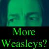
#04 [+00 -22] = -22

lmeden
#11 [+00 -14] = -14
jamie_love13
#10 [+01 -13] = -12
Thank you guys so much for participating! I hope you will stick around for voting and the comeback challenge!
People's Choice
munkymp3
#05 [+12 -00] = +12
Congrats! You have immunity for the next challenge. You will still need to submit an icon (or use a skip), but you cannot be eliminated.
Mods' Choice
shadowshamrock
#27 Love the center crop with this picture, as it clearly draws the focus to McGonagall. The colouring is subtle and well executed, and the use of the light texture is a great extra here.
Points
+ are positive/favorite votes
- are negative/least favorite votes
Voting post for reference
01. [+01 -00] = +01
02. [+02 -00] = +02
03. [+03 -02] = +01
04. [+00 -22] = -22
05. [+12 -00] = +12
06. [+04 -01] = +03
07. [+06 -00] = +06
08. [+01 -03] = -02
09. [+00 -08] = -08
10. [+01 -13] = -12
11. [+00 -14] = -14
12. [+08 -00] = +08
13. [+02 -01] = +01
14. [+00 -00] = 00
15. [+01 -02] = -01
16. [+01 -05] = -04
17. [+00 -00] = 00
18. [+05 -00] = +05
19. [+03 -01] = +02
20. [+02 -00] = +02
21. [+00 -01] = -01
22. [+01 -00] = +01
23. [+00 -00] = 00
24. [+00 -06] = -06
25. [+02 -02] = 00
26. [+07 -00] = +07
27. [+02 -00] = +02
28. [+08 -00] = +08
29. [+08 -02] = +06
30. [+01 -00] = +01
31. [+01 -00] = +01
32. [+01 -00] = +01
33. [+01 -02] = -01
34. [+03 -00] = +03
35. [+00 -02] = -02
With the sheer amount of votes and comments, there's probably at least one mistake in there somewhere, so please double check that the number of comments you received matches your points listed!
Least favourite comments
03 reason: I think the idea is a good one, McGonagall & Snape as two sides of a coin, but it looks a bit awkward as it does not line up well - most especially asymmetrical in the faces.
03 reason: With this one, maybe they can sharpen it more because it's very blurry. And the cropping is kind of awkward and it doesn't fit well with the icon
04 reason: I love how the text fits with his expression, it's pretty perfect! However, the font and text style doesn't look great on the icon in general, it is too bright compared to the more muted green of the icon, and it's very harsh on the black cut. A more subtle colour, and perhaps moving the lines a little closer together and making them a little smaller would make the text flow much nicer, I think!
04 reason: Snape is blurry and the text colour is very hard on the eyes. Also, the harsh break between image and black part is too sharp and it contradicts the blurriness of the image.
04 reason: the green on the image is overwhelming and the text colour is too similar to be of contrast, and too different to match with the rest of the image. Plus the image looks slightly blurry.
04 reason: the strong green saturation really overwhelms the icon - perhaps a little more desaturated green would have been a better choice.
04 reason: I really wish this icon were executed a little better, because I think it's hilarious. The text on it fits so well with Snape's face and his attitude as we know it. You can totally just see him thinking this, and it's too funny XD That being said, it just isn't executed as nicely as it could have been. I like the way it's cropped, although I do think I'd like the black to be a little less, to see more of his expression. I think it would've been better to make Snape either b&w, or to leave his colors as they were in the original, instead of the green. I'm all for playing with coloring on icons, and even am ok with the coloring being somewhat unnatural, but this is a bit too far. The lime green font could be more subtle too. Basically, I'm not a fan of the green & black color scheme this icon has, but I do love the idea behind the icon and the cropping. The coloring is what makes it a least favorite for me.
04 reason: Poor colouring, font choice.
04 reason: The focus is directed to the text rather than the subject.
04 Reason: Green, Green, Green. Symbolic of Slytherin but also too of ~envy~. XP What can be said about this icon is that it does capture ones attention, that's for sure, but unfortunately the thing is that it's not necessarily appealing to the eye. The idea is humorous, but aesthetically the icon would have been complimented by a different sort of font. One that's not so simplistic and normal, 'cause the idea would have been driven in by something more bold to match his emotion, his surprise. Then, of course, there is the colour which isn't really that alluring over all in any image but the idea behind it was funny, so it's not all that bad! It's just for the aesthetic reasons is all.
04 reason: the two colors used really clash with each other. maybe if the same color had been used for both shade of green it would have worked better
04 reason: The text is distracting. It's very bright and pixelly.
04 reason: It's too squared off and Snape's face looks strange with both the crop and the green saturation? Also, I'm not quite understanding the text as there are no Weasleys in the piece. The font, as well, is too squared off. It could use a texture or angled text or something else.
04 reason: The crop is awkward, and the use of two different shades of green (for the coloring of Snape's face and the text) makes the icon feel like 2 different parts.
04 reason: While the idea is cute, the font choice and placement could have been better. While colorizing Snape allows it to match the font color, the two greens are very different making it look very off.
04 reason: The font doesn't really work with this icon and I think the contrast/coloring could have been done a little better.
04 reason: The humor of it is great, but the green/blue of Snape makes it hard for someone (outside of the fandom) to recognize him. The text is pixelated and takes up too much of the icon.
04 reason: The icon looks choppy to me. The border on the bottom is harsh and the lettering is in a very plain font. I feel that it would look better with a less common font, that matched the picture better. Additionally, the green on black background looks sort of harsh, and doesn't match the image well.
04 reason: I am not a big fan of the cropping on this one, maybe they could put it somewhere else... Like maybe on top. I also think they could change the coloring and make it more light than just regular green.
04 reason: The text overpowers the subject and the coloring could be done while still keeping contrast.
04 reason: The green flood filling style effect doesn't really work very well. Perhaps playing with the opacity a little bit could help it out a bit.
04 reason: The text has a lot of pixels and the color is too much green!
04 reason: The overly green tinge to the whole thing seems to be to represent the Slytherin Snape is, but if gives the icon a very grainy effect, and the text could be improved upon.
04 reason: I like how Snape's face is placed, but it needs much more light and dark contrast. Increasing the contrast between his hair and face would make the icon much more effective. You should try using a different font for the text, and putting it all on one line to make it look cohesive. Alternatively, you could leave it in two lines, but change the sizes of the lines so that they have the same length.
06 reason: I like the crop and the "Not Amused" but the other writing is too small and overpowered to be read
08 reason: The subjects appear rather blurry, but I know this was a difficult image to crop if you wanted to try to include both subjects in your icon. The coloring also appears to completely wash out Snape.
08 reason: The icon is very yellow!
08 reason: The texture overpowers the image, Snape is hard to see. If you were to widen the void in the texture in which McGonagall is situated it would help.
09 reason: The fake background idea is great but the areas around her are pixelated - using a soft brush on lowered opacity would help with this.
09 reason: The subject appears very pixelated in the icon. While the background itself looks great, the gridlines in it seem to make pixelation more apparent.
09 reason: Awkward background, too pixeled.
09 reason: the image has not been resized properly, it is blury, the base has not been worked on, the texture is not appropriate for this image because it is girly and playful whereas McG is a sombre woman and her emotions are mismatched to what the texture tells us
09 Reason: It's nice to see creativity, that must be said, it's just that in this case the creativity ended up being somewhat distracting from the given image itself. It's the boarder on the right hand side. It's distracting and draws the viewers eyes away from the figure herself, so understandably that takes a little away from the icon and where its focus is meant to be. The colours and patterns do it as well, again on the same side, so perhaps if they'd been more subtle, a little tuned down, the icon would have worked better over all.
09 reason: The background doesn't match the image of Mcgonagall. It actually does nothing for the icon. It doesn't compliment the mood of the icon, or the theme of the icon.
09 reason: The crop around McGonagall's hat is kind of jagged, and the background doesn't seem to fit very well visually or contextually.
09 reason: The edging on McGonagall is rough/pixalated. The background is awesome though.
10 reason: I am not a big fan on the placing/coloring of the font. Maybe they could place it somewhere else like on the bottom left and make it a little/whiter.
10 reason: not a very flattering crop. perhaps making the original image a bit smaller and including more of their faces would improve the icon.
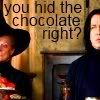
10 reason: I'm glad that the maker tried to fit both Snape and McGonagall into the icon, but the crop just doesn't work here. This sort of crop works if you 3 or 4 people in it, but it just doesn't look right with all that empty space in between Snape and McGonagall and then seeing barely even half of the characters. It also looks a little oversharpened, and the text is too big and bulky. Had the maker made the text in white or light beige, to where it would stand out more, and made it smaller and placed it in between Snape and McGonagall, this icon could've worked, but as it stands, it just doesn't work. It's a funny icon though.
10 reason: The text doesn't compliment the image.
10 reason: The text is difficult to read. The color of the font is too dark.
10 reason: The crop is awkward -- there is too much negative space between McG and Snape and they are cut through in a strange place. I don't see enough of the two of them. Also, the text is hard to read, and the font is ordinary and spaced in an unflattering way. I like the text / words chosen, but it doesn't completely fit with the icon.
10 reason: The text is a bit hard to read (though I'm not sure which color would be better since the background is textured) and the crop is a bit weird. And I'm not sure if my eyes are just really tired, but the edges, where McGonagall and Snape are, are blurry, which is awkward.
10 reason: This isn't a bad icon, but there were so many good ones that choosing three least favorites was hard. The cropping on this is really good, but I don't feel as though the text really fits the image well. A better font choice with better placement of the text would have worked much better for this icon.
10 reason: This icon is a good idea in theory, but could use a little work on the execution. The image is a little bit grainy, especially around the words, but this could be fixed easily. The text is also very plain and somewhat hard to read.
10 reason: The cropping makes is slightly difficult to make out who we are looking at. I like the idea behind it but I think the spacing of the characters was too wide for this to work particularly well.
10 reason: The text doesn't fit the caption and the font is not appropriate.
10 reason: The composition and text placement on this icon do not work very well. Since the caption is based on their faces, I think more of their faces should be shown. The font used for the text is very basic and has very little interest - a bolder font in a lighter color would probably work better. The text placement looks very random, and I think it would be better suited by being in two lines rather than three, and being placed above their heads rather than between them. Also, this is a small nitpick, but there should be a comma after chocolate.
10 reason: The crop is a tad unflattering, and the text, while quite readable, just doesn't seem to fit very well into the icon as a whole. Also, there doesn't seem to be a whole lot going on with coloring. (The text is giggle-worthy, though. :D)
11 reason: The texture is distracting.
11 reason: I don't think the clouds contribute anything to the icon. They're a bit too much, to the point that the only thing I can make out is Snape's face, and it took me a little while to even be able to tell that they were clouds. Remember that Snape should be the focus here; it's such a close crop that so many other elements are distracting.
11 reason: It's very bright and there's very little contrast in it. Furthermore, the texture and the subject of the image don't go well together. The texture overpowers the icon and distracts from the actual subject of it.
11 reason: I like how this has been taken in another direction than the other icons, it's certainly exciting and the composition is nicely done. However the picture looks a little grainy/pixellated and the blue is a bit too light/bright, making Snape look a bit too white in the face compared to the rest of the icon- this could instead be the contrast causing this but I'm not sure. :)
11 reason: the image is overwhelmed by textures and the main focus seems to be on the items in the foreground rather than the character.
11 reason: This icon just doesn't make much sense :| Cloud textures generally only work if they are really subtle, or if you are actually using them to add clouds into a cloudless sky. Seeing actual clouds below Snape just makes me scratch my head. Textures are a great way to make an icon more interesting, but they only help when used in the right way. When they're used improperly, they actually hinder the icon. This crop would've worked nicely with negative space either above or below Snape; a nice black area, or similar, below Snape instead of the clouds would've worked really well. In addition to the cloud texture, the maker used a blue/purple coloring for the icon in general, and Snape is just washed out and not the focus of the icon, which I think he should be. Honestly, it almost makes Snape look like a cloud himself; pale face among blue/purple coloring. He blends right into the texture; the texture should blend in and enhance the icon, not the other way around. I appreciate the effort, but the end results just aren't fantastic in this case.
11 reason: The coloring has no variety - it's all purple with very little color contrast. There's very little light contrast, too - the lighting is washed out. If Snape's face were darker and more green rather than magenta, it would have more visual interest.
11 reason: Snape just kind of fades away into the clouds. Maybe bringing him to the front of the cloud base would make the icon stronger.
11 reason: the texture used on this icon overpowers it. it could stand to be set on a different layer setting and tone downed a bit and it could work better.
11 reason: The cloud texture doesn't seem to fit with Snape, and makes it hard to see him.
11 reason: The texture overpowers the icon and it lacks contrast making the icon one color and flat.
11 reason: While the use of the cloud texture is creative, it leaves Snape very washed out and really forces him into the background of the icon.
11 reason: I think the way the texture is used takes away from what the icon is actually of. The focus seems to be on the clouds rather than Severus. Perhaps actually erasing the area of the texture that covers his face could help.
11 reason: To be honest, I'm a bit baffled concerning the texture that you chose to use for this icon. not only does it completely overwhelm the subject so that I barely see Severus, but I'm a little confused as to why it was even chosen. I feel as though icons tell a story to the viewer, and this story is obscured- is Severus imagining someplace else? Or perhaps it was used for artistic effect, i don't know :(
13 reason: I love the cropping and composition of the icon, snape and mcgonagall sitting high in the centre, and the text place dbelow all looks great together. However, I feel that the contrast is a little off on the picture, making Snape's face look too white, it's washed him out and it's difficult to see who it is! Also, the 'otp' text is a little bright. I can see how it's made to stand out against the black and white which is a great idea, but I just think it's a little too bright, a slightly darker red might look better.
15 reason: the image seems skewed and washed out.
15 reason: My main problem with this icon is the text. It looks like it got cut off on the right side, and the font is sort of hard to read when it's that small anyway. The icon also looks a little washed out so it's hard to tell what the text is talking about.
16 reason: the icon is way oversharpened. the crop on this was nice but the oversharpening really ruined the effect.
16 Reason: This icon actually has a good crop but what let it down was the grainy affect that can be seen all over the composition itself. That affect isn't alluring or complimentary in most cases in this case, well, how does it fit conceptually? The crop conveyed the emotion in a bold way, so all that let this down was that affect.
16 reason: The coloring is bright, but the icon is heavily pixelated - probably due to over-sharpening.
16 reason: The image of Snape is very grainy and unclear. Also, the composition of the icon is very unbalanced, with Snape's black robes at most of the bottom and the middle and his face at the top. (Some white text in the middle would've helped to even things out.)
16 reason: It might just be me, but the cropping you've used here is incredibly awkward, and I'm not sure what my eye is supposed to be focusing on. This icon would have benefited from a better focus and perhaps some smoothing/texture, because the photo appears to be grainy :(
19 reason: Awkward dropping, obvious choice of wording.
21reason: The grunge texture does not compliment the icon.
24 reason: also, the quality of the image deteriorated from the improper resizing (try applying 'smart size' option), the image is bleak, the letters overpower the image, the question mark should not be nearly as big as her head
24 reason: The text is difficult to read. Maybe another colour or another font would be a better match with the colours of the icon.
24 reason: The text is blurry, hard to read. I like the sentiment of it, but it is distracting. Also, the coloring is dull and doesn't draw out the focus on anything in particular.
24 reason: The text is too blurred and the icon is oversharpened.
24 reason: The image of McGonagall is very grainy and seems unsharpened or blurry; the same blurriness is happening with the text. It's very unclear and hard to make out overall.
24 reason: Too over-sharpened, and the font chosen does not work well with the icon.
25 reason: The green is very overpowering and it gives the person a hue that makes him look ill.
25 reason: The text colour seems to clash. While the chosen text colour is visible I think you would be able to use an emerald text that would match the colour scheme of the icon. Another option would be to use a silver text to pull from the house crest.
29 reason: the image looks unrealistic due to the background, the icon looks incomplete because there is a lot of unjustified, empty space above them, and because the wall behind them looks smudged. it looks like a work in progress
29 reason: I realize what you were trying to do here, use a blurry texture to create a certain mood but the two characters are just too small! My eye focuses on the blur rather than the characters, and considering it should be an icon glorifying Snape and McGonagall, I didn't find the technique effective. Perhaps make them slightly larger/more compelling?
33 reason: I'm just not a fan of the colors. The rusted cyan and orage does nothing for me. It doesn't increase the focus on Mcgonagall, and it doesn't compliment her, either.
33 reason: This icon has potential, but it's a little blurry. The suject's face looks out of focus. A little sharpening would have made this a much better icon.
35 reason: The text on the icon is really difficult to read. The font there looks cool, but it would be better if it was a little bit larger.
35 reason: I like that both professors were included and the "secretive" conversation, but I really had to strain to read what they were saying.
Favourite comments
01 reason: I like the crop and the colouring and I also like how the Slytherin crest is blurred in the background.
02 reason: Nice colouring, excellent crop and background replacement.
02 reason: Damn why didn't I think to do something like this? XD I love this icon, so much. I really love the negative space background, and I like that it resembles a chalkboard, since McGonagall is a professor and everything. I think this is a really effective use of tiny text; rather than it just being 'slapped on,' it plays the role of a texture and also makes the negative space more interesting. McGonagall really stands out for me too; the coloring applied to her is great, and even though she's dressed in black on a black background, she stands out nicely. Making the red of the dessert in front of her pop so much really helps make McGonagall pop. This is a really beautiful icon.
03 reason: I love how they've set the image up. Coloring looks great and the dual image is flawless.
03 Reason: The tones in this work are really lovely and balanced, as is its general composition over all. It really is the colours that really draw the eye and are appealing about it though. They're really warm and stand out from the other icons for this reason. As mentioned before it's the balance in the piece as well that makes it stand out. The maker has just dealt with all these aspects so well and so they're icon is really captivating.
03 reason: The colouring is very good on the eyes and it enhances the subjects of the image nicely. The light texture or whatever was used gives it a dreamy look that works very well on the icon, a look that is enhanced by the slight blurriness of the image.
05 reason: Excellent styling and colouring, the text is also very funny.
05 reason: The text fits well with the icon. Plus, I love the background and how it fits so easily around the subject. And the colors are nice, too.
05 reason: I think the composition is really interesting and unique. The red background for the text pops, although I think it could be brighter, and a light drop shadow underneath would also help.
05 reason: Hee. Not only is this icon humorous to look at, but you've managed to isolate Snape without it being awkward to the eye. The pop of red looks fabulous against Snape's clothing, and the grey wispy background is just enough contrast, but not enough to draw attention away from the subject. Well done!
05 reason: Love the colouring, the background, the red smudge, the font and the text. Everything really.
05 reason: the orientation is set up nicely and the text is legible.
05 reason: I really love this icon. The cutting out around Snape was done very well, and the background matches the image well. Additionally I love the font used for this icon, and the (for lack of a better word) blob behind the text makes it stand out well, and very easy to read. My only critique would be that maybe the text would look better a little lighter but, overall not much needs to be changed.
05 reason: I love the way this one is cropped, with the original background cut out. The font suits the image well and the splash of color just enhances the whole thing.
05 reason: love the silhouette of snape and a very fitting caption.
05 reason: the icon is simple, neat and the text is easily legible and well placed.
05 reason: The way the seems almost molded around the subject really helps it stand out instead of simply using a flat single color background.
05 reason: An interesting composition that I think works very well on this icon. The text and brush placement are nice as they they pop out to one's eyes without being too overpowering. Also, the text itself underlines the image very well and brings back the focus on the person.
06 reason: the coloring of this icon is just gorgeous.
06 reason: I think the caption goes great with the look on Mcgonagall's face. The colors are pretty and the composition looks very nice!
06 reason: I think the text is clever, and I like how it's colored to match the background to the right of McGonagall's head. The coloring is also very pretty.
06 reason: The crop and coloring works really well. I like the softer greens and blues. The text is well-placed as well, and fitting for her expression. Well done.
07 reason: I love the creativity of focusing on the food, as opposed to the obvious crop on either McGonagall or Snape. I like how it's simple, clear, well colored, and the text is just the right size.
07 reason: I really like the coloring in this icon. The food really sticks out. I also liked where was the font placed too!
07 reason: The colouring is very bright and makes the food looks delicious. I also find that the tiny text fits perfectly in the picture.
07 reason: I like the coloring and the cropping. The text compliments the image rather than distracts from it.
07 reason: The subtle coloring of the background to match the subject really seems to enhance it and help it stand out.
07 reason: A very lively colouring that brings out the strawberries very nicely. The text placement works very well as it doesn't overlap with the strawberries and the cropping gives them a nice focus without being too "in your face".
08 reason: I'm a big fan of the colors. While I think Snape could have been a little less faded out, the contrast between the two characters actually makes me notice Snape more. Overall I think it was very well made!
10 reason: I like how you managed to give the impression of a quietly agreed upon detente between the professors, and cropping half face on both balances the icon nicely.
12 reason: The colors are nice and bright, and the composition works really well. I like the text a lot, and it was a cool idea to focus on the food rather than on the professors. You might want to add something to lighten up the icon, such as a light texture.
12 reason: i like how the image is cropped, the strawberries on the cake are juicy, the image has bright, pleasent colors, and I want to eat that cake just as the word 'yummy' suggests
12 reason: Very creative crop/focus, nice coloring and text.
12 reason: The colouring and the cropping is very good.
12 reason: The coloring is crisp without oversharpening and the text is there but not screaming OMG TEXT as a lot of icons do. There's a nice balance.
12 reason: excellent choice to focus on the food in the image and not the character. beautiful coloring as well.
12 reason: Understated, beautiful colouring.
12 reason: I love the originality of this icon. On top of that the image and text placement is perfect, and the colouring looks great, a real difference from the original cap.
13 reason: love the black and white and red :)
13 reason: I really like the little square with the text at the bottom.
15 reason: Ah! Someone who did something with the pile of sweets in front of McGonagall. Love it. The text is in the right place and colored beautifully. It blends in very well with the rest of the icon. Also, the crop works well.
16 reason: I like the cropping and texture. They compliment one another very well.
18 reason: The rotation and the text provide a nice general feel for the icon, and the overall cold coloring goes well with it.
18 reason: The text placement and font choice are spot-on, and it has a really good feeling of movement. I like the coloring for the most part - my only complaint is that her face has a bit too much magenta.
18 reason: McGonagall's face is sharp, and the coloring is nice. The position of the text works very well.
18 reason: With this icon, I loved the placing of it & the font they choose. I also like the boldness of the icon too!
18 reason: The colouring on this looks great, really natural which is hard with the colouration of the original. The composition looks great and really unique, and the text goes perfectly, in style and placement!
19 reason: I like coloring and how sharp the image is. It really pops
19 reason: I find this image to be subtle and soft. The font choice and color fits the image well. The icon looks very accurate, like a Japanese home, nothing extra and everything is placed according the the rules.
19 reason: excellent font choice and very interesting crop.
20 reason: I really like this icon. I love what they did with they cropping; it fits very well. And also the font they choose & the coloring.
20 reason: This icon impressed me because it uses a wider crop to feature both subjects, but yet they don't seem to get lost or blurred out. The coloring is aesthetically pleasing and the font stands out very well.
22 reason: A classy, pretty icon. You've got wonderful colouring that remains neutral, and yet the blurry texture only enhances Minerva's features. I also loved the cropping you chose- there's JUST enough negative space in the bottom right corner, really balances things out.
25 reason: I love the cropping and coloring on this one and the text really works well on the image, I think.
25 reason: I like the crop on this as well - seeing only the lower half of the face makes the expression more regal instead of that shocked confusion look of the original. Also, the green tint gives a nice different look without making his skin look sickly as some tints will.
26 reason: Good crop and excellent use of BAMF.
26 reason: Love the crop, colours and text!
26 reason: While the color scheme is not exactly typical of a Gryffindor, the composition as a whole and the text placement is wonderful.
26 reason: Very nice orientation and the coloring is different along with keeping contrast
26 reason: I also particularly like this icon. The cropping is really nice, I like how they used negative space to place the words but the image is still shown enough to see what it is. I'm also a big fan of tiny text when used properly, and I think that it definitely adds to the image in this case.
26 reason: I believe the idea the icon maker creates, when the image is taken out of the screenshot context and given a BAMF context. The image is well centered, the letters arrangement is a lot of micro-management, and they are placed creatively and properly, the grey texture line matches her eye color.
26 reason: the background and the image compliment each other and the image is well edited.
27 reason: The light texture makes for an overall very well done composition for the icon.
27 reason: I adore the cropping on this and the placement of the texture. Simple, but very pretty.
28 reason: This is a totally gorgeous icon. The cold colouring and ashy tones you've used really make the subjects pop, plus conveys a distinct mood that I felt immediately upon viewing. Not to mention you've used a perfect balancing of motion...combined with placing two scenes on top of one another, I am absolutely captivated! Well done!
28 reason: I love the double crop effect and the colouring.
28 reason: This icon is another of my favorites. I think the colors are a little washed out but in this case it's a good thing; the colors being this way really translate well with this image. Additionally the cropping for this icon is superb.
28 reason: The split on this one is great because of their expressions. I also love the antique~ coloring it has.
28 reason: I like the cropping and the colouring.
28 Reason: In this case of course all have used the same image yet somehow this icon conveys the emotions more boldly then others. It may be because of the composition itself that aids conveying that emotion to the audience. It's simple but in a really good way because the composition is balanced and clear. The soft colouring really compliments the idea as well because it's not over done or distracting, it fits the imagery perfectly. Well done to them!
28 reason: I like the crop on this one. Both professors are included without straining space, and you still can tell they are looking at the same thing with pretty much the same opinion.
28 reason: I love the faded colours in this, it looks lovely, especially with the tone of the characters.
29 Reason: The colouring and in this icon is really alluring. The tones are beautiful. The effect is really intriguing as well and certainly draws the eye to the icon between all the others. The imagery is really interesting and the maker used it well.
29 reason: Gorgeous. Oh my God. The coloring and the crop work very well together--I can tell who it is even though it's pretty far back--and I love the glow/blur thing you have going on at the top there. You don't need me to tell you that you did a fantastic job.
29 reason: The coloring on this icon is simply superb - it is just bright enough to not be overpowering, yet has shadows which do not overpower the icon either. Also, I love the creative cropping which adds a sense of height to the icon and helps to center McGonagall and Snape.
29 reason: I love how they managed to create the negative space above McGonagall and Snape, bringing the focus more on them, even though they are such a small part of the icon. I also like that it's clean and simple.
29 reason: Bringing the distance out like this works, and you've got the right coloring and muddling of the background that it fits and draws the focus on the two professors. Nicely done.
29 reason: Perfectly simple, great use of negative space.
29 reason: This icon used such a nice effect, crop, and coloring. Even though Snape and McGonagall are really small and we can't see much detail in their faces, the crop is really great. The negative space created up top, as well as the soft, subtle blurring, help bring the focus to the characters. I really love the soft yet bright coloring the maker achieved as well. There is such a nice, strong contrast in this icon that make Snape and McGonagall really stand out, which can be tricky to do when they've been cropped so tiny. Sometimes simple icons are the best, and this is one of those cases I think.
29 reason: the image looks very natural despite being heavily edited in the background and it's just all around very clean and crisp looking.
30 reason: love the coloring and the crop is snappy.
31 reason: The coloring is bright, the image isn't pixelated, and I love the white blob adding depth.
32 reason: I find this one very funny and I also like the colouring!
33 reason: Beautiful colours and fading of the texture.
34 reason: The simple and classic layout of this icon, plus the wonderfully executed greyscale effect, looks simply stunning. Also, it equally brings out McGonagall and Snape, stressing the balance of the image.
34 reason: I love the use of dead space. It leaves us with just enough of the picture to see what we need to see.
34 reason: I really am such a sucker for a well-executed b&w icon. I love the crop of this icon, because I really like to see both McGonagall and Snape together in these icons, because their expressions work so well together, since they both have such WTF looks on their faces. Adding the black on top and bottom was a great technique; I think it brings more attention to Snape and McGonagall. This icons has b&w done right; there is a nice variety of dark blacks, all shades of grey, and bright whites. It's not washed out and there is great contrast. Pair the great use of b&w with a great crop and nice effect, and you get just a gorgeous, simplistic icon that looks fantastic.
HiH points
Eliminations
Unfortunately we have to say goodbye to the following participants:
caitriona_3
#04 [+00 -22] = -22
lmeden
#11 [+00 -14] = -14
jamie_love13
#10 [+01 -13] = -12
Thank you guys so much for participating! I hope you will stick around for voting and the comeback challenge!
People's Choice
munkymp3
#05 [+12 -00] = +12
Congrats! You have immunity for the next challenge. You will still need to submit an icon (or use a skip), but you cannot be eliminated.
Mods' Choice
shadowshamrock
#27 Love the center crop with this picture, as it clearly draws the focus to McGonagall. The colouring is subtle and well executed, and the use of the light texture is a great extra here.
Points
+ are positive/favorite votes
- are negative/least favorite votes
Voting post for reference
01. [+01 -00] = +01
02. [+02 -00] = +02
03. [+03 -02] = +01
04. [+00 -22] = -22
05. [+12 -00] = +12
06. [+04 -01] = +03
07. [+06 -00] = +06
08. [+01 -03] = -02
09. [+00 -08] = -08
10. [+01 -13] = -12
11. [+00 -14] = -14
12. [+08 -00] = +08
13. [+02 -01] = +01
14. [+00 -00] = 00
15. [+01 -02] = -01
16. [+01 -05] = -04
17. [+00 -00] = 00
18. [+05 -00] = +05
19. [+03 -01] = +02
20. [+02 -00] = +02
21. [+00 -01] = -01
22. [+01 -00] = +01
23. [+00 -00] = 00
24. [+00 -06] = -06
25. [+02 -02] = 00
26. [+07 -00] = +07
27. [+02 -00] = +02
28. [+08 -00] = +08
29. [+08 -02] = +06
30. [+01 -00] = +01
31. [+01 -00] = +01
32. [+01 -00] = +01
33. [+01 -02] = -01
34. [+03 -00] = +03
35. [+00 -02] = -02
With the sheer amount of votes and comments, there's probably at least one mistake in there somewhere, so please double check that the number of comments you received matches your points listed!
Least favourite comments
03 reason: I think the idea is a good one, McGonagall & Snape as two sides of a coin, but it looks a bit awkward as it does not line up well - most especially asymmetrical in the faces.
03 reason: With this one, maybe they can sharpen it more because it's very blurry. And the cropping is kind of awkward and it doesn't fit well with the icon
04 reason: I love how the text fits with his expression, it's pretty perfect! However, the font and text style doesn't look great on the icon in general, it is too bright compared to the more muted green of the icon, and it's very harsh on the black cut. A more subtle colour, and perhaps moving the lines a little closer together and making them a little smaller would make the text flow much nicer, I think!
04 reason: Snape is blurry and the text colour is very hard on the eyes. Also, the harsh break between image and black part is too sharp and it contradicts the blurriness of the image.
04 reason: the green on the image is overwhelming and the text colour is too similar to be of contrast, and too different to match with the rest of the image. Plus the image looks slightly blurry.
04 reason: the strong green saturation really overwhelms the icon - perhaps a little more desaturated green would have been a better choice.
04 reason: I really wish this icon were executed a little better, because I think it's hilarious. The text on it fits so well with Snape's face and his attitude as we know it. You can totally just see him thinking this, and it's too funny XD That being said, it just isn't executed as nicely as it could have been. I like the way it's cropped, although I do think I'd like the black to be a little less, to see more of his expression. I think it would've been better to make Snape either b&w, or to leave his colors as they were in the original, instead of the green. I'm all for playing with coloring on icons, and even am ok with the coloring being somewhat unnatural, but this is a bit too far. The lime green font could be more subtle too. Basically, I'm not a fan of the green & black color scheme this icon has, but I do love the idea behind the icon and the cropping. The coloring is what makes it a least favorite for me.
04 reason: Poor colouring, font choice.
04 reason: The focus is directed to the text rather than the subject.
04 Reason: Green, Green, Green. Symbolic of Slytherin but also too of ~envy~. XP What can be said about this icon is that it does capture ones attention, that's for sure, but unfortunately the thing is that it's not necessarily appealing to the eye. The idea is humorous, but aesthetically the icon would have been complimented by a different sort of font. One that's not so simplistic and normal, 'cause the idea would have been driven in by something more bold to match his emotion, his surprise. Then, of course, there is the colour which isn't really that alluring over all in any image but the idea behind it was funny, so it's not all that bad! It's just for the aesthetic reasons is all.
04 reason: the two colors used really clash with each other. maybe if the same color had been used for both shade of green it would have worked better
04 reason: The text is distracting. It's very bright and pixelly.
04 reason: It's too squared off and Snape's face looks strange with both the crop and the green saturation? Also, I'm not quite understanding the text as there are no Weasleys in the piece. The font, as well, is too squared off. It could use a texture or angled text or something else.
04 reason: The crop is awkward, and the use of two different shades of green (for the coloring of Snape's face and the text) makes the icon feel like 2 different parts.
04 reason: While the idea is cute, the font choice and placement could have been better. While colorizing Snape allows it to match the font color, the two greens are very different making it look very off.
04 reason: The font doesn't really work with this icon and I think the contrast/coloring could have been done a little better.
04 reason: The humor of it is great, but the green/blue of Snape makes it hard for someone (outside of the fandom) to recognize him. The text is pixelated and takes up too much of the icon.
04 reason: The icon looks choppy to me. The border on the bottom is harsh and the lettering is in a very plain font. I feel that it would look better with a less common font, that matched the picture better. Additionally, the green on black background looks sort of harsh, and doesn't match the image well.
04 reason: I am not a big fan of the cropping on this one, maybe they could put it somewhere else... Like maybe on top. I also think they could change the coloring and make it more light than just regular green.
04 reason: The text overpowers the subject and the coloring could be done while still keeping contrast.
04 reason: The green flood filling style effect doesn't really work very well. Perhaps playing with the opacity a little bit could help it out a bit.
04 reason: The text has a lot of pixels and the color is too much green!
04 reason: The overly green tinge to the whole thing seems to be to represent the Slytherin Snape is, but if gives the icon a very grainy effect, and the text could be improved upon.
04 reason: I like how Snape's face is placed, but it needs much more light and dark contrast. Increasing the contrast between his hair and face would make the icon much more effective. You should try using a different font for the text, and putting it all on one line to make it look cohesive. Alternatively, you could leave it in two lines, but change the sizes of the lines so that they have the same length.
06 reason: I like the crop and the "Not Amused" but the other writing is too small and overpowered to be read
08 reason: The subjects appear rather blurry, but I know this was a difficult image to crop if you wanted to try to include both subjects in your icon. The coloring also appears to completely wash out Snape.
08 reason: The icon is very yellow!
08 reason: The texture overpowers the image, Snape is hard to see. If you were to widen the void in the texture in which McGonagall is situated it would help.
09 reason: The fake background idea is great but the areas around her are pixelated - using a soft brush on lowered opacity would help with this.
09 reason: The subject appears very pixelated in the icon. While the background itself looks great, the gridlines in it seem to make pixelation more apparent.
09 reason: Awkward background, too pixeled.
09 reason: the image has not been resized properly, it is blury, the base has not been worked on, the texture is not appropriate for this image because it is girly and playful whereas McG is a sombre woman and her emotions are mismatched to what the texture tells us
09 Reason: It's nice to see creativity, that must be said, it's just that in this case the creativity ended up being somewhat distracting from the given image itself. It's the boarder on the right hand side. It's distracting and draws the viewers eyes away from the figure herself, so understandably that takes a little away from the icon and where its focus is meant to be. The colours and patterns do it as well, again on the same side, so perhaps if they'd been more subtle, a little tuned down, the icon would have worked better over all.
09 reason: The background doesn't match the image of Mcgonagall. It actually does nothing for the icon. It doesn't compliment the mood of the icon, or the theme of the icon.
09 reason: The crop around McGonagall's hat is kind of jagged, and the background doesn't seem to fit very well visually or contextually.
09 reason: The edging on McGonagall is rough/pixalated. The background is awesome though.
10 reason: I am not a big fan on the placing/coloring of the font. Maybe they could place it somewhere else like on the bottom left and make it a little/whiter.
10 reason: not a very flattering crop. perhaps making the original image a bit smaller and including more of their faces would improve the icon.
10 reason: I'm glad that the maker tried to fit both Snape and McGonagall into the icon, but the crop just doesn't work here. This sort of crop works if you 3 or 4 people in it, but it just doesn't look right with all that empty space in between Snape and McGonagall and then seeing barely even half of the characters. It also looks a little oversharpened, and the text is too big and bulky. Had the maker made the text in white or light beige, to where it would stand out more, and made it smaller and placed it in between Snape and McGonagall, this icon could've worked, but as it stands, it just doesn't work. It's a funny icon though.
10 reason: The text doesn't compliment the image.
10 reason: The text is difficult to read. The color of the font is too dark.
10 reason: The crop is awkward -- there is too much negative space between McG and Snape and they are cut through in a strange place. I don't see enough of the two of them. Also, the text is hard to read, and the font is ordinary and spaced in an unflattering way. I like the text / words chosen, but it doesn't completely fit with the icon.
10 reason: The text is a bit hard to read (though I'm not sure which color would be better since the background is textured) and the crop is a bit weird. And I'm not sure if my eyes are just really tired, but the edges, where McGonagall and Snape are, are blurry, which is awkward.
10 reason: This isn't a bad icon, but there were so many good ones that choosing three least favorites was hard. The cropping on this is really good, but I don't feel as though the text really fits the image well. A better font choice with better placement of the text would have worked much better for this icon.
10 reason: This icon is a good idea in theory, but could use a little work on the execution. The image is a little bit grainy, especially around the words, but this could be fixed easily. The text is also very plain and somewhat hard to read.
10 reason: The cropping makes is slightly difficult to make out who we are looking at. I like the idea behind it but I think the spacing of the characters was too wide for this to work particularly well.
10 reason: The text doesn't fit the caption and the font is not appropriate.
10 reason: The composition and text placement on this icon do not work very well. Since the caption is based on their faces, I think more of their faces should be shown. The font used for the text is very basic and has very little interest - a bolder font in a lighter color would probably work better. The text placement looks very random, and I think it would be better suited by being in two lines rather than three, and being placed above their heads rather than between them. Also, this is a small nitpick, but there should be a comma after chocolate.
10 reason: The crop is a tad unflattering, and the text, while quite readable, just doesn't seem to fit very well into the icon as a whole. Also, there doesn't seem to be a whole lot going on with coloring. (The text is giggle-worthy, though. :D)
11 reason: The texture is distracting.
11 reason: I don't think the clouds contribute anything to the icon. They're a bit too much, to the point that the only thing I can make out is Snape's face, and it took me a little while to even be able to tell that they were clouds. Remember that Snape should be the focus here; it's such a close crop that so many other elements are distracting.
11 reason: It's very bright and there's very little contrast in it. Furthermore, the texture and the subject of the image don't go well together. The texture overpowers the icon and distracts from the actual subject of it.
11 reason: I like how this has been taken in another direction than the other icons, it's certainly exciting and the composition is nicely done. However the picture looks a little grainy/pixellated and the blue is a bit too light/bright, making Snape look a bit too white in the face compared to the rest of the icon- this could instead be the contrast causing this but I'm not sure. :)
11 reason: the image is overwhelmed by textures and the main focus seems to be on the items in the foreground rather than the character.
11 reason: This icon just doesn't make much sense :| Cloud textures generally only work if they are really subtle, or if you are actually using them to add clouds into a cloudless sky. Seeing actual clouds below Snape just makes me scratch my head. Textures are a great way to make an icon more interesting, but they only help when used in the right way. When they're used improperly, they actually hinder the icon. This crop would've worked nicely with negative space either above or below Snape; a nice black area, or similar, below Snape instead of the clouds would've worked really well. In addition to the cloud texture, the maker used a blue/purple coloring for the icon in general, and Snape is just washed out and not the focus of the icon, which I think he should be. Honestly, it almost makes Snape look like a cloud himself; pale face among blue/purple coloring. He blends right into the texture; the texture should blend in and enhance the icon, not the other way around. I appreciate the effort, but the end results just aren't fantastic in this case.
11 reason: The coloring has no variety - it's all purple with very little color contrast. There's very little light contrast, too - the lighting is washed out. If Snape's face were darker and more green rather than magenta, it would have more visual interest.
11 reason: Snape just kind of fades away into the clouds. Maybe bringing him to the front of the cloud base would make the icon stronger.
11 reason: the texture used on this icon overpowers it. it could stand to be set on a different layer setting and tone downed a bit and it could work better.
11 reason: The cloud texture doesn't seem to fit with Snape, and makes it hard to see him.
11 reason: The texture overpowers the icon and it lacks contrast making the icon one color and flat.
11 reason: While the use of the cloud texture is creative, it leaves Snape very washed out and really forces him into the background of the icon.
11 reason: I think the way the texture is used takes away from what the icon is actually of. The focus seems to be on the clouds rather than Severus. Perhaps actually erasing the area of the texture that covers his face could help.
11 reason: To be honest, I'm a bit baffled concerning the texture that you chose to use for this icon. not only does it completely overwhelm the subject so that I barely see Severus, but I'm a little confused as to why it was even chosen. I feel as though icons tell a story to the viewer, and this story is obscured- is Severus imagining someplace else? Or perhaps it was used for artistic effect, i don't know :(
13 reason: I love the cropping and composition of the icon, snape and mcgonagall sitting high in the centre, and the text place dbelow all looks great together. However, I feel that the contrast is a little off on the picture, making Snape's face look too white, it's washed him out and it's difficult to see who it is! Also, the 'otp' text is a little bright. I can see how it's made to stand out against the black and white which is a great idea, but I just think it's a little too bright, a slightly darker red might look better.
15 reason: the image seems skewed and washed out.
15 reason: My main problem with this icon is the text. It looks like it got cut off on the right side, and the font is sort of hard to read when it's that small anyway. The icon also looks a little washed out so it's hard to tell what the text is talking about.
16 reason: the icon is way oversharpened. the crop on this was nice but the oversharpening really ruined the effect.
16 Reason: This icon actually has a good crop but what let it down was the grainy affect that can be seen all over the composition itself. That affect isn't alluring or complimentary in most cases in this case, well, how does it fit conceptually? The crop conveyed the emotion in a bold way, so all that let this down was that affect.
16 reason: The coloring is bright, but the icon is heavily pixelated - probably due to over-sharpening.
16 reason: The image of Snape is very grainy and unclear. Also, the composition of the icon is very unbalanced, with Snape's black robes at most of the bottom and the middle and his face at the top. (Some white text in the middle would've helped to even things out.)
16 reason: It might just be me, but the cropping you've used here is incredibly awkward, and I'm not sure what my eye is supposed to be focusing on. This icon would have benefited from a better focus and perhaps some smoothing/texture, because the photo appears to be grainy :(
19 reason: Awkward dropping, obvious choice of wording.
21reason: The grunge texture does not compliment the icon.
24 reason: also, the quality of the image deteriorated from the improper resizing (try applying 'smart size' option), the image is bleak, the letters overpower the image, the question mark should not be nearly as big as her head
24 reason: The text is difficult to read. Maybe another colour or another font would be a better match with the colours of the icon.
24 reason: The text is blurry, hard to read. I like the sentiment of it, but it is distracting. Also, the coloring is dull and doesn't draw out the focus on anything in particular.
24 reason: The text is too blurred and the icon is oversharpened.
24 reason: The image of McGonagall is very grainy and seems unsharpened or blurry; the same blurriness is happening with the text. It's very unclear and hard to make out overall.
24 reason: Too over-sharpened, and the font chosen does not work well with the icon.
25 reason: The green is very overpowering and it gives the person a hue that makes him look ill.
25 reason: The text colour seems to clash. While the chosen text colour is visible I think you would be able to use an emerald text that would match the colour scheme of the icon. Another option would be to use a silver text to pull from the house crest.
29 reason: the image looks unrealistic due to the background, the icon looks incomplete because there is a lot of unjustified, empty space above them, and because the wall behind them looks smudged. it looks like a work in progress
29 reason: I realize what you were trying to do here, use a blurry texture to create a certain mood but the two characters are just too small! My eye focuses on the blur rather than the characters, and considering it should be an icon glorifying Snape and McGonagall, I didn't find the technique effective. Perhaps make them slightly larger/more compelling?
33 reason: I'm just not a fan of the colors. The rusted cyan and orage does nothing for me. It doesn't increase the focus on Mcgonagall, and it doesn't compliment her, either.
33 reason: This icon has potential, but it's a little blurry. The suject's face looks out of focus. A little sharpening would have made this a much better icon.
35 reason: The text on the icon is really difficult to read. The font there looks cool, but it would be better if it was a little bit larger.
35 reason: I like that both professors were included and the "secretive" conversation, but I really had to strain to read what they were saying.
Favourite comments
01 reason: I like the crop and the colouring and I also like how the Slytherin crest is blurred in the background.
02 reason: Nice colouring, excellent crop and background replacement.
02 reason: Damn why didn't I think to do something like this? XD I love this icon, so much. I really love the negative space background, and I like that it resembles a chalkboard, since McGonagall is a professor and everything. I think this is a really effective use of tiny text; rather than it just being 'slapped on,' it plays the role of a texture and also makes the negative space more interesting. McGonagall really stands out for me too; the coloring applied to her is great, and even though she's dressed in black on a black background, she stands out nicely. Making the red of the dessert in front of her pop so much really helps make McGonagall pop. This is a really beautiful icon.
03 reason: I love how they've set the image up. Coloring looks great and the dual image is flawless.
03 Reason: The tones in this work are really lovely and balanced, as is its general composition over all. It really is the colours that really draw the eye and are appealing about it though. They're really warm and stand out from the other icons for this reason. As mentioned before it's the balance in the piece as well that makes it stand out. The maker has just dealt with all these aspects so well and so they're icon is really captivating.
03 reason: The colouring is very good on the eyes and it enhances the subjects of the image nicely. The light texture or whatever was used gives it a dreamy look that works very well on the icon, a look that is enhanced by the slight blurriness of the image.
05 reason: Excellent styling and colouring, the text is also very funny.
05 reason: The text fits well with the icon. Plus, I love the background and how it fits so easily around the subject. And the colors are nice, too.
05 reason: I think the composition is really interesting and unique. The red background for the text pops, although I think it could be brighter, and a light drop shadow underneath would also help.
05 reason: Hee. Not only is this icon humorous to look at, but you've managed to isolate Snape without it being awkward to the eye. The pop of red looks fabulous against Snape's clothing, and the grey wispy background is just enough contrast, but not enough to draw attention away from the subject. Well done!
05 reason: Love the colouring, the background, the red smudge, the font and the text. Everything really.
05 reason: the orientation is set up nicely and the text is legible.
05 reason: I really love this icon. The cutting out around Snape was done very well, and the background matches the image well. Additionally I love the font used for this icon, and the (for lack of a better word) blob behind the text makes it stand out well, and very easy to read. My only critique would be that maybe the text would look better a little lighter but, overall not much needs to be changed.
05 reason: I love the way this one is cropped, with the original background cut out. The font suits the image well and the splash of color just enhances the whole thing.
05 reason: love the silhouette of snape and a very fitting caption.
05 reason: the icon is simple, neat and the text is easily legible and well placed.
05 reason: The way the seems almost molded around the subject really helps it stand out instead of simply using a flat single color background.
05 reason: An interesting composition that I think works very well on this icon. The text and brush placement are nice as they they pop out to one's eyes without being too overpowering. Also, the text itself underlines the image very well and brings back the focus on the person.
06 reason: the coloring of this icon is just gorgeous.
06 reason: I think the caption goes great with the look on Mcgonagall's face. The colors are pretty and the composition looks very nice!
06 reason: I think the text is clever, and I like how it's colored to match the background to the right of McGonagall's head. The coloring is also very pretty.
06 reason: The crop and coloring works really well. I like the softer greens and blues. The text is well-placed as well, and fitting for her expression. Well done.
07 reason: I love the creativity of focusing on the food, as opposed to the obvious crop on either McGonagall or Snape. I like how it's simple, clear, well colored, and the text is just the right size.
07 reason: I really like the coloring in this icon. The food really sticks out. I also liked where was the font placed too!
07 reason: The colouring is very bright and makes the food looks delicious. I also find that the tiny text fits perfectly in the picture.
07 reason: I like the coloring and the cropping. The text compliments the image rather than distracts from it.
07 reason: The subtle coloring of the background to match the subject really seems to enhance it and help it stand out.
07 reason: A very lively colouring that brings out the strawberries very nicely. The text placement works very well as it doesn't overlap with the strawberries and the cropping gives them a nice focus without being too "in your face".
08 reason: I'm a big fan of the colors. While I think Snape could have been a little less faded out, the contrast between the two characters actually makes me notice Snape more. Overall I think it was very well made!
10 reason: I like how you managed to give the impression of a quietly agreed upon detente between the professors, and cropping half face on both balances the icon nicely.
12 reason: The colors are nice and bright, and the composition works really well. I like the text a lot, and it was a cool idea to focus on the food rather than on the professors. You might want to add something to lighten up the icon, such as a light texture.
12 reason: i like how the image is cropped, the strawberries on the cake are juicy, the image has bright, pleasent colors, and I want to eat that cake just as the word 'yummy' suggests
12 reason: Very creative crop/focus, nice coloring and text.
12 reason: The colouring and the cropping is very good.
12 reason: The coloring is crisp without oversharpening and the text is there but not screaming OMG TEXT as a lot of icons do. There's a nice balance.
12 reason: excellent choice to focus on the food in the image and not the character. beautiful coloring as well.
12 reason: Understated, beautiful colouring.
12 reason: I love the originality of this icon. On top of that the image and text placement is perfect, and the colouring looks great, a real difference from the original cap.
13 reason: love the black and white and red :)
13 reason: I really like the little square with the text at the bottom.
15 reason: Ah! Someone who did something with the pile of sweets in front of McGonagall. Love it. The text is in the right place and colored beautifully. It blends in very well with the rest of the icon. Also, the crop works well.
16 reason: I like the cropping and texture. They compliment one another very well.
18 reason: The rotation and the text provide a nice general feel for the icon, and the overall cold coloring goes well with it.
18 reason: The text placement and font choice are spot-on, and it has a really good feeling of movement. I like the coloring for the most part - my only complaint is that her face has a bit too much magenta.
18 reason: McGonagall's face is sharp, and the coloring is nice. The position of the text works very well.
18 reason: With this icon, I loved the placing of it & the font they choose. I also like the boldness of the icon too!
18 reason: The colouring on this looks great, really natural which is hard with the colouration of the original. The composition looks great and really unique, and the text goes perfectly, in style and placement!
19 reason: I like coloring and how sharp the image is. It really pops
19 reason: I find this image to be subtle and soft. The font choice and color fits the image well. The icon looks very accurate, like a Japanese home, nothing extra and everything is placed according the the rules.
19 reason: excellent font choice and very interesting crop.
20 reason: I really like this icon. I love what they did with they cropping; it fits very well. And also the font they choose & the coloring.
20 reason: This icon impressed me because it uses a wider crop to feature both subjects, but yet they don't seem to get lost or blurred out. The coloring is aesthetically pleasing and the font stands out very well.
22 reason: A classy, pretty icon. You've got wonderful colouring that remains neutral, and yet the blurry texture only enhances Minerva's features. I also loved the cropping you chose- there's JUST enough negative space in the bottom right corner, really balances things out.
25 reason: I love the cropping and coloring on this one and the text really works well on the image, I think.
25 reason: I like the crop on this as well - seeing only the lower half of the face makes the expression more regal instead of that shocked confusion look of the original. Also, the green tint gives a nice different look without making his skin look sickly as some tints will.
26 reason: Good crop and excellent use of BAMF.
26 reason: Love the crop, colours and text!
26 reason: While the color scheme is not exactly typical of a Gryffindor, the composition as a whole and the text placement is wonderful.
26 reason: Very nice orientation and the coloring is different along with keeping contrast
26 reason: I also particularly like this icon. The cropping is really nice, I like how they used negative space to place the words but the image is still shown enough to see what it is. I'm also a big fan of tiny text when used properly, and I think that it definitely adds to the image in this case.
26 reason: I believe the idea the icon maker creates, when the image is taken out of the screenshot context and given a BAMF context. The image is well centered, the letters arrangement is a lot of micro-management, and they are placed creatively and properly, the grey texture line matches her eye color.
26 reason: the background and the image compliment each other and the image is well edited.
27 reason: The light texture makes for an overall very well done composition for the icon.
27 reason: I adore the cropping on this and the placement of the texture. Simple, but very pretty.
28 reason: This is a totally gorgeous icon. The cold colouring and ashy tones you've used really make the subjects pop, plus conveys a distinct mood that I felt immediately upon viewing. Not to mention you've used a perfect balancing of motion...combined with placing two scenes on top of one another, I am absolutely captivated! Well done!
28 reason: I love the double crop effect and the colouring.
28 reason: This icon is another of my favorites. I think the colors are a little washed out but in this case it's a good thing; the colors being this way really translate well with this image. Additionally the cropping for this icon is superb.
28 reason: The split on this one is great because of their expressions. I also love the antique~ coloring it has.
28 reason: I like the cropping and the colouring.
28 Reason: In this case of course all have used the same image yet somehow this icon conveys the emotions more boldly then others. It may be because of the composition itself that aids conveying that emotion to the audience. It's simple but in a really good way because the composition is balanced and clear. The soft colouring really compliments the idea as well because it's not over done or distracting, it fits the imagery perfectly. Well done to them!
28 reason: I like the crop on this one. Both professors are included without straining space, and you still can tell they are looking at the same thing with pretty much the same opinion.
28 reason: I love the faded colours in this, it looks lovely, especially with the tone of the characters.
29 Reason: The colouring and in this icon is really alluring. The tones are beautiful. The effect is really intriguing as well and certainly draws the eye to the icon between all the others. The imagery is really interesting and the maker used it well.
29 reason: Gorgeous. Oh my God. The coloring and the crop work very well together--I can tell who it is even though it's pretty far back--and I love the glow/blur thing you have going on at the top there. You don't need me to tell you that you did a fantastic job.
29 reason: The coloring on this icon is simply superb - it is just bright enough to not be overpowering, yet has shadows which do not overpower the icon either. Also, I love the creative cropping which adds a sense of height to the icon and helps to center McGonagall and Snape.
29 reason: I love how they managed to create the negative space above McGonagall and Snape, bringing the focus more on them, even though they are such a small part of the icon. I also like that it's clean and simple.
29 reason: Bringing the distance out like this works, and you've got the right coloring and muddling of the background that it fits and draws the focus on the two professors. Nicely done.
29 reason: Perfectly simple, great use of negative space.
29 reason: This icon used such a nice effect, crop, and coloring. Even though Snape and McGonagall are really small and we can't see much detail in their faces, the crop is really great. The negative space created up top, as well as the soft, subtle blurring, help bring the focus to the characters. I really love the soft yet bright coloring the maker achieved as well. There is such a nice, strong contrast in this icon that make Snape and McGonagall really stand out, which can be tricky to do when they've been cropped so tiny. Sometimes simple icons are the best, and this is one of those cases I think.
29 reason: the image looks very natural despite being heavily edited in the background and it's just all around very clean and crisp looking.
30 reason: love the coloring and the crop is snappy.
31 reason: The coloring is bright, the image isn't pixelated, and I love the white blob adding depth.
32 reason: I find this one very funny and I also like the colouring!
33 reason: Beautiful colours and fading of the texture.
34 reason: The simple and classic layout of this icon, plus the wonderfully executed greyscale effect, looks simply stunning. Also, it equally brings out McGonagall and Snape, stressing the balance of the image.
34 reason: I love the use of dead space. It leaves us with just enough of the picture to see what we need to see.
34 reason: I really am such a sucker for a well-executed b&w icon. I love the crop of this icon, because I really like to see both McGonagall and Snape together in these icons, because their expressions work so well together, since they both have such WTF looks on their faces. Adding the black on top and bottom was a great technique; I think it brings more attention to Snape and McGonagall. This icons has b&w done right; there is a nice variety of dark blacks, all shades of grey, and bright whites. It's not washed out and there is great contrast. Pair the great use of b&w with a great crop and nice effect, and you get just a gorgeous, simplistic icon that looks fantastic.
HiH points