Results - Round 01 Challenge 07
Thanks for voting everyone! Here are the results for the 7th challenge of round one.
Eliminations
Unfortunately we have to say goodbye to the following participant:
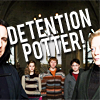
rideinthelimo
#02 [+00 -04] = -04
Thank you so much for participating! I hope you will stick around for voting!
People's Choice
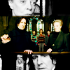
nastylies
#03 [+05 -00] = +05
Mods' Choice
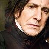
zestyzorra
#01 Love the cropping, it just works so well for this picture! The colouring is plain, but with the lack of colours around him it's hard to get such a natural colouring, and the subtle textures definitely add to it.
Points
+ are positive/favourite votes
- are negative/least favourite votes
Voting post for reference
01. [+02 -03] = -01
02. [+00 -04] = -04
03. [+05 -00] = +05
Least favourite comments
01 - While simple icons can be well-executed, the contrast seems a bit off on this one. It also looks like you've used part of a red light texture, which seems rather randomly done - perhaps you could have made it more prominent & used it to help focus on Snape more?
01 - I like simple icons, but I think this might be a bit too simple. There aren't any visible color/texture effects present, and it just seems kind of plain.
01 - I know it's a ~subtle icon, but I feel like it's not finished yet, there's something missing. And I feel the cropping, although intended to be 'close' isn't close enough. It just feels liuke it's in your face, as opposed to zooming in on something
02 - It's not that I don't like it, but compared to the other two choices it seems a little busy.
02 - Honestly, I didn't want to pick a least favorite, because I love them all....but eventually it has to be done ;). The biggest reason I chose this icon as my least favorite is because it seems overly brightened and sharpened. Snape and McGonagall are really bright and kind of hard to look at. I love everything else about it though. The text is funny, fitting, and I love how strong it is. Even though you can only see half of Snape and McGonagall's faces, I love the crop. It works so well for what the maker was going for, putting the emphasis on the text and on the trio. So, although it is my least favorite, it is still a well-made, strong icon - just too bright/sharp!
02 - The icon is overpixelated like it was sharpened too much.
02 - the text is a bit difficult to read, and the faces over-bright and sliced in half, which makes them distracting.
Favourite comments
01 - clear and simple. A bit oversharpened, but the subject is clear.
01 - Lovely coloring, amazing closeup! The icon is very pleasing to look at, definitely grabs your attention
03 - I like that it's a nice scene, and that the faces can be seen. The colours are really brought out, whilst a little over saturated I feel it works in this icon.
03 - I love the contrast between the black and white and the color, as well as the division of the image into the three parts. It's creative and well-executed.
03 - OMG this icon is so interesting to look at! I love the composition. There are so many artistic things going on in this icon. The maker used the rule of thirds, and it is made stronger by combining b&w with color, and also using parts of the image with the whole image. I love that we get to see the strong emotions on Snape's and McGonagall's faces, and also that it is made even stronger by good b&w. The whole picture being scaled down and in color in the middle makes such a nice transition in between the two's faces. We see their emotions mimicked on each other's faces, and in between, we see why they have those looks on their face. This is just such a visually appealing icon; I really love it.
03 - The trio of panels, not to mention the gorgeous coloring, work wonderfully together.
03 - the use of split screen is sheer genius and makes this icon stand out from the other two. very well done. excellent overall composition.
HiH points
Eliminations
Unfortunately we have to say goodbye to the following participant:

rideinthelimo
#02 [+00 -04] = -04
Thank you so much for participating! I hope you will stick around for voting!
People's Choice

nastylies
#03 [+05 -00] = +05
Mods' Choice

zestyzorra
#01 Love the cropping, it just works so well for this picture! The colouring is plain, but with the lack of colours around him it's hard to get such a natural colouring, and the subtle textures definitely add to it.
Points
+ are positive/favourite votes
- are negative/least favourite votes
Voting post for reference
01. [+02 -03] = -01
02. [+00 -04] = -04
03. [+05 -00] = +05
Least favourite comments
01 - While simple icons can be well-executed, the contrast seems a bit off on this one. It also looks like you've used part of a red light texture, which seems rather randomly done - perhaps you could have made it more prominent & used it to help focus on Snape more?
01 - I like simple icons, but I think this might be a bit too simple. There aren't any visible color/texture effects present, and it just seems kind of plain.
01 - I know it's a ~subtle icon, but I feel like it's not finished yet, there's something missing. And I feel the cropping, although intended to be 'close' isn't close enough. It just feels liuke it's in your face, as opposed to zooming in on something
02 - It's not that I don't like it, but compared to the other two choices it seems a little busy.
02 - Honestly, I didn't want to pick a least favorite, because I love them all....but eventually it has to be done ;). The biggest reason I chose this icon as my least favorite is because it seems overly brightened and sharpened. Snape and McGonagall are really bright and kind of hard to look at. I love everything else about it though. The text is funny, fitting, and I love how strong it is. Even though you can only see half of Snape and McGonagall's faces, I love the crop. It works so well for what the maker was going for, putting the emphasis on the text and on the trio. So, although it is my least favorite, it is still a well-made, strong icon - just too bright/sharp!
02 - The icon is overpixelated like it was sharpened too much.
02 - the text is a bit difficult to read, and the faces over-bright and sliced in half, which makes them distracting.
Favourite comments
01 - clear and simple. A bit oversharpened, but the subject is clear.
01 - Lovely coloring, amazing closeup! The icon is very pleasing to look at, definitely grabs your attention
03 - I like that it's a nice scene, and that the faces can be seen. The colours are really brought out, whilst a little over saturated I feel it works in this icon.
03 - I love the contrast between the black and white and the color, as well as the division of the image into the three parts. It's creative and well-executed.
03 - OMG this icon is so interesting to look at! I love the composition. There are so many artistic things going on in this icon. The maker used the rule of thirds, and it is made stronger by combining b&w with color, and also using parts of the image with the whole image. I love that we get to see the strong emotions on Snape's and McGonagall's faces, and also that it is made even stronger by good b&w. The whole picture being scaled down and in color in the middle makes such a nice transition in between the two's faces. We see their emotions mimicked on each other's faces, and in between, we see why they have those looks on their face. This is just such a visually appealing icon; I really love it.
03 - The trio of panels, not to mention the gorgeous coloring, work wonderfully together.
03 - the use of split screen is sheer genius and makes this icon stand out from the other two. very well done. excellent overall composition.
HiH points