Round 4: Challenge 3 Results
I couldn't keep waiting for votes so.....
ELIMINATED: (Please stick around, vote and participate in the comeback challenge!)
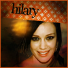
shakirafixation
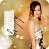
xxshebeexx
PEOPLE'S CHOICE:

elena_vlc_15
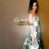
on_broadway36
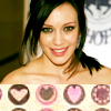
16tosvo
TALLIES: ( click here for your icon number)
1. - 5 + 4 = -1
2. - 4 + 3 = -1
3. - 7 + 2 = -5
4. - 7 + 3 = -4
5. - 4 + 3 = -1
6. - 7 + 2 = -5
I've put all the icon comments together this time so you don't have to search the positive and the favourites.
(-) = Lesser and (+) = Favourites.
ICON 01:
(+) The text and cropping is lovley.
(+) nice cropping and colour (though i think it would look better without the text)
(+) The text is nice and the coloring is vibrant while being dark. Nice work!
(+) nice clear, clean colouring and good text use
(-) The font & text placement bring down the picture. Could've been done in a better area.
(-) text is unattractive
(-) The colouring makes her skin look pasty and the icon is overall a little too dark
(-) the icon is a lil too dark
(-) cropping isn't good-looking
ICON 02:
(+) lovely use of coloring, and great use of text
(+) great cropping and using of textures
(+) nice croping and use of textures
(-) edges of image are pixelated
(-) oversharp (especially her face), too much empty space, and the text could be a tad bigger
(-) While the coloring looks good, Hilary's face looks very blurred out.
(-) the icon is too sharp especially around her upper body
ICON 03:
(+) good use of textures (though her skin seems a bit too yellow/green)
(+) Maybe a little too dark, but nice use of texture, text and brush.
(-) the icon is far too dark
(-) text looks so much sharpened/crappy and don't match the color of the used texture. pretty composition, though.
(-) too dark
(-) it seems too dark
(-) Bad cut out and discarting texture use.
(-) the icon is a bit too dark
(-) there are too many textures, overcrowding the image and overpowering the icon
ICON 04:
(+) great coloring!
(+) great coloring & nice cropping
(+) great crop and colouring!
(-) the icon is over-sharpened and her lips are neon pink
(-) the tiny text brush doesn't really fit the image, it would have been better without it
(-) The cropping is very awkward, cutting off half a persons eye and half a persons mouth (at that angle) takes away from the icon (it is very distracting). Also, the tiny text does not serve a purpose, it's just there (again just distracting).
(-) the cropping is awkward
(-) coloring is too bright
(-) The cropping could have been better and the lips and background are a bit too much on the neon side
(-) The cyan glow is unflattering especially against the bright clashing lips. The tiny text/dots (not sure) aren't flattering where they're positioned and don't add anything to the icon.
ICON 05:
(+) like the texture
(+) nice texture
(+) The texture throws it off a little but Hilary's colouring and cropping is the best of them all. It's clean there's no too sharp/too blurry.
(-) Mainly, she looks naked! If the texture had been placed down more (or up more for that matter, but that may have looked very strange) it may not have this problem, but in the exact position it's in she looks like she's wearing nothing behind that texture. Speaking of the texture, it doesn't necessarily fit with the rest of the piece, the way it is it just draws attention to itself and because of that it hurts the icon. Maybe if the rest of the background was completely out of focus, or not there at all, it might work. Also (going with if the background was out of focus) you can see that the background has more of a blue feel (with whatever that text is) or yellow to her left), there really isn't a purple pink feel anywhere (well, maybe her lips) so the coloring of the texture doesn't work. Maybe if the texture had more contrast, her hair goes black at some point (still with detail though), but the darkest the texture gets is a murky darkish purple/brown. It would have worked better if the contrast and coloring were universal.
(-) the texture doesn't really fit, and the cropping is unexciting
(-) Hilary's skin is a little too yellow and the texture is blurry.
(-) texture looked untimely
ICON 06:
(+) The use of texture is wonderful. It feels like she actually could be there standing in front of that texture (the coloring, use of textures, and contrast are really what makes it all fit together). The tiny text works (although the white background may be slightly distracting, but then it works well with the main text of Hilary... so it's a toss up). The font choice, color, and placement of her name all work very well.
(+) The textures used give it a very unique look & the rounded edges are a nice touch.
(-) edges of image are pixelated
(-) overcrowded
(-) The texture looks grainy and the text is placed oddly.
(-) bad texture use
(-) Bad use of texture
(-) Oversharpned.
(-) Hilary looks too sharpened around the edges, hair and face. The white rectangle throws off the icon how stark it is in comparison.
ELIMINATED: (Please stick around, vote and participate in the comeback challenge!)

shakirafixation

xxshebeexx
PEOPLE'S CHOICE:

elena_vlc_15

on_broadway36
16tosvo
TALLIES: ( click here for your icon number)
1. - 5 + 4 = -1
2. - 4 + 3 = -1
3. - 7 + 2 = -5
4. - 7 + 3 = -4
5. - 4 + 3 = -1
6. - 7 + 2 = -5
I've put all the icon comments together this time so you don't have to search the positive and the favourites.
(-) = Lesser and (+) = Favourites.
ICON 01:
(+) The text and cropping is lovley.
(+) nice cropping and colour (though i think it would look better without the text)
(+) The text is nice and the coloring is vibrant while being dark. Nice work!
(+) nice clear, clean colouring and good text use
(-) The font & text placement bring down the picture. Could've been done in a better area.
(-) text is unattractive
(-) The colouring makes her skin look pasty and the icon is overall a little too dark
(-) the icon is a lil too dark
(-) cropping isn't good-looking
ICON 02:
(+) lovely use of coloring, and great use of text
(+) great cropping and using of textures
(+) nice croping and use of textures
(-) edges of image are pixelated
(-) oversharp (especially her face), too much empty space, and the text could be a tad bigger
(-) While the coloring looks good, Hilary's face looks very blurred out.
(-) the icon is too sharp especially around her upper body
ICON 03:
(+) good use of textures (though her skin seems a bit too yellow/green)
(+) Maybe a little too dark, but nice use of texture, text and brush.
(-) the icon is far too dark
(-) text looks so much sharpened/crappy and don't match the color of the used texture. pretty composition, though.
(-) too dark
(-) it seems too dark
(-) Bad cut out and discarting texture use.
(-) the icon is a bit too dark
(-) there are too many textures, overcrowding the image and overpowering the icon
ICON 04:
(+) great coloring!
(+) great coloring & nice cropping
(+) great crop and colouring!
(-) the icon is over-sharpened and her lips are neon pink
(-) the tiny text brush doesn't really fit the image, it would have been better without it
(-) The cropping is very awkward, cutting off half a persons eye and half a persons mouth (at that angle) takes away from the icon (it is very distracting). Also, the tiny text does not serve a purpose, it's just there (again just distracting).
(-) the cropping is awkward
(-) coloring is too bright
(-) The cropping could have been better and the lips and background are a bit too much on the neon side
(-) The cyan glow is unflattering especially against the bright clashing lips. The tiny text/dots (not sure) aren't flattering where they're positioned and don't add anything to the icon.
ICON 05:
(+) like the texture
(+) nice texture
(+) The texture throws it off a little but Hilary's colouring and cropping is the best of them all. It's clean there's no too sharp/too blurry.
(-) Mainly, she looks naked! If the texture had been placed down more (or up more for that matter, but that may have looked very strange) it may not have this problem, but in the exact position it's in she looks like she's wearing nothing behind that texture. Speaking of the texture, it doesn't necessarily fit with the rest of the piece, the way it is it just draws attention to itself and because of that it hurts the icon. Maybe if the rest of the background was completely out of focus, or not there at all, it might work. Also (going with if the background was out of focus) you can see that the background has more of a blue feel (with whatever that text is) or yellow to her left), there really isn't a purple pink feel anywhere (well, maybe her lips) so the coloring of the texture doesn't work. Maybe if the texture had more contrast, her hair goes black at some point (still with detail though), but the darkest the texture gets is a murky darkish purple/brown. It would have worked better if the contrast and coloring were universal.
(-) the texture doesn't really fit, and the cropping is unexciting
(-) Hilary's skin is a little too yellow and the texture is blurry.
(-) texture looked untimely
ICON 06:
(+) The use of texture is wonderful. It feels like she actually could be there standing in front of that texture (the coloring, use of textures, and contrast are really what makes it all fit together). The tiny text works (although the white background may be slightly distracting, but then it works well with the main text of Hilary... so it's a toss up). The font choice, color, and placement of her name all work very well.
(+) The textures used give it a very unique look & the rounded edges are a nice touch.
(-) edges of image are pixelated
(-) overcrowded
(-) The texture looks grainy and the text is placed oddly.
(-) bad texture use
(-) Bad use of texture
(-) Oversharpned.
(-) Hilary looks too sharpened around the edges, hair and face. The white rectangle throws off the icon how stark it is in comparison.