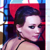
Round 4: Challenge 2 Results
Under the cut are the results. If you've been eliminated please stick around, vote and enter the comeback challenge. :)
ELIMINATED:
wonkiebonky
- 9 Votes

overevery
- 3 Votes

PEOPLE'S CHOICE:
xxshebeexx
+5 Votes

MOD'S CHOICE:
no mod's choice.
TALLIES: ( click here for your icon number)
01. -3 + 1 = -3
02. -3 + 3 = 0
03. -1 + 2 = +1
04. -2 + 0 = -2
05. -2 + 2 = 0
06. -1 + 4 = +3
07. -2 + 0 = -2
08. -0 + 5 = +5
09. -2 + 0 = -2
10. -0 + 0 = 0
11. -1 + 2 = +1
12. -9 + 0 = -9
I've put all the icon comments together this time so you don't have to search the positive and the favourites.
(-) = Lesser and (+) = Favourites.
ICON 01:
(-) icon is too dark
(-) a bit too dark
(-) The icon is over-sharpened & the coloring is too dark.
ICON 02:
(+) nice background and icon style
(+) Great use of texture
(+) I like how you used the flowery texture
(-) The circle behind the front circle is distracting, and the text is pixellated.
(-) texture doesn't fit with the icon
(-) Pale coloring and distracting texture use.
ICON 03:
(+) Lovely crop and gorgeous, bright colouring
(+) Great cropping.
(-) The coloring of the icon is too orange & unflattering in some parts.
ICON 04:
(-) hilary is too small in that icon and the icon is too empty.
(-) too much textutes
ICON 05:
(+) The texture used along with the text looks great.
(+) nice background
(-) coloring is too yellow
(-) texture doesn't fit with the icon & coloring seems a bit yellow
ICON 06:
(+) good cropping and colouring.
(+) lovely coloring & great cropping
(+) The coloring is lovely & nice cropping.
(+) Great coloring!
(-) The lighting and colouring makes her look a bit pasty
ICON 07:
(-) The colour is a little washed out
(-) a bit too orange
ICON 08:
(+) Gorgeous coloring and a beautiful effect.
(+) WOW. i love how its so different and not blue-ish from the rest. also the picture/stock and texture in the back are pretty and they match well with the colouring of hilary.
(+) Lovely colorin & good use of the textures
(+) The coloring and icon concept is gorgeous!
(+) very original, good composition and contrast
ICON 09:
(-) light texture doesn't fit
(-) the light texture doesnt fit well.
ICON 10:
no votes.
ICON 11:
(+) nice crop and text use
(+) Pretty, natural coloring.
(-) Bad, pale coloring and the box with the text is awkward.
ICON 12:
(-) looks grainy
(-) A little too heavy on the pink and a bit too much contrast
(-) the picture looks a little over sharp and the red square doesnt really match
(-) icon is too dark and over contrasted
(-) Pinkish coloring and overpowering textures.
(-) The textures overpower the image, & it's over-sharpened.
(-) Hilary looks so purple
(-) the texture is not used well. its blurry around hilary's face.
(-) Hilary's face is too purple and the background is distracting.
Merry Christmas and have a Happy New Year. hilary_lims will recommence Jan 2, '08 with Round 4: Challenge 3. Enjoy your holidays. :)
ELIMINATED:
wonkiebonky
- 9 Votes

overevery
- 3 Votes

PEOPLE'S CHOICE:
xxshebeexx
+5 Votes

MOD'S CHOICE:
no mod's choice.
TALLIES: ( click here for your icon number)
01. -3 + 1 = -3
02. -3 + 3 = 0
03. -1 + 2 = +1
04. -2 + 0 = -2
05. -2 + 2 = 0
06. -1 + 4 = +3
07. -2 + 0 = -2
08. -0 + 5 = +5
09. -2 + 0 = -2
10. -0 + 0 = 0
11. -1 + 2 = +1
12. -9 + 0 = -9
I've put all the icon comments together this time so you don't have to search the positive and the favourites.
(-) = Lesser and (+) = Favourites.
ICON 01:
(-) icon is too dark
(-) a bit too dark
(-) The icon is over-sharpened & the coloring is too dark.
ICON 02:
(+) nice background and icon style
(+) Great use of texture
(+) I like how you used the flowery texture
(-) The circle behind the front circle is distracting, and the text is pixellated.
(-) texture doesn't fit with the icon
(-) Pale coloring and distracting texture use.
ICON 03:
(+) Lovely crop and gorgeous, bright colouring
(+) Great cropping.
(-) The coloring of the icon is too orange & unflattering in some parts.
ICON 04:
(-) hilary is too small in that icon and the icon is too empty.
(-) too much textutes
ICON 05:
(+) The texture used along with the text looks great.
(+) nice background
(-) coloring is too yellow
(-) texture doesn't fit with the icon & coloring seems a bit yellow
ICON 06:
(+) good cropping and colouring.
(+) lovely coloring & great cropping
(+) The coloring is lovely & nice cropping.
(+) Great coloring!
(-) The lighting and colouring makes her look a bit pasty
ICON 07:
(-) The colour is a little washed out
(-) a bit too orange
ICON 08:
(+) Gorgeous coloring and a beautiful effect.
(+) WOW. i love how its so different and not blue-ish from the rest. also the picture/stock and texture in the back are pretty and they match well with the colouring of hilary.
(+) Lovely colorin & good use of the textures
(+) The coloring and icon concept is gorgeous!
(+) very original, good composition and contrast
ICON 09:
(-) light texture doesn't fit
(-) the light texture doesnt fit well.
ICON 10:
no votes.
ICON 11:
(+) nice crop and text use
(+) Pretty, natural coloring.
(-) Bad, pale coloring and the box with the text is awkward.
ICON 12:
(-) looks grainy
(-) A little too heavy on the pink and a bit too much contrast
(-) the picture looks a little over sharp and the red square doesnt really match
(-) icon is too dark and over contrasted
(-) Pinkish coloring and overpowering textures.
(-) The textures overpower the image, & it's over-sharpened.
(-) Hilary looks so purple
(-) the texture is not used well. its blurry around hilary's face.
(-) Hilary's face is too purple and the background is distracting.
Merry Christmas and have a Happy New Year. hilary_lims will recommence Jan 2, '08 with Round 4: Challenge 3. Enjoy your holidays. :)