Session 6; Challenge 10: Results
Banner maker this week is orlandogirl.
Results:
Eliminated:


orlandogirl
with -6 votes
Please stick around to vote for other challenges!
People's Choice:
hot_radcliffe
with +4 votes
Comments:
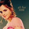
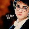
1. (-2) + (+6) = +4
+ Simple and great colouring.
+ no comment
+ no comment
+ no comment
- The coloring for both icons is muted and somewhat flat, especially in the first one. The cropping is decent but not outstanding, the images are a bit too sharp around the edges, and the text (in font type, coloring and placement) really takes away from overall appearance of both icons.
+ no comment
- I think both icons appear really dark and the blending with the texture is not well done
+ the coloring and cropping is great
2. (-2) + (+1) = -1
+ no comment
- hermione's 'edges' look harsh and jagged, the notebook texture behind harry is out of place
- the icons are good but on the first icon the white text seems to stand out to much against the darker image and on the second icon i really like the notebook effect.i think it matches him good but the light texture seems to crowd the image and not match the rest of the icon well.
3. (-1) + (+4) = +3
+ no comment
+ no comment
+ no comment
+ Beautiful use of textures =]
- it's a nice set up but you can't really tell that each icon refers to the hhr ship
4. (-7) + (+1) = -6
- The icons look too crowded.
- The images are very small and blurry (the light texture on top "unfocus" the images even more). Font doesn't compliment the icon, and it's the one that is father from the "implied" theme, they could just be Harry and Hermione - friends.
- the photos are too blurry and are overpowered by the textures. also, the font does not fit well with the overall look of the icon
- the textures are too distracting from the images of hhr
- the choice of text colour is too light against the texture making it too hard to read
+ although I think the textures are really too much, the blending is spot on.
- The text in the icons is hardly readable, and there is too much going on, too much textures.
- The textyre use of light circles matches, but with all the over textures drowns the subject and text.
Results:
Eliminated:
orlandogirl
with -6 votes
Please stick around to vote for other challenges!
People's Choice:
hot_radcliffe
with +4 votes
Comments:
1. (-2) + (+6) = +4
+ Simple and great colouring.
+ no comment
+ no comment
+ no comment
- The coloring for both icons is muted and somewhat flat, especially in the first one. The cropping is decent but not outstanding, the images are a bit too sharp around the edges, and the text (in font type, coloring and placement) really takes away from overall appearance of both icons.
+ no comment
- I think both icons appear really dark and the blending with the texture is not well done
+ the coloring and cropping is great
2. (-2) + (+1) = -1
+ no comment
- hermione's 'edges' look harsh and jagged, the notebook texture behind harry is out of place
- the icons are good but on the first icon the white text seems to stand out to much against the darker image and on the second icon i really like the notebook effect.i think it matches him good but the light texture seems to crowd the image and not match the rest of the icon well.
3. (-1) + (+4) = +3
+ no comment
+ no comment
+ no comment
+ Beautiful use of textures =]
- it's a nice set up but you can't really tell that each icon refers to the hhr ship
4. (-7) + (+1) = -6
- The icons look too crowded.
- The images are very small and blurry (the light texture on top "unfocus" the images even more). Font doesn't compliment the icon, and it's the one that is father from the "implied" theme, they could just be Harry and Hermione - friends.
- the photos are too blurry and are overpowered by the textures. also, the font does not fit well with the overall look of the icon
- the textures are too distracting from the images of hhr
- the choice of text colour is too light against the texture making it too hard to read
+ although I think the textures are really too much, the blending is spot on.
- The text in the icons is hardly readable, and there is too much going on, too much textures.
- The textyre use of light circles matches, but with all the over textures drowns the subject and text.