Round 6; Challenge 9: Results
Bannermaker this week is hot_radcliffe. (Volunteer here!)
Eliminated:
tubby2747
with -5 votes
People's Choice:
ennelya
with +2 votes
Comments:
#1: (-2) = -2
- heart brush doesn't fit the image
- the icon is nice but the icon doesnt seem that creative and simple is god but the heart doesnt seem to go well with the image and seems to pop out too much.maybe if you find a different heart and fade it a bit,it will help
#2: (-3) + (+3) = 0
- It may just be the most original idea among the group, but the image turned out too small, too blurry and too dark :(
- the texture doesn't fit and is really too much
- flower brush/texture doesn't fit the image
+ original idea using the concrete texture in the background as well as the flowers
+ no comment
+ no comment
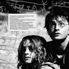
#3: (-4) + (+2) = -2
- the image looks blurry
- a little bit too blurry and the cropping is a little awkward
- the image looks too blurry
- the lighting on Harry is too bright
+ I like the rotation of the subjects and the blurred (soft light?) layer gives it a nice touch.
+ nice crop
#4: (-5) = -5
- the background is very busy between the scribbles and the tiny text box
- a bit too oversharpened, too much contrast (I can't believe I'M saying that), and the brush used in the background is a little bit too busy
- The scratch texture used is too rough and doesn't compliment the icon.
- hhr seem too dark and the background texture is too distracting
- the scriggle seems to over power the icon and it looks like to much is goin on the icon,its very busy.
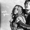
#5: (+2) = 2
+ nice crop =]
+ I like the text and crop
THE NEXT CHALLENGE HAS BEEN POSTED!
Eliminated:
tubby2747
with -5 votes
People's Choice:
ennelya
with +2 votes
Comments:
#1: (-2) = -2
- heart brush doesn't fit the image
- the icon is nice but the icon doesnt seem that creative and simple is god but the heart doesnt seem to go well with the image and seems to pop out too much.maybe if you find a different heart and fade it a bit,it will help
#2: (-3) + (+3) = 0
- It may just be the most original idea among the group, but the image turned out too small, too blurry and too dark :(
- the texture doesn't fit and is really too much
- flower brush/texture doesn't fit the image
+ original idea using the concrete texture in the background as well as the flowers
+ no comment
+ no comment
#3: (-4) + (+2) = -2
- the image looks blurry
- a little bit too blurry and the cropping is a little awkward
- the image looks too blurry
- the lighting on Harry is too bright
+ I like the rotation of the subjects and the blurred (soft light?) layer gives it a nice touch.
+ nice crop
#4: (-5) = -5
- the background is very busy between the scribbles and the tiny text box
- a bit too oversharpened, too much contrast (I can't believe I'M saying that), and the brush used in the background is a little bit too busy
- The scratch texture used is too rough and doesn't compliment the icon.
- hhr seem too dark and the background texture is too distracting
- the scriggle seems to over power the icon and it looks like to much is goin on the icon,its very busy.
#5: (+2) = 2
+ nice crop =]
+ I like the text and crop
THE NEXT CHALLENGE HAS BEEN POSTED!