Round 6; Challenge 2: Results
Hopefully I've got everything right. Been staring at it for about half an hour to make sure everything adds up right, but after so long it all looks right anyways. Again, sorry for the delay. At least now we only have to eliminate 3 people instead of 5!
Bannermaker this week is orlandogirl. (Volunteer here!)
Eliminated:
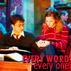
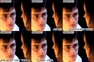
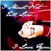
nopamuk
with -5 votes
cheapxdate
with -5 votes
weasleysangel
with -4 votes
Sorry to see you go, but stick around for voting and the 2nd chance challenge!
People's Choice:Mod's Choice
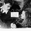
li_potter
with +2 votes
pokecharm
Comments:
#1: (-6) + (+1) = -5
- the icon is really red
- it seems like there's a red coloring layer that overpowers the image
- Icon is over saturated
- Overly saturated. Too much color in the picture, and the red font doesn't work for the composition.
- the image is over saturated and the font doesn't go with the icon.
- oversharpened text
+ fantastic coloring and placing of text
#2: (-3) + (+1) = -2
- Lacks contrast, and is way to light. Their faces appear to be washed out.
- The colouring is very cold and it flat. It doesn't enhance the picture at all. The composition lacks character and strength.
- too light, texture doesn't work
+ Great colouring and the text fits perfectly with the image.
#3: (-1) + (+3) = 2
- the tiny text is nice, but picture is rotated too much
+ No comment
+ I really love the way the picture gains strength in black and white. It's a little sharp, but it's really nice.
+ No comment
#4: (+1) = 1
+ No comment
#5: (-3) = -3
- the yellow coloring makes their faces look too yellow aka it overpowers the image.
- The colouring makes their faces look too yellow
- the yellow colouring is a bit overpowering in the icon
#6: (-1) + (+1) = 0
- the texture oversharpens the icon and the white box doesn't seem to go along with the icon.
+ nice
#7: (+1) = 1
+ nice blend and crop
#8: (-5) = -5
- Font doesn't fit with the image.
- the text is a bit strangely placed and doesn't fit the icon
- Text placement at the corner doesn't benefit the layout of the icon, and the font choice could have been more creative.
- It's very generic there wasnt much change to the coloring and the font they used is very pixleated and detracts from the icon its just not very apealing to the ihcon itself.
- not much going on, too simple, the small text doesn't seem like a good choice for this icon
#9: (-2) + (+1) = -1
- the light texture does not fit with the icon and takes away from the picture
- The coloring is okay on the icon but i the brush they used just dosn't fit with the message the were giving in the icon and nether dose the font the font is very plan
+ i really like the coloring of this icon, well done :)
#10: (-3) = -3
- Good idea of the window icon but the colouring in Harry looks weird and the text could be better.
- the frames do not make the image better
- Hard to find a focal point, text looks squished in the box. Colouring is a bit off (ie Harry's face is very yellow)
#11: (-4) + (+1) = -3
- the brush used doesn't really fit the icon, and the text is difficult to read and takes away from it
- the light texture does not fit with the icon and takes away from the picture
- The brush is too bold and the icon needs a bit more contrast.
- brush/frame doesn't fit with icon
+ I love the brushes and font that they used it compliments the icon very well and soent overwhelm it and they did an awsome color job on the picture itself its not to bright and not to dark good job.
#12: (-4) = -4
- It looks oversaturated.
- Over sharpened, text looks distracting
- the text is sharp around the edges, and needs to be anti-aliased. The icon is also oversharpened.
- the image is over sharpened
#13: (-1) = -1
- The icon is too pale/under constrasted
#14: (+1) = 1
- This one is very blury nd over sharp at the same time (not sure how that can be but it was acomplished here lol) and the coloring is odd especally on harrys face.
+ Beautiful coloring and choice of image :)
#15: (-3) = -3
- I think the blending is a bit much
- The scratchy texture overpowers the icon
- The blending of the two pictures is confusing, and there isn't any relevance to any of them. They're on the same level, competing with each other and that is very confusing. I don't think the scratches work for the icon.
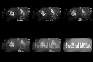
#16: (-2) + (+2) = 0
- The animation is very quick and doesn't run smoothly.
- the animation is too fast and you cant really tell whats going on in the icon
+ No comment
+ Gorgeous. I love the text and the animation. The contrast is perfect.
THE NEXT CHALLENGE HAS BEEN POSTED.
Bannermaker this week is orlandogirl. (Volunteer here!)
Eliminated:


nopamuk
with -5 votes
cheapxdate
with -5 votes
weasleysangel
with -4 votes
Sorry to see you go, but stick around for voting and the 2nd chance challenge!
People's Choice:Mod's Choice


li_potter
with +2 votes
pokecharm
Comments:
#1: (-6) + (+1) = -5
- the icon is really red
- it seems like there's a red coloring layer that overpowers the image
- Icon is over saturated
- Overly saturated. Too much color in the picture, and the red font doesn't work for the composition.
- the image is over saturated and the font doesn't go with the icon.
- oversharpened text
+ fantastic coloring and placing of text
#2: (-3) + (+1) = -2
- Lacks contrast, and is way to light. Their faces appear to be washed out.
- The colouring is very cold and it flat. It doesn't enhance the picture at all. The composition lacks character and strength.
- too light, texture doesn't work
+ Great colouring and the text fits perfectly with the image.
#3: (-1) + (+3) = 2
- the tiny text is nice, but picture is rotated too much
+ No comment
+ I really love the way the picture gains strength in black and white. It's a little sharp, but it's really nice.
+ No comment
#4: (+1) = 1
+ No comment
#5: (-3) = -3
- the yellow coloring makes their faces look too yellow aka it overpowers the image.
- The colouring makes their faces look too yellow
- the yellow colouring is a bit overpowering in the icon
#6: (-1) + (+1) = 0
- the texture oversharpens the icon and the white box doesn't seem to go along with the icon.
+ nice
#7: (+1) = 1
+ nice blend and crop
#8: (-5) = -5
- Font doesn't fit with the image.
- the text is a bit strangely placed and doesn't fit the icon
- Text placement at the corner doesn't benefit the layout of the icon, and the font choice could have been more creative.
- It's very generic there wasnt much change to the coloring and the font they used is very pixleated and detracts from the icon its just not very apealing to the ihcon itself.
- not much going on, too simple, the small text doesn't seem like a good choice for this icon
#9: (-2) + (+1) = -1
- the light texture does not fit with the icon and takes away from the picture
- The coloring is okay on the icon but i the brush they used just dosn't fit with the message the were giving in the icon and nether dose the font the font is very plan
+ i really like the coloring of this icon, well done :)
#10: (-3) = -3
- Good idea of the window icon but the colouring in Harry looks weird and the text could be better.
- the frames do not make the image better
- Hard to find a focal point, text looks squished in the box. Colouring is a bit off (ie Harry's face is very yellow)
#11: (-4) + (+1) = -3
- the brush used doesn't really fit the icon, and the text is difficult to read and takes away from it
- the light texture does not fit with the icon and takes away from the picture
- The brush is too bold and the icon needs a bit more contrast.
- brush/frame doesn't fit with icon
+ I love the brushes and font that they used it compliments the icon very well and soent overwhelm it and they did an awsome color job on the picture itself its not to bright and not to dark good job.
#12: (-4) = -4
- It looks oversaturated.
- Over sharpened, text looks distracting
- the text is sharp around the edges, and needs to be anti-aliased. The icon is also oversharpened.
- the image is over sharpened
#13: (-1) = -1
- The icon is too pale/under constrasted
#14: (+1) = 1
- This one is very blury nd over sharp at the same time (not sure how that can be but it was acomplished here lol) and the coloring is odd especally on harrys face.
+ Beautiful coloring and choice of image :)
#15: (-3) = -3
- I think the blending is a bit much
- The scratchy texture overpowers the icon
- The blending of the two pictures is confusing, and there isn't any relevance to any of them. They're on the same level, competing with each other and that is very confusing. I don't think the scratches work for the icon.
#16: (-2) + (+2) = 0
- The animation is very quick and doesn't run smoothly.
- the animation is too fast and you cant really tell whats going on in the icon
+ No comment
+ Gorgeous. I love the text and the animation. The contrast is perfect.
THE NEXT CHALLENGE HAS BEEN POSTED.