Round 5; Challenge 11: Results
Bannermaker this week is hot_radcliffe. (Volunteer here!)
Eliminated: shadowsong_13
People's Choice: tubby2747
Eliminated:
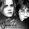
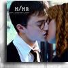
shadowsong_13
with -4 votes
People's Choice:
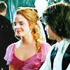
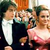
tubby2747
with +4 votes
Comments:
Part 1
#1: (-2) + (+2) = 0 willowcanne
- This icon needs something more to be on par with the other two.
- The picture is floating on nothing... there is no intent in it, and it reflects no emotion. It looks unfinished.
+ Great choice of image, contrast is just perfect!
+ Nice b&w and framing!
#2: (-2) + (+3) = 1 tubby2747
- Oversharpened -- and it looks like not much was done to it but oversharpening
- The framing and colouring are not interesting.
+ Great image and colouring.
+ I love the colouring! I think it's a bit too sharp, but it's still the best of the three...
+ Great color and emotion in this icon.
#3: (-3) + (-2) = -1 shadowsong_13
- The cropping is great but there´s nothing that catches my attention.
- It's slightly oversharpned, and if the heart brush was more "shapened" it would have complimented the icon better.
- The black and white is over-contrasted and the color is grainy. Also, there is no visual interest in the icon. Also, the font used is too structured for such an icon, and the heart is all fuzzy (try sharpening it).
+ Good blending, and good contrast.
+ no comment
Part 2
#1: (-4) + (+1) = -3 shadowsong_13
- The manipulation looks strange; it's the least convincing.
- While I like the idea, I think it the colouring is a little too cold, and while that was ok for the H/C kiss, it doesn't really go with the idea of a H/Hr one... It's pretty, but I have to choose one!
- The background texture is oddly placed -- it would be fine if the whole image was of H/Hr, but it looks strange off the right like that.
- Good crop and color, but it's overdone; you should have stopped at the image with the neat border and not added the text, which is blurry. It would have been perfect without it.
+ The manip it's flawless. There was just no need for the text at the top left corner, it distracts from the image ans is blurry.
#2: (-3) + (+3) = 0 willowcanne
- The icon is great but since I have to eliminate one I´ll choose this cause it looks to me the maker didn´t have that much work to make the manip like the others.
- I have to vote for one... and this is the less complicated one. But it's a lovely icon even if H/Hr are not so close.
- The texture really overpowers the icon. The colouring is a little plain.
+ I love the composition. I love the intent in it, and the fonts look so good together! Although I think the colouring could've been better, I love this composition the most.
+ no comment
+ I love the high crop and the varying handwriting fonts.
#3: (+3) = 3 tubby2747
+ OMG!it´s a missing scene from GoF! perfect!
+ Great manip, and very pretty.
+ Perfect manipulation, nice colouring!
Congratulations to our finalists! The final challenge has been posted!
Eliminated: shadowsong_13
People's Choice: tubby2747
Eliminated:


shadowsong_13
with -4 votes
People's Choice:


tubby2747
with +4 votes
Comments:
Part 1
#1: (-2) + (+2) = 0 willowcanne
- This icon needs something more to be on par with the other two.
- The picture is floating on nothing... there is no intent in it, and it reflects no emotion. It looks unfinished.
+ Great choice of image, contrast is just perfect!
+ Nice b&w and framing!
#2: (-2) + (+3) = 1 tubby2747
- Oversharpened -- and it looks like not much was done to it but oversharpening
- The framing and colouring are not interesting.
+ Great image and colouring.
+ I love the colouring! I think it's a bit too sharp, but it's still the best of the three...
+ Great color and emotion in this icon.
#3: (-3) + (-2) = -1 shadowsong_13
- The cropping is great but there´s nothing that catches my attention.
- It's slightly oversharpned, and if the heart brush was more "shapened" it would have complimented the icon better.
- The black and white is over-contrasted and the color is grainy. Also, there is no visual interest in the icon. Also, the font used is too structured for such an icon, and the heart is all fuzzy (try sharpening it).
+ Good blending, and good contrast.
+ no comment
Part 2
#1: (-4) + (+1) = -3 shadowsong_13
- The manipulation looks strange; it's the least convincing.
- While I like the idea, I think it the colouring is a little too cold, and while that was ok for the H/C kiss, it doesn't really go with the idea of a H/Hr one... It's pretty, but I have to choose one!
- The background texture is oddly placed -- it would be fine if the whole image was of H/Hr, but it looks strange off the right like that.
- Good crop and color, but it's overdone; you should have stopped at the image with the neat border and not added the text, which is blurry. It would have been perfect without it.
+ The manip it's flawless. There was just no need for the text at the top left corner, it distracts from the image ans is blurry.
#2: (-3) + (+3) = 0 willowcanne
- The icon is great but since I have to eliminate one I´ll choose this cause it looks to me the maker didn´t have that much work to make the manip like the others.
- I have to vote for one... and this is the less complicated one. But it's a lovely icon even if H/Hr are not so close.
- The texture really overpowers the icon. The colouring is a little plain.
+ I love the composition. I love the intent in it, and the fonts look so good together! Although I think the colouring could've been better, I love this composition the most.
+ no comment
+ I love the high crop and the varying handwriting fonts.
#3: (+3) = 3 tubby2747
+ OMG!it´s a missing scene from GoF! perfect!
+ Great manip, and very pretty.
+ Perfect manipulation, nice colouring!
Congratulations to our finalists! The final challenge has been posted!