Icon Tutorial 2
(Crossposted to labellsansbra)
Since putting up the original one back... whenever it was, I have continously messed and recoloured and experimented with my icons. I need a hobby. And in all the months since I first started doing it, the overall method has changed quite a bit. Or well, I like to think so, otherwise I wouldn't putting up this thing.
So have a slightly updated tutorial for how I do Matsumoto's icons, which will probably be outdated in a week when I find something else shiny.
The first, most important thing when it comes to colour no matter what, even if you're only tinting or overlaying or whatnot is: SAVE YOUR COLOUR. I don't care if you keep swatches, a picture with colour blobs, a bookmark to a wikipedia page, a notepad file with the hex code, WHATEVER, save every colour you use. Unless it's, you know, black or white. This is really is the most important thing, especially if you want your icons to look like a matching set. Doing this when you startout and making it a habit to save it will go a long way in the future to save time.
Secondly is get to know your tools! Obviously not just the paintbrush and eraser, but the dodge and burn tool to clean up lineart, the clonestamp tool, special layers .. just experiment with them and get familiar with what they do. Make shortcuts with them! Go crazy, have fun, etc etc. I assume that you know at least the basic stuff.
On to the tutorial itself. I'm using photoshop CS3 but it should be fairly translatable to other things. o/
- This is the icon I'm starting with.
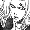
It's not a very clean scan. In fact, it used to be LESS clean before that, but I used levels and eraser to fix it a bit. To make the lines slightly more darker, and fix up her uniform, the dodge tool set to "shadows" comes quiiite in handy.
- Here's the cleaned up version.
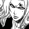
Much better!
- There's a lot of ways to set up the base image for colouring. Some people use it as the background, some use it as the top... I tend to go for the latter because I'm lazy. And you'll see why in a moment.
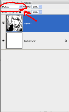
So I set it to multipy after I make sure that the lineart is what I want it to be. You'll notice I have a background in the picture. This icon won't HAVE a real background, but I keep that in there because if I need to adjust the opacity of the layers, the icon won't end up transparent in places. I tend to make the background a single colour, like blue to contrast with her hair, but it's possible to all sorts of nice effects, textures with it. I personally just choose not to because I'm anal and eventually end thinking the icon is too busy.
- Then I make at least three new layers.
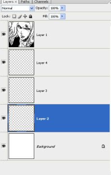
I say at least because I use a different layer for each "part" of her. Her skin, her hair, and her clothes are all parts of her. I don't have to worry about her uniform because it's black in this, but I do create a layer for her scarf and her eyes. If I'm dealing with a lighter (doujinshi) scan, I usually make another layer for her uniform as well.
If there's another person in the icon, I might make another layer or two for them, depending. If there's a lot of overlapping or touching pieces, I do to keep things neat and easy to clean up (it's easer to erase mistakes then to constantly go back and chose the color again). If there's not, they'll share a layer, like in this icon.
You'll notice I don't label the layers. . . . that is because I'm lazy and have large thumbnails. Please label your layers if you want or need it.
- Then lay down the flat color.
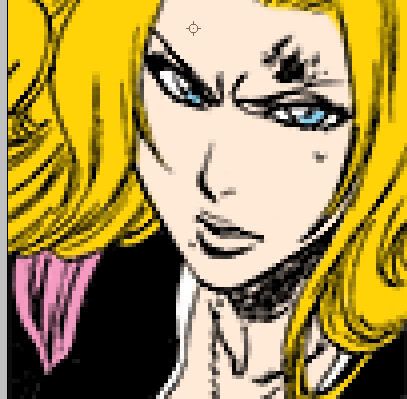
It's been enlarged 400% so you can actually see it. I ended up making some slight changes to it, but all I worry about now is just putting the colour down and making any adjustments where I see fit. I got Rangiku's hair colour by sampling from a picture in the manga, and her skin is from skin swatches I've made. Sampling is AWESOME. I highly recommend it if your character has a unique hair color or eye color, or what. Don't worry about going over the eyes in the skin colour layer, because in the top layer, I go over them again with white and her eye colour.
Here's the layers from this: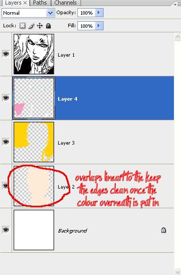
Yes, as you noticed, the very bottom color layer overlaps on the edges for cleaner lines in the end process. Obviously it's harder to do if there's a real background in the picture, but this is why I have the lineart at the top. Also as you can see, they're all set to NORMAL at 100 % opacity for now. This won't change.
- Then I create a new layer on top of EACH of my existing colour layers.
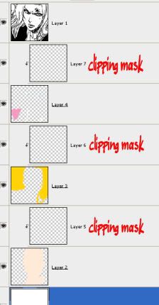
... and set them all to clipping mask (by right clicking said layer or going into layer options at the top). Once again, they're all set to Normal at 100 percent. THIS might change later on if I need to reduce the opacity of the shading/highlight, but it's a good place to start out. If there's more than one set of colour in a layer, like in the icon I linked earlier, I generally create a new clipping mask layer.
- Now to put in the shadows and highlights.
And the layers from it. Usually I do one layer at a time, but for the sake of the tutorial, I did all of them at once.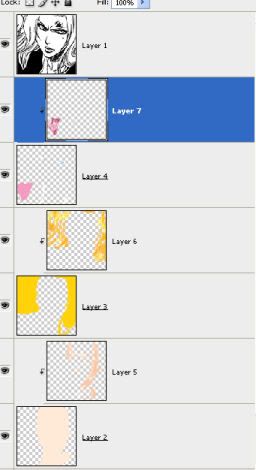
Here's where I repeat SAVE YOUR COLOURS. For good depth, you want at least two shades up from your base colour and two down. Once again, if you're working from a canon image, go ahead and colour sample those said shades. I know that in CS3, it also allows you to load up preset colour palletes in the preset manager. They are amazing. Use them, if you want. And once you have your two shades up and down, SAVE THEM. Please. ;o; And then apply the shading and highlights where appropriate. This icon doesn't allow me to do, but if you think it'll help by putting in a drawing of a lightsource, do it.
It looks... yeah.
- I soften them.

This shows what the icon looks like with the skin gaussian blurred twice at .9 pixels. Since I'm dealing with a 100x100 image, I usually keep it around that. I might go slightly over 1 pixel, but rarely over 2. However, gaussian blurring isn't "soft" enough for me. Your mileage may vary.
- So I get out of my blur tool.

And I manually soften the colours in the shading. Doing this will make them lighter, so I usually go back with the darker colours where I need them again. I concentrate on the edges of the colour and usually use a larger (5-10) brush. Again, it just takes experimenting and trying it out until you accomplish something YOU like. This is what I ended up liking, so I went with it. You probably can't tell, but I did include shading to the shadow under her chin and left that mostly alone with the blur tool.
Touching the top and left side of the image with the blur tool will um, give you black blurry splotches appearing. This is easily remedied by either being careful or resizing the canvas to make white room on all sides of the image, if you keep it in the middle. The right and bottom should be fine, though.
- After I do her skin, I move to her hair.
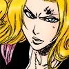
Here's what her hair looks like when it's gaussian blured twice. I didn't like that all, so I redid most of the shading on her hair and use the manual blur.
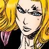
I used two shades up and down, but I also have a really bright shade for the highlights, and I will put in white dots for emphasis if I want to. Again, it's all about doing what you think looks good and what you want. Sometimes I don't include the white all.
This is also a really good example of why I put the shading on another level. If want to redo it, I don't have to worry about switching to the base colour and shades over and over again. It's just a matter of erasing. Sometimes I will adjust the opacity of her hair shading level. That day is not today.
- Then I move onto her scarf.

Second verse, same as first. This is also where I remembered "oh right her lips are showing in this icon" and jumped down to create a new clipping mask layer over my skin and shade her lips in.
If there's other characters in the icon that are being coloured, then you do their shading layers all the same way. Remember, experiment with what you like.
So when I'm mostly done with my shading and colour, I move on to the ~lineart~.
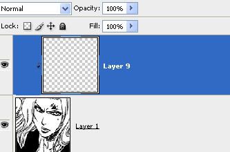
So I make a new layer and set it to normal, and clipping mask. Clipping mask is so that when I change it to its final setting, it'll only effect the lineart and none of the colour underneath. Normal is so that I can see what I'm doing, which is--
- -going over all the lines with darker shades.
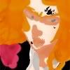
Yes, it looks terrible. I'm not neat at all. 8D. I usually use darker shades for the lines because I don't like it when the lineart is TOO light. You may think otherwise. You'll notice I left the blood on her face alone. It's going to get its own layer later.
- After I finish going over ALL the black contour lines, I set the layer to soft light.
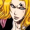
Soft light is MY preferred setting, but screen/overlay/colour/etc may also be used with adjusted opacity settings. However, not every layer setting effects ONLY the lines. Keep this in mind, whatever you do, but AGAIN use whatever you think looks good. And see, setting it to clipping mask makes it so that only the black lines are affected. I didn't get a screenshot, but if I hadn't set it to clipping mask, the there would have been light splotches all over the colour where it overlaps.
Now that you can see the lines again, this is a good time to fix and tweak some of the colours over them. For example, I recolour her pupils black and make the lines around her eyes blue, and while I didn't in this picture, I'll give her a slightly red hue around her lips. This is how the necklace ends up coloured. It's... a lot easier than trying to do it any otherway.
- From here, I kind of. Do whatever, depending on what I want the icon to look like.
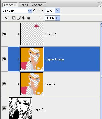
Typically, once I'm satisfied with the soft light layer, I duplicate it and adjust the opacity level, usually around 30-60 percent. You'll notice the layer of blood above that. I ended up using a more bright shade of red, but this is set to screen with opacity adjusted.
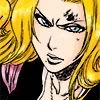
- Annnd here's the finished icon!
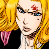
I have stopped putting in borders on my icons, but if I do, I make a new layer above the softlight ones and do it there. That keeps it nice, black, sharp and REMOVEABLE. Which I like. I always save in PNG because I hate JPG artifacts with the passion of a thousand fiery suns.
SO IN CONCLUSION.
I have too much free time on my hands.
Though this does seem like it's a long proccess, usually icons only take about 15-20 minutes to make. Longer, depending on how much experimentation I want to do. But if I'm going to messing with different shading, or seeing how an icon looks with a blush or whatnot, it's so much more easier to create a new layer for messing around, and deleting it when I don't want it.
Again, this icon didn't end up using a background, but because I like to keep them simple, it would have ended up plain bright blue so I wouldn't look at it in six months and think it's distracting away from her.
Um um um any questions or thoughts or whatever? I'm apparently really bored.