Signs
Here I have made many "signs" for the siteScene Photography. It is a myspace page, linked up to my livejournal page that focuses all on art.
These are all in order from when I made them. First to last. You can tell the difference. Sadly, it has not been a big hit. The premises of this post is just the defaults for the site. Nothing that interesting, but i like some of the editing I did!
People can also post their own work if they'd like. I have a friend who is drawing for the site =] yay, A hit! A hit!
(The description, caption,comments, whatever you'd like to call them are beneath the picture. I know it looks like it should be above it. If not, then Im crazy and sorry for confusing you further.)
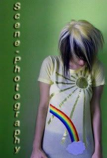
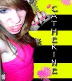
I don't particularly like the colors in this one. The green is a weird shade so it looks odd with the off yellow to me. But I liked the rainbow on the shirt. It was the first one.
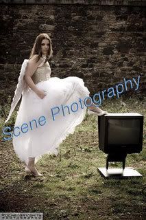
This one is just ok. Its just so random and the colors are too ordinary! But I liked the picture or photoshoot.
I should have edited the colors a bit more. but I think its sorta of cute!
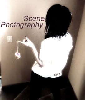
I like how it seems very blue, cool colors. And I enjoyed working on this one even though it didn't turn out so great =]
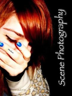
I love the orange hair with the blue fingernails with the black background! I think it gave it a really cool look. this was the default for a while.
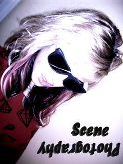
Glasses = freaking amazing! thats all i got to say here!
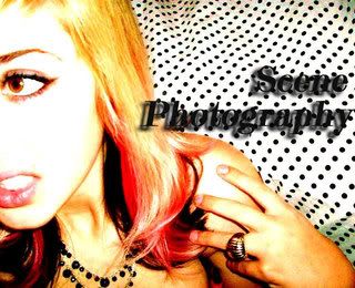
The polka dots were incredibly scene per say.I liked the colors in her hair and patters together.
Colors=dashing.
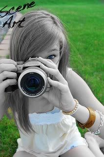
The camera had sort of a rainbow on the lens. so i decided black and white with some color. I think it turned out well. The font was the issue. Also you can see instead of scene photography i changed it to art. I figured if the site was for art, I should be all inclusive in the name, ya?
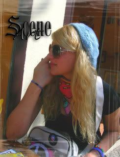
I really liked the outfit that the girl was wearing and I think that the font was rather cool. I tried using a frame with OnOne Essentials for photoshop. Most of them are similar, but I changed the opacity and width to make it work. It looks fine.
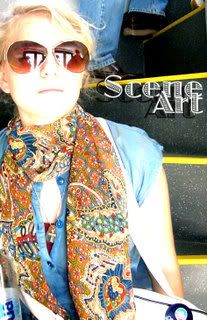
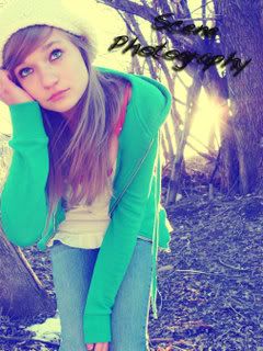
This, i think, is my favorite! I love the stairs she's sitting on, and again her fashion sense is incredible. It went well together and as for the font; it took awhile to find something that worked that went well with her style. i think it turned out great.
aha! this one. Well I had made a few signs for certain people in particular with their names and stuff for example
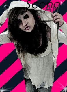
and as you can see I made the background striped and bright so I tried it again. the problem was that I had cut the girl out from another picture and the background was white, and she was wearing a white jacket so it was hard to define what was her and what was the wall. So she ended up being very jagged around the edges. So I used some texture and bam. I don't particularly like this kind of style for things like icons, layouts ect. Im sort of a more simple girl, but I presume some people really enjoy it. So it turned out ok for being in between the detailed and simple.
Comment me with things I should change (if I haven't already mentioned it) or what your favorites are for next time I make a new default.
All art. Always. =]
Type your cut contents here.
These are all in order from when I made them. First to last. You can tell the difference. Sadly, it has not been a big hit. The premises of this post is just the defaults for the site. Nothing that interesting, but i like some of the editing I did!
People can also post their own work if they'd like. I have a friend who is drawing for the site =] yay, A hit! A hit!
(The description, caption,comments, whatever you'd like to call them are beneath the picture. I know it looks like it should be above it. If not, then Im crazy and sorry for confusing you further.)
I don't particularly like the colors in this one. The green is a weird shade so it looks odd with the off yellow to me. But I liked the rainbow on the shirt. It was the first one.
This one is just ok. Its just so random and the colors are too ordinary! But I liked the picture or photoshoot.
I should have edited the colors a bit more. but I think its sorta of cute!
I like how it seems very blue, cool colors. And I enjoyed working on this one even though it didn't turn out so great =]
I love the orange hair with the blue fingernails with the black background! I think it gave it a really cool look. this was the default for a while.
Glasses = freaking amazing! thats all i got to say here!
The polka dots were incredibly scene per say.I liked the colors in her hair and patters together.
Colors=dashing.
The camera had sort of a rainbow on the lens. so i decided black and white with some color. I think it turned out well. The font was the issue. Also you can see instead of scene photography i changed it to art. I figured if the site was for art, I should be all inclusive in the name, ya?
I really liked the outfit that the girl was wearing and I think that the font was rather cool. I tried using a frame with OnOne Essentials for photoshop. Most of them are similar, but I changed the opacity and width to make it work. It looks fine.
This, i think, is my favorite! I love the stairs she's sitting on, and again her fashion sense is incredible. It went well together and as for the font; it took awhile to find something that worked that went well with her style. i think it turned out great.
aha! this one. Well I had made a few signs for certain people in particular with their names and stuff for example
and as you can see I made the background striped and bright so I tried it again. the problem was that I had cut the girl out from another picture and the background was white, and she was wearing a white jacket so it was hard to define what was her and what was the wall. So she ended up being very jagged around the edges. So I used some texture and bam. I don't particularly like this kind of style for things like icons, layouts ect. Im sort of a more simple girl, but I presume some people really enjoy it. So it turned out ok for being in between the detailed and simple.
Comment me with things I should change (if I haven't already mentioned it) or what your favorites are for next time I make a new default.
All art. Always. =]
Type your cut contents here.