#26 - Ziyi Zhang Tutorial.
Going from:

to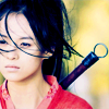
Translatable and pretty simple.
Begin with your base!

Duplicate your base and set the layer to SCREEN (my opacity for this particular icon is 80%):

Create a new layer filled with #fcede0 and set the layer to MULTIPLY 100%:

>
Go to Layers>New Adjustment Layer>COLOR BALANCE, enter in:
MIDTONES: 32, -40, 14
SHADOWS: -35, 11, 33
NO HIGHLIGHTS

Create new layer filled with #67b5ec and set the layer to SOFTLIGHT 100%:

>
Create a new layer filled with #e0fce3 and set the layer to COLOR BURN 100%:

>
Create a new layer filled with #3d7973 and set the layer to OVERLAY 100%:

>
Duplicate your base layer, drag it all the way to the top, and set the layer to SOFTLIGHT 100%:

Go to Layers>New Adjustment Layer>HUE/SATURATION/LIGHTNESS, enter 35 in the master saturation slot:

Go to Layers>New Adjustment Layer>COLOR BALANCE, enter in:
MIDTONES: -27, -17, 13
SHADOWS: 13, -5, -15
NO HIGHLIGHTS

And it's done! Yay! As you might have noticed, it turns out pretty red on certain icons, so perhaps the yellower the picture is, the better.
You can ask me questions, leave me comments, show me results, friend me, make me feel loved...
Other examples:
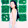
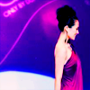



-Kelsey

to

Translatable and pretty simple.
Begin with your base!

Duplicate your base and set the layer to SCREEN (my opacity for this particular icon is 80%):

Create a new layer filled with #fcede0 and set the layer to MULTIPLY 100%:

>

Go to Layers>New Adjustment Layer>COLOR BALANCE, enter in:
MIDTONES: 32, -40, 14
SHADOWS: -35, 11, 33
NO HIGHLIGHTS

Create new layer filled with #67b5ec and set the layer to SOFTLIGHT 100%:

>

Create a new layer filled with #e0fce3 and set the layer to COLOR BURN 100%:

>

Create a new layer filled with #3d7973 and set the layer to OVERLAY 100%:

>

Duplicate your base layer, drag it all the way to the top, and set the layer to SOFTLIGHT 100%:

Go to Layers>New Adjustment Layer>HUE/SATURATION/LIGHTNESS, enter 35 in the master saturation slot:

Go to Layers>New Adjustment Layer>COLOR BALANCE, enter in:
MIDTONES: -27, -17, 13
SHADOWS: 13, -5, -15
NO HIGHLIGHTS

And it's done! Yay! As you might have noticed, it turns out pretty red on certain icons, so perhaps the yellower the picture is, the better.
You can ask me questions, leave me comments, show me results, friend me, make me feel loved...
Other examples:


-Kelsey