#6 - Arron Yan Tutorial.
Going from this:
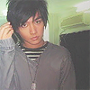
to
No selective coloring!
Let us begin with a base. Please note that I have duplicated & and set the layers to SCREEN a couple times to get it too look like this. I also SHARPENED the layers and used the SMUDGE TOOL to make it look pretty:

Go to LAYERS>NEW ADJUSTMENT LAYER>COLOR BALANCE and enter the following numbers:
SHADOWS: 0, -10, 0
MIDTONES: -38, +12, +22
HIGHLIGHTS: 0, 0, -14

Create a new layer and fill it with the color #357570 and set it to SOFTLIGHT 100%:
Create a new layer and fill it with the color #092b8c and set it to EXCLUSION 60%:

Duplicate the base and set it to SOFTLIGHT 100%:

Go to LAYERS>NEW ADJUSTMENT LAYER>HUE/SATURATION and put +10 in SATURATION:

Go to LAYERS>NEW ADJUSTMENT LAYER>BRIGHTNESS/CONTRAST and put +7 in BRIGHTNESS and +10 in CONTRAST:

Now I used this brush by uglybusiness. Please note that I rotated it and also made it smaller:

Now I added font. Using John Handy 30pt font for the large letters and 18th Century 10pt font in white (#ffffff) I created this:

Using this texture by ewanism and setting it to SCREEN 100% I made this (yes I rotated it):

Using this border and setting it to SCREEN 100%, I made this:

And done! It wasn't too hard, eh?
-Kelsey

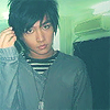
to
No selective coloring!
Let us begin with a base. Please note that I have duplicated & and set the layers to SCREEN a couple times to get it too look like this. I also SHARPENED the layers and used the SMUDGE TOOL to make it look pretty:

Go to LAYERS>NEW ADJUSTMENT LAYER>COLOR BALANCE and enter the following numbers:
SHADOWS: 0, -10, 0
MIDTONES: -38, +12, +22
HIGHLIGHTS: 0, 0, -14

Create a new layer and fill it with the color #357570 and set it to SOFTLIGHT 100%:

Create a new layer and fill it with the color #092b8c and set it to EXCLUSION 60%:

Duplicate the base and set it to SOFTLIGHT 100%:

Go to LAYERS>NEW ADJUSTMENT LAYER>HUE/SATURATION and put +10 in SATURATION:

Go to LAYERS>NEW ADJUSTMENT LAYER>BRIGHTNESS/CONTRAST and put +7 in BRIGHTNESS and +10 in CONTRAST:

Now I used this brush by uglybusiness. Please note that I rotated it and also made it smaller:

Now I added font. Using John Handy 30pt font for the large letters and 18th Century 10pt font in white (#ffffff) I created this:

Using this texture by ewanism and setting it to SCREEN 100% I made this (yes I rotated it):

Using this border and setting it to SCREEN 100%, I made this:
And done! It wasn't too hard, eh?
-Kelsey