My 1st PSP icon tutorial!
Hi! This is my 1st PSP icon tutorial, so please be nice! :D
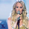
Make this:
from this: Carrie Underwood pic!
1. Open up your image in PSP. Resize it to 100x100, and crop it to your satisfaction.
2. Duplicate your base (layer: duplicate), and set it to screen, 100% opacity.
3. Make a new Raster Layer (Layers: New Raster Layer), and set it to burn, 100% opacity. Make sure this is above your duplicated layer!
4. Fill that layer with this color: 91DDEE (a light turquoise) by clicking on your paint bucket tool, or pushing your "f" button on your keyboard.
5. I thought my icon looked a little dark still, so I duplicated my base once again, brought it up to the top, and set it to screen 100% opacity.
6. To lighten the icon up a tiny bit more, I made a new curves adjustment layer (Layers: New Adjustment Layer: Curves) and typed in these numbers for the RGB settings: Input: 25 Output: 25 (this layer won't make too much of a difference, which is what we want).
7. Now to add some color: I made a new color balance adjustment layer (Layers: New Adjustment Layer: Color Balance) and put in these numbers, going across: 54, 8, 10.
8. Last but not least: Make 1 more adjustment layer, only this time, we're going to add some saturation. Go to Layers: New Adjustment Layer: Hue/Saturation/Lightness. Up your Saturation to +25 in the Master setting.
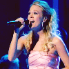
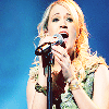
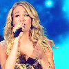
And you're done! This makes for a very nice coloring! Remember to always play around with your opacities and settings, sometimes you may need to duplicate your base to soft light if your image is already light! Here are a few other icons I've made with this coloring effect:
1
2
3


4
5


Any questions? Please feel free to ask me! :D
Make this:
from this: Carrie Underwood pic!
1. Open up your image in PSP. Resize it to 100x100, and crop it to your satisfaction.
2. Duplicate your base (layer: duplicate), and set it to screen, 100% opacity.
3. Make a new Raster Layer (Layers: New Raster Layer), and set it to burn, 100% opacity. Make sure this is above your duplicated layer!
4. Fill that layer with this color: 91DDEE (a light turquoise) by clicking on your paint bucket tool, or pushing your "f" button on your keyboard.
5. I thought my icon looked a little dark still, so I duplicated my base once again, brought it up to the top, and set it to screen 100% opacity.
6. To lighten the icon up a tiny bit more, I made a new curves adjustment layer (Layers: New Adjustment Layer: Curves) and typed in these numbers for the RGB settings: Input: 25 Output: 25 (this layer won't make too much of a difference, which is what we want).
7. Now to add some color: I made a new color balance adjustment layer (Layers: New Adjustment Layer: Color Balance) and put in these numbers, going across: 54, 8, 10.
8. Last but not least: Make 1 more adjustment layer, only this time, we're going to add some saturation. Go to Layers: New Adjustment Layer: Hue/Saturation/Lightness. Up your Saturation to +25 in the Master setting.
And you're done! This makes for a very nice coloring! Remember to always play around with your opacities and settings, sometimes you may need to duplicate your base to soft light if your image is already light! Here are a few other icons I've made with this coloring effect:
1
2
3
4
5
Any questions? Please feel free to ask me! :D