icons: 20 inspirations and gift!
Two sets of icons: Thor and Farscape.
gift set for spyglass_
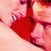
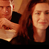

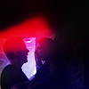
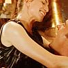
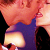
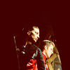
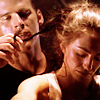
Thor (2011) for 20inspirations
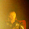
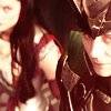
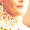
I chose to do give a go to Round Two: Composition and Cropping after some consideration of the other rounds. Round Three: Lighting was another one I thought about and I think I still used some lighting ideas even though I kept to Round Two. But I did try my hands at some other themes for challenges as a test and those icons are included as the alternates below. This set of icons actually ended up being really hard to finish. I didn't expect it to be, but as I was making them not everything I wanted to happen within the icons wasn't always happening. In the end I think I like about 60-70 percent of what I've made and trust me I had a few more icons to this, not including the alternates at the bottom. These are the ones I felt didn't completely suck.
01.
02.
03.
04.
05.
06.
07.
08.
09.
10.
11.
12.
13.
14.
15.
16.
17.
18.
19.
20.
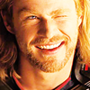
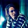
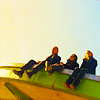
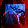
alternates:

*
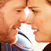
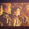
and before I start on the main set let me talk some of these quickly! At first I wasn't sure what round to make for this challenge so I tried my hands at a few rounds to see which interested me more. The first icon would have been epitome!. Second: Simplicity. Third: Rainbow. Fourth: Summer! Fifth: Colouring. Sixth: Summer. Seventh: Complex! Eighth: Lighting. In the the end Round Two won out but these were the best of my test batch.
AND NOW TO THE MAIN SET. TEEL DEAR!
01. [composition: photo/shadows.] First icon I made! I hardly EVER like the first icon I make, but I just really loved how this one turned out. The colouring is more like the second set of icons, but I was thinking about the hard light that takes over the picture in some of the first set. I also focused the word shadows and they play between the light and dark in cap. The cropping is a very boring centre crop though! But I was thinking more about the texture, light, and shadows together across Thor to build the icon.
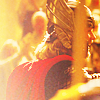
02. [composition: cropping/video] I really liked the cropping here! I was one of those icons i was worried about because it's a pretty centred cap, but the whole cap is an obvious cap to crop: centre, so I wanted to try something different. I think it worked. The video I was thinking about when doing the colouring was actually the Audi commercial and it's title "The Next Big Thing" which amused me while making it because that's kinda what the whole scene is about: Thor being the next big thing: King.
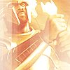
03. [composition: cropping/photo] Those gold/yellow/brown set of images are so good for this film when thinking about icons, and while I did take from how things were lit in the image I also uppped the brightness by eleventy! I'm not even a huge fan of yellow caps anymore, but Thor has a lot of them and I wanted to make them blinding! Gold and blinding! Which you'll see is why this icon is full of light. (This and few other were one I was thinking about Round Three with too, if it wasn't obvious.)
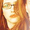
04. [composition: cropping/personal] I just love how Darcy's face is half covered by Jane's hair in this icon. (sidenote: Jane's hair in this film does amazing things.) But I love it because a lot of hair icons are about the owner of the hair's hair, but here it's Darcy getting a hair icon and they're so close! What is personal space between them here?! Which is why I cropped it so close. Persona! Ha!
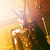
05. [composition: photo/askew/texture] That armour photo was so good and there's a lot of armour in this film! But really what it is about this icon that I love is how it's centred but diagonal at the same time. It's all titled on it's axis and you don't really look at Loki straight on because he's not being straight with you. [Enter meta on how the the film used the title of the camera to add to Loki's character. It tilts it A LOT when focusing on him because he's never really being straight forward. When it is facing head on are 9/10 the most important scenes.]
06. [composition: close/photo] EASY ICON! Cropped it close to Thor's excellent face - ugh this film! So many good faces! - and one again used the very bright lighting from the first set of images while keeping a yellowy/pink feeling.
07. [composition: photo/cropping] One of my faves! Frigg's necklace is such a good piece of jewellery to icon. Bright lighting form the first set of images and the royal feel of the second, especially when thinking about the detailing in that shoot were mostly what was thinking about here.
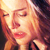
08. [composition: photo/subtle/music] JANE'S HAIR. SO GOOD. I' like the small hints of violet and pink I was able to bring out her because the image is very orange. Also, unlike other icons in this set I didn't really sharpen as much.
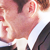
09. [composition: crop/photo] Oh Coulson I made you so pink! I guess I could have used composed here too, thinking about it. Mostly I was trying some colouring techniques and the bright yet soft colours in the first set of images.
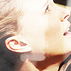
10. [composition: photo/crop/texture] The texture is obvious and really it just adds a little oomph and depth to the icon which felt a little flat and boring before. I'm really into super bright faces right now, if you can't tell.
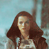
11. [composition: photo/music] I was listening to the Dexter theme and then the Perfect Circle vid when I was making it and I guess it influenced the mood and colour. This scene for those who don't know: is VERY VERY DARK AND BLUE. It took a lot of layers to pull the colour back and shift them to a soft mossy pale green. Her face just looks amazing to me then too. (sidenote: I had so many more Sif icons, but ugh they just weren't as good as I wanted them to be. There are few in the alternates below.)
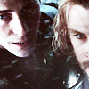
12. [composition: cropping/shadows] Here it was just me trying to get a close to their faces I as I could. I almost went black and white for the icon but idk I liked the hints of colour even though I desaturated/contrasted the image quiet a bit because again it was a very dark image.
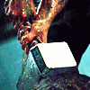
13. [composition: cropping/touch] There's a dirty joke here I won't make. Another icon that was almost black/white but it just looked like CRAP so i deleted that layer. Honestly, I'm still not super sure about the colour scheme but this was as close to how I pictured it as I managed.
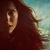
14. [composition: photo/negative space] JANE'S HAIR. SORRY, I HAVE FEELING ABOUT WHAT IT DOES HERE. Oblig and cliche hair icon, I know. I'm sorry, but really it's doing gr9 things in this scene. Oh and the photo I kept thinking about while making this was the Black Swan gifs, which is hilarious to me because nothing to do, but Natalie Portman bathed in shadow and light.
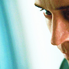
15. [composition: music/focus] Just look at all the focus in his eyes! (Another askew Loki cap, btw!) But yeah this icon was a bit of a challenge bc it's 80% his face and didn't want it all. I see too many icons of him in this scene and it's his whole face and I was like… noooooooo, i don't wanna! but what?! And then some random cropping happened for about a minute before I found this one. You can still sense his focus, he's still the focus, but he just seems like he's pulling back into the shadows too.
16. [composition: cropping/photo] A familiar cropping for this image I think, but… I like it! It gives a little sense of extra history and feeling to the characters. Makes them seem more personal to each other. I think I completely lucked out with how strong SIf still manages to be in the icon because I was scared she's fade into the background considering how she's actually a little blurred by distance and perception in the image it self. Their faces being in line with each other and her arm following that line is SUCH luck. Thanks Kenneth Branagh!
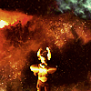
17. [composition: negative space] One of the most beautiful long shots in the film! Also space! Space being the negative space! Image jokes! Sometimes I'm just shallow for pretty things and faces.
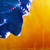
18. [composition: ending/texture/crop] One of my fave caps! Laufey's face is so detailed it's insane! Whyyyyyy so many dark Joutenhiem caps, I want to sob! Right, back to the icon! It's Lafeuy's end and it's the first time we really see his face clearly! STOP MY FEELINGS.
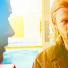
19. [composition: photo/space/texutre] Another of my fave caps and I love it because of how Jane and Thor's facial language mirrors each other but then as I cropped and coloured it the detail on Jane's face was lost, which as sad bc of the cap, but I still liked the composition. Not the greatest, I know, but still.
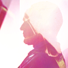
20. [composition: photo/abstract] I honestly don't know why I made all the Coulson icons pink but MAYBE IT'S HIS FAVOURITE COLOUR. Anyway, this was weird icon to make because I was playing with another icon and I accidentally added it to this Coulson cap when it was set to screen and it gave me such an interesting colouring that I decided to keep it. So yeah this is two caps with a shit ton of curves and vibrance layers.
- comments are lovely to hear!
- credit please!
- hope you like you're farscape set, spyglass_!
gift set for spyglass_
Thor (2011) for 20inspirations
I chose to do give a go to Round Two: Composition and Cropping after some consideration of the other rounds. Round Three: Lighting was another one I thought about and I think I still used some lighting ideas even though I kept to Round Two. But I did try my hands at some other themes for challenges as a test and those icons are included as the alternates below. This set of icons actually ended up being really hard to finish. I didn't expect it to be, but as I was making them not everything I wanted to happen within the icons wasn't always happening. In the end I think I like about 60-70 percent of what I've made and trust me I had a few more icons to this, not including the alternates at the bottom. These are the ones I felt didn't completely suck.
01.
02.
03.
04.
05.
06.
07.
08.
09.
10.
11.
12.
13.
14.
15.
16.
17.
18.
19.
20.
alternates:
*
and before I start on the main set let me talk some of these quickly! At first I wasn't sure what round to make for this challenge so I tried my hands at a few rounds to see which interested me more. The first icon would have been epitome!. Second: Simplicity. Third: Rainbow. Fourth: Summer! Fifth: Colouring. Sixth: Summer. Seventh: Complex! Eighth: Lighting. In the the end Round Two won out but these were the best of my test batch.
AND NOW TO THE MAIN SET. TEEL DEAR!
01. [composition: photo/shadows.] First icon I made! I hardly EVER like the first icon I make, but I just really loved how this one turned out. The colouring is more like the second set of icons, but I was thinking about the hard light that takes over the picture in some of the first set. I also focused the word shadows and they play between the light and dark in cap. The cropping is a very boring centre crop though! But I was thinking more about the texture, light, and shadows together across Thor to build the icon.
02. [composition: cropping/video] I really liked the cropping here! I was one of those icons i was worried about because it's a pretty centred cap, but the whole cap is an obvious cap to crop: centre, so I wanted to try something different. I think it worked. The video I was thinking about when doing the colouring was actually the Audi commercial and it's title "The Next Big Thing" which amused me while making it because that's kinda what the whole scene is about: Thor being the next big thing: King.
03. [composition: cropping/photo] Those gold/yellow/brown set of images are so good for this film when thinking about icons, and while I did take from how things were lit in the image I also uppped the brightness by eleventy! I'm not even a huge fan of yellow caps anymore, but Thor has a lot of them and I wanted to make them blinding! Gold and blinding! Which you'll see is why this icon is full of light. (This and few other were one I was thinking about Round Three with too, if it wasn't obvious.)
04. [composition: cropping/personal] I just love how Darcy's face is half covered by Jane's hair in this icon. (sidenote: Jane's hair in this film does amazing things.) But I love it because a lot of hair icons are about the owner of the hair's hair, but here it's Darcy getting a hair icon and they're so close! What is personal space between them here?! Which is why I cropped it so close. Persona! Ha!
05. [composition: photo/askew/texture] That armour photo was so good and there's a lot of armour in this film! But really what it is about this icon that I love is how it's centred but diagonal at the same time. It's all titled on it's axis and you don't really look at Loki straight on because he's not being straight with you. [Enter meta on how the the film used the title of the camera to add to Loki's character. It tilts it A LOT when focusing on him because he's never really being straight forward. When it is facing head on are 9/10 the most important scenes.]
06. [composition: close/photo] EASY ICON! Cropped it close to Thor's excellent face - ugh this film! So many good faces! - and one again used the very bright lighting from the first set of images while keeping a yellowy/pink feeling.
07. [composition: photo/cropping] One of my faves! Frigg's necklace is such a good piece of jewellery to icon. Bright lighting form the first set of images and the royal feel of the second, especially when thinking about the detailing in that shoot were mostly what was thinking about here.
08. [composition: photo/subtle/music] JANE'S HAIR. SO GOOD. I' like the small hints of violet and pink I was able to bring out her because the image is very orange. Also, unlike other icons in this set I didn't really sharpen as much.
09. [composition: crop/photo] Oh Coulson I made you so pink! I guess I could have used composed here too, thinking about it. Mostly I was trying some colouring techniques and the bright yet soft colours in the first set of images.
10. [composition: photo/crop/texture] The texture is obvious and really it just adds a little oomph and depth to the icon which felt a little flat and boring before. I'm really into super bright faces right now, if you can't tell.
11. [composition: photo/music] I was listening to the Dexter theme and then the Perfect Circle vid when I was making it and I guess it influenced the mood and colour. This scene for those who don't know: is VERY VERY DARK AND BLUE. It took a lot of layers to pull the colour back and shift them to a soft mossy pale green. Her face just looks amazing to me then too. (sidenote: I had so many more Sif icons, but ugh they just weren't as good as I wanted them to be. There are few in the alternates below.)
12. [composition: cropping/shadows] Here it was just me trying to get a close to their faces I as I could. I almost went black and white for the icon but idk I liked the hints of colour even though I desaturated/contrasted the image quiet a bit because again it was a very dark image.
13. [composition: cropping/touch] There's a dirty joke here I won't make. Another icon that was almost black/white but it just looked like CRAP so i deleted that layer. Honestly, I'm still not super sure about the colour scheme but this was as close to how I pictured it as I managed.
14. [composition: photo/negative space] JANE'S HAIR. SORRY, I HAVE FEELING ABOUT WHAT IT DOES HERE. Oblig and cliche hair icon, I know. I'm sorry, but really it's doing gr9 things in this scene. Oh and the photo I kept thinking about while making this was the Black Swan gifs, which is hilarious to me because nothing to do, but Natalie Portman bathed in shadow and light.
15. [composition: music/focus] Just look at all the focus in his eyes! (Another askew Loki cap, btw!) But yeah this icon was a bit of a challenge bc it's 80% his face and didn't want it all. I see too many icons of him in this scene and it's his whole face and I was like… noooooooo, i don't wanna! but what?! And then some random cropping happened for about a minute before I found this one. You can still sense his focus, he's still the focus, but he just seems like he's pulling back into the shadows too.
16. [composition: cropping/photo] A familiar cropping for this image I think, but… I like it! It gives a little sense of extra history and feeling to the characters. Makes them seem more personal to each other. I think I completely lucked out with how strong SIf still manages to be in the icon because I was scared she's fade into the background considering how she's actually a little blurred by distance and perception in the image it self. Their faces being in line with each other and her arm following that line is SUCH luck. Thanks Kenneth Branagh!
17. [composition: negative space] One of the most beautiful long shots in the film! Also space! Space being the negative space! Image jokes! Sometimes I'm just shallow for pretty things and faces.
18. [composition: ending/texture/crop] One of my fave caps! Laufey's face is so detailed it's insane! Whyyyyyy so many dark Joutenhiem caps, I want to sob! Right, back to the icon! It's Lafeuy's end and it's the first time we really see his face clearly! STOP MY FEELINGS.
19. [composition: photo/space/texutre] Another of my fave caps and I love it because of how Jane and Thor's facial language mirrors each other but then as I cropped and coloured it the detail on Jane's face was lost, which as sad bc of the cap, but I still liked the composition. Not the greatest, I know, but still.
20. [composition: photo/abstract] I honestly don't know why I made all the Coulson icons pink but MAYBE IT'S HIS FAVOURITE COLOUR. Anyway, this was weird icon to make because I was playing with another icon and I accidentally added it to this Coulson cap when it was set to screen and it gave me such an interesting colouring that I decided to keep it. So yeah this is two caps with a shit ton of curves and vibrance layers.
- comments are lovely to hear!
- credit please!
- hope you like you're farscape set, spyglass_!