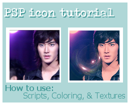
[Icon Tutorial] in Paint Shop Pro
Oh man, I am posting like crazy today... but here's one more! We've never had an icon tut in this community before... let's see if anyone likes it? If you do, comment and let us know!
I. Cropping :
We're going to start off with our picture (FYI, having an image in high quality to begin with goes a looooong way towards ending up with a sharp-looking icon.) and do a standard, no-frills off-center crop on it. Click on your Selection tool (and to make your life easier, choose Selection type "Square") and then drag the tool across the area you want in your icon.
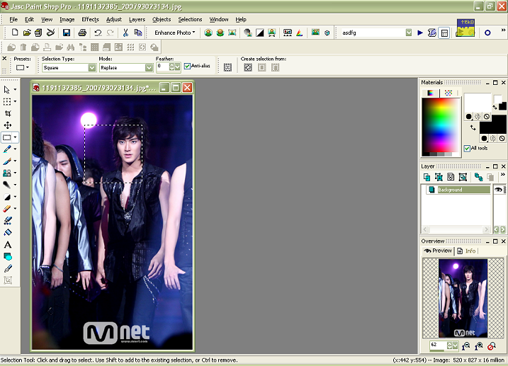
(You'll notice across the bottom, there's handy directions for using whichever tool you're currently utilizing.)
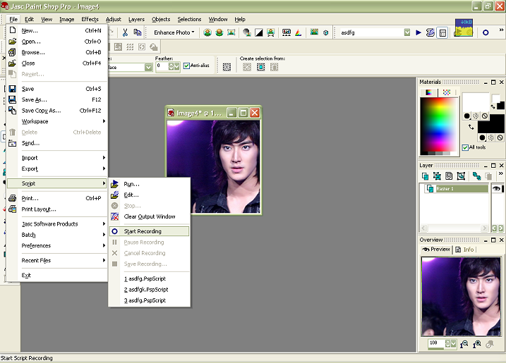
II. How to Make and Use a Script :
First of all, a Script is only helpful in cases where you're planning on using the same procedures on many different images. Examples of this are:
-Prepping screencaps for a post, or for icons;
-Prepping scans or pictures;
-Prepping a series of imgs to use in an animated icon or GIF
An example of a Script I use on an almost regular basis consists of the commands:
(Duplicate base, Set to Screen, Duplicate, Set to Soft Light, Merge Layers, Resize, Sharpen)
Which is just about perfect to turn a dim and muddled screencap into a bright and crisp one. :D And soooooooooo helpful when I have 20+ screencaps I want to post!!
Anyway, for our icon. Once you have the cropped base, Start Recording:
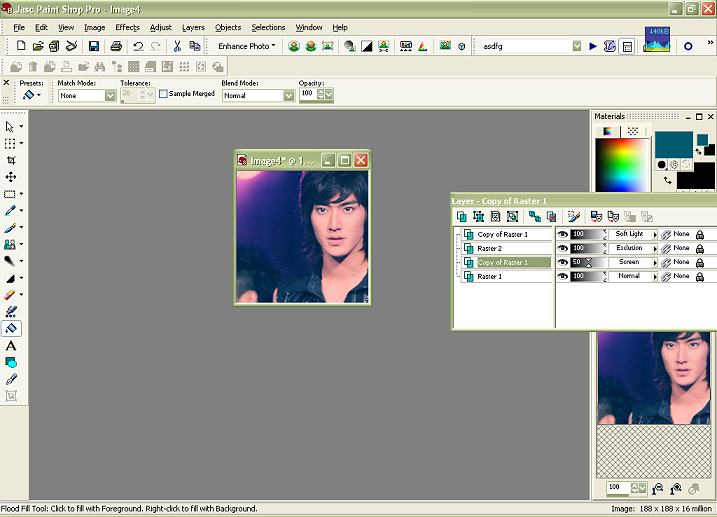
You can do the steps in any sequence, so long as the layers are properly ordered. I performed my procedure as follows:
1. Duplicate the base THREE times.
2. Set the closest duplicate layer to SCREEN.
3. Set the top-most layer to SOFT LIGHT.
4. Using the Fill Bucket, Fill the middle layer with a dark greenish-blue color (##0a565c or similar, doesn't have to be exact).
5. Set your newly-colored layer to EXCLUSION.
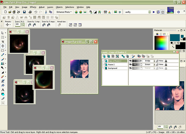
At this point, your Layers and base should resemble the following:
The Script is still recording! We can do a couple more things...
6. Sharpen the base image
7. Resize (all layers) to our LJ-friendly 100x100 px size.
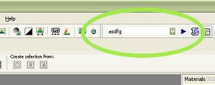
Okay, at that point you want to go back to the Script Menu, and choose "Save Recording". A window will pop up prompting you to name your script, and that's it! You're all set. The Script tool is in the upper Right-hand corner of the PSP window, with a button that looks exactly like a "Play" arrow to the right of it.
From now on, the only thing you need to do for all other images (once past the Cropping stage) is select your Script and hit that Play button. The hamster will jump on the wheel and zoom-zoom-zoom, PSP will do all that work for you in about 0.234 seconds. :D
IMPORTANT -- Things you CAN NOT do while Recording a Script, it will give you errors:
(NO) Switch between images
(Yes) You CAN, however, paste on something you have stored in your clipboard; Script will remember it.
(NO) Attempt to Save the image you're currently working on. :( I wish it would, but it doesn't.
II. Coloring : Our Exclusion layer is doing all of that for us. The reason we don't merge the layers during our Script is so you can go back at a later point and fiddle with the opacity of the various layers, because obviously that's going to differ a bit for different images. For the icon in this tutorial, I shifted the Screen layer to about 50% opacity, and left everything else alone.
III. Texture :
Since it's so popular at the moment, and really really easy to use, I've chosen a "Lens-Flare" texture to apply to our icon at this point. You can download a really nice set made by ssaya here.
To use:
1. Open up a selection of the lens-flare textures in PSP. Choose ONE, COPY it, and then PASTE it onto your icon as a New Layer (Cntl+L). Make sure it is the topmost layer.
2. Set the layer to SCREEN.
3. This is unnecessary, but I like it (I think it makes the flare "pop" a bit more) DUPLICATE the texture layer and set it to DODGE. You'll want to lower the Opacity quite a bit for this layer.
And that's it! You can do more at this point-- add some text, whatever (but don't go crazy, there IS such a notion as "Too much of a good thing" in the icon-making business.) BUT all that is the subject of another tutorial. :)
For more information, the archives of icon_tutorial is a great place to start.
Note: The reason I chose "Scripts" as a subject for this tutorial is because I used them extensively to transform pics from this particular set of images into this particular set of icons. You'll notice a lot of images look very similar (quality-wise, coloring-wise) and hence, they are ideal subjects for applying a script to. You wouldn't necessarily get good results from using this same script on a different set of pictures (i.e. pictures that had white backgrounds, fuzzy quality, a range of colors and hues, etc.) Just to let you know.
But I hope the technical "idea" of the Script function is something you can feel more comfortable using now, in a variety of contexts. :Db
I. Cropping :
We're going to start off with our picture (FYI, having an image in high quality to begin with goes a looooong way towards ending up with a sharp-looking icon.) and do a standard, no-frills off-center crop on it. Click on your Selection tool (and to make your life easier, choose Selection type "Square") and then drag the tool across the area you want in your icon.
(You'll notice across the bottom, there's handy directions for using whichever tool you're currently utilizing.)
II. How to Make and Use a Script :
First of all, a Script is only helpful in cases where you're planning on using the same procedures on many different images. Examples of this are:
-Prepping screencaps for a post, or for icons;
-Prepping scans or pictures;
-Prepping a series of imgs to use in an animated icon or GIF
An example of a Script I use on an almost regular basis consists of the commands:
(Duplicate base, Set to Screen, Duplicate, Set to Soft Light, Merge Layers, Resize, Sharpen)
Which is just about perfect to turn a dim and muddled screencap into a bright and crisp one. :D And soooooooooo helpful when I have 20+ screencaps I want to post!!
Anyway, for our icon. Once you have the cropped base, Start Recording:
You can do the steps in any sequence, so long as the layers are properly ordered. I performed my procedure as follows:
1. Duplicate the base THREE times.
2. Set the closest duplicate layer to SCREEN.
3. Set the top-most layer to SOFT LIGHT.
4. Using the Fill Bucket, Fill the middle layer with a dark greenish-blue color (##0a565c or similar, doesn't have to be exact).
5. Set your newly-colored layer to EXCLUSION.
At this point, your Layers and base should resemble the following:
The Script is still recording! We can do a couple more things...
6. Sharpen the base image
7. Resize (all layers) to our LJ-friendly 100x100 px size.
Okay, at that point you want to go back to the Script Menu, and choose "Save Recording". A window will pop up prompting you to name your script, and that's it! You're all set. The Script tool is in the upper Right-hand corner of the PSP window, with a button that looks exactly like a "Play" arrow to the right of it.
From now on, the only thing you need to do for all other images (once past the Cropping stage) is select your Script and hit that Play button. The hamster will jump on the wheel and zoom-zoom-zoom, PSP will do all that work for you in about 0.234 seconds. :D
IMPORTANT -- Things you CAN NOT do while Recording a Script, it will give you errors:
(NO) Switch between images
(Yes) You CAN, however, paste on something you have stored in your clipboard; Script will remember it.
(NO) Attempt to Save the image you're currently working on. :( I wish it would, but it doesn't.
II. Coloring : Our Exclusion layer is doing all of that for us. The reason we don't merge the layers during our Script is so you can go back at a later point and fiddle with the opacity of the various layers, because obviously that's going to differ a bit for different images. For the icon in this tutorial, I shifted the Screen layer to about 50% opacity, and left everything else alone.
III. Texture :
Since it's so popular at the moment, and really really easy to use, I've chosen a "Lens-Flare" texture to apply to our icon at this point. You can download a really nice set made by ssaya here.
To use:
1. Open up a selection of the lens-flare textures in PSP. Choose ONE, COPY it, and then PASTE it onto your icon as a New Layer (Cntl+L). Make sure it is the topmost layer.
2. Set the layer to SCREEN.
3. This is unnecessary, but I like it (I think it makes the flare "pop" a bit more) DUPLICATE the texture layer and set it to DODGE. You'll want to lower the Opacity quite a bit for this layer.
And that's it! You can do more at this point-- add some text, whatever (but don't go crazy, there IS such a notion as "Too much of a good thing" in the icon-making business.) BUT all that is the subject of another tutorial. :)
For more information, the archives of icon_tutorial is a great place to start.
Note: The reason I chose "Scripts" as a subject for this tutorial is because I used them extensively to transform pics from this particular set of images into this particular set of icons. You'll notice a lot of images look very similar (quality-wise, coloring-wise) and hence, they are ideal subjects for applying a script to. You wouldn't necessarily get good results from using this same script on a different set of pictures (i.e. pictures that had white backgrounds, fuzzy quality, a range of colors and hues, etc.) Just to let you know.
But I hope the technical "idea" of the Script function is something you can feel more comfortable using now, in a variety of contexts. :Db