2 GIMP Tutorials
After receiving some comments on my coloring in my latest icon batch, I figured I'd post two of the tutorials I used. =]
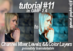
When I made this coloring, my ultimate goal was to achieve something similar to selective coloring (with the enhanced reds and blues). It's not quite that, but I still really like how this turned out. :) Also, the settings will be approximate - you'll need to play around with them to suit your image.
Step 1 - Get your base. Mine is from the BBC Doctor Who site, of the lovely Rose Tyler(played by Billie Piper). Crop your image and scale to 100x100.
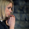
Step 2 - I want to balance out the image's colors. So duplicate your base, and select the 'Auto White Balance' tool (colors>auto>white balance).
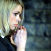
This step can sometimes make your image look a little funky (like mine). To remedy this, I lowered the layer's opacity to 30%.
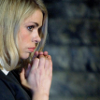
(NOTE: Some images will look fine after the white balance, and so you can leave the opacity at 100%)
Step 3 - I want to brighten the image up more. So add a new layer, and fill with #f6ff00 (a bright yellow).

Set this layer to 'softlight' 50% opacity. This adds more yellow, and brightens up the overall image.
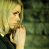
Step 4 - The yellows okay... but my goal is to make the reds and blues of the image stand out. So, copy the entire image (edit>copy visible), and 'paste' as a new layer. Then open up Channel Mixer and put in these approximate settings (make sure preserve luminosity is unchecked!)
Channels (experiment with these a bit)
RED: 130, -55, 10
GREEN: -8, 110, 25
BLUE: -5, 55, 125
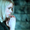
The effect it has on your image varies, but the general result should be mainly blue, with some red. Sometimes it has the effect of making your image too bright - if that’s the case, I usually go to the green channel and move the green slider to the left (so that the number decreases). On this icon I put this setting at 106.
Step 5 - Now I want to increase the red and blue colors of the icon a bit more. So open up Levels and put in the following approximate settings
Channels (play around a bit with these)
VALUE- input: 10,1.00, 255 output: 0, 255
RED- input: 0, 1.12, 255 output: 10, 255
GREEN- input: 0, 1.05, 255 output: 5, 255
BLUE- input: 0, 1.10, 255 output: 5, 255
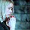
For this icon I lowered the green channel slightly to 1.02 so my image wasn’t to bright. Also play around with the values input setting; some icons need only 5 or less instead of 10.
Step 6 - This looks good, but the color is a bit dull. Open hue-saturation and increase the master saturation.
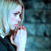
I increased mine by 25, but some images might require less.
Step 7 - I don’t like how there isn’t a lot of red in the image. I can use 2 different methods to remedy this, both involving Levels.
So, open Levels, and look to the bottom of the window. Above the ‘edit these settings as curves’ button are 4 square buttons.
- method 1 - press the ‘auto’ button (which is what I did for this icon).
- method 2 - (the trickier one) select the white dropper button (at the edge). Then move your mouse over your image and select a point that you know is white (or should be white) on the icon. This can have mixed results, sometimes making your image too bright, too dark, too red, etc. It does give you more flexibility on the result of this step, though.
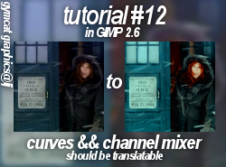
There are probably other ways to achieve this effect (channel mixer, curves, etc), but I haven't tried them.
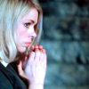
Whichever you choose, your end result should end up something like this, brighter and with the reds standing out more.
Step 8 - Now I want to increase the overall color some more. So duplicate the layer, open channel mixer, and put in these approximate settings (preserve luminosity unchecked!):
Channels (experiment with these a bit)
RED: 110, -25, 0
GREEN: -5, 40, 60
BLUE: -50, 80, 60
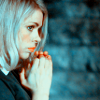
Step 9 - I still wanted some more color, so I opened hue-saturation and increased the master saturation by 15.

Then I set that layer to 'color' 100% opacity.
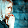
Step 10 - Now the image looks over bright and a bit washed out. To remedy that, I went to the layer below (the one in step 7) opened the brightness-contrast tool and lowered the brightness by 10.

(layer from step 7 with reduced brightness)
Now the image looks much better.
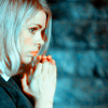
However, some images might still be to bright. Experiment with the Values channel in levels, along with the brightness and contrast tool some more, too.
Step 11 - Last step! I wanted to increase the color a little bit more, so I copied the entire image and pasted it as a new layer. I opened up hue saturation and put in these settings:
Settings (what you put in depends on your image - for example, some might not need any red at all)
MASTER: saturation +5
RED: saturation +5
CYAN: saturation +5

And that’s it! :D
Please, let me know if you have any trouble or if a step doesn't make sense. ^-^
Other icons made with this tutorial:
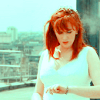
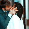
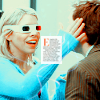
This tutorial is rather simple, yet nicely brightens up and increases the color.
Step 1 - Get your image. Mine's of 'Doctor Who's Donna (played by Catherine Tate), and was capped by the awesome marishna . Then crop and scale to 100x100

I then sharpened my image with the 'Unsharp Mask' tool (filters>enhance>unsharp mask)
My settings
10, 0.12, 0
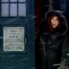
Step 2 - I want to brighten my image up. So, duplicate the base and open up the Curves tool.
Settings:
VALUE- x:125 y:100
RED- x:78 y:160
GREEN- x:78 y:160
BLUE- x:78 y:160
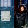
That's too bright for my liking, so I reduced the opacity of the layer to around 50%. How much you reduce it depends on your image.
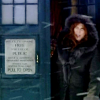
Step 3 - Now it's time to add some color! Copy the entire image (edit>copy visible) and paste as a new layer. Now open the Channel Mixer tool and put in these approximate settings:
Channels (make sure 'preserve luminosity' is unchecked)
RED: 120, -40, 10 (if you want more red, increase the first number some)
GREEN: -10, 55, 70
BLUE: -40, 45, 100
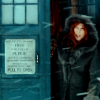
Now set layer to 'color' 100% opacity
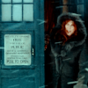
Step 4 - I want to add a tiny bit more color to the icon. So, copy the entire image again and paste as new layer. Open the Hue-saturation tool and increase saturation(I recommend increasing the reds and cyans, though some images might also look good with increased greens, etc.)
My settings:
MASTER: saturation +15
RED: saturation +10, lightness +5
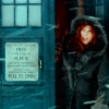
That's it! :D
Other icons made with this tutorial:

- If you have any questions at all, please ask! I'll get back to you ASAP.
- Feel free to WATCH/FRIEND this community
- My other tutorials can be found HERE
- I love seeing results! =D

When I made this coloring, my ultimate goal was to achieve something similar to selective coloring (with the enhanced reds and blues). It's not quite that, but I still really like how this turned out. :) Also, the settings will be approximate - you'll need to play around with them to suit your image.
Step 1 - Get your base. Mine is from the BBC Doctor Who site, of the lovely Rose Tyler(played by Billie Piper). Crop your image and scale to 100x100.

Step 2 - I want to balance out the image's colors. So duplicate your base, and select the 'Auto White Balance' tool (colors>auto>white balance).

This step can sometimes make your image look a little funky (like mine). To remedy this, I lowered the layer's opacity to 30%.

(NOTE: Some images will look fine after the white balance, and so you can leave the opacity at 100%)
Step 3 - I want to brighten the image up more. So add a new layer, and fill with #f6ff00 (a bright yellow).

Set this layer to 'softlight' 50% opacity. This adds more yellow, and brightens up the overall image.

Step 4 - The yellows okay... but my goal is to make the reds and blues of the image stand out. So, copy the entire image (edit>copy visible), and 'paste' as a new layer. Then open up Channel Mixer and put in these approximate settings (make sure preserve luminosity is unchecked!)
Channels (experiment with these a bit)
RED: 130, -55, 10
GREEN: -8, 110, 25
BLUE: -5, 55, 125

The effect it has on your image varies, but the general result should be mainly blue, with some red. Sometimes it has the effect of making your image too bright - if that’s the case, I usually go to the green channel and move the green slider to the left (so that the number decreases). On this icon I put this setting at 106.
Step 5 - Now I want to increase the red and blue colors of the icon a bit more. So open up Levels and put in the following approximate settings
Channels (play around a bit with these)
VALUE- input: 10,1.00, 255 output: 0, 255
RED- input: 0, 1.12, 255 output: 10, 255
GREEN- input: 0, 1.05, 255 output: 5, 255
BLUE- input: 0, 1.10, 255 output: 5, 255

For this icon I lowered the green channel slightly to 1.02 so my image wasn’t to bright. Also play around with the values input setting; some icons need only 5 or less instead of 10.
Step 6 - This looks good, but the color is a bit dull. Open hue-saturation and increase the master saturation.

I increased mine by 25, but some images might require less.
Step 7 - I don’t like how there isn’t a lot of red in the image. I can use 2 different methods to remedy this, both involving Levels.
So, open Levels, and look to the bottom of the window. Above the ‘edit these settings as curves’ button are 4 square buttons.
- method 1 - press the ‘auto’ button (which is what I did for this icon).
- method 2 - (the trickier one) select the white dropper button (at the edge). Then move your mouse over your image and select a point that you know is white (or should be white) on the icon. This can have mixed results, sometimes making your image too bright, too dark, too red, etc. It does give you more flexibility on the result of this step, though.
There are probably other ways to achieve this effect (channel mixer, curves, etc), but I haven't tried them.

Whichever you choose, your end result should end up something like this, brighter and with the reds standing out more.
Step 8 - Now I want to increase the overall color some more. So duplicate the layer, open channel mixer, and put in these approximate settings (preserve luminosity unchecked!):
Channels (experiment with these a bit)
RED: 110, -25, 0
GREEN: -5, 40, 60
BLUE: -50, 80, 60

Step 9 - I still wanted some more color, so I opened hue-saturation and increased the master saturation by 15.

Then I set that layer to 'color' 100% opacity.

Step 10 - Now the image looks over bright and a bit washed out. To remedy that, I went to the layer below (the one in step 7) opened the brightness-contrast tool and lowered the brightness by 10.

(layer from step 7 with reduced brightness)
Now the image looks much better.

However, some images might still be to bright. Experiment with the Values channel in levels, along with the brightness and contrast tool some more, too.
Step 11 - Last step! I wanted to increase the color a little bit more, so I copied the entire image and pasted it as a new layer. I opened up hue saturation and put in these settings:
Settings (what you put in depends on your image - for example, some might not need any red at all)
MASTER: saturation +5
RED: saturation +5
CYAN: saturation +5

And that’s it! :D
Please, let me know if you have any trouble or if a step doesn't make sense. ^-^
Other icons made with this tutorial:


This tutorial is rather simple, yet nicely brightens up and increases the color.
Step 1 - Get your image. Mine's of 'Doctor Who's Donna (played by Catherine Tate), and was capped by the awesome marishna . Then crop and scale to 100x100

I then sharpened my image with the 'Unsharp Mask' tool (filters>enhance>unsharp mask)
My settings
10, 0.12, 0

Step 2 - I want to brighten my image up. So, duplicate the base and open up the Curves tool.
Settings:
VALUE- x:125 y:100
RED- x:78 y:160
GREEN- x:78 y:160
BLUE- x:78 y:160

That's too bright for my liking, so I reduced the opacity of the layer to around 50%. How much you reduce it depends on your image.

Step 3 - Now it's time to add some color! Copy the entire image (edit>copy visible) and paste as a new layer. Now open the Channel Mixer tool and put in these approximate settings:
Channels (make sure 'preserve luminosity' is unchecked)
RED: 120, -40, 10 (if you want more red, increase the first number some)
GREEN: -10, 55, 70
BLUE: -40, 45, 100

Now set layer to 'color' 100% opacity

Step 4 - I want to add a tiny bit more color to the icon. So, copy the entire image again and paste as new layer. Open the Hue-saturation tool and increase saturation(I recommend increasing the reds and cyans, though some images might also look good with increased greens, etc.)
My settings:
MASTER: saturation +15
RED: saturation +10, lightness +5

That's it! :D
Other icons made with this tutorial:


- If you have any questions at all, please ask! I'll get back to you ASAP.
- Feel free to WATCH/FRIEND this community
- My other tutorials can be found HERE
- I love seeing results! =D