Tutorial
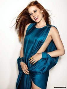
>>>

For this coloring method, you'll want a photo that doesn't have a lot of red in it - these steps bring out blues, so it can look really sloppy if there is a lot of red in the original image. A photo with blue/cyan works best.
01. I always do the Auto-Trilogy: levels, contrast, color. As always, if Auto Color effs things up too much, either fade the results or leave it out completely.
02. Selective Colors: I'll be honest - the reason for this layer existing is because it was from a different coloring method/tutorial and I liked the way it looked on my image, so I used it here. :)
Red: -100.15.21.0
Yellow: 100.0.100.0
Neutral: 11.8.10.0
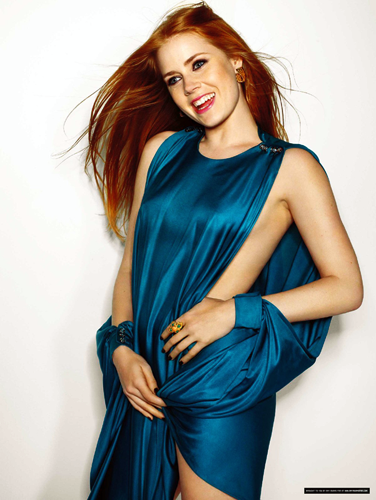
03. Photo Filter: I wanted to tone down the reds just a little bit. I like using Filters when I want to take out a certain color AND enhance its opposite.
Photo Filter: Cyan
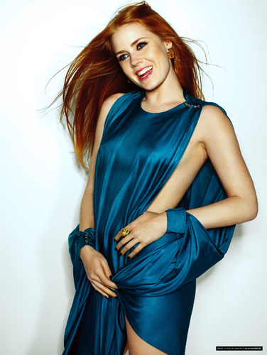
04. Selective Colors: MOAR BLUE. That's why :)
Red: -70.1.100.10
Yellow: -20.0.1.0
Cyan: 59.0.-60.0
Blue: 0.0.-61.0
White: 14.0.0.0
Neutral: 0.-4.-3.3
Black: 0.0.0.4

FINITO! Easy peasy.
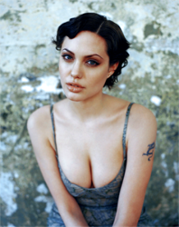
Other examples with this coloring:
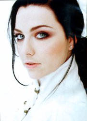
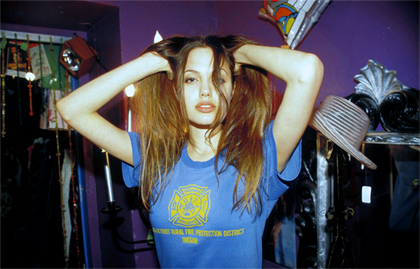
Let me know if you have any questions.