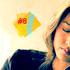
Tutorial #4
scary_tan wondered how I got the coloring for

and
.
Here are the basic steps towards that type of coloring.
Tutorial #4: Coloring
For PSP9 - Translatable
STEP 1:
Adjust - Sharpen
Adjust - Auto Contrast Enhancement: Lighter, Normal, Bold.

to
STEP 2:
Duplicate top layer and set to "Screen".

to
STEP 3:
This gradient on top of everything and set to "Burn".

to
STEP 4:
Right-click the gradient. New Adjustment Layer, Hue/Saturation/Lightness. Push "Saturation" up to about 30 or 37.

to
STEP 5:
Right click the Hue/Saturation/Lightness layer, head to New Adjustment Layer, Color Balance. Set Midtones: Cyan -65, Yellow: -32, Shadows: Cyan -83, Blue 8.

to
OPTIONAL STEP:
Optional: Make two new layers, select a preferred brush and a paint color. For this, I used #2d70a8 set to "Hue" and #e2b554 set to "Luminence". Then I added a little but of text.

This is an fairly simple way of getting coloring in an icon. It all depends on the base coloring of the picture you've chosen and the color of gradient that you use, and then applying just the right amount of Saturation and Color Balance tweaking. You might find this technique qorks best with images that have a slightly blueish or orange-ish undertone. The trick is the play around, you might just like what you come up with. :)
Hope that helped someone!
and
.
Here are the basic steps towards that type of coloring.
Tutorial #4: Coloring
For PSP9 - Translatable
STEP 1:
Adjust - Sharpen
Adjust - Auto Contrast Enhancement: Lighter, Normal, Bold.
to
STEP 2:
Duplicate top layer and set to "Screen".
to
STEP 3:
This gradient on top of everything and set to "Burn".
to
STEP 4:
Right-click the gradient. New Adjustment Layer, Hue/Saturation/Lightness. Push "Saturation" up to about 30 or 37.
to
STEP 5:
Right click the Hue/Saturation/Lightness layer, head to New Adjustment Layer, Color Balance. Set Midtones: Cyan -65, Yellow: -32, Shadows: Cyan -83, Blue 8.
to
OPTIONAL STEP:
Optional: Make two new layers, select a preferred brush and a paint color. For this, I used #2d70a8 set to "Hue" and #e2b554 set to "Luminence". Then I added a little but of text.
This is an fairly simple way of getting coloring in an icon. It all depends on the base coloring of the picture you've chosen and the color of gradient that you use, and then applying just the right amount of Saturation and Color Balance tweaking. You might find this technique qorks best with images that have a slightly blueish or orange-ish undertone. The trick is the play around, you might just like what you come up with. :)
Hope that helped someone!