♣ geet 『29』
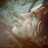
How to go from this to this.
Difficulty: Medium if you don't know how to use curves.
01. Crop, sharpen your base as you need to. You should also play with variations. I've recently learned that variations actually make coloring go much easier if you know where you want to go with the icon. For instance, with this icon, I wanted to make some more yellows pop out from the background so I went to Image -> Adjustments -> Variations -> Shadows and clicked More Yellow and More Red, each once. Every image is different however, so you're gonna need to experiment. Sometimes this step isn't necessary.
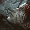
02. The next couple steps I took from this tutorial and adjusted as needed. Make a Levels layer with the following numbers:
14, 1.57, 250
03. Hue/Saturation layer this time:
Saturation: + 10

04. Now you're gonna make two color fill layers. The first one will be a grayish color (I used #dcdcdc) and set that to multiply. Then make another color fill layer using a brownish color (#100f00 for mine) and set that to exclusion.
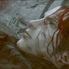
05. Selective color now! I want those reds and greys to pop out. Here were my settings:
Red:
0, +62, +60, 0
Yellow:
0, +61, +72, 0
Blue:
+100, +100, +100, 0
Neutrals:
-1, -9, +5, +11
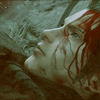
06. Now Zack looks green and sickly. Curves will fix that. Note that curves will vary from image to image. So you're gonna have to experiment. Here were the points I made:
RGB:
Input: 194, Output: 209
Input: 72, Output: 69
Red:
Input: 189, Output: 196
Input: 58, Output: 56
Green:
Input: 194, Output: 181
Input: 59, Output: 54
Blue:
Input: 193, Output: 194
Input: 66, Output: 61
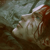
Voila. Zack doesn't look sick now.
07. I wanted to make Zack look a little healthier (hey, if you're gonna die, you better die looking good) so another Selective color layer.
Red:
0, 0, +65, 0
Yellow:
0, 0, +20, 0
Cyan:
+100, 0, 0, 0
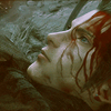
08. Now make a color balance layer. This layer is just going to make parts of Zack skin a little darker.
Shadows:
+3, -3, +3
Midtones:
-9, -6, -12
Highlights:
-8, 0, 0

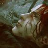
09. Now I wanted to bring some of the adjusted base's colors back. So duplicate the base you used in step one, drag it all the way to the top and Go Filter -> Blur -> Gaussian Blur. Then set that layer to soft light and change the opacity to 31% and the fill to 31% as well.

But the icon could use some more depth. This step might get a little complicated so please pay attention. Do a ctrl + alt+ A to select all the layers. Then do ctrl+shift+c to copy them all. Then ctrl+v and all your layers have been copied into one. Now use gaussian blur and set that layer to soft light. Set the opacity to 40% and the fill to 61%
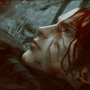
10. Now this is a nifty step that I took from powercorrupts' tutorial. I love how she has this ability to bring out the reds and cyans. So we're gonna make a channel mixer layer this time. Here were the settings I used:
Red:
+85
-10
+10
Green:
-15
+55
+50
Blue:
-50
+75
+60
Adjust the opacity to 60%
11. Zack still looks a little gloomy and sick to me. So curves layer now. Here were the points I made:
RGB:
Input: 186, Output: 206
Input: 58, Output: 81
Red:
Input: 191, Output: 188
Input: 62, Output: 55
Green:
Input: 191, Output: 189
Input: 71, Output: 64
Blue:
Input: 196, Output: 186
Input: 73, Output: 59
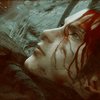
12. Now we're gonna use a couple of textures to spice things up a bit. First, use this texture:
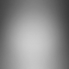
by ???
and set that to Soft light.
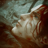
13. Now we're going to use this texture:
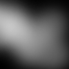
by ???
rotate it and set that to Screen. Tone down the opacity to 45%
14. Last texture. I wanted to make some of the reds pop out but not too much. So I used this texture:

by ??? (I really need to get into the habit of remembering where I got these textures from)
and set that to Soft light. I changed the opacity to 25% and the fill to 30%

And voila. I usually add a lot more to the icon, like textures and other brushes just for a finishing touch but this is often how I color it.
So think this was helpful! Show me what you get! I'm curious to see how people incorporate their styles with this tutorial.
Difficulty: Medium if you don't know how to use curves.
01. Crop, sharpen your base as you need to. You should also play with variations. I've recently learned that variations actually make coloring go much easier if you know where you want to go with the icon. For instance, with this icon, I wanted to make some more yellows pop out from the background so I went to Image -> Adjustments -> Variations -> Shadows and clicked More Yellow and More Red, each once. Every image is different however, so you're gonna need to experiment. Sometimes this step isn't necessary.

02. The next couple steps I took from this tutorial and adjusted as needed. Make a Levels layer with the following numbers:
14, 1.57, 250
03. Hue/Saturation layer this time:
Saturation: + 10

04. Now you're gonna make two color fill layers. The first one will be a grayish color (I used #dcdcdc) and set that to multiply. Then make another color fill layer using a brownish color (#100f00 for mine) and set that to exclusion.

05. Selective color now! I want those reds and greys to pop out. Here were my settings:
Red:
0, +62, +60, 0
Yellow:
0, +61, +72, 0
Blue:
+100, +100, +100, 0
Neutrals:
-1, -9, +5, +11

06. Now Zack looks green and sickly. Curves will fix that. Note that curves will vary from image to image. So you're gonna have to experiment. Here were the points I made:
RGB:
Input: 194, Output: 209
Input: 72, Output: 69
Red:
Input: 189, Output: 196
Input: 58, Output: 56
Green:
Input: 194, Output: 181
Input: 59, Output: 54
Blue:
Input: 193, Output: 194
Input: 66, Output: 61

Voila. Zack doesn't look sick now.
07. I wanted to make Zack look a little healthier (hey, if you're gonna die, you better die looking good) so another Selective color layer.
Red:
0, 0, +65, 0
Yellow:
0, 0, +20, 0
Cyan:
+100, 0, 0, 0

08. Now make a color balance layer. This layer is just going to make parts of Zack skin a little darker.
Shadows:
+3, -3, +3
Midtones:
-9, -6, -12
Highlights:
-8, 0, 0

09. Now I wanted to bring some of the adjusted base's colors back. So duplicate the base you used in step one, drag it all the way to the top and Go Filter -> Blur -> Gaussian Blur. Then set that layer to soft light and change the opacity to 31% and the fill to 31% as well.

But the icon could use some more depth. This step might get a little complicated so please pay attention. Do a ctrl + alt+ A to select all the layers. Then do ctrl+shift+c to copy them all. Then ctrl+v and all your layers have been copied into one. Now use gaussian blur and set that layer to soft light. Set the opacity to 40% and the fill to 61%

10. Now this is a nifty step that I took from powercorrupts' tutorial. I love how she has this ability to bring out the reds and cyans. So we're gonna make a channel mixer layer this time. Here were the settings I used:
Red:
+85
-10
+10
Green:
-15
+55
+50
Blue:
-50
+75
+60
Adjust the opacity to 60%

11. Zack still looks a little gloomy and sick to me. So curves layer now. Here were the points I made:
RGB:
Input: 186, Output: 206
Input: 58, Output: 81
Red:
Input: 191, Output: 188
Input: 62, Output: 55
Green:
Input: 191, Output: 189
Input: 71, Output: 64
Blue:
Input: 196, Output: 186
Input: 73, Output: 59

12. Now we're gonna use a couple of textures to spice things up a bit. First, use this texture:

by ???
and set that to Soft light.

13. Now we're going to use this texture:

by ???
rotate it and set that to Screen. Tone down the opacity to 45%

14. Last texture. I wanted to make some of the reds pop out but not too much. So I used this texture:

by ??? (I really need to get into the habit of remembering where I got these textures from)
and set that to Soft light. I changed the opacity to 25% and the fill to 30%

And voila. I usually add a lot more to the icon, like textures and other brushes just for a finishing touch but this is often how I color it.
So think this was helpful! Show me what you get! I'm curious to see how people incorporate their styles with this tutorial.