Lily Munster Tutorial 1
Difficulty: Intermediate
Program: Paint Shop Pro
from this:
to this:
.
1. Get things started!
First, I cropped off the lower part of my image, just at the top rim of Lily's handbasket, because I didn't want my image to go any further than that.

Then I resized my image to 360 pixels wide and 380 pixels high, just so it would be easier to work with in terms of placement later.
I created a new raster layer, converted my background to a raster layer (by right-clicking the background and then left-clicking Promote Background Layer; you have to do this in order to move the layer), and then switched the two layers in the Layers Palette.

2. Transform the image.
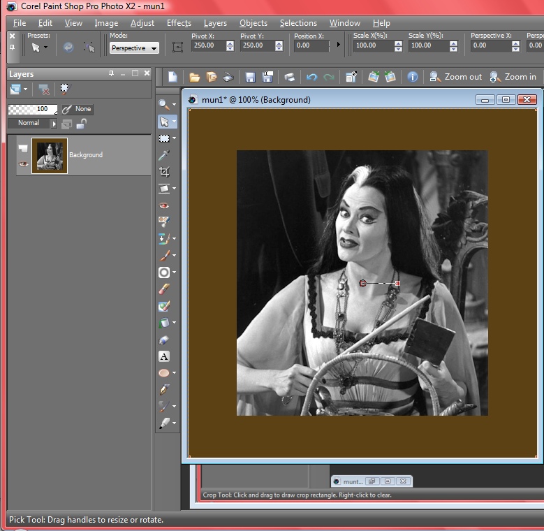
Now that I have a nice, empty layer beneath my image, when I change the Canvas Size to 500 by 500, my image looks like this:

If I had left my background as it was, it would look like this:
I prefer an empty background. :)
Next, I took the Dropper Tool and used it to select a dark gray from my image--#2b2b2b, to be precise. I liked it because it's lighter than Lily's hair, but darker than her dress and skin, so it will offer a nice contrast to both. I filled my empty layer with this gray.

3. Finish off the negative space touches and resize.
Making sure I have the layer with Lily selected, I created a mask layer by hitting Layers>New Mask Layer>Show All. (I almost always select Show All, so I can see everything I'm working with.)
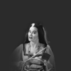
Then, grabbing my Paint Brush Tool with black (#000000) black selected at Size: 100, Hardness: 0, Step: 1, and Opacity: 100, I tapped all around Lily until everything surrounding her was gone, and her sleeves were fading away nicely. (I really liked that faded touch; it added yet another ghoulish edge to the whole look.) Then I resized my image to 100 by 100 pixels.
4. Increase lightness and contrast.
I copied my base and then pasted it as a new layer twice (Ctrl+C, then Ctrl+V twice), setting the lower copy to Screen 40 and the upper copy to Hard Light 40.

5. Texture time!
I took this one:
by tomycoffee and convert it to black and white by going to Adjust>Hue/Saturation/Lightness and setting it to Saturation: -100. (If you want to, you could also go to Layers>New Adjustment Layer>Hue/Saturation/Lightness and use it to set all the layers to black and white. It's your choice.)
That done, I set the texture to Soft Light 57.
Next I took this one: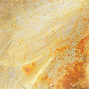
, also made by tomycoffee, set it to black and white, and then to Soft Light 66.
One more tomycoffee texture. I took this one: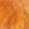
, set it to black and white again, and then to Soft Light 21.
Now the image's background has a bit of softness, a bit of grunge, and a bit of twined wire fence to liven things up.
6. Apply light blob of choice. The more dark and dramatic, the better, especially with such gothic subject matter.
I grabbed my Paint Brush Tool, and with white (#ffffff) selected at Size: 30, Hardness: 0, Step: 1, and Opacity:100, scribbled a circle just centered at the left of Lily's face and shoulder.
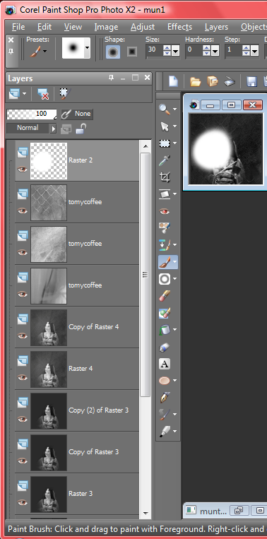
I went to Adjust>Blur>Glaussian Blur and set it to Radius: 20. (After making sure that the light blob layer was still selected.) Then I adjusted the layer to Normal 28.
I love fixing subtle light blobs a little to the side of the focal point of my icon (in this case, Lily at the center), because it brightens the focal point and adds interest to the background just next to the focal point, without washing either of them out or distracting the viewer from the rest of the icon.
7. Increase contrast!
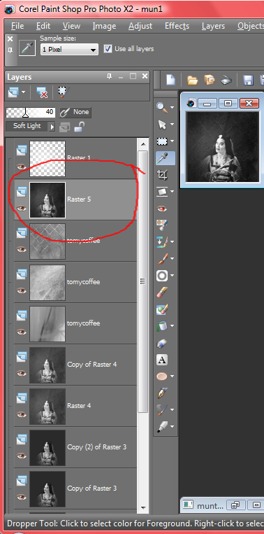
I hit Copy-Merged, in order to copy the image as it is now, and then Paste, or Ctrl+V, to paste that as a new layer. Then I moved this layer beneath my light blob layer in the Layers Palette and set it to Soft Light 40. It's the minor tweaks like this, pumping up the darkness and drama a bit, that really make the difference, at least for me.
8. Add text as needed, playing around with the settings until you get the look you want.
I selected the font "Miss" (which I can't seem to find online, even though I'm certain I downloaded it from a free site as some point) at white and Size: 80 and simply typed in lily, all lowercase, obviously.
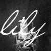
Next, I stretched and pivoted the text until it spanned across the entire icon and angled just slightly upward on the right side. I love how the text is nice and loopy, so you almost forget that's her name there, because it looks purely ornamental, like just another texture or something.

Making sure that I had the text layer still selected, I created another Mask Layer, this time choosing Hide All. I went to my Paint Brush, and instead of using the regular circle, I selected Grunge Clouds2 by iceytina over at deviantart.com, and using white, tapped a few times around Lily. Then I selected the entire layer group (Group - Vector 2) and set it to Normal 65.

I liked the grungy look this added to the text--very complimentary to the slightly rough background, and not quite as bold and distracting as the untouched version.
9. Finally, sharpen!
I hit Copy Merged, Ctrl+V, and then Adjust>Sharpness>Sharpen. Then I played around with the opacity until I got the sharpness level just how I liked it, in the end setting my layer to Normal:30.

And now I'm finished! The fussing can end. :)
Program: Paint Shop Pro
from this:

to this:

.
1. Get things started!
First, I cropped off the lower part of my image, just at the top rim of Lily's handbasket, because I didn't want my image to go any further than that.

Then I resized my image to 360 pixels wide and 380 pixels high, just so it would be easier to work with in terms of placement later.
I created a new raster layer, converted my background to a raster layer (by right-clicking the background and then left-clicking Promote Background Layer; you have to do this in order to move the layer), and then switched the two layers in the Layers Palette.

2. Transform the image.
Now that I have a nice, empty layer beneath my image, when I change the Canvas Size to 500 by 500, my image looks like this:

If I had left my background as it was, it would look like this:

I prefer an empty background. :)
Next, I took the Dropper Tool and used it to select a dark gray from my image--#2b2b2b, to be precise. I liked it because it's lighter than Lily's hair, but darker than her dress and skin, so it will offer a nice contrast to both. I filled my empty layer with this gray.

3. Finish off the negative space touches and resize.
Making sure I have the layer with Lily selected, I created a mask layer by hitting Layers>New Mask Layer>Show All. (I almost always select Show All, so I can see everything I'm working with.)
Then, grabbing my Paint Brush Tool with black (#000000) black selected at Size: 100, Hardness: 0, Step: 1, and Opacity: 100, I tapped all around Lily until everything surrounding her was gone, and her sleeves were fading away nicely. (I really liked that faded touch; it added yet another ghoulish edge to the whole look.) Then I resized my image to 100 by 100 pixels.

4. Increase lightness and contrast.
I copied my base and then pasted it as a new layer twice (Ctrl+C, then Ctrl+V twice), setting the lower copy to Screen 40 and the upper copy to Hard Light 40.

5. Texture time!
I took this one:

by tomycoffee and convert it to black and white by going to Adjust>Hue/Saturation/Lightness and setting it to Saturation: -100. (If you want to, you could also go to Layers>New Adjustment Layer>Hue/Saturation/Lightness and use it to set all the layers to black and white. It's your choice.)
That done, I set the texture to Soft Light 57.
Next I took this one:

, also made by tomycoffee, set it to black and white, and then to Soft Light 66.
One more tomycoffee texture. I took this one:

, set it to black and white again, and then to Soft Light 21.
Now the image's background has a bit of softness, a bit of grunge, and a bit of twined wire fence to liven things up.

6. Apply light blob of choice. The more dark and dramatic, the better, especially with such gothic subject matter.
I grabbed my Paint Brush Tool, and with white (#ffffff) selected at Size: 30, Hardness: 0, Step: 1, and Opacity:100, scribbled a circle just centered at the left of Lily's face and shoulder.

I went to Adjust>Blur>Glaussian Blur and set it to Radius: 20. (After making sure that the light blob layer was still selected.) Then I adjusted the layer to Normal 28.
I love fixing subtle light blobs a little to the side of the focal point of my icon (in this case, Lily at the center), because it brightens the focal point and adds interest to the background just next to the focal point, without washing either of them out or distracting the viewer from the rest of the icon.

7. Increase contrast!
I hit Copy-Merged, in order to copy the image as it is now, and then Paste, or Ctrl+V, to paste that as a new layer. Then I moved this layer beneath my light blob layer in the Layers Palette and set it to Soft Light 40. It's the minor tweaks like this, pumping up the darkness and drama a bit, that really make the difference, at least for me.

8. Add text as needed, playing around with the settings until you get the look you want.
I selected the font "Miss" (which I can't seem to find online, even though I'm certain I downloaded it from a free site as some point) at white and Size: 80 and simply typed in lily, all lowercase, obviously.

Next, I stretched and pivoted the text until it spanned across the entire icon and angled just slightly upward on the right side. I love how the text is nice and loopy, so you almost forget that's her name there, because it looks purely ornamental, like just another texture or something.

Making sure that I had the text layer still selected, I created another Mask Layer, this time choosing Hide All. I went to my Paint Brush, and instead of using the regular circle, I selected Grunge Clouds2 by iceytina over at deviantart.com, and using white, tapped a few times around Lily. Then I selected the entire layer group (Group - Vector 2) and set it to Normal 65.

I liked the grungy look this added to the text--very complimentary to the slightly rough background, and not quite as bold and distracting as the untouched version.
9. Finally, sharpen!
I hit Copy Merged, Ctrl+V, and then Adjust>Sharpness>Sharpen. Then I played around with the opacity until I got the sharpness level just how I liked it, in the end setting my layer to Normal:30.

And now I'm finished! The fussing can end. :)