Ask the Maker 4.0 (Part 1): Buffy tutorial
My first tutorial for Ask the Maker 4.0! This one covers some of my techniques for bright colouring, two-toned icons (requested by applepips16), and how I smooth hair and skin in lower resolution caps (for accordion and vetica). All in one little Buffy icon!
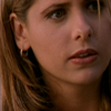
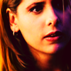
Before I start - just so you know, there's a reason I don't write tutorials very often, and it's because I'm terrible at them. I do everything in weird ways, I take a million layers for everything... Just, keep that in mind! If you're here less for the tutorial and more for the "tips and tricks", check out step 8 for how I make my two-toned icons, and steps 10 and 13 for blurring and smoothing :)
This cap is from Season 1 of Buffy, which is notoriously grainy and often dark. My cap is from smg-source.org; as you can see, although the quality is passable, it's certainly not comparable to modern HD and I don't really have the same cropping options as I might have with a higher quality cap.
1. I start by cropping my base. I always start out at 200x200 (unless I'm making a particularly complex icon, at which point I start at 500x500, but that's a story for another tutorial...). I like starting larger as it allows me to smooth things out aggressively but then resize so it looks more subtle. Anyway, here's my starting point.
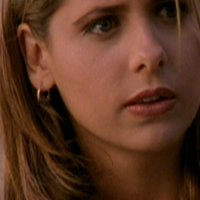
Side note: I really like this crop, where there's at least a little bit of hair on both sides of the face. I think it frames the icon nicely, and I almost certainly over-use it ;)
2. The first thing I generally do is use a Curves Adjustment Layer to brighten the cap up. Nothing too complicated - I just drag the RGB Curve up until it looks brighter. And because it's an adjustment layer, if I decide later that it's too bright, or still not bright enough, I can go back and easily change it. Here's my result.
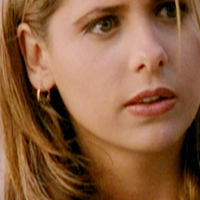
3. The next thing I do is add some contrast; there are lots of ways of doing this, but my favourite is taking another Curves Adjustment Layer, not changing any of the settings, and setting it to Soft Light or Overlay. Here I used Overlay, as the cap was seriously lacking in contrast.
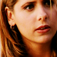
4. That still isn't enough contrast for me, so I duplicated my Overlay layer, but then reduced the Opacity to 60%
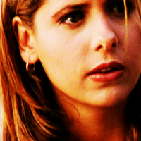
5. At this point I'm not very happy with the colours; in particular, I don't like how the highlights are blue-ish, the shadows on the left side of the face are yellow, and everything else is kind of a brown-red. I like my colouring more even, so I added a Colour Balance layer, with midtones 0/0/+50 to increase the blues.
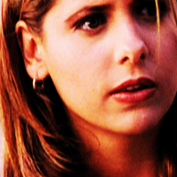
7. The colours are more even, but it's also looking pretty dull, so I added a Vibrance layer
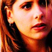
8. At this stage, I'm really noticing that the right half of her face, where the shadows are, is turning out more blue than the left side. I decide I want to emphasize this. On a new layer I paint over the shadow-y side of her face with blue, and set that layer to Soft Light 50% Opacity. I put this layer in between my two initial Curves layers (the one for brightening and the one for contrast) to make it look more natural.
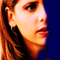

9. The next step serves two purposes. First, I want to bring a bit more purple in, and second, really dark shadows is one of the things that can make a non-HQ cap look non-HQ so I want to lighten them up. I do this by adding a dark purple layer (#1e000a) and setting it to Lighten. That just kind of mutes the shadows a little bit and helps smooth them out.

10. At this point I can't take it anymore, her hair looks all pixelly and gross, so here's where I start to properly smooth it out. I start by making a new layer and Copy-Merging onto it (Ctrl-Shift-Alt-E) - it's basically the same thing as merging, except you don't lose any of your layers underneath, so it's perfect if you want to change things later. Then, on my copy-merge layer, I take the Smudge Tool at an opacity of between 10% and 20%, and just...start smudging the hair. Always in the direction that the hair is actually going, and I make sure to be zoomed in a lot and just go slow. Basically you're just running the smudge tool over the hair, following the lines of the hair as precisely as you can, and it gradually blurs it together without messing up the ~flow~. Make sure you do it in sections - for example, closer to her temples, the hair is going more horizontally, so I smudged that separately from the part that's flowing straight down. I also smudge the little piece of hair that's falling in front of her right eye.
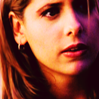
This is a technique I use a lot, especially on hair. You can see it's been used in all of the following examples, with varying degrees of subtlety.


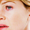
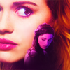
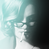
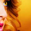

(Side note: smudging hair can make it lose definition, so a lot of the time at the end I'll need to then sharpen the hair more to compensate - but we'll get there when we get there)
11. Everything from here on is starting to get pretty subtle, but bear with me. I wanted a bit more purple and shadows, so I added a layer of #3d1f29, a dark purple, set to Soft Light, 30% Opacity. (It's a minor difference, but it's there, and more noticeable with more layers on top!)
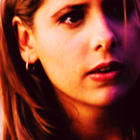
12. That makes my shadows too black again, so I added another dark purple layer (#1e000a) set to Lighten. I'm also finding that the bright half of her face is looking pretty flat, so I added a Color Balance layer with +30 Blue in the Highlights - this brightens and adds a bit of blue to the highlights - and then added a bit of Yellow (0, 0, -19) in Midtones to balance it out.

13. The skin is looking a little pixelly still, so I decide to blur it a bit. This is an advantage of working at 200x200, because I can basically "over blur" thing, until it looks almost fake, but once it's resized down it mostly just looks smooth. I just used the Blur Tool, opacity between 30-50%, and smoothed out all the pixellated areas of her skin, taking care not to blur any small details like eyebrows, ears, nostrils, lips, etc.

14. I want the right side of her face to be even more purple, so I took my blue layer from Step 8 and duplicated it, bringing it to the top, and reducing the Opacity to 30%.
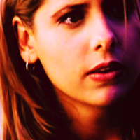
15. I'm now finding the highlights too blue (I know, I know), so I add a really pale yellow layer (I used #fffbe1) set to Multiply 70%. This has the added advantage of giving everything some of the same yellow-ish tones, which will make it look more even and therefore more HQ!

16. I'm still not very happy with how the highlights on the left are blue and the shadows are yellow, so I decide to add some Curves to try to fix it. Basically, I went into the Blue channel of a Curves Adjustment Layer, and made a reverse S-shape to make the highlights more yellow and the shadows more blue. Here's a picture if what I just said makes no sense. (I love this type of Curves layer by the way, I've been using it all the time lately, I like the slightly retro vibe that it gives)
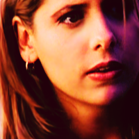
17. Because I am the worst at doing things in few layers and I want the highlights to be even more yellow, I add a new Color Balance layer, and change the highlights to 0, 0, -15. Why add more yellow this way, rather than using Curves you might but probably won't ask? Well. Changing the highlights with Color Balance tend to make the icon brighter and more contrasted, and icons always seem less bright/contrast-y once they're resized, so I'm compensating for that in advance.
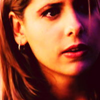
18. So many steps, I'm so sorry! Now I've decided I want the whole thing to be a bit darker and more unified, and also bring in some slightly different tones to it, so I add another Curves layer, and this time adjusting the Red channel, dragging the curve down to make things more shadowed and Cyan. Mine looks like this.
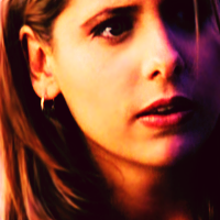
19. I want it just a little bit more flat looking though, so I add yet another dark purple layer (#1e000a) set to Lighten. Could I have saved my Lighten layers for the end, rather than doing 3 different ones? Probably. But I like building up colour a little bit at a time, idk.

20. This next step isn't too important, but I am finding the left side of her icon, right at the edge, to be a bit too bright. I generally like my icons to feel "framed" - rarely literally, with textures, but rather with light, shadows, or hair. So basically, since the right half of the icon has a dark edge, I don't want the left edge to be too bright either. I also really like the colour combination of yellow/orange/purple, so I decided to paint over the left edge of the hair with yellow on a new layer...
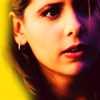
...then set that layer to Multiply. It's subtle, but it makes the edge a bit less noticeably bright, and adds a bit more colour to the icon.

Resize down to 100x100 and you're done. TAKE A DEEP BREATH, YOU MADE IT.

Please let me know if you found this tutorial helpful, and I'll be sure to do some more! There's still plenty more to come for Ask the Maker: definitely a guide on dark icons, tips for blending, more tutorials with bright colouring, and some other stuff too. And please please let me know if you have any questions or troubles with this, as that will allow me to make my future tutorials better! :)
Before I start - just so you know, there's a reason I don't write tutorials very often, and it's because I'm terrible at them. I do everything in weird ways, I take a million layers for everything... Just, keep that in mind! If you're here less for the tutorial and more for the "tips and tricks", check out step 8 for how I make my two-toned icons, and steps 10 and 13 for blurring and smoothing :)
This cap is from Season 1 of Buffy, which is notoriously grainy and often dark. My cap is from smg-source.org; as you can see, although the quality is passable, it's certainly not comparable to modern HD and I don't really have the same cropping options as I might have with a higher quality cap.
1. I start by cropping my base. I always start out at 200x200 (unless I'm making a particularly complex icon, at which point I start at 500x500, but that's a story for another tutorial...). I like starting larger as it allows me to smooth things out aggressively but then resize so it looks more subtle. Anyway, here's my starting point.
Side note: I really like this crop, where there's at least a little bit of hair on both sides of the face. I think it frames the icon nicely, and I almost certainly over-use it ;)
2. The first thing I generally do is use a Curves Adjustment Layer to brighten the cap up. Nothing too complicated - I just drag the RGB Curve up until it looks brighter. And because it's an adjustment layer, if I decide later that it's too bright, or still not bright enough, I can go back and easily change it. Here's my result.
3. The next thing I do is add some contrast; there are lots of ways of doing this, but my favourite is taking another Curves Adjustment Layer, not changing any of the settings, and setting it to Soft Light or Overlay. Here I used Overlay, as the cap was seriously lacking in contrast.
4. That still isn't enough contrast for me, so I duplicated my Overlay layer, but then reduced the Opacity to 60%
5. At this point I'm not very happy with the colours; in particular, I don't like how the highlights are blue-ish, the shadows on the left side of the face are yellow, and everything else is kind of a brown-red. I like my colouring more even, so I added a Colour Balance layer, with midtones 0/0/+50 to increase the blues.
7. The colours are more even, but it's also looking pretty dull, so I added a Vibrance layer
8. At this stage, I'm really noticing that the right half of her face, where the shadows are, is turning out more blue than the left side. I decide I want to emphasize this. On a new layer I paint over the shadow-y side of her face with blue, and set that layer to Soft Light 50% Opacity. I put this layer in between my two initial Curves layers (the one for brightening and the one for contrast) to make it look more natural.
9. The next step serves two purposes. First, I want to bring a bit more purple in, and second, really dark shadows is one of the things that can make a non-HQ cap look non-HQ so I want to lighten them up. I do this by adding a dark purple layer (#1e000a) and setting it to Lighten. That just kind of mutes the shadows a little bit and helps smooth them out.
10. At this point I can't take it anymore, her hair looks all pixelly and gross, so here's where I start to properly smooth it out. I start by making a new layer and Copy-Merging onto it (Ctrl-Shift-Alt-E) - it's basically the same thing as merging, except you don't lose any of your layers underneath, so it's perfect if you want to change things later. Then, on my copy-merge layer, I take the Smudge Tool at an opacity of between 10% and 20%, and just...start smudging the hair. Always in the direction that the hair is actually going, and I make sure to be zoomed in a lot and just go slow. Basically you're just running the smudge tool over the hair, following the lines of the hair as precisely as you can, and it gradually blurs it together without messing up the ~flow~. Make sure you do it in sections - for example, closer to her temples, the hair is going more horizontally, so I smudged that separately from the part that's flowing straight down. I also smudge the little piece of hair that's falling in front of her right eye.
This is a technique I use a lot, especially on hair. You can see it's been used in all of the following examples, with varying degrees of subtlety.
(Side note: smudging hair can make it lose definition, so a lot of the time at the end I'll need to then sharpen the hair more to compensate - but we'll get there when we get there)
11. Everything from here on is starting to get pretty subtle, but bear with me. I wanted a bit more purple and shadows, so I added a layer of #3d1f29, a dark purple, set to Soft Light, 30% Opacity. (It's a minor difference, but it's there, and more noticeable with more layers on top!)
12. That makes my shadows too black again, so I added another dark purple layer (#1e000a) set to Lighten. I'm also finding that the bright half of her face is looking pretty flat, so I added a Color Balance layer with +30 Blue in the Highlights - this brightens and adds a bit of blue to the highlights - and then added a bit of Yellow (0, 0, -19) in Midtones to balance it out.
13. The skin is looking a little pixelly still, so I decide to blur it a bit. This is an advantage of working at 200x200, because I can basically "over blur" thing, until it looks almost fake, but once it's resized down it mostly just looks smooth. I just used the Blur Tool, opacity between 30-50%, and smoothed out all the pixellated areas of her skin, taking care not to blur any small details like eyebrows, ears, nostrils, lips, etc.
14. I want the right side of her face to be even more purple, so I took my blue layer from Step 8 and duplicated it, bringing it to the top, and reducing the Opacity to 30%.
15. I'm now finding the highlights too blue (I know, I know), so I add a really pale yellow layer (I used #fffbe1) set to Multiply 70%. This has the added advantage of giving everything some of the same yellow-ish tones, which will make it look more even and therefore more HQ!
16. I'm still not very happy with how the highlights on the left are blue and the shadows are yellow, so I decide to add some Curves to try to fix it. Basically, I went into the Blue channel of a Curves Adjustment Layer, and made a reverse S-shape to make the highlights more yellow and the shadows more blue. Here's a picture if what I just said makes no sense. (I love this type of Curves layer by the way, I've been using it all the time lately, I like the slightly retro vibe that it gives)
17. Because I am the worst at doing things in few layers and I want the highlights to be even more yellow, I add a new Color Balance layer, and change the highlights to 0, 0, -15. Why add more yellow this way, rather than using Curves you might but probably won't ask? Well. Changing the highlights with Color Balance tend to make the icon brighter and more contrasted, and icons always seem less bright/contrast-y once they're resized, so I'm compensating for that in advance.
18. So many steps, I'm so sorry! Now I've decided I want the whole thing to be a bit darker and more unified, and also bring in some slightly different tones to it, so I add another Curves layer, and this time adjusting the Red channel, dragging the curve down to make things more shadowed and Cyan. Mine looks like this.
19. I want it just a little bit more flat looking though, so I add yet another dark purple layer (#1e000a) set to Lighten. Could I have saved my Lighten layers for the end, rather than doing 3 different ones? Probably. But I like building up colour a little bit at a time, idk.
20. This next step isn't too important, but I am finding the left side of her icon, right at the edge, to be a bit too bright. I generally like my icons to feel "framed" - rarely literally, with textures, but rather with light, shadows, or hair. So basically, since the right half of the icon has a dark edge, I don't want the left edge to be too bright either. I also really like the colour combination of yellow/orange/purple, so I decided to paint over the left edge of the hair with yellow on a new layer...
...then set that layer to Multiply. It's subtle, but it makes the edge a bit less noticeably bright, and adds a bit more colour to the icon.
Resize down to 100x100 and you're done. TAKE A DEEP BREATH, YOU MADE IT.
Please let me know if you found this tutorial helpful, and I'll be sure to do some more! There's still plenty more to come for Ask the Maker: definitely a guide on dark icons, tips for blending, more tutorials with bright colouring, and some other stuff too. And please please let me know if you have any questions or troubles with this, as that will allow me to make my future tutorials better! :)