Icon tutorial: coloring
->

Program(s): Photoshop CS2
Involves: curves, variations, color balance, blending modes, adding textures
Translatable: yes
Steps: 12
Difficulty: easy
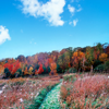
1. Another base from gettyimages. As you can see, we're going to change the colors a lot and make them warmer. The first step is too add yellow. I'll do that in the same step as brightening the image.
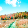
Duplicate your base. Go to Image -> Adjustments --> Variations and click twice on yellow (arrow in the middle). Set it to Screen 100 %.
If you use PSP or Gimp you can use Color Balance instead of Variations (directly on the layer, no Adjustment layer!): Midtones +20 0 -100

->
2. I know I'll want to use a grey texture with a black border (I think from xswaniconsx, modified by me). I'm adding it this early because I'll work with a lot of layers to achieve the coloring, and that way I know how much the texture will darken the icon. It saves fiddling later.

+
->
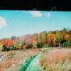
3. On with adding more orange/yellow with a Color Balance layer.
Midtones: 0 0 -56
Shadows: 0 0 +5
Highlights: +17 0 +17

->
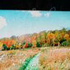
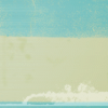
4. Add this texture (my own) and set it to Color Burn 35%. You can also use a light blue fill layer, but I prefer the texture, because the beige part in the middle works better with the road and grass.

+
->
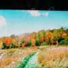
5. More brightening and warming the colors with a Curves layer.
RGB: 1st point: I: 121 O: 143
2nd point: I: 27 O: 12
Red: 1st point: I: 170 O: 226
2nd point: I: 50 O: 96
3rd point: I: 23 O: 8
Green: 1st point: I: 96 O: 111
2nd point: I: 21 O: 38
Blue: 1st point: I: 97 O: 117
Set that layer to Normal 35%.

->
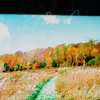
6. And the last step for the coloring, adding more yellow and red with a Color Balance layer.
Midtones: +53 +2 -31
Shadows: +7 -42 -28
Highlights: +12 0 -9

->

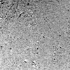
7. Add this texture (my own), set to Multiply 10%

+
->
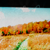
8. The next two steps are two of my favourites, stolen from trutdelamode
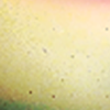
Add a texture by tihana, set to Overlay 27%

+
->

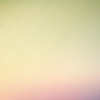
9. Add the same texture by tihana, placed slightly different, set to Multiply 58%

+
->
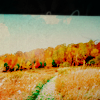
10. For a more vivid coloring, add a Brightness/Contrast layer.
Brightness -8
Contrast +10

->
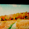
11. This step is for PS users, but completely optional, it's only a minor difference.
New Selective Color layer
Yellows
Cyan: 0
Magenta: +6
Yellow: -9
Black: 0

->

12. For decoration add some tect in Garamond SSi 10 pt, a tiny text brush and one of my light textures.

->

Done.
Feel free to ask any questions.