Icon tutorial: coloring
->
Program(s): Photoshop CS
Involves: curves, variations, colour balance, levels, brightness/contrast
Translatable: no for the coloring part, yes for making the actual icon
Steps: 17
Difficulty: medium
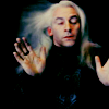
Lucius Malfoy
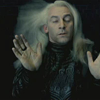
This cap from the OotP trailer isn’t that great and will need a bit of work.
As I’ve been writing this, I realized that the amount of layers is insane, and it probably won’t work on any other cap. Well, at least you can learn that something nice can come from just futzing around.
1. Duplicate the twice and set both layers to Screen 100%.

->
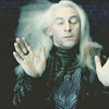
2. This looks pretty blah and much too blue.
Go back to your base and add some red and yellow with the variation tool (Image -> Adjustments -> Variations):
Midtones: with the arrow in the middle click once on red, move the arrow two points down and click once on yellow, once on red. Fade it to 50% (Edit -> Fade Variations -> 50%).

->
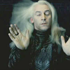
3. Better, but still pretty dull. Add a Hue/Saturation layer and increase the saturation to +25.

->

4. The picture needs more red and the blacks look washed out. Fix it with a Selective Color layer.
Red
Cyan: -77
Magenta: +40
Yellow: +68
Black: +27
Neutral
Cyan: +9
Magenta: +24
Yellow: +6
Black: 0
Blacks
Cyan: 0
Magenta: 0
Yellow: 0
Black: +25

->
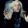
5. Duplicate the Selective Color layer and set it to Normal 54%.

->
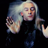
7. Add a fill layer with a very dark blue (#021021), set it to Exclusion 54%.

->
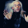
8. Now it’s lacking yellow, especially the face and blond hair. Add a Color Balance layer.
Midtones: +4 -24 -34
Shadows : -22 +12 +13
Highlights: -3 0 0

->

9. For a darker look and more blue, add a Levels layer.
RGB: Input Levels: 0 0,74 255

->
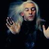
10. Now it’s too dark. Merge the visible layers as new layer (Alt+Ctrl+Shift+E). That way you keep the colors better than by using the original base.
Go to Image -> Brightness/Contrast. Reduce the Brightness to -36 and increase the contrast to +6. Blur it once. Set that layer to Screen 40% and move it a tiny bit to the right.

->
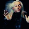
11. Add a Curves layer to brighten it.
RGB : I: 123 O: 149
Red : I: 117 O: 137
Green: I: 123 O: 128
Blue: I: 121 O: 114
I: 43 O: 0

->
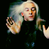
12. I’m weird and picky, so I lowered the saturation and brightness again (after all that increasing and brightening ;)).
Add a Hue/saturation layer:
Saturation: -8
Lightness : -5

->

13. And another Color Balance Layer. Can you tell I'm just futzing around?
Midtones: +2 -20 -15
Highlights: -23 -3 -12

->
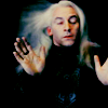
14. And yet another Curves layer, set it to Multiply 21%
RGB : I: 120 O: 135
Red : I: 124 O: 132
Green: I: 121 O: 128
Blue: I: 128 O: 138

->

Done. Whew…
I hope you found some of this at least remotely useful. Credits for tuts aren't necessary.