How To Use Font On Icons: Photoshop CS2
Program(s)+version: Photoshop CS2
Involves: Text Pallette
Translatable: Possibly
Steps: None really more like guidelines
Difficulty: 3 out of 5

First, you want to start with a good solid base. You can use "blank" enough textures but I'm not too fond of those. So I'm going to use a basic solid color. I chose this PINK color, that's just because I like pink right now.

Now since I am using a bright blank base I could use white but to me it will look too harsh. So I open my color palette by clicking on the color swatches in my tool bar and I choose a very light grey. Usually #eeeeee.

After that I choose the font tool and this is a biggie instead of just clicking on the icon where I want my text to go I left-click and HOLD the left button and drag so that there's a selection style box. This is rather important for me, I'll explain why in a moment.

The reason why I do the boxed style is a preference because I like my letters to line up. Its also easier to edit the letter width, line break width and paragraph style. I'll explain all that a little on let's just get passed the basic icon ;) To be frank though I use both parts of the text palette; character and Paragraph.
Onto the icon
You choose your text here I chose lyrics from Paramore's "That's What You Get" I used Apple Garamond That's not exactly what I downloaded but I don't remember where I go the original that's for you though its pretty similar.

For me that's too simple. So instead of keeping it all the same I am going to click on the "No Sir," part of the text and just like you'd click in a word document, you highlight just that part of the text. Instead of having the text at 16 pt ( I set it customly to that) like the rest of it I set it to 24 pt ACK! Your text may have disappeared just extend the box and move it around the icon to get it back into the place you want :) The out corner edges help you extend the box size.

Now I really don't like the paragraph style its not equal in parts and offputting in my eye. So I highlight all the text (Ctrl+A) and I go to the Paragraph tab in my Text Tablet. My settings are at a basic writing style left to right. I don't like that. I like the justified style and I mostly play with the middle justification. But I'll show all four styles :)
Left or Justify Last Left:

Right or Justify last Right:

Center or Justify last center:

Block or Justify All

I prefer Center for this icon. Its still looking bland to me so I am going to highlight not anymore and I am going to go back to character and set that at a 18 pt and then go to my Regular, Italic, Bold, Bold Italic drop down menu and choose italics for my highlighted part. I also keep my anti-alias smooth so that way the edges don't look funky.

Now my icons look like this:

Okay it looks much more decent but this is my nitpicky part:
Go to your layers palette and right click your text layer. Pick Rasterize Type this makes it into a layer that you can no longer edit with the text tool. With this layer still highlighted Ctrl+A the layer Cut (Ctrl+X) and paste (Ctrl+P) it back into the same layer by reclicking the layer in the palette now your text should be centered in the icon.

and that's how I do a basic text only icon. Merge layers and save the icon how you normally save your icons.
My text varies on how I want to emphasize the wording, you can even change up the fonts in the same box. And if you want your changed fonts to still line up it gets a little trickier.
I am going to change the "not anymore" into Arial Black size 14 pt since its a bolder font. If you noticed it still lined it up because that's how the justify works :)

Basically its an easier way to make sure your text lines up without having so many layers.

If you want to fiddle you can with different like moving the text box you made as if you were cropping. Since your text is there your text is going to move but again its an easier to give your text variance without making so many layers. Of course, this would be all before your rasterize type :)
Before it slips my mind if you are using justify be sure to have hyphenate checked in that palette so that instead of having to readjust the whole word it follows.

Unless you don't mind it on the next line it just helps when you're trying to quote long words and it helps to make it fit better.


The last one also shows that if the word on a line is too short when you're using a justified paragraph style the word will stretch out to fit. It looks okay here but sometimes it can look awkward ie;
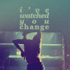
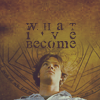
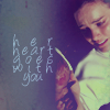
icon credit: luckygrphx
Words with apostrophes usually look most odd as you can see.
Jumbled Text
I just made the background blue for this so I know where I started a different part of the tutorial)
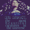
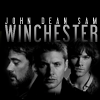
When I jumble my text such as:
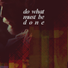
icon credit: luckygrphx
I mentioned I don't make several different layers and layering them on top of each other. I simply use the leading drop down box found next to the font size menu.

I highlight all my text again and you'll notice that all the other menus go blank. That's because I'm using two different fonts and different sizes which is nothing to worry about. We're just going to worry about the leading menu. Here its set to 12 but its still pretty broken up. I am going to set it to 8 pt. Rasterize it, copy and paste it so that its back in the middle. Depending on the size of your font the pts is going to vary. You would have to experiment to find the leading as to how much you want it jumbled. This works for me for this tutorial. :)

The end result:

As you can see its not completely jumbled but its simple for the tutorial.
Text Distortion
credit: luckygrphx
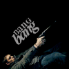
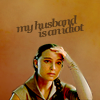
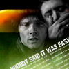
I don't distort my text too much mainly just angle it differently. You can do this when you are still in the text box and it has the corners so that you can rotate and resize. Or you can do it after your rasterize and go to Edit>Free Transform which also lets you rotate it, stretch, scale and all the other fun stuff I don't want to get into.

Text For Images
credit: luckygrphx
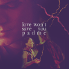
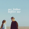
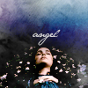
I have to say its not really different than a blank text only. The only difference is a choose text color by using the eye dropper tool through the color selection in the character text palette and here i chose a light blue color. I also arranged the box to fit. Its not really too flattering here but its just to show you how it works.

The light blue blends in with the icon and doesn't focus all the attention to the just the text yet you can still read it. You have to play with the colors to see how you want your text to stand out.
Fading Text
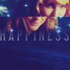
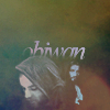
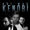
Basic paragraph writing style follows, rasterize it. Take a soft round ERASER BRUSH. I usually go 45 since its easy to work with.

It depends on how much you want to disappear. Usually I keep the text really close but this was just to show.

I believe that covers most of my tricks.
Fonts I usually use:
Arial Black
Georgia
Libel Suit
Apple Garamond
All Used Up
Headline
Viper Nora
JaneAusten
Times New Roman
Superstar
Palatino Linotype
Pointy
Phew. That was long. Again, if there's any confusion please let me know. :)
Involves: Text Pallette
Translatable: Possibly
Steps: None really more like guidelines
Difficulty: 3 out of 5

First, you want to start with a good solid base. You can use "blank" enough textures but I'm not too fond of those. So I'm going to use a basic solid color. I chose this PINK color, that's just because I like pink right now.

Now since I am using a bright blank base I could use white but to me it will look too harsh. So I open my color palette by clicking on the color swatches in my tool bar and I choose a very light grey. Usually #eeeeee.

After that I choose the font tool and this is a biggie instead of just clicking on the icon where I want my text to go I left-click and HOLD the left button and drag so that there's a selection style box. This is rather important for me, I'll explain why in a moment.

The reason why I do the boxed style is a preference because I like my letters to line up. Its also easier to edit the letter width, line break width and paragraph style. I'll explain all that a little on let's just get passed the basic icon ;) To be frank though I use both parts of the text palette; character and Paragraph.
Onto the icon
You choose your text here I chose lyrics from Paramore's "That's What You Get" I used Apple Garamond That's not exactly what I downloaded but I don't remember where I go the original that's for you though its pretty similar.

For me that's too simple. So instead of keeping it all the same I am going to click on the "No Sir," part of the text and just like you'd click in a word document, you highlight just that part of the text. Instead of having the text at 16 pt ( I set it customly to that) like the rest of it I set it to 24 pt ACK! Your text may have disappeared just extend the box and move it around the icon to get it back into the place you want :) The out corner edges help you extend the box size.

Now I really don't like the paragraph style its not equal in parts and offputting in my eye. So I highlight all the text (Ctrl+A) and I go to the Paragraph tab in my Text Tablet. My settings are at a basic writing style left to right. I don't like that. I like the justified style and I mostly play with the middle justification. But I'll show all four styles :)
Left or Justify Last Left:

Right or Justify last Right:

Center or Justify last center:

Block or Justify All

I prefer Center for this icon. Its still looking bland to me so I am going to highlight not anymore and I am going to go back to character and set that at a 18 pt and then go to my Regular, Italic, Bold, Bold Italic drop down menu and choose italics for my highlighted part. I also keep my anti-alias smooth so that way the edges don't look funky.

Now my icons look like this:

Okay it looks much more decent but this is my nitpicky part:
Go to your layers palette and right click your text layer. Pick Rasterize Type this makes it into a layer that you can no longer edit with the text tool. With this layer still highlighted Ctrl+A the layer Cut (Ctrl+X) and paste (Ctrl+P) it back into the same layer by reclicking the layer in the palette now your text should be centered in the icon.

and that's how I do a basic text only icon. Merge layers and save the icon how you normally save your icons.
My text varies on how I want to emphasize the wording, you can even change up the fonts in the same box. And if you want your changed fonts to still line up it gets a little trickier.
I am going to change the "not anymore" into Arial Black size 14 pt since its a bolder font. If you noticed it still lined it up because that's how the justify works :)

Basically its an easier way to make sure your text lines up without having so many layers.

If you want to fiddle you can with different like moving the text box you made as if you were cropping. Since your text is there your text is going to move but again its an easier to give your text variance without making so many layers. Of course, this would be all before your rasterize type :)
Before it slips my mind if you are using justify be sure to have hyphenate checked in that palette so that instead of having to readjust the whole word it follows.

Unless you don't mind it on the next line it just helps when you're trying to quote long words and it helps to make it fit better.


The last one also shows that if the word on a line is too short when you're using a justified paragraph style the word will stretch out to fit. It looks okay here but sometimes it can look awkward ie;
icon credit: luckygrphx
Words with apostrophes usually look most odd as you can see.
Jumbled Text
I just made the background blue for this so I know where I started a different part of the tutorial)
When I jumble my text such as:
icon credit: luckygrphx
I mentioned I don't make several different layers and layering them on top of each other. I simply use the leading drop down box found next to the font size menu.

I highlight all my text again and you'll notice that all the other menus go blank. That's because I'm using two different fonts and different sizes which is nothing to worry about. We're just going to worry about the leading menu. Here its set to 12 but its still pretty broken up. I am going to set it to 8 pt. Rasterize it, copy and paste it so that its back in the middle. Depending on the size of your font the pts is going to vary. You would have to experiment to find the leading as to how much you want it jumbled. This works for me for this tutorial. :)

The end result:

As you can see its not completely jumbled but its simple for the tutorial.
Text Distortion
credit: luckygrphx
I don't distort my text too much mainly just angle it differently. You can do this when you are still in the text box and it has the corners so that you can rotate and resize. Or you can do it after your rasterize and go to Edit>Free Transform which also lets you rotate it, stretch, scale and all the other fun stuff I don't want to get into.

Text For Images
credit: luckygrphx
I have to say its not really different than a blank text only. The only difference is a choose text color by using the eye dropper tool through the color selection in the character text palette and here i chose a light blue color. I also arranged the box to fit. Its not really too flattering here but its just to show you how it works.

The light blue blends in with the icon and doesn't focus all the attention to the just the text yet you can still read it. You have to play with the colors to see how you want your text to stand out.
Fading Text
Basic paragraph writing style follows, rasterize it. Take a soft round ERASER BRUSH. I usually go 45 since its easy to work with.

It depends on how much you want to disappear. Usually I keep the text really close but this was just to show.

I believe that covers most of my tricks.
Fonts I usually use:
Arial Black
Georgia
Libel Suit
Apple Garamond
All Used Up
Headline
Viper Nora
JaneAusten
Times New Roman
Superstar
Palatino Linotype
Pointy
Phew. That was long. Again, if there's any confusion please let me know. :)