Beginners Guide to Exclusion Layers
Program(s)+version: Photoshop 7.0
Involves: Exclusion Layers
Translatable: Yes
Difficulty: Easy
This tutorial is specifically for Exclusion layers. Here I will share and explain some of my favorite exclusion layers and their effect. I will be covering five fill layers and their effects, they are:
1. Washed out coloring,
2. Old Photographs coloring,
3. Black and white vintage,
4. Color vintage and
5. Contrast reduction.
Each effect will be shown with a human/people and stock example.
My originals are:

and
WASHED OUT EFFECT:
#07223E:

This is the most common exclusion fill layer used. Mostly all tutorials will have this one. The reason being this fill layer is very good when you want to achieve a soft look and balance the vibrant colors.
People: This type of coloring effect is good to subdue an icon's colors and give it a soft and welcoming look. The skin in this layer is very nice making it ideal of people icons.

Stock: On stock icons the coloring has the same effect but if used in the wrong way they can prove pretty bad. The thing is, unlike people or even animal icons, stock icons usually tend to contain a lot of whites in the background. Exclusion layers turn the whites into a soft yellowish brown color which is not always pleasing. So when using on stock images its best to play around with the opacity of the layer and/or to use it in combination with a "Soft Light" or "Color Burn" layer.

OLD PHOTOGRAPH:
Now before I begin, I'm sure each individual has their own opinion of what a "old photograph" coloring is, so please keep in mind I'm explaining what I feel looks like a old photograph effect =]
#002868:

This layer is very deadly for shadows and blacks in general, as they turn bluish in color. So when using with dark images different effect combinations as a MUST.
People: This layer, as you will notice from the below example, is very over powering. Hence it should NEVER be used alone, always use it in combinations.

Now the coloring is pretty bad, but here's how it will look with a simple trick, duplicate the base and bring it to the top and set it to soft light.

Much better, no? This is why I was stressing on the combination usage ;)
Stock: With the stock images it has more or less the same the effect, but again due to the tendency to include more whites this coloring can be very rough on stock images. Like so:

But like with people icons, I used the same trick I mentioned above and here's a better effect:

This effect enhances reds to a good extent.
BLACK AND WHITE VINTAGE:
What is vintage coloring? For me, its basically a image with a ting of brown tint which makes it appear old giving it a classic look. This effect is specifically for black and white images.
#3F0319:

People: As the title suggest it gives you a vintage look best suitable for black and white images. It gives a very old-high-school-year-book look. However to achieve this effect properly, it is suggested to duplicate your base, bring it to the top and set it to soft light.
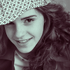
Stock: With stock images it has the same effect but I personally don't like to use it with stock images as I don't think vintage is particularly a good look for stock images, but its your choice =]
The "duplicate your base, bring it to the top and set it to soft light" applies here as well.

While I said its best with black and white images, this effect works pretty good with colored stock images as well.

COLOR VINTAGE:
#2A0336:

People: Like the name suggest, vintage look for colored images. This effect enhances browns and slightly reds.

Stock: Again, it has more or less the same effect as with people but I'd suggest you go for the effect of the black and white fill layer as it has a better look on stock images.

CONTRAST REDUCTION:
#2B2829:

As the name suggests, this effect is good to tone down the contrast of images without affecting the brightness much. Also unlike the other fill layers, this one doesn't affect the original colors much. As with other layers, its best when used in combinations.


There are many more exclusion layers, the key is how you use them. Try to experiment some on your own and never forget to use them in combinations with different effects =] And another important thing is never use only an exclusion layer, mostly people just use one exclusion layer and think they're done, but you're not, there are so may more possibilities to achieve fabulous coloring!
If I may suggest then, with Exclusion layers it best to try combinations of different Soft Light, Burn and Multiply layers.
Hope this was helpful to anyone and please comment so i can feel warm and fuzzy :P
Involves: Exclusion Layers
Translatable: Yes
Difficulty: Easy
This tutorial is specifically for Exclusion layers. Here I will share and explain some of my favorite exclusion layers and their effect. I will be covering five fill layers and their effects, they are:
1. Washed out coloring,
2. Old Photographs coloring,
3. Black and white vintage,
4. Color vintage and
5. Contrast reduction.
Each effect will be shown with a human/people and stock example.
My originals are:

and

WASHED OUT EFFECT:
#07223E:

This is the most common exclusion fill layer used. Mostly all tutorials will have this one. The reason being this fill layer is very good when you want to achieve a soft look and balance the vibrant colors.
People: This type of coloring effect is good to subdue an icon's colors and give it a soft and welcoming look. The skin in this layer is very nice making it ideal of people icons.

Stock: On stock icons the coloring has the same effect but if used in the wrong way they can prove pretty bad. The thing is, unlike people or even animal icons, stock icons usually tend to contain a lot of whites in the background. Exclusion layers turn the whites into a soft yellowish brown color which is not always pleasing. So when using on stock images its best to play around with the opacity of the layer and/or to use it in combination with a "Soft Light" or "Color Burn" layer.

OLD PHOTOGRAPH:
Now before I begin, I'm sure each individual has their own opinion of what a "old photograph" coloring is, so please keep in mind I'm explaining what I feel looks like a old photograph effect =]
#002868:

This layer is very deadly for shadows and blacks in general, as they turn bluish in color. So when using with dark images different effect combinations as a MUST.
People: This layer, as you will notice from the below example, is very over powering. Hence it should NEVER be used alone, always use it in combinations.

Now the coloring is pretty bad, but here's how it will look with a simple trick, duplicate the base and bring it to the top and set it to soft light.

Much better, no? This is why I was stressing on the combination usage ;)
Stock: With the stock images it has more or less the same the effect, but again due to the tendency to include more whites this coloring can be very rough on stock images. Like so:

But like with people icons, I used the same trick I mentioned above and here's a better effect:

This effect enhances reds to a good extent.
BLACK AND WHITE VINTAGE:
What is vintage coloring? For me, its basically a image with a ting of brown tint which makes it appear old giving it a classic look. This effect is specifically for black and white images.
#3F0319:

People: As the title suggest it gives you a vintage look best suitable for black and white images. It gives a very old-high-school-year-book look. However to achieve this effect properly, it is suggested to duplicate your base, bring it to the top and set it to soft light.

Stock: With stock images it has the same effect but I personally don't like to use it with stock images as I don't think vintage is particularly a good look for stock images, but its your choice =]
The "duplicate your base, bring it to the top and set it to soft light" applies here as well.

While I said its best with black and white images, this effect works pretty good with colored stock images as well.

COLOR VINTAGE:
#2A0336:

People: Like the name suggest, vintage look for colored images. This effect enhances browns and slightly reds.

Stock: Again, it has more or less the same effect as with people but I'd suggest you go for the effect of the black and white fill layer as it has a better look on stock images.

CONTRAST REDUCTION:
#2B2829:

As the name suggests, this effect is good to tone down the contrast of images without affecting the brightness much. Also unlike the other fill layers, this one doesn't affect the original colors much. As with other layers, its best when used in combinations.


There are many more exclusion layers, the key is how you use them. Try to experiment some on your own and never forget to use them in combinations with different effects =] And another important thing is never use only an exclusion layer, mostly people just use one exclusion layer and think they're done, but you're not, there are so may more possibilities to achieve fabulous coloring!
If I may suggest then, with Exclusion layers it best to try combinations of different Soft Light, Burn and Multiply layers.
Hope this was helpful to anyone and please comment so i can feel warm and fuzzy :P