2 coloring tutorials
go from this: 
to this: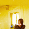
and
from this: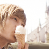
to this: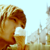
Program(s)+version: GIMP 2.2
Involves: curves, color balance, channel mixer
Translatable: yes
Steps: first icon: 14 steps; second icon: 6 steps
Difficulty: easy
TUTORIAL 01.
This will probably work best with a very particular kind of icon - one that has a light background and subtle shadows.

>>
step one:
I started out with this image of Jaejoong from the Bonjour Paris Photobook, and cropped it to my liking. I ended up with this:

It's okay that it's not exactly 100x100 pixels. We'll fix that towards the end.
step two:
The black lamp and pole-looking-thing on the lower left side bothered me, so to get rid of those, I used my best friend, the smudge tool - with a round, soft-edged brush - to wipe the yucky blackness away. The result:

step three:
The colors are looking pretty dull right now, so to enhance them a bit, I used curves (Layer > Colors > Curves) with these settings:
Blue: x:96 y:6 ; x:196 y:255

step four:
Jae's looking a little green and sickly. We'll fix that with color balance (Layer > Colors > Color Balance), using these settings:
Midtones: 0, -25, 0
(preserve luminosity: on)

Adds a nice pinkness back to his body.
step five:
Duplicate the layer (Layer > Duplicate Layer).

>
step six:
This is where you might start getting freaked out by the coloring. Just bear with me. ;D
On the duplicated layer, use curves (Layer > Colors > Curves) with these settings:
Blue: x:160 y:10

step seven:
I want the lines and shadows on the wall to be more vibrant, so - still on the duplicated layer - I use channel mixer (Filters > Colors > Channel Mixer) with these settings:
Red: 200, -19.3, -9.4
Green: 0, 100, 0
Blue: -35.1, 36, 3.6
(preserve luminosity: on)

step eight:
This step only makes a slight difference, but I want a tiny bit more red in the image. So - still on the duplicated layer - use curves (Layer > Colors > Curves) with these settings:
Green: x:20 y:5

step nine:
Jae's color is off again. Let's fix that by erasing the bit of him on the duplicated layer.

>
step ten:
Return to the layer right below the duplicated one. Go to curves (Layer > Color > Curves) again, using these settings:
Value: x:12 y:6
Green: x:19 y:5
This will help Jae stand out a bit more.

step eleven:
Flatten your image (Image > Flatten Image).
step twelve:
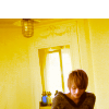
Copy and paste your flattened image onto a new 100x100 layer, and offset it so there's space at the top.
step thirteen:
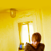
Use the color picker tool to get the yellow color of the wall, then use that color to fill the white space at the top. When that's done, flatten your image (Image > Flatten Image) and use the smudge tool to blend where you filled the white space in with the image.

>
step fourteen:
Last step! On a new layer, set this texture
by lookslikerain to Screen 100%. Using the smudge tool again, smudge out the white parts covering Jae's face.

And ta-da! You're done.
--
TUTORIAL 02.
This one's really basic.
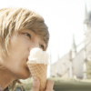
I started out with this:
It seems too reddish, so use color balance (Layer > Colors > Color Balance) with these settings:
Highlights: -21, 0, -13
(preserve luminosity: on)
step two:
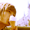
To up the colors a bit, I used curves (Layer > Colors > Curves) with these settings:
Blue: x:114 y:3 ; x:199 y:255
Green: x:55 y:4
step three:
To add a warmer tint, make two new layers and color fill both with a dark brown (#290000). Set the first layer to Subtract and the second to Screen 100%. [Note: for PS users, just make one new layer, color fill, and set to Exclusion 100%]

step four:
To enhance the shadows a bit more, make a new layer, color fill with a light gray (#e8e8e8) and set it to Burn 100%.

step five:
I'm fickle and decided I wanted a little red back in the image -_-;;, so I used color balance (Layer > Colors > Color Balance) with these settings:
Midtones: 0, -10, 0
(preserve luminosity: on)
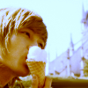
step six:
I don't like the dark stripe on the lower part of the image. So smudge it out using the smudge tool.
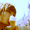
And voila. [:
--
Hope these are helpful. Questions are welcome!

to this:

and
from this:

to this:

Program(s)+version: GIMP 2.2
Involves: curves, color balance, channel mixer
Translatable: yes
Steps: first icon: 14 steps; second icon: 6 steps
Difficulty: easy
TUTORIAL 01.
This will probably work best with a very particular kind of icon - one that has a light background and subtle shadows.

>>

step one:
I started out with this image of Jaejoong from the Bonjour Paris Photobook, and cropped it to my liking. I ended up with this:

It's okay that it's not exactly 100x100 pixels. We'll fix that towards the end.
step two:
The black lamp and pole-looking-thing on the lower left side bothered me, so to get rid of those, I used my best friend, the smudge tool - with a round, soft-edged brush - to wipe the yucky blackness away. The result:

step three:
The colors are looking pretty dull right now, so to enhance them a bit, I used curves (Layer > Colors > Curves) with these settings:
Blue: x:96 y:6 ; x:196 y:255

step four:
Jae's looking a little green and sickly. We'll fix that with color balance (Layer > Colors > Color Balance), using these settings:
Midtones: 0, -25, 0
(preserve luminosity: on)

Adds a nice pinkness back to his body.
step five:
Duplicate the layer (Layer > Duplicate Layer).

>

step six:
This is where you might start getting freaked out by the coloring. Just bear with me. ;D
On the duplicated layer, use curves (Layer > Colors > Curves) with these settings:
Blue: x:160 y:10

step seven:
I want the lines and shadows on the wall to be more vibrant, so - still on the duplicated layer - I use channel mixer (Filters > Colors > Channel Mixer) with these settings:
Red: 200, -19.3, -9.4
Green: 0, 100, 0
Blue: -35.1, 36, 3.6
(preserve luminosity: on)

step eight:
This step only makes a slight difference, but I want a tiny bit more red in the image. So - still on the duplicated layer - use curves (Layer > Colors > Curves) with these settings:
Green: x:20 y:5

step nine:
Jae's color is off again. Let's fix that by erasing the bit of him on the duplicated layer.

>

step ten:
Return to the layer right below the duplicated one. Go to curves (Layer > Color > Curves) again, using these settings:
Value: x:12 y:6
Green: x:19 y:5
This will help Jae stand out a bit more.

step eleven:
Flatten your image (Image > Flatten Image).
step twelve:
Copy and paste your flattened image onto a new 100x100 layer, and offset it so there's space at the top.

step thirteen:
Use the color picker tool to get the yellow color of the wall, then use that color to fill the white space at the top. When that's done, flatten your image (Image > Flatten Image) and use the smudge tool to blend where you filled the white space in with the image.

>

step fourteen:
Last step! On a new layer, set this texture

by lookslikerain to Screen 100%. Using the smudge tool again, smudge out the white parts covering Jae's face.

And ta-da! You're done.
--
TUTORIAL 02.
This one's really basic.
I started out with this:

It seems too reddish, so use color balance (Layer > Colors > Color Balance) with these settings:
Highlights: -21, 0, -13
(preserve luminosity: on)

step two:
To up the colors a bit, I used curves (Layer > Colors > Curves) with these settings:
Blue: x:114 y:3 ; x:199 y:255
Green: x:55 y:4

step three:
To add a warmer tint, make two new layers and color fill both with a dark brown (#290000). Set the first layer to Subtract and the second to Screen 100%. [Note: for PS users, just make one new layer, color fill, and set to Exclusion 100%]

step four:
To enhance the shadows a bit more, make a new layer, color fill with a light gray (#e8e8e8) and set it to Burn 100%.

step five:
I'm fickle and decided I wanted a little red back in the image -_-;;, so I used color balance (Layer > Colors > Color Balance) with these settings:
Midtones: 0, -10, 0
(preserve luminosity: on)

step six:
I don't like the dark stripe on the lower part of the image. So smudge it out using the smudge tool.

And voila. [:
--
Hope these are helpful. Questions are welcome!